Registration Open
Registration Open
25 May | 09:00
-

Reset your password
We'll email you instructions on how to reset your password

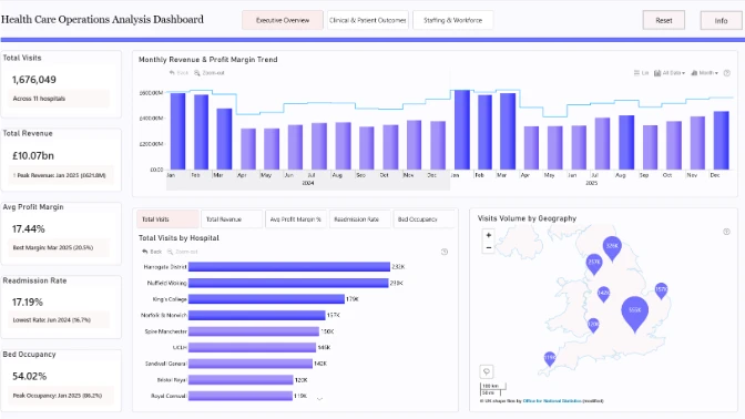
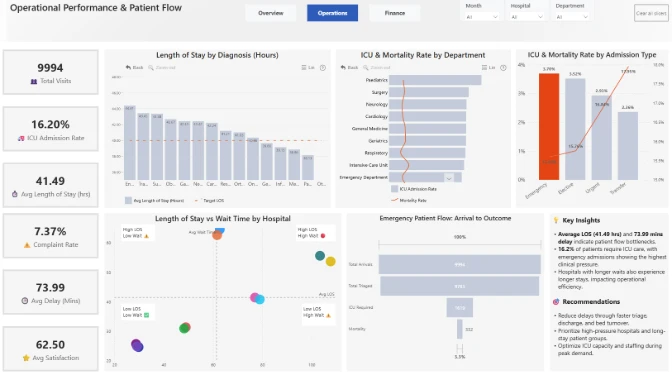
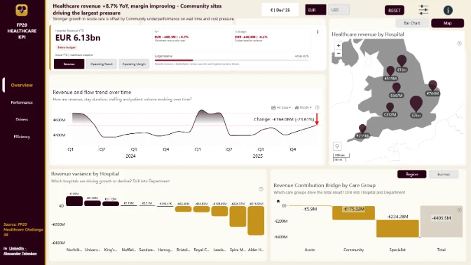
Register for the new FP20 Analytics Challenge 38 on Healthcare data analytics! Pre-registration now to get an update when challenge is live!
Workshop | Power BI Workshop: Build a Hospital Patient Flow Dashboard
Workshop | Power BI Workshop: Build a Hospital Patient Flow Dashboard
04 June | 07:00
-
Webinar | Top 5 Power BI Dashboards for Healthcare Operations Analysis
Webinar | Top 5 Power BI Dashboards for Healthcare Operations Analysis
03 July | 08:00
25 May - 29 June
Dive into the dataset, build a Power BI report, practice your data visualization skills, and compete for prizes.
Main ZoomCharts Prize
$300 Amazon Gift Card
FP20 Analytics Community Prizes
Skillwave, The Data Vis Force, and Enterprise DNA

Want to build professional Power BI reports and grow your portfolio?
This challenge helps you level up with expert feedback, hands-on workshops, webinars with MVPs, and visibility in our public results showcase. It’s a great way to learn, gain recognition, and connect with a supportive data community.
The challenge is hosted in partnership with FP20 Analytics, a LinkedIn community that brings together 22k+ passionate data professionals and helps new analysts improve their craft. It’s a welcoming space where you can practice, learn, and share your work with others.
➤ Live Workshops & 1:1 Mentoring
Learn from experienced Power BI professionals through practical workshops and one-on-one mentoring for tailored advice on your submission.
➤ Personalized Feedback
Receive detailed, constructive feedback on your report and improve your skills with real insights from experienced analysts.
➤ Free ZoomCharts Custom Visuals License
Get a ZoomCharts Developer License with full access to the Drill Down PRO visuals library.
➤ Free Report Downloads
Validated challenge participants receive 5 free downloads from the Power BI Report Gallery.
Live Winner Announcement
Winners will be announced during a special live webinar. Join the winner announcement and top submissions review to see standout reports, learn from the best entries, and celebrate the challenge results.
Follow these steps to register, build your Power BI report, submit your entry, and compete for the ZoomCharts Grand Prize.
If you have your own Microsoft account: select "See My License" and follow the setup instructions.
If you don’t have a work or school Microsoft account: select "See My Account" to activate a free Microsoft account provided by ZoomCharts exclusively for challenge participants.
Recommended pages
Up to 3 pages
Canvas size
16:9 or 1920 x 1080
Log in to your account on this page and upload your report in .pbix format for validation.
If your report does not meet all requirements:
You will receive an email explaining what needs to be fixed. You can update your report and submit it again.
Validation timeline:
Note: You may resubmit your entry as many times as needed before the challenge deadline.
To be eligible for all prizes, complete these steps:
Tool
Power BI
Recommended length
Up to 3 pages
Including drill-through pages
Canvas size
16:9 or 1920 x 1080
Default Power BI or Full HD
ZoomCharts visuals
At least 2
Drill Down visuals on at least one page
Need help choosing or using ZoomCharts visuals? See this practical guide for using Drill Down PRO visuals.
Challenge Brief
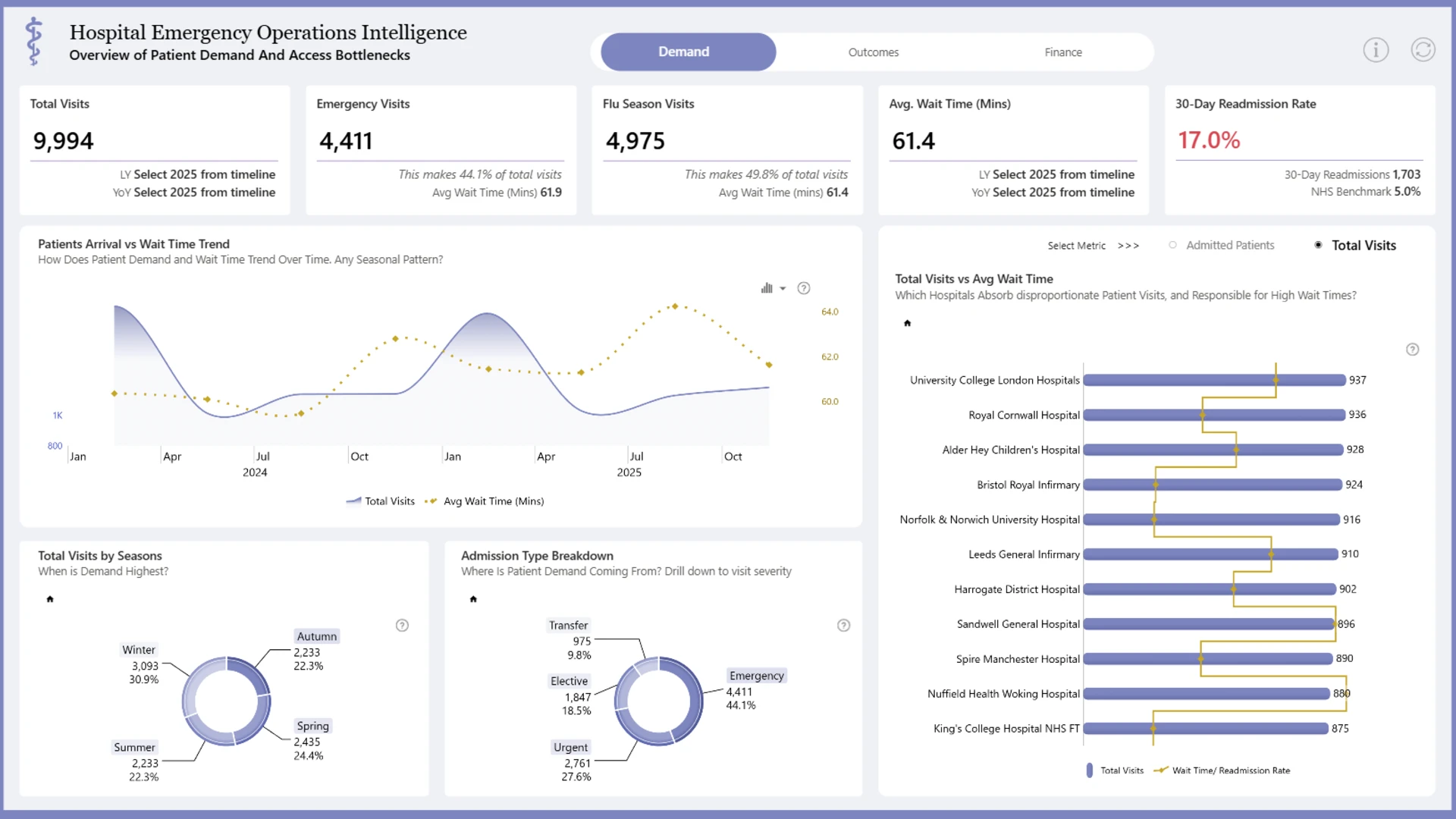
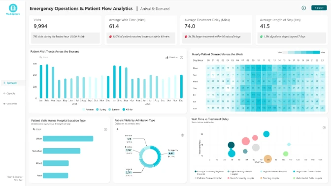
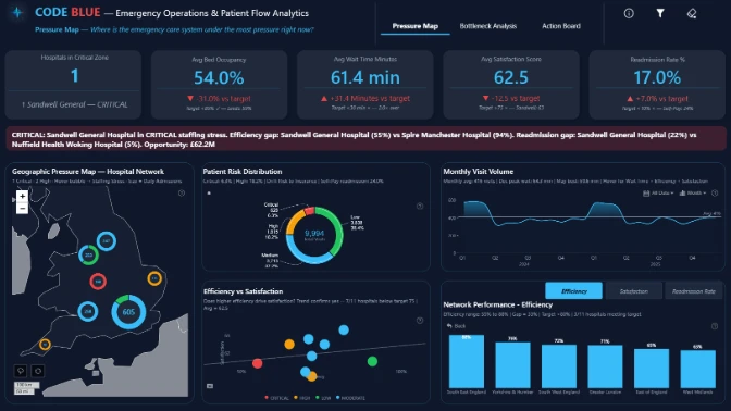
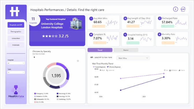
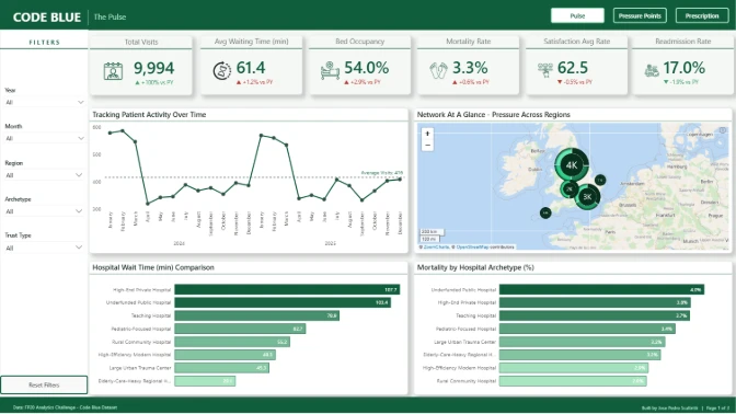
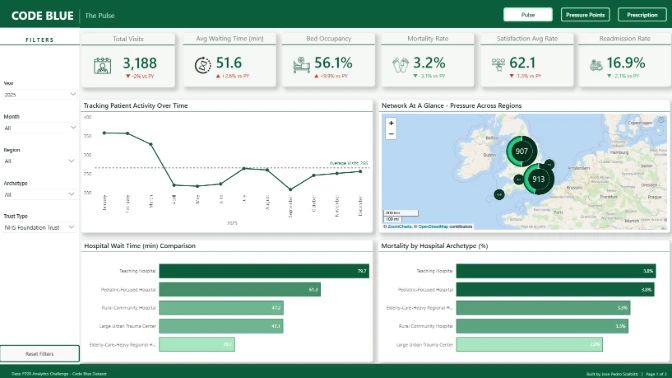
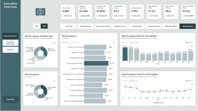
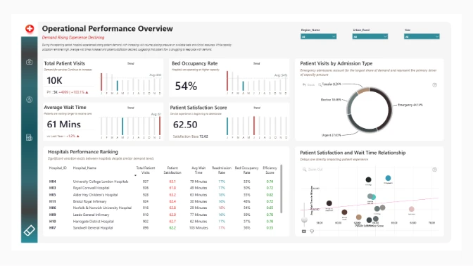
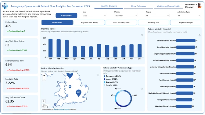
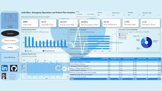
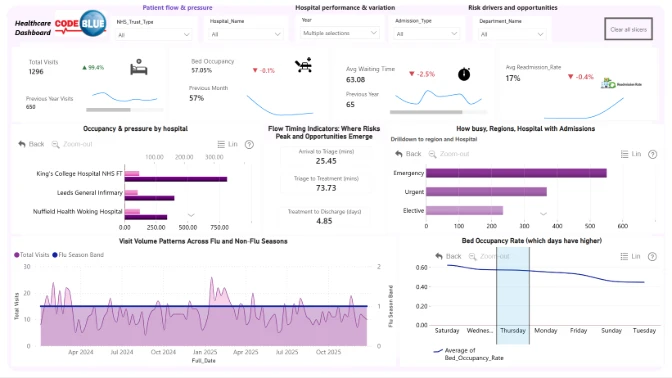
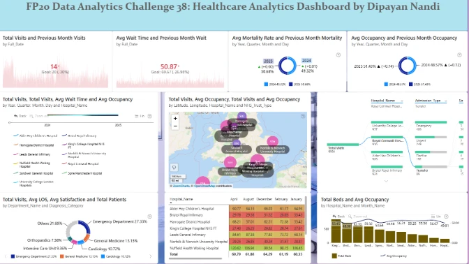
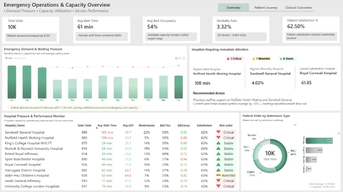
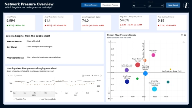
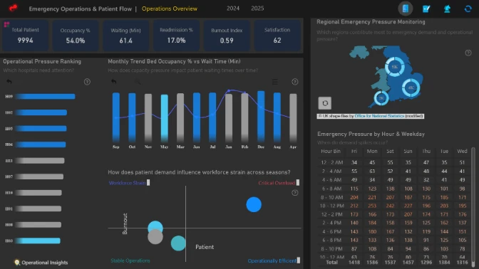
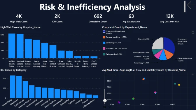
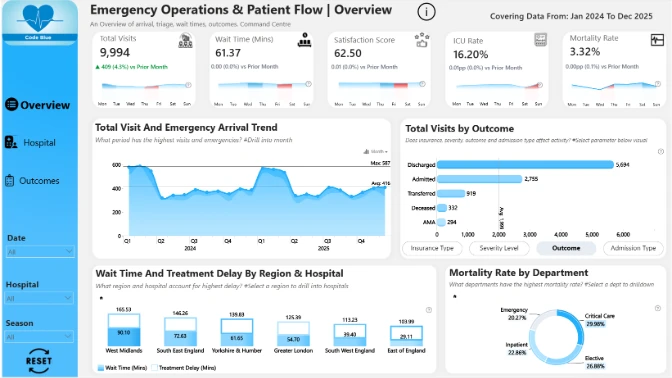
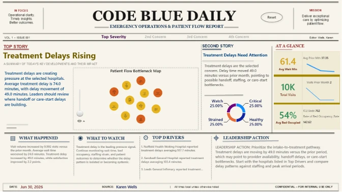
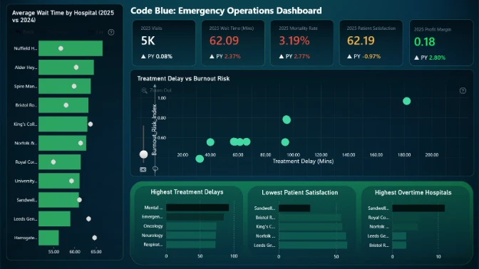
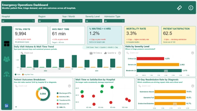
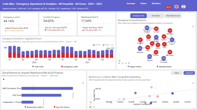
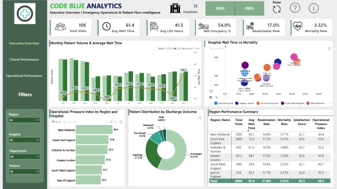
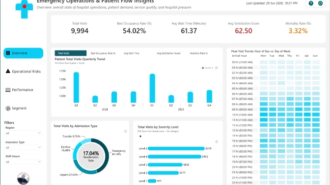
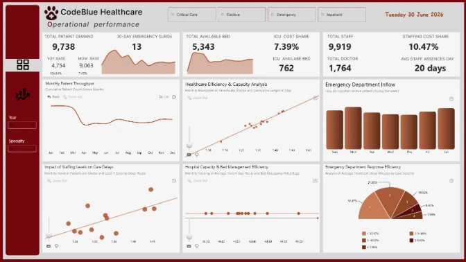
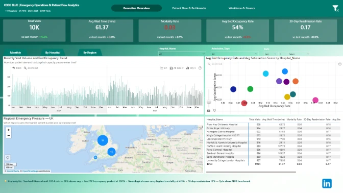
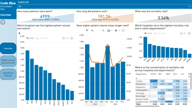
In this data analytics challenge, you will use the healthcare dataset from the "Code Blue" Emergency Operations & Patient Flow dataset to help hospitals understand operational performance, identify pressure points, and support better decision-making.
Patient flow trends
How does Beds change by Full_Date, and what trend patterns should leaders pay attention to?
Hospital performance
Which Hospital_ID and Hospital_Name account for the highest activity, pressure, or performance variation?
Metric movement
Which measures show the strongest improvement or decline?
Risks and inefficiencies
Where are the biggest gaps, risks, or inefficiencies in the process?
Performance drivers
Which groups or dimensions explain the biggest differences in performance?
Segment comparison
How do key metrics compare across important business segments?
Outliers
Are there unusual patterns that need further investigation?
Outcome factors
Which factors appear most connected to better or worse outcomes?
Each report is evaluated based on three main criteria: Intuitiveness, Interactivity, and Insightfulness. These factors ensure that the report is accurate, functional, user-friendly, and ready to be presented to end users.
How clear and easy is the report to understand at a glance?
How engaging and seamless is the report exploration experience?
How accurate, complete, and meaningful is the data for decision-making?
Total possible score: 45 points. A strong submission should be easy to understand, smooth to explore, and rich enough to support meaningful decisions.
Workshop | Power BI Workshop: Build a Hospital Patient Flow Dashboard
Workshop | Power BI Workshop: Build a Hospital Patient Flow Dashboard
04 June | 07:00
-
Webinar | Top 5 Power BI Dashboards for Healthcare Operations Analysis
Webinar | Top 5 Power BI Dashboards for Healthcare Operations Analysis
03 July | 08:00
25 May - 29 June