Nov 07, 2024
How-To Guide: Drill Down Scatter PRO for Power BI
Read our step-by-step guide on how to create Power BI scatter charts with our Scatter PRO visual, how to set up fields and customize the chart.

Read our step-by-step guide on how to create Power BI scatter charts with our Scatter PRO visual, how to set up fields and customize the chart.
About Drill Down Scatter PRO
Power BI scatter charts are the best way to visualize the relationship between two variables. Each data point is plotted on X and Y axes based on their coordinates, which allows to easily identify trends, clusters, and other patterns. Power BI scatter charts are often used in science, finance, marketing, journalism, and other industries to gain insights from large amounts of data.
Drill Down Scatter PRO by ZoomCharts is designed to improve the user experience and functionality of Power BI scatter charts. With intuitive touch or mouse interactions to pan and zoom the chart, select data and drill down, it allows for easy data exploration for anyone.
Scatter PRO also makes data analysis more efficient with 9 levels of drill down, cross-chart filtering, dynamic threshold line, area shading, and a wide range of customization features. You can read more about the key features of the new visual and how they can benefit report creators and decision-makers in the Scatter PRO announcement post.
Build 360o Reports with Scatter PRO
Scatter PRO was designed with interactive and user-friendly Power BI reports in mind. You can extract the ultimate potential from this visual when using multiple ZoomCharts visuals on the same report page. They will work together to dynamically cross-filter data, giving decision-makers 360° insights that empower confident and fully informed decisions.
Want to see Scatter PRO in action and learn more about building incredible Power BI reports with this visual? In our latest webinar, our Power BI experts Una, Aivis, and Lee demonstrated its capabilities and showed practical examples on how to seamlessly integrate it within Power BI reports. Click here to watch the recording!
How To Use Scatter PRO Visual
The setup process for Scatter PRO is pretty straightforward, and you will feel right at home if you’ve used other Power BI scatter chart visuals before. Let’s get started!
Step 1: Prepare your data
Before you begin, you need to make sure that your data set has all the required columns to successfully create a Power BI scatter chart. You will need two columns of numerical values that will be used as data point coordinates, and at least one column of category names adjacent to the values.
For this scatter chart Power BI example, we will use a retail data set from the sample report (click here to download the .pbix file). This data set contains a list of customers (customer_id), their total spendings (Monetary), number of purchases (Frequency), and time in days since their last purchase (Recency). Each value was then assigned a score from 1-5, and all three numbers were combined into an RFM score which then determined the Segment and Subsegment of each customer.
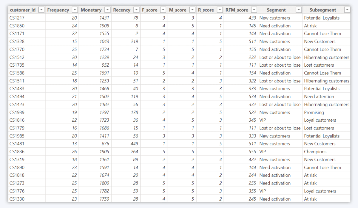
We are planning to use the Monetary and Recency columns as X-Axis and Y-Axis values, which will allow us to visualize the relationship between the two. The data set also has multiple columns which can be used as categories – Segment, Subsegment, and customer_id, which will give us a lot of choice on how to go about creating our scatter chart.
Step 2: Create the scatter chart
Click the Scatter PRO icon in the Visualizations pane to add it to your report. If you don’t see it, press the ellipsis icon and select Get more visuals (if you want to get the visual from AppSource) or Import a visual from a file (if you have downloaded it externally).
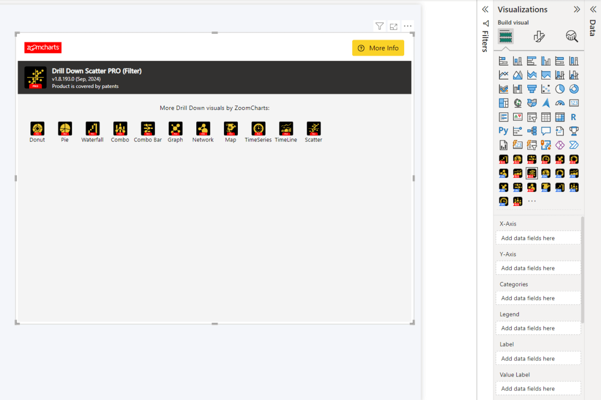
Afterwards, you will need to add your data to create a Power BI scatter chart. Drill Down Scatter PRO requires at least three fields – X-Axis, Y-Axis, and Categories. All the other fields are optional, and adding data to them will enable you to use specific customization settings. You can read a detailed description of all Scatter PRO fields in the 'Setting Up Fields' documentation page.
X-Axis and Y-Axis fields must contain columns with numerical values that will be used to determine the data point location on both axes. However, these two fields are not enough to plot data points on their own, and you will see just one large marker that aggregates all values together.
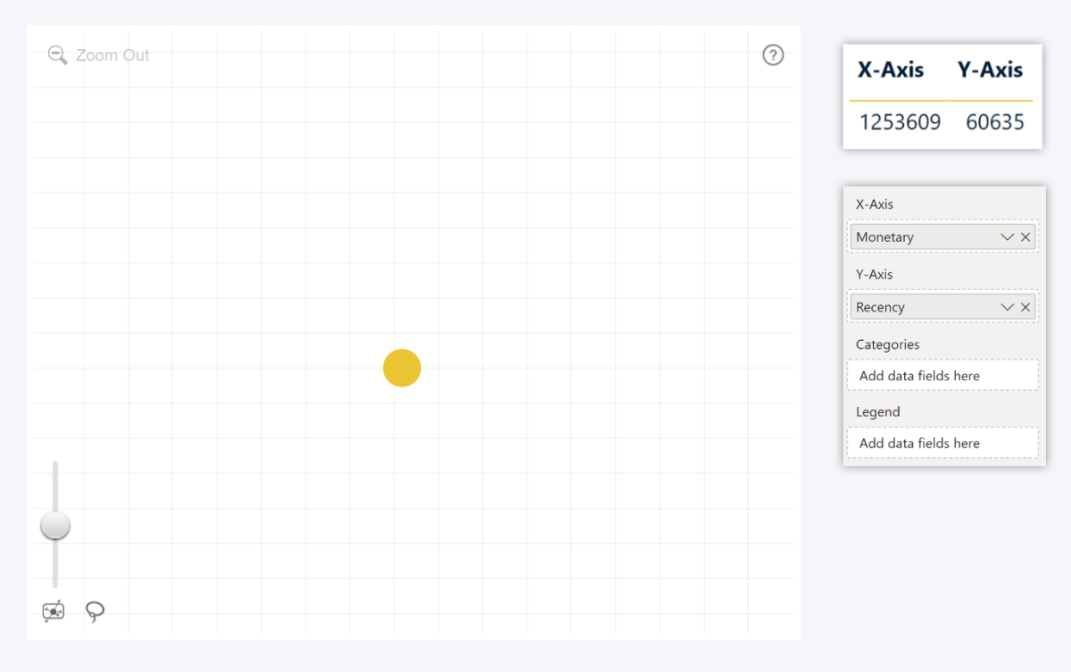
That’s why you also need to use the Categories field, which will plot a separate data point for each unique category name. If the column has multiple rows with the same category name, their values will be aggregated and displayed as a single data point. By default, the values for each data point will be summed, but you can apply a different aggregate (Average, Minimum, Maximum, Median, etc.) to the X-Axis or Y-Axis fields.
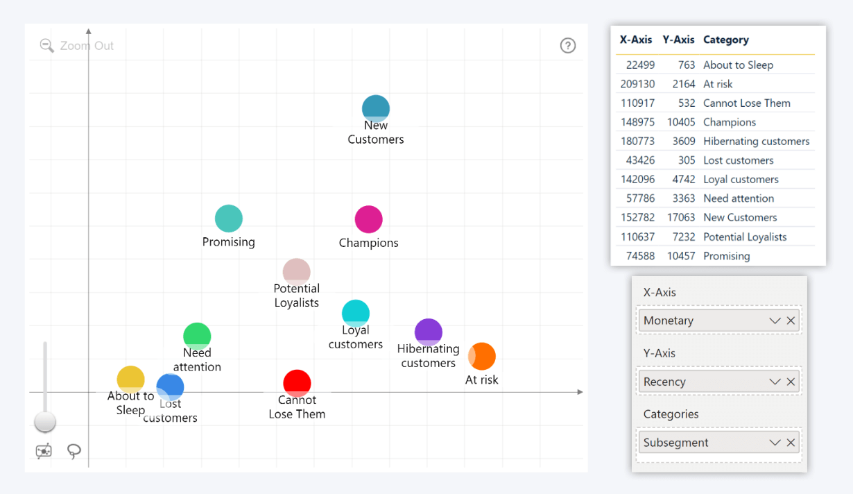
In this example, we added the Subsegment column to the Categories field, which caused the visual to display each subsegment (New Customers, Champions, etc.) as a data point that aggregates all values within that subsegment. If we had used a column with unique strings for each row (like customer_id in our data set), each value would have been displayed as a separate data point – just like this.
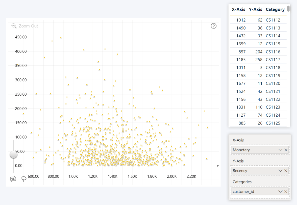
You can add multiple columns to this field to create a drill down hierarchy. This way, you can display fewer markers for large categories (such as country, market segment, etc.) in the initial view, and allow the user to drill down and see a more granular view with more data points.

Step 3: Use optional fields
While Scatter PRO needs just three fields (X-Axis, Y-Axis and Categories) to successfully create a Power BI scatter chart and plot values as data points, this visual also offers multiple optional fields that will enable specific configuration options or enhance the functionality of your chart even further.
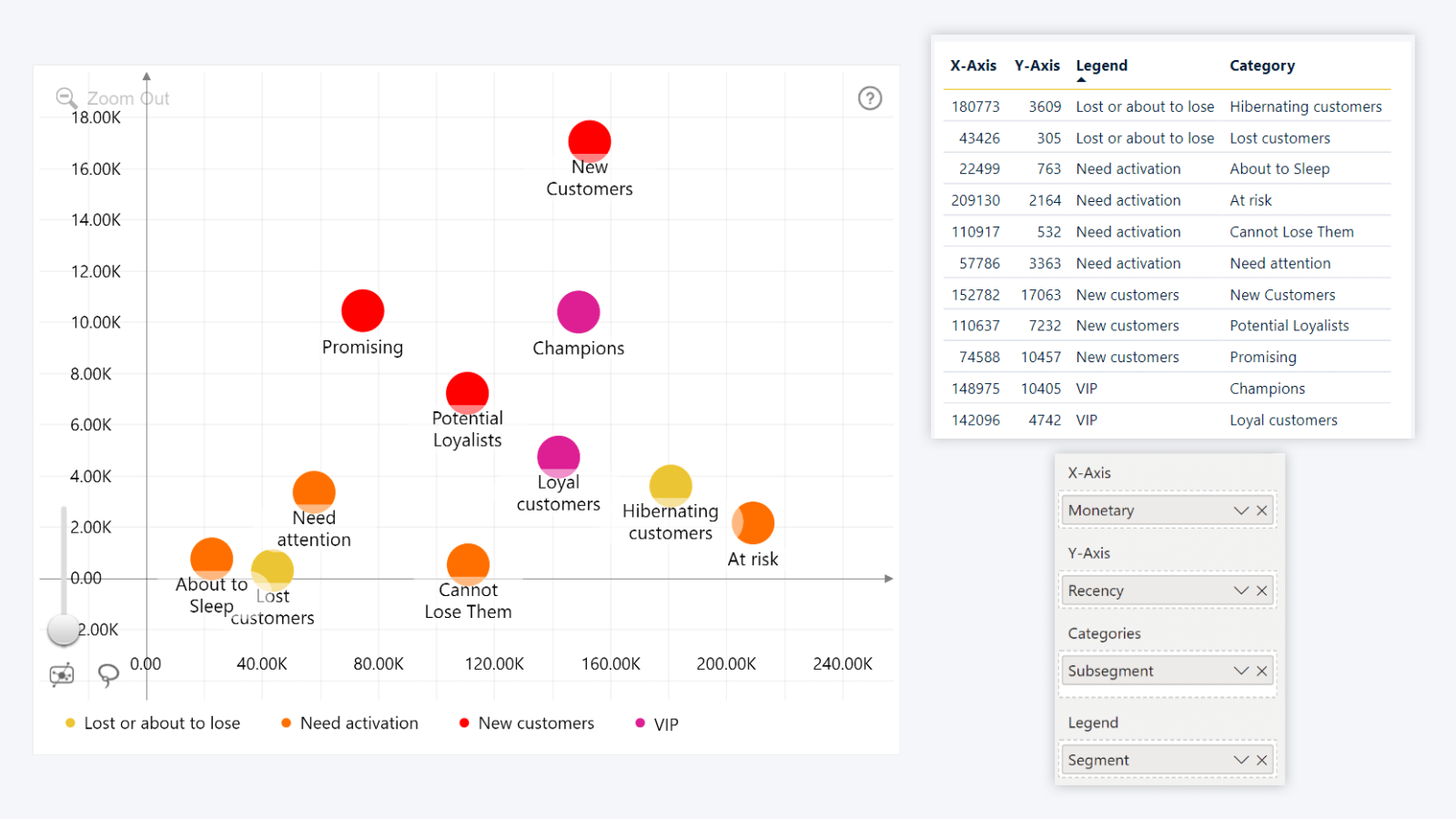
First, we want to talk about the Legend field. Similarly to Categories, this field can have a column with category names or IDs, and the visual will create groups from data points that have matching data. You can then customize the marker shape or fill color for each group, and the visual will display each group in the legend.
Since the Legend field is independent from Categories, you can use it to visually identify related data point markers (for example, countries, respondent age groups, etc.). In this example, we used the Subsegments column from earlier as the categories, and then added the Segments column to the Legend field. Now, all data points that belong to the same legend group share the same color, even when they are in different categories.
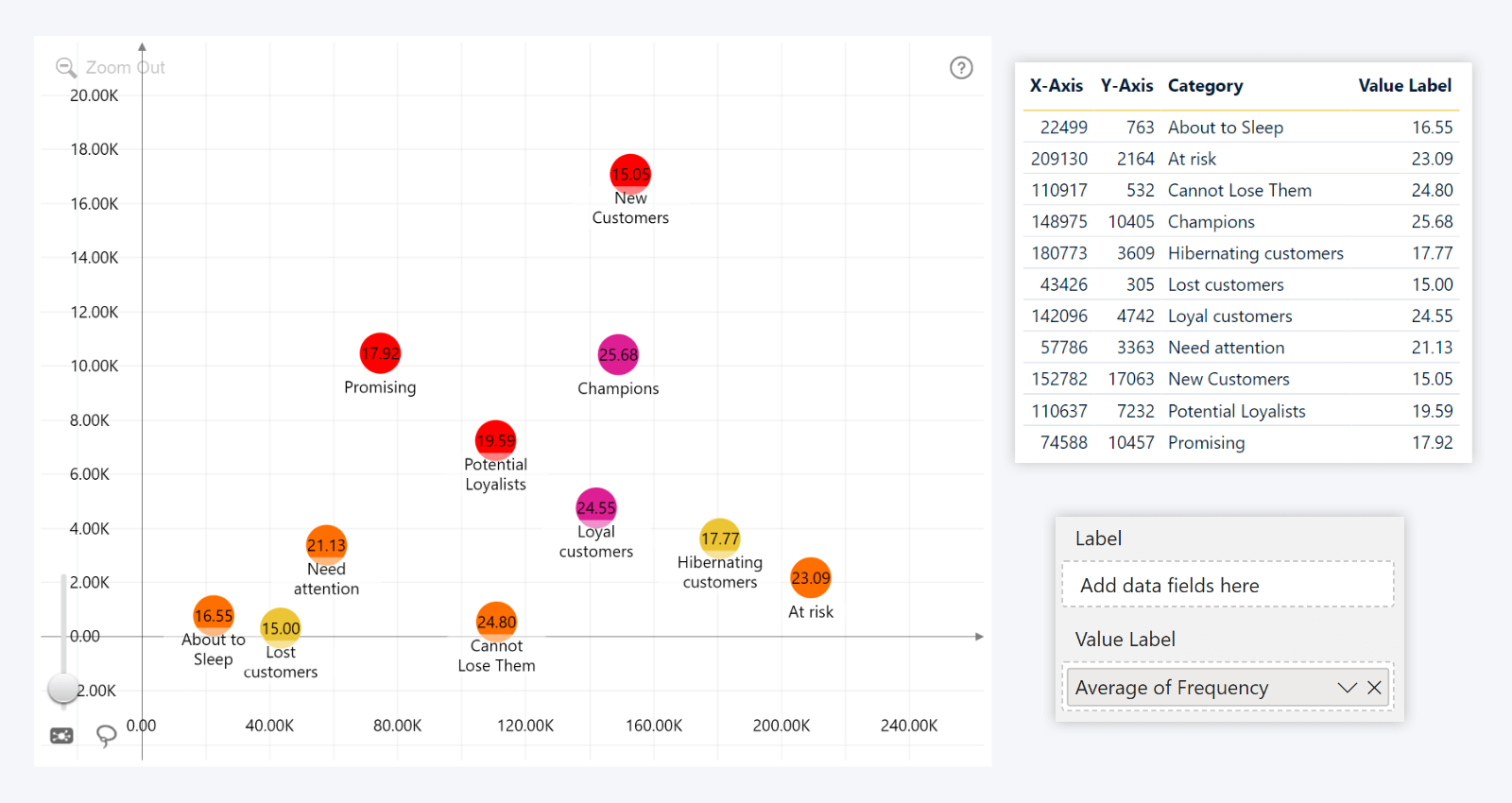
Want to use custom Power BI scatter chart data labels? Scatter PRO has two optional fields – Label and Value Label. If these fields are empty, each marker will simply display its category name as its label, but if you wish to show something different, simply drag a text column to the Label field.
Similarly, you can add a column with numerical values to the Value Label field – whether it’s the same column that you used for X-Axis or Y-Axis fields or something entirely different. The values will be aggregated using your selected method (Sum, Average, Count, Min, Max, Median, etc).
In this example, we opted to leave the Label field empty and display the Power BI scatter category labels as-is, and added the Frequency column (with Average aggregate) to the Value Label field, so we can see the average customer purchase frequency directly on each subsegment’s marker.
By default, all data point markers in Scatter PRO will use the same appearance settings that can be configured in the Data Points (Defaults) section. But what if you want to apply different settings to specific data point groups? That’s where the Data Point Group field comes in.
Create a column or measure that contains the following strings – group1, group2, group3, group4, group5, group6, group7, group8, group9, or empty rows. Add it to the Data Point Group field, and all data points with matching strings will be assigned to the same group that you can customize separately from the default settings. Each group that you have created will have its own Data Point Group (1-9) section with settings such as marker shape, color mode, opacity, outline, label position and more.
Lastly, we want to talk about the Marker Color, Marker Shape, and Marker Image fields. They can be used to apply specific customization rules to each individual data point. Add a column containing color names/hex codes/RGB values, shape names (circle/rectangle/droplet/rhombus/diamond) or base64 image data to the respective fields, and they will be applied to all markers that have them.
How To Use Marker Images in Scatter PRO
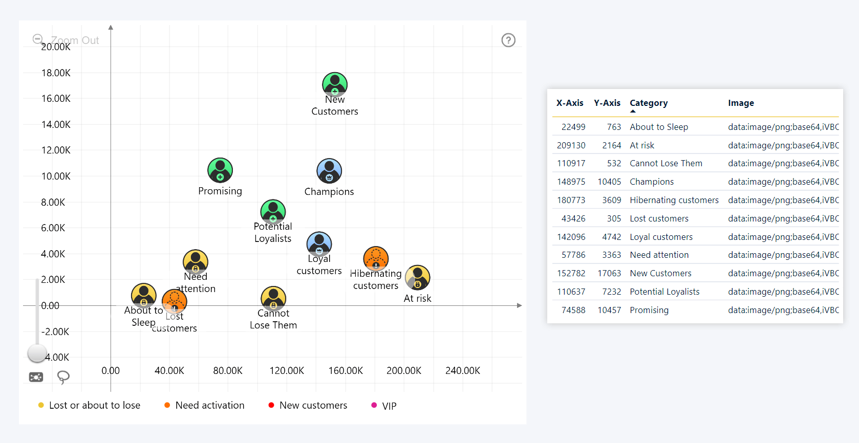
There are a couple of things you need to know if you want to use custom images for data points. Scatter PRO, like other Drill Down Visuals, is Power BI Certified, which means that it cannot access any external resources – and that includes online image URLs. Our solution is storing the images entirely within the data table as text, which can be done by encoding them to base64.
Use an image-to-base64 encoder tool (there are multiple free options available online). This will convert image files (PNG, JPG, SVG, etc.) to text strings, which you can then paste into a column for use in the Marker Image field. Afterwards, enable the Show Images toggle in Data Points (Default) or Data Point Group (1-9). Any data point which has valid image data will display an image inside its marker. Important notes:
- The base64 output format must be Data URI. The visual will recognize text strings as images only if they start with data:image/[format];base64, where [format] is the original file format (for example, png).
- Max image size is 32.7kB. This is because of the text cell limit in Power BI, which is 32766 characters. Larger images will be cut off and not displayed properly.
- We recommend using square images. While you can adjust appearance with the Image Cropping setting, the images will usually look the best in all marker shapes when their dimensions are as close to 1:1 as possible.
Step 4: Customize your scatter chart
Now it’s time for the fun part – customization! Head to the Format visual tab and explore all the settings that this visual can offer – legend customization, axis settings, thresholds, area shading, data point appearance, inside and outside labels, and more.
We have implemented multiple ways to customize data point markers in Scatter PRO, allowing each report creator to find a method that best suits their needs.
- Defaults: The Format Visual tab has a Data Points (Default) section where you can configure the marker shape, fill color mode and opacity, marker outline, data label content and position and other settings for all data points at once.
- Category colors: You can apply specific marker fill colors to each category from the Categories Choose colors in the Category Colors section, and then head to the Data Points (Default) or individual Data Point Group sections and set the Color Mode setting to Auto.
- Legend group colors and shapes: Scatter PRO has a Legend field that can be used to create data point groups independent of their category; and you can apply a custom marker color or shape to the entire group. Head to Legend Colors and Legend Shapes sections to customize settings, and then set the Color Mode to Auto and Marker Shape to Dynamic.
- Data Point Group settings: You can use the Data Point Group field to assign each data point to one of max. 9 groups, and fully customize all data points within that group, overriding the default marker settings. Each group will have its own Data Point Group section in the Format Visual tab.
- Dynamic formatting: You can use optional fields such as Marker Color, Marker Shape, and Marker Image to provide specific formatting rules for each individual data point, directly from your data. Make sure that the Color Mode and Marker Shape settings are set to Dynamic, and the Show Images toggle is on.
Here are some examples of Power BI scatter charts created with Drill Down Scatter PRO.
Scatter Example 1: Color-Coded Segments
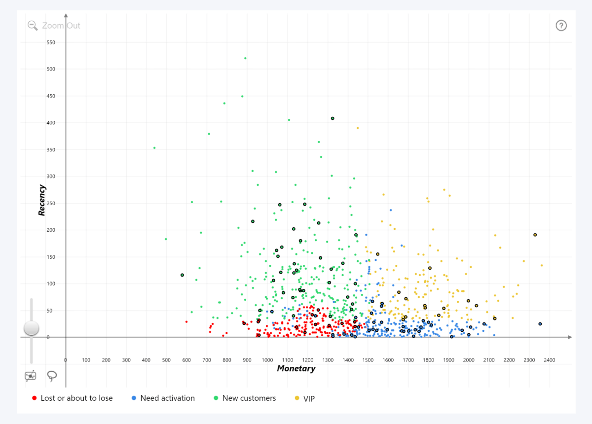
In this scatter chart Power BI example, we displayed each unique customer_ID as its own data point, and used the Segments column as legend groups. The Legend Colors setting was then used to color-code each segment.
We also wanted to highlight specific data points to bring attention to certain customers, which is why we assigned them to the same Data Point Group and enabled a black outline for their markers. Lastly, we configured the Marker Detail Min Size setting so that marker labels will pop up only when the user zooms in close enough.
Scatter Example 2: Threshold Line and Area
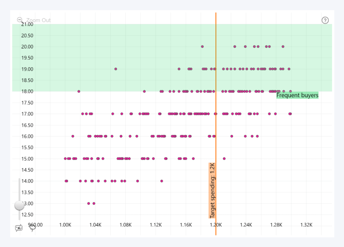
Here, we used the Thresholds feature for two different purposes – a line threshold to signify our target, and an area to highlight the most frequent buyers. For both thresholds, we manually entered constant values (1200 on the X-Axis for target spending and 18-21 on the Y-Axis for frequent buyers). However, if you choose a different Value Type, you can also place the threshold at calculated values like Average, Median, Min, Max, Percentile, and others.
You might have noticed that the X-Axis values exceed one thousand, while the highest value on the Y-Axis is just 20. If both axes were displayed 1:1, the data point spread would be practically negligible. That’s why we left the Value Axis->Fixed Aspect Ratio toggle disabled, so that each axis is scaled based on the highest value in its field.
Scatter Example 3: Emphasizing Outliers with Area Shading
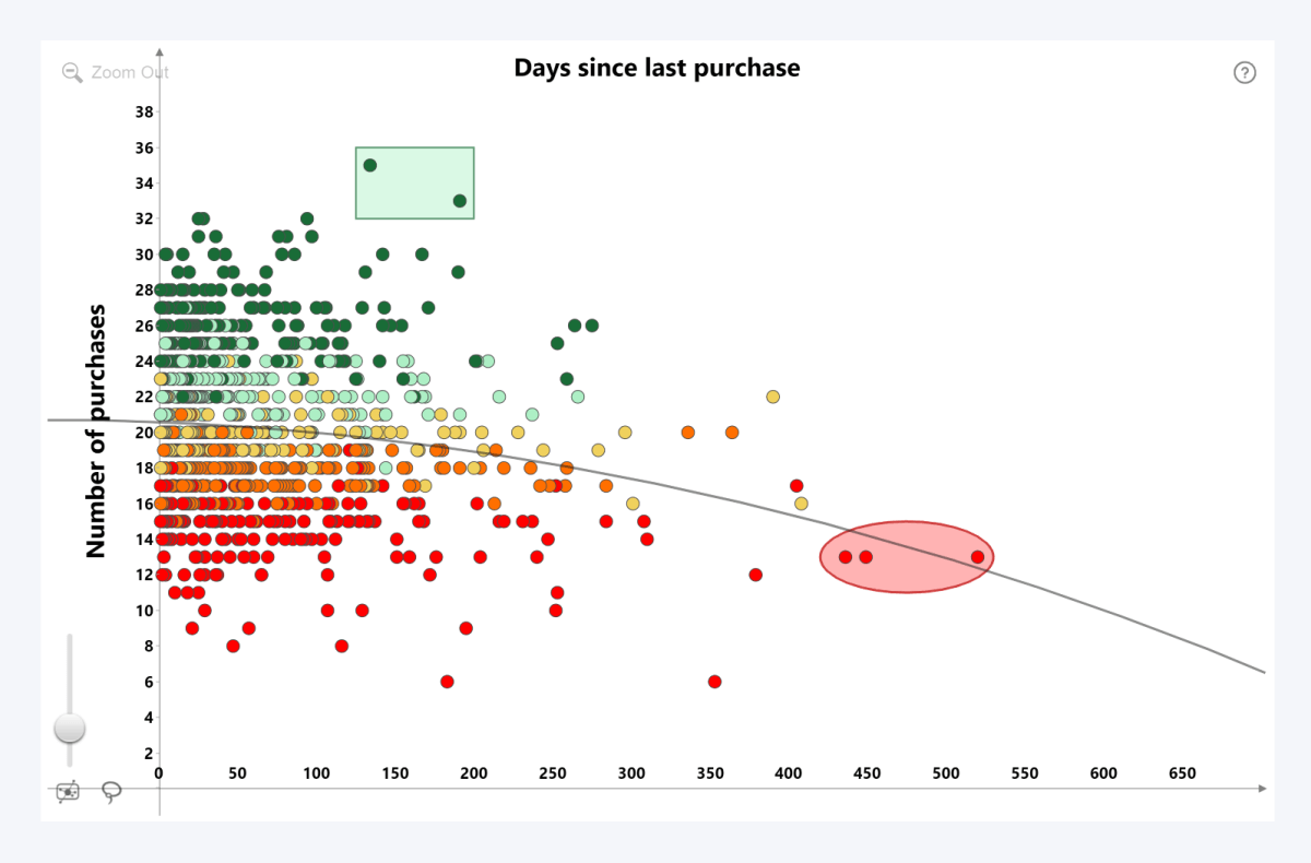
This scatter chart shows the Frequency column on the Y-Axis, and the Recency on the X-Axis. However, we also wanted to provide insights into each customer’s total spending by color-coding the markers based on the Monetary value.
Thankfully, our data had an M_Score column which assigns a grade between 1 and 5 based on the Monetary column value (its original purpose was to contribute to the RFM score for customer segmentation). We added the column to the Legend field, thus creating separate legend groups for M_Score tiers, which allowed us to apply custom Legend Colors for each (lowest = red; highest = green).
In addition, we enabled a quadratic Power BI regression line with the Regression Line setting, using 2 as the Regression Degree. Lastly, we created two custom shapes at manually selected coordinates with the Area Shading feature, which will bring the user’s attention to two specific groups of outliers.
Additional Scatter PRO Resources
- Scatter PRO Demo Webinar: Watch the webinar recording for a deep dive into the visual and live demos of insightful and powerful reports created with Scatter PRO.
- Product Page: Read about the key features, see the visual in action, and get started with the free demo of Scatter PRO.
- Documentation: In-depth technical descriptions of data fields, features and settings.
- YouTube Tutorial Series: Learn the essentials of Scatter PRO (setup, axis settings, regression line, area shading, data point customization, and more) in 9 brief and informative videos.

Want more info like this?
Subscribe to our newsletter and be the first to read our latest articles and expert data visualization tips!
