Aug 13, 2025
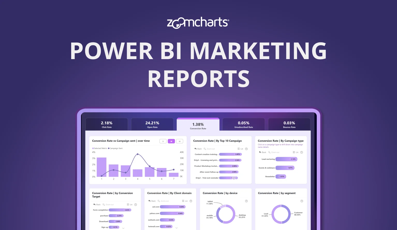
How Can You Use Power BI to Improve Your Marketing Campaigns?
A technical overview of marketing data visualization in Power BI, covering maps, bar/combo, donut/pie, timelines, interactive filtering, and building dashboards.
A technical overview of marketing data visualization in Power BI, covering maps, bar/combo, donut/pie, timelines, interactive filtering, and building dashboards.
Every day, marketing teams run into the same frustrating problem: piles of campaign data that just doesn't make sense. Maybe you've spent ages scrolling through countless spreadsheets, trying to figure out which region or message worked best, only to end up more confused.
Those key insights are hidden in the numbers, and by the time you see a pattern, it’s often too late to do anything about it. We understand how overwhelming that can be. But there’s good news - a toolset that breaks down your data, making it visual, interactive, and easy to act on.
In this blog post, we will reveal how Power BI can help marketing specialists spot trends faster, make smarter real-time decisions, and develop stories that really connect without drowning in data.
Why Visualizing Marketing Data Matters?
When you look at your marketing results across different places, you might notice some pretty surprising things like a smaller town having the highest click-through rates or a campaign that seems dull on paper actually doing really well on mobile. Seeing how your data stacks up in different regions and channels helps you spot real opportunities and plan your next move with more confidence.
Visuals humanize data. Seeing performance by region or channel brings clarity. A map shows where your discounts are converted, a timeline reveals a weekend surge, a donut chart highlights channel mix. All with just a glance.
Explore Power BI Visuals for Marketing Campaign Improvement
Power BI has a wide range of visualization and analysis tools designed to highlight different aspects of your results and make it easier to identify opportunities or areas for improvement.
Maps and Geographic Visuals
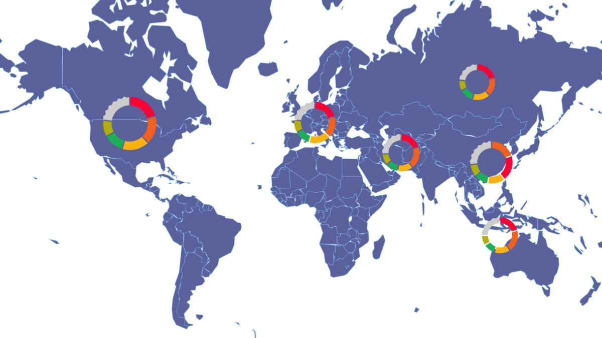
With an interactive map, a marketing specialist can easily see how their campaigns are doing in different locations. Whether you're comparing regions, cities, or custom areas, maps give your marketing team a quick overview. Features like clustering help pick out geographic hotspots, and interactive filters let you zoom into specific spots or select areas for more detailed insights.
Bar, Stacked, and Column Charts
Column charts are great for comparing different campaigns, platforms, or time frames. Mixing columns with other types of charts makes it easier for a marketing team to see trends and outliers, especially when working with large datasets. For horizontal comparisons, bar charts offer the same clarity in a different layout.
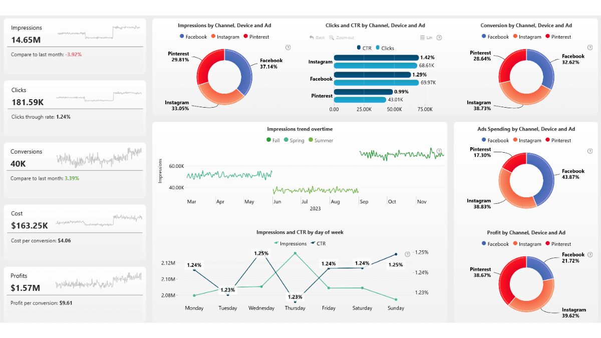
Stacked column charts go a step further by showing both the total value for each category and how individual series contribute to that total. With the Combo visual, you can mix columns, areas, and lines, choose from stacked, 100% stacked, or clustered layouts, and customize each series for colors, labels, and tooltips. This tool helps marketing teams compare overall results while clearly seeing the breakdown of each component.
Donut and Pie Charts
Pie and donut charts are perfect for showing how your results are split up, like ad spend by channel or conversion share across campaigns. They give a quick picture of how different parts contribute to the whole. In addition, pies and donuts work great as interactive “buttons.” Click a slice to instantly filter the entire report to that category. Think of them as a slicer and visual in one.
Timeline and Time Series Charts
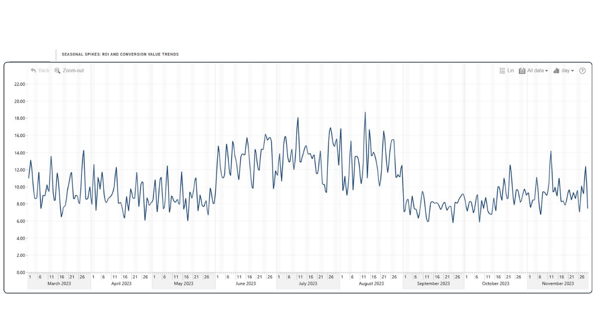
If you're tracking how a campaign performs over time, time series charts help reveal peaks, valleys, and patterns. Applying filters to focus on specific date ranges makes it easier to spot key moments, like a campaign launch or a big event. With Timeline PRO, you can automatically aggregate data into time units (from decades to even milliseconds) based on your datetime column, and drill down with just a click.
Key Features of Power BI Visuals
Power BI already includes many excellent built-in visuals for different chart types, including pie charts, column charts, maps, and many more. However, if you want even more interactivity and configuration options, check out Drill Down Visuals by ZoomCharts.
You can fully customize their appearance with advanced color controls, labels, and more tooltips. Furthermore, you get lively filtering and drill-down interactions, all designed to work smoothly on any device, whether it’s desktop, tablet, or even a conference screen.
Picking the right visuals turns complex data into clear, easy-to-understand insights. That way, it's way simpler to optimize your campaigns and share your results with your team or clients.
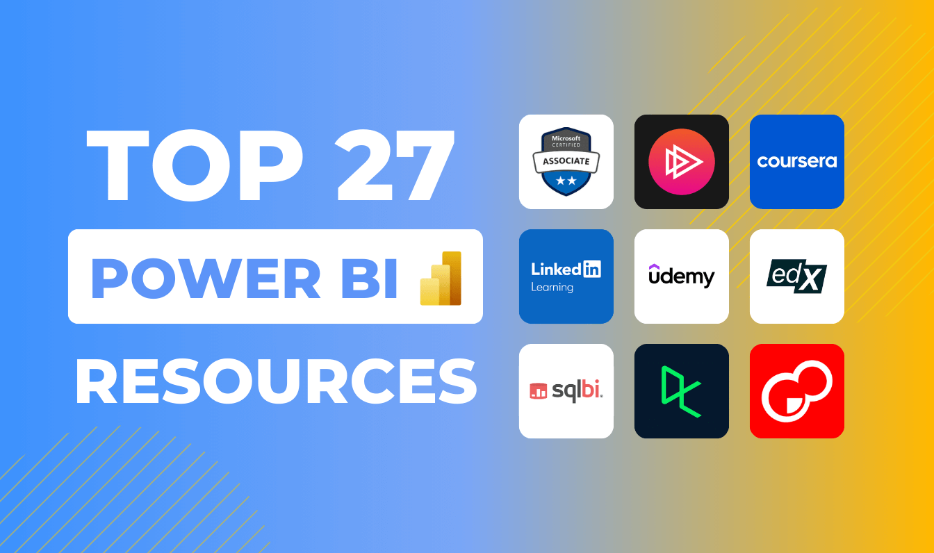
If you want to learn more explore our detailed guide on choosing the right Power BI chart types for your data, where we explain how each visual works and why it matters.
How to Build Your Own Interactive Campaign Report?
Here’s a simple step-by-step guide to help you build your own report from the ground up:
1. Gather and Organize Your Data
Start by collecting all the key data related to your marketing efforts. Include info like campaign channels (think Facebook, Instagram, email), geographic details (such as country, city, or custom regions), and important metrics such as clicks, conversions, ad spend, impressions, cost per conversion, and total revenue. The more complete and tidy your data is, the easier it’ll be to work with later.
2. Bring Your Data into Power BI
Next, import your data into Power BI. Take a moment to double-check that your columns are consistent, especially those related to locations like city or region names, so they work smoothly for mapping and analysis. Clean data means more accurate visuals and insights.
3. Add Maps for Location Data
Maps in Power BI are honestly game changers for data visualization. In Power BI, you can link a map visual to your data and display key metrics geographically. With Map PRO, you’ll need latitude and longitude fields, and each row will be displayed as a node - with the ability to cluster multiple nearby nodes together and even display them as a pie chart. Advanced features like clustering, color gradients, and custom base and shape layers help you spot high-engagement or high-conversion areas with precision.
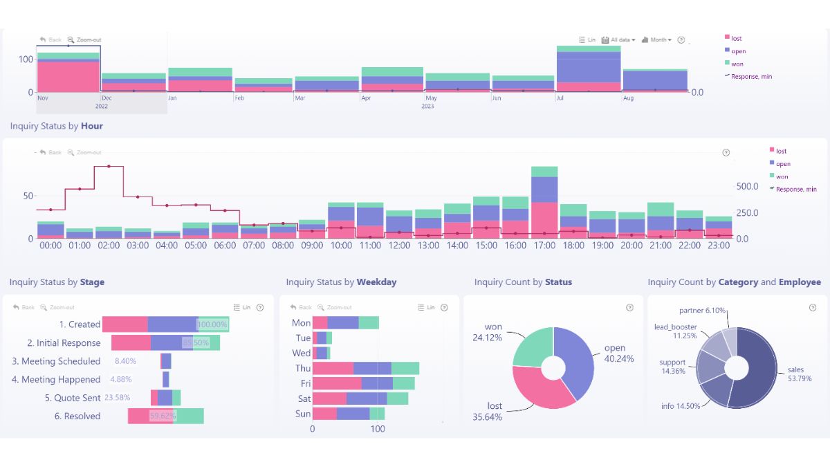
4. Make Your Report Interactive
In our visuals, drilldowns are enabled by default by simply adding multiple categories to create a hierarchy. This means users can click on a city or region to instantly see more detailed information, such as performance broken down by platform in that area. Cross-filtering makes everything work together. To do so, select a city on the map, and other visuals, like a bar chart of CTR by channel, automatically update, giving instant context.
5. Add Other Visuals to Tell the Full Story
Don’t just stick to maps, include bar charts to compare platforms, donut charts to show campaign type distribution, and line charts to track trends over time. Combining different visuals helps your team get a complete picture of what's working and what needs a boost.
6. Test and Share Your Report
Before sharing, test how it works on both desktops and mobile devices to ensure a smooth experience. Once everything is ready, publish the report and provide access to colleagues or managers so they can view the latest data and interact with the visuals in real-time. A well-structured, user-friendly report ensures your insights reach the right people quickly.
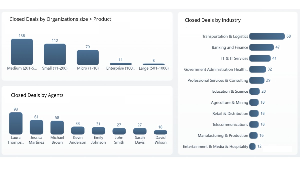
A Real-Life Example
Try live demo & download .pbix template
Awarded first place in the Onyx Data June 2024 challenge, this marketing analysis report examines the performance of fashion brand campaigns across Facebook, Pinterest, and Instagram, specifically in London, Manchester, and Birmingham. The report allows users to apply interactive filters based on campaign, time, channel, device type, and city. Key metrics such as click-through rate (CTR), cost per conversion, and profit margins are available for detailed exploration and data-driven insights.
Want to see what’s possible? Browse Report Gallery to explore real-world examples built with ZoomCharts custom visuals. If you prefer learning by watching, check out PRO Reports Video Tutorials for practical, hands-on tips on building effective reports.
FAQ
How do you connect marketing data sources to Power BI?
You can connect via built-in connectors, APIs, or third-party tools (e.g. Supermetrics) to pull data from ad platforms, analytics services, CRM systems, and then clean/transform it in Power Query.
What types of visuals work best for marketing dashboards in Power BI?
Maps, combo charts, bar/column visuals, donut/pie charts, timelines and filtering visuals help surface insights across geography, channel, time, and conversions.
Can Power BI support natural language querying on marketing data?
Yes. Power BI’s Q&A feature allows users to type questions in plain language and get charts or summaries automatically based on the underlying data model.
Related content
- Why You Need a Power BI Sales Dashboard
- Power BI Dashboard vs Report: What's the Difference?
- Top 10 Power BI Reports

Want more info like this?
Subscribe to our newsletter and be the first to read our latest articles and expert data visualization tips!