Jan 31, 2025
Top 12 Key SaaS Business Metrics You Must Track in 2025
ARR, CLV, NRR, churn, and more – learn about the most important SaaS business metrics, their formulas, how to read and interpret them, and how to best visualize them.

ARR, CLV, NRR, churn, and more – learn about the most important SaaS business metrics, their formulas, how to read and interpret them, and how to best visualize them.
SaaS Metrics for Measuring Your Success
One of the most significant changes in the business landscape is the ever-growing popularity of the SaaS (software-as-a-service) business model. The subscription business model has been adopted by more and more companies, ranging from established industry giants like Microsoft and Adobe to up-and-coming startups. The worldwide SaaS revenue in 2023 was $178.1 billion (Gartner, 2024).
And the reason for that is simple – it just makes sense, for the business and customers alike. For customers, SaaS means lower upfront costs, ongoing software updates and customer support, and easier scaling. The SaaS business itself can expect steady and recurring revenue from customers, which makes it easier to plan your budget, set performance targets and make future projections. In short, SaaS can help avoid the feast-or-famine nature of one-time payments.
In this article, we compiled a list of the most important subscription business model metrics. The twelve SaaS business metrics have been separated into three categories – revenue, customer acquisition, and customer retention, reflecting the three core pillars of a successful SaaS business. We will provide the formula for each metric, a brief explanation and example, plus practical tips on how to visualize these metrics in tools like Power BI.
SaaS Revenue Metrics
The top priority for 68% of investors is the management's ability to protect revenue and invest in growth. (BCG, 2025)
The goal of any business is to generate revenue, and SaaS is no exception. This section contains multiple SaaS business metrics for measuring your ability to generate revenue, which will allow you to get insights into your financial health, analyze your growth, and set your future targets.
Where SaaS differs is in the way they generate their revenue. Whereas regular businesses usually deal with one-time purchases, SaaS customers subscribe to the product or service, generating steady and recurring revenue over time. As long as the customer uses your product, they will continue paying the monthly or yearly subscription fee. That’s why subscription business model metrics use recurring revenue.
1. Monthly Recurring Revenue (MRR)
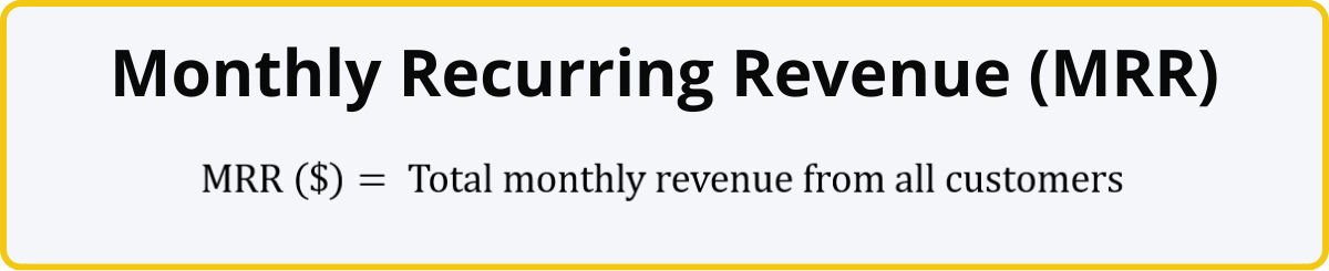
MRR is one of the key metrics for subscription business, and it reveals the total revenue generated by your product or service from customer payments. For example, if your app has 12,000 premium subscribers, and the premium subscription costs $5/month, the MRR generated by your app is $60,000.
Of course, that was a very simple example. Your business may have multiple products, subscription tiers, customer-specific offers and promotions. In addition, some clients may make an upfront payment for an entire year instead of doing monthly payments, which means that their invoice totals should be divided into 12 parts to estimate MRR.
You can determine your MRR by summing up the total revenue during that month, or you can quickly get a rough estimate by finding out the monthly average revenue per user (ARPU) and multiplying it by the total amount of customers. New sales and upgrades will increase your MRR, whereas cancellations and downgrades will cause lost MRR.
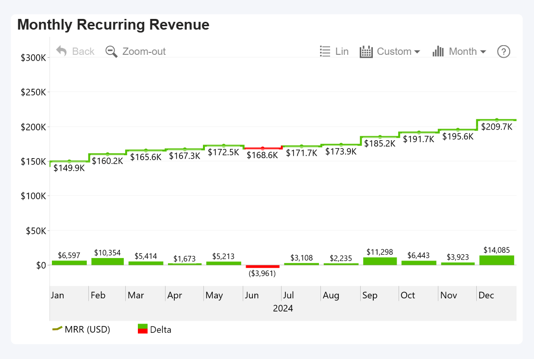
How To Visualize MRR
MRR will find its natural home on a time series chart, allowing you to easily track month-by-month changes and monitor your growth. In this example, we visualized MRR over a year as a stepped line. It’s also important to understand month-over-month changes, so we displayed MRR delta as an additional series of columns. Then, we applied conditional formatting to distinguish months with a negative change in revenue by coloring these periods red.
Power BI + Drill Down Timeline PRO by ZoomCharts
2. Annual Recurring Revenue (ARR)
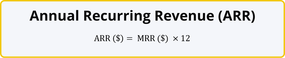
ARR is the prediction of how much revenue will be generated by your SaaS business over a year based on your current MRR. It operates under the assumption that the existing customers keep on paying their subscription fees for the entire year.
Unless something significant happens that causes unexpected changes in acquisition rate or churn, ARR is a solid baseline that allows you to monitor the financial health of your SaaS business, determine and track your goals, and evaluate the growth potential of your business.
For example, if a user pays $5/month for your premium subscription, the total amount they will pay you over the course of the year will be $60. And, using our previous example, if you have 12,000 users that pay $5/month and bring in $60,000 MRR, then the ARR will be $720,000.
Keep in mind that ARR is focused on the recurring revenue from subscriptions, and it should exclude one-time payments like setup or consultation fees (unless these services are included as a part of the subscription package), or accessory and merchandise sales if you have them.
How To Visualize ARR
Here’s an example of an interactive Power BI report that analyzes ARR and other SaaS metrics from multiple angles. The two time series charts display the cumulative ARR growth and the growth rate. On the ARR chart, you can click on a column to drill down and see a detailed MRR breakdown of each month.
The adjacent visuals provide additional insights like contribution percentage per each product category and product, ARR delta per each owner, and a detailed breakdown of ARR changes (new sales, upsells, downsells, churn).
Interacting with one visual will instantly apply filter to all others – for example, if you drill down to a specific year on the ARR time series chart, other visuals will show data for that year. Or, if you select a slice on the donut chart, the report will instantly filter ARR data just to that product category.
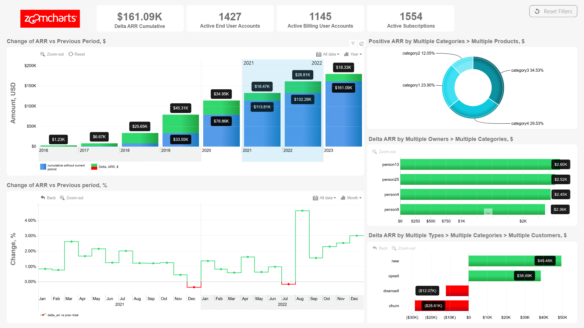
Try live demo and download Power BI ARR report template for free
3. Revenue Growth Rate
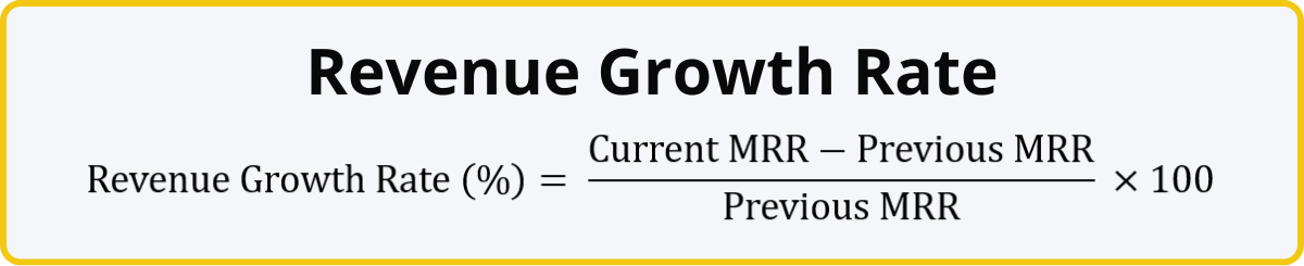
Revenue growth rate shows the percentage increase of your MRR compared to the previous month. With this SaaS business metric, you can monitor how fast your company is growing.
For example, if your MRR for the previous month was $100,000, but this month’s MRR is $105,000, it means that you have increased your monthly recurring revenue by $5,000, which translates to 5% growth rate. You have successfully acquired new customers and/or upgraded the existing ones.
This formula can also be used to determine the annual growth rate – simply replace the MRR values with ARR. The optimum growth rate for a SaaS company will depend on factors such as industry, target audience, and the growth stage of your company.
How To Visualize Revenue Growth Rate
The ARR report example above demonstrates how revenue growth rate can be integrated into the data narrative when analyzing SaaS revenue metrics. The ARR timeline chart on the top is accompanied by a timeline chart displaying the % change, which provides an easy-to-read insight into your revenue growth rate. Meanwhile, conditional formatting highlights positive growth periods green, and negative growth periods red, visually emphasizing months that need the user’s attention.
4. Average Revenue Per User (ARPU)
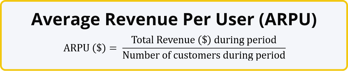
Another important subscription business metric is ARPU, which reveals the average revenue during a time period (month, quarter, year, etc.) brough in by one customer. This number will help you assess the value of each customer, identify upsell opportunities, and refine your pricing strategy. Some SaaS business executives use MRR per user or ARR per user instead of ARPU.
The revenue from each client is affected by multiple factors like the number of licenses, different pricing tiers, volume discounts, special promotions, and customized offers. This formula will take that into consideration and reveal the average revenue from each user. If your ARPU is growing over time, it means that your pricing and sales strategy is successful, and users are upgrading their subscription or expanding their use of your product.
How To Visualize ARPU
This number can be easily visualized in multiple ways. ARPU can be displayed on a report as a simple KPI card, but you can also track your ARPU growth over time by placing it on a time series chart, or use a column chart to compare ARPU across multiple products, regions, market segments and other categories.
If you create a simple =DIVIDE() measure between your Revenue and Number of Customers columns, Power BI will dynamically determine the ARPU based on your active filters (like time period, region, etc.). This means that you can easily integrate an ARPU visualization into your report to provide valuable context to the user and enhance data storytelling.
In this example, we selected a product slice on the donut chart and a time range on the time series chart, and the KPI card shows the ARPU for Product 1 between September and October.
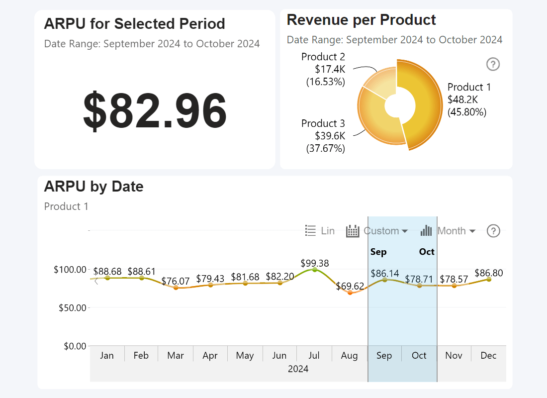
Power BI, built-in Card visual, Drill Down Timeline PRO & Donut PRO
SaaS Customer Acquisition Metrics
The average organization in 2023 used 112 different SaaS tools. (BetterCloud, 2024)
A successful SaaS business is one that attracts new users (customer acquisition) and retains the existing customers (customer retention). This section focuses on the former, and these SaaS business metrics will provide you with insights regarding your ability to attract new and valuable customers to your service.
The SaaS business metrics in this section can also measure the efficiency of your marketing and sales efforts to see if they provide the desired returns, pinpoint your subscription revenue and duration targets, and identify potential drop-offs in the sales pipeline.
5. New Customer Growth Rate
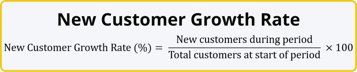
One of the simplest, yet most important subscription business model metrics is the new customer growth rate. It shows the rate at which your company is acquiring new customers over a specific time period (month, quarter, year) as a percentage.
For example, if your product had 10,000 users at the start of the month and 1,500 new users signed up during the month, the new customer growth rate would be 15%. A high growth rate means that your product or service is attracting a lot of new customers.
Conversely, if this number is low, that could be the first sign that you may need to revise your marketing and sales strategy or make adjustments to your product. Maybe the customers don’t even know about your product and your marketing efforts fail to reach your audience. Maybe they are not convinced by your messaging and do not see enough value to take the plunge.
How To Visualize New Customer Growth Rate
New customer growth rate is a simple percentage, which means that there are multiple ways to visualize it. You can place it on a time series chart to monitor changes and spot trends over time. Furthermore, Power BI, you can create a simple =DIVIDE() measure in Power BI, which will allow you to calculate and visualize the new customer growth rate per each category.
For example, if your SaaS business provides multiple products or subscription tiers, you can visualize the growth rate for each of them separately. Similarly, you can gain insights about the new customer growth rate per each market segment (e.g. location, demographic group, etc.) to identify blind spots in your marketing strategy.

Power BI + Drill Down Timeline PRO, Combo PRO, & Combo Bar PRO by ZoomCharts
6. Customer Acquisition Cost (CAC)
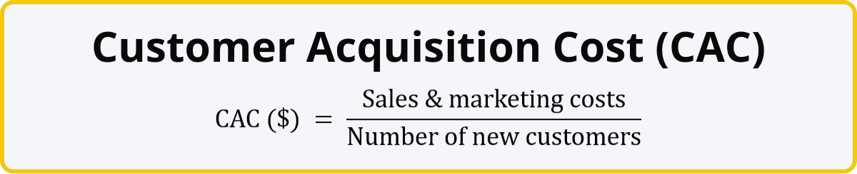
This SaaS business metric shows you how much it costs to acquire one customer. Divide your total sales and marketing expenses (e.g. staff salaries, ad campaigns, contractors, events etc.) by the amount of new customers you gained. The resulting value will be displayed in the same currency as your marketing costs. You can calculate CAC for the entire lifetime of a product, or a specific time period (for example, a new marketing campaign).
On its own, CAC will provide a glimpse into the efficiency of your marketing efforts. Low CAC means that you are getting a high return on your marketing and sales investment, while high CAC may indicate that your marketing budget is not spent efficiently, and you may need to review your strategy. However, the optimal CAC is something that every business must determine for themselves, because an overly low CAC could also mean that you are leaving your marketing budget on the table and limiting your growth potential.
That’s why CAC best used together with other metrics for a more complete view. For example, you can calculate the CLV:CAC ratio to compare the lifetime value of a customer against the cost of their acquisition. For example, if your CLV is $1,000, but your CAC is $200, then the ratio will be 5:1. Is that high or low? It depends on various factors like your industry, target audience and the growth stage of your SaaS business. CAC also plays an integral role in determining another SaaS business metric - CAC payback period - which we will explain in the next section.
How To Visualize CAC
CAC often finds its place on SaaS business analysis Power BI reports as a KPI card or a similar visual. If you have calculated separate CACs for multiple categories (like different products, market segments, channels, regions, etc.), you can directly compare them next to each other on a column or bar chart.
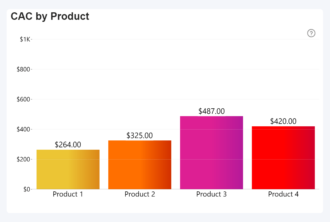
Power BI + Drill Down Combo PRO by ZoomCharts
7. CAC Payback Period
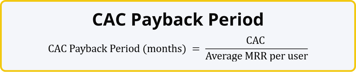
This SaaS business metric shows the minimum subscription length to fully recover the cost of acquiring one customer. For example, if the CAC is $250, and your average MRR per user is $25, it will take 10 months for one customer to break even. Any subscription shorter than that the CAC payback period will lose you money. For most SaaS businesses, a healthy CAC payback period is around 6 months.
If the payback period is too long, it means that you are either not getting enough revenue per user, or you are spending too much to acquire a customer. However, if your CAC payback period is reasonable, but your average contract length is shorter than that (thus failing to break even), you may need to look at customer retention metrics to identify the reasons why users are leaving.
Another reason to use this metric is because CAC on its own does not tell the full story. For example, CAC for the enterprise segment will usually be much larger than B2C or SMB, but they also bring larger revenue and sign lengthy contracts. Determining the CAC payback period will help you pinpoint the optimal CAC target for your SaaS business. For example, if you have set a payback period target, you can reverse the formula and find out the maximum CAC you can afford (CAC Payback Period * average MRR per user = CAC).
How To Visualize CAC Payback Period
CAC Payback Period is a useful KPI for your average contract length (ACL). Here’s a Power BI example that visualizes the ACL of different products. To compare them against each product’s CAC payback period, we visualized the latter as an additional series, which will be displayed as an outline. Then, we applied conditional formatting so that the outline is green if the ACL exceeds the CAC payback period, and orange if it does not.
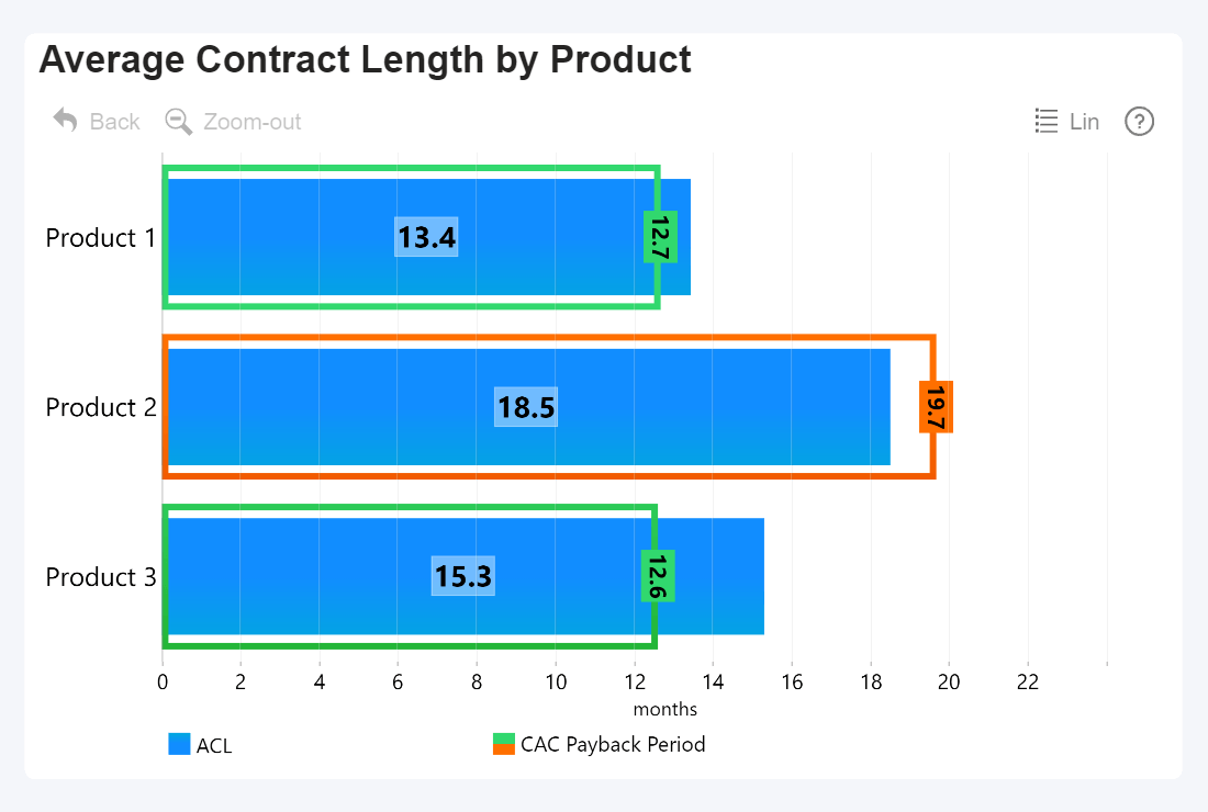
Power BI + Drill Down Combo Bar PRO by ZoomCharts
8. Lead-to-Customer Conversion Rate
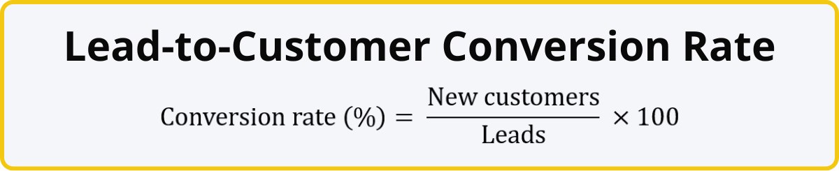
Just like soccer players have their shot conversion rates (how many % of their shot attempts result in a goal), SaaS businesses have a similar metric – lead-to-customer conversion rate. It’s the percentage of leads that become paying customers, and it is used to gauge the effectiveness of your lead generation strategy.
For example, if your sales team had 1,000 sales-qualified leads, and 50 of them decided to become paying customers, it means that you have a 5% lead-to-customer conversion rate. Just like other SaaS business metrics on this list, there is no one-size-fits-all target % and you must take a wide variety of factors into consideration like industry, target audience, your size and growth stage, and the barrier-of-entry of your product .
If you wish to find out the conversion rate of other components of your sales funnel, you can substitute leads with different values. For example, to find out your trial conversion rate, you can divide the number of paying customers gained via free trials by the total number of free trial sign-ups. Conversion rates will provide an insight into your ability to acquire new customers, and you can find out which parts of your sales and marketing funnel have the highest drop-offs.
If your lead-to-customer conversion rate is below your expectations, it could mean that the customers do not get convinced about the product’s value during their communication with the sales team. Or maybe your lead generation efforts are focusing on the wrong audiences. Similarly, a low trial conversion rate could indicate that the product itself left a bad first impression or the user was not onboarded well enough to see its value.
How To Visualize Conversion Rate
Conversion rates are simple, yet very versatile metrics. Since they are percentages, they can be visualized in a wide variety of ways - KPI cards, gauges, time series charts to track changes over time, or column/bar charts to compare conversion rates across multiple categories (department, salesperson, product, communication channel, etc.).
This Power BI sales conversion report provides an example of how to visualize and analyze conversion rate across the entire sales funnel. The lead-to-customer conversion rate is displayed as a time series chart so you can see trends over time, and selecting a time period will instantly apply a filter to the entire report. It also shows the individual conversion rates for Top 3 highest and lowest converting sales agents.

Try live demo and download the .pbix template of Sales Conversion Report for free
SaaS Customer Retention Metrics
52% of organizations in 2023 scrutinized their SaaS budget more heavily, and 44% of IT teams were tasked with reducing SaaS spending (BetterCloud, 2024). More than ever, your SaaS product or service needs to prove its value to users and focus on customer retention.
Loyal and satisfied customers are the lifeblood of a successful SaaS business. Your deals are not one-and-done purchases; each subscription is an ongoing commitment. If the customer is satisfied with your service, they will happily continue their subscription, resulting in steady recurring revenue. Conversely, if they do not find value in your service or have poor experience, they will be more likely to downgrade or leave completely.
The following metrics can be used to monitor customer retention – your ability to keep paying customers and prevent them from leaving you for competitors. Of course, no business can keep 100% of their customers – a part of your userbase will always come and go, often because of factors outside of your control. So, a healthy SaaS business will always have a bit of churn.
However, if your customer retention metrics display worrisome trends, it could indicate that the customers are not satisfied with your service or do not find value in it. That’s a great starting point to investigate what needs improvement.
Maybe the product itself needs improvements or new features. Maybe customers have poor experience with after-sales support – it’s too slow or unhelpful. Maybe it’s a marketing issue and the customers are not informed about the capabilities of your product, therefore not seeing the full value that you can offer to them. Once you have identified and addressed the issues, you can then monitor changes in retention to see if you have achieved the desired outcome.
9. Churn Rate
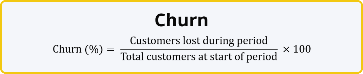
Simply put, churn is how many people ended their subscription during a time period (month, quarter, year, etc.). For example, if at the start of the month, you had 100,000 active customers, but during the month, 6,500 of them ended their subscription, it means that your churn is 6.5%, which is fairly high.
Note that you must use the net amount of leaving customers, instead of a subtraction between total customer numbers at both ends of the period. That’s because the churn rate is focused purely on leaving customers and it does not include the new acquisitions. Doing so allows you to identify potential issues with retaining your existing clients.
You want to keep your churn rate as low as possible. The optimal churn rate differs by industry (how competitive is the market?), target audience (B2B or B2C?), type of your product (mission-critical tools or “nice-to-haves”?), the size and growth stage of your company, and many other factors. Here’s a good baseline to start determining your target churn rate:
| Churn Rate | Monthly | Annual |
|---|---|---|
| Good | <1% | <10% |
| Acceptable | 2% - 5% | 10% - 20% |
| Concerning | >5% | >20% |
How To Visualize Churn Rate
Since churn rate is a percentage, it’s usually displayed as a simple KPI card, or in some cases, a gauge. If you wish to see the overall churn rate trends, you can also place it on a time series chart and see how it changes over time. In a platform like Power BI, you can also use cross-filtering to integrate churn rate deeper into the data narrative and allow users to instantly access more detailed insights.
For example, you can select a specific sales agent in a different visual and instantly see their personal churn rate. Or how about selecting a specific range on a time series chart to calculate the average churn rate for that period. Here’s an example:

Power BI + Drill Down Combo Bar PRO & Timeline PRO by ZoomCharts
10. Revenue Churn Rate
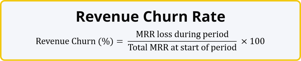
This SaaS metric is similar to the previously described churn rate, with one crucial difference. Whereas churn rate operates with the number of customers, revenue churn rate uses monthly recurring revenue instead, allowing you to evaluate loss in revenue caused by cancellations or downgrades during the time period.
Both of these subscription business metrics are often used hand-in-hand, as they paint a more complete picture. Some customers bring in more revenue than others, and losing them would cause a larger dent in your MRR – and revenue churn rate is designed to show that difference.
Furthermore, not all revenue loss is caused by full-on cancellations – some customers may decide to downgrade their subscription tier or reduce the number of purchased licenses, and this will also be reflected by the revenue churn rate.
How To Visualize Revenue Churn Rate
Just like the churn rate metric, revenue churn rate is expressed as a percentage. So, the same idea applies here as well – KPI cards or gauges, time series charts for change over time. If you wish to use both metrics at the same time, there are multiple ways how you can integrate them in your report for easy comparison. Here’s an example where we displayed both in the same Timeline PRO chart as different series.
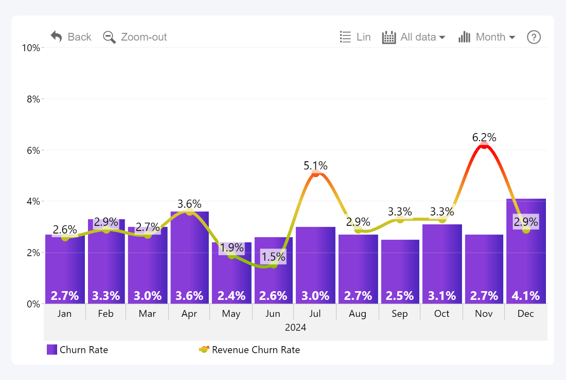
Power BI + Drill Down Timeline PRO by ZoomCharts
11. Customer Lifetime Value (CLV)
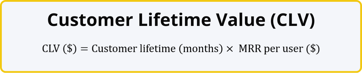
CLV, sometimes called LTV (long-term value), is used to estimate the total revenue you can expect from a customer during their time with your product. For example, if the average customer uses your product for 36 months, and your MRR per user is $10, this means that your CLV is $360.
CLV can be helpful for determining the optimal marketing spend and setting boundaries for your CAC. This SaaS business metric can be applied for your entire business, or used to determine the CLV for separate products, pricing tiers, target audiences, regions, countries, or other categories. This will allow you to finetune your marketing strategy and spend your budget more efficiently. Furthermore, a low CLV indicates possible issues with user retention or low revenue for the segment.
How To Visualize CLV
You can compare the CLV across multiple categories (segments, regions, etc.) by displaying it on a column or bar chart. This example also uses the Thresholds feature of Combo PRO to display the average CLV across all countries.
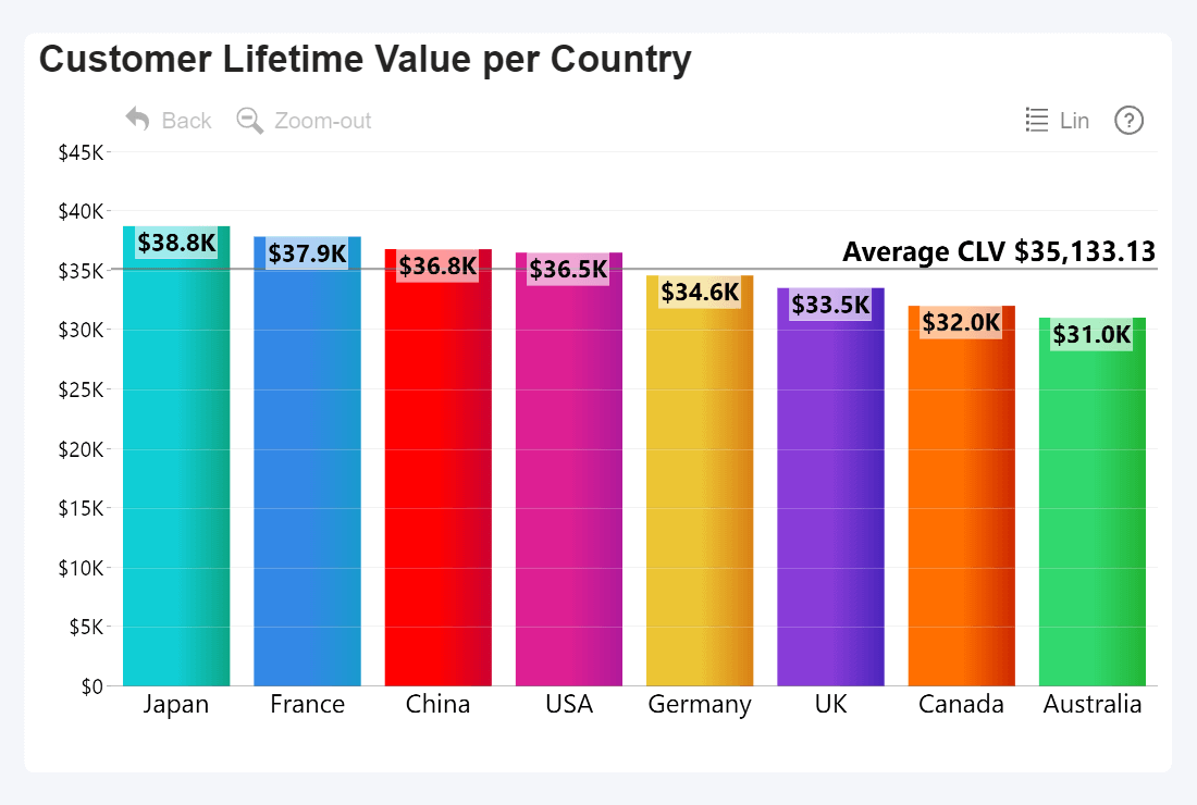
Power BI + Drill Down Combo PRO by ZoomCharts
12. Net Revenue Retention (NRR)
This SaaS business metric measures your ability to retain revenue from your existing customers. Unlike growth rate, NRR excludes MRR gain from new customers. It instead focuses purely on changes within your existing userbase – upsells, churn, and downsells.
The baseline for NRR is 100%, which means that nothing changed compared to the last period. If your NRR is above that, it means that you gained more via upsells than you lost due to churn or downsells. Conversely, any value below 100% means that your MRR from your existing customers is shrinking, which is a possible signal that you may need to revise your customer retention strategy.
Example: Your previous MRR was $10,000; during the month you made upsells worth $1500, but your MRR loss caused by churn was $300, in addition to $200 due to downsells. It means that the net MRR increase from your existing customers was $1000, and your NRR is 110%, which means that it is positive.
How To Visualize NRR
NRR differs from other percentage metrics by having 100% as the baseline. Like many other metrics, it can be easily visualized as a simple KPI card, or on a time series chart as a line series. Conditional formatting comes in really handy here, allowing to instantly mark positive NRR green and negative red.
In this example, we also limited the axis range to 70-130%, so the 100% baseline is always at the center. The tooltip also shows columns like the initial MRR and changes due upsells, churns, and downsells on mouseover, allowing the user to instantly get useful insights about the period.
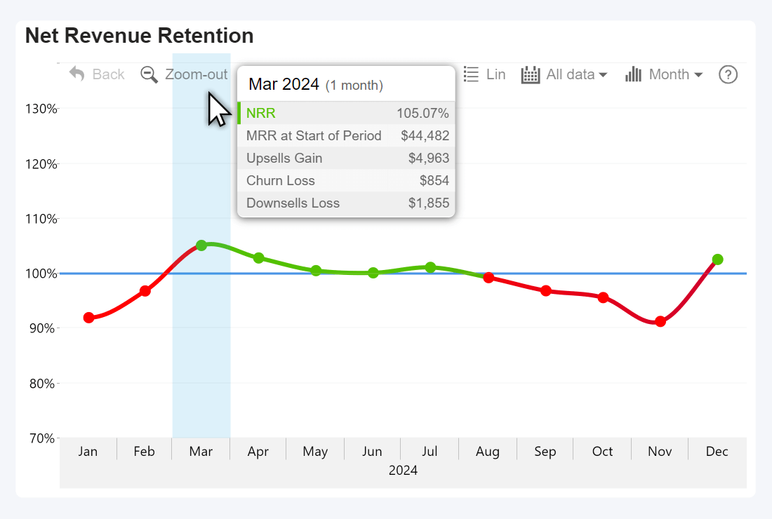
Power BI + Drill Down Timeline PRO by ZoomCharts
How Successful SaaS Companies Use Data to Grow
We explained the twelve most important subscription business model metrics that can be used to gain insight into the financial health, viability and growth of a company. In addition, SaaS business gather and analyze other metrics for various departments like product development, marketing, customer support , etc.
Out of context, none of these SaaS business metrics can tell you the entire story. When used together, these metrics can help you understand the full picture. The best-in-class SaaS businesses leverage the power of data to make swift and confident decisions, thus gaining an edge over the competition. Here’s how:
- Faster reaction. Data can identify new opportunities, find areas to improve, and pinpoint potential risks before they become larger concerns. Data-driven SaaS businesses spend less time making decisions, and they operate proactively, not reactively.
- Improved decision-making. Data-driven SaaS businesses explore data from multiple dimensions to reduce blindspots and see how multiple metrics interact with each other. This allows them to spot trends and correlations even in the most unlikely places. They see the full picture and make fully informed decisions.
- Employee involvement. In a best-in-class SaaS business, every employee is a data analyst. They have the necessary tools and knowledge to explore data related to their department and gain valuable insights for their day-to-day work.
Data visualization plays an integral part in getting the most value out of your data and achieving the above goals. With Power BI + ZoomCharts Visuals, your business can visualize data as interactive and engaging reports that make data exploration faster, more insightful and user-friendly. Users can easily drill down for more detailed insights with just a click, and multiple visuals will seamlessly work together to analyze the same data from multiple perspectives.
Start creating incredible and efficient SaaS reports in Power BI with Drill Down Visuals – a suite of 12 powerful and highly customizable custom visuals, including Combo, Donut, Timeline, Map, Graph, Scatter, and more. You can try out live demos and download report examples created with ZoomCharts visuals in our Report Gallery.
Upgrade Your Reports
Designing Power BI reports that extract the most value from your data can be challenging and requires a lot of knowledge and experience. If your business is looking to upgrade your reporting capabilities and increase your ROI from business intelligence, we provide a special service called ZoomCharts Experience Reports, which includes:
- A tailor-made report developed by our team of Power BI professionals
- Report development training and user onboarding
- 24/7 technical support
- Customized pricing plan for your business

Want more info like this?
Subscribe to our newsletter and be the first to read our latest articles and expert data visualization tips!