Nov 26, 2024
5 Reasons Why Data Visualization is Important in Business
Business data visualization can increase your ROI from business intelligence tools by producing faster and better insights for data-driven decisions, and increasing user adoption.

Business data visualization can increase your ROI from business intelligence tools by producing faster and better insights for data-driven decisions, and increasing user adoption.
What is Business Intelligence Data Visualization
In business intelligence, data visualization plays the crucial role of transforming business data into visual formats – charts, graphs, maps, etc. This makes data easier to read and understand for the users and allows them to quickly spot trends, patterns and outliers.
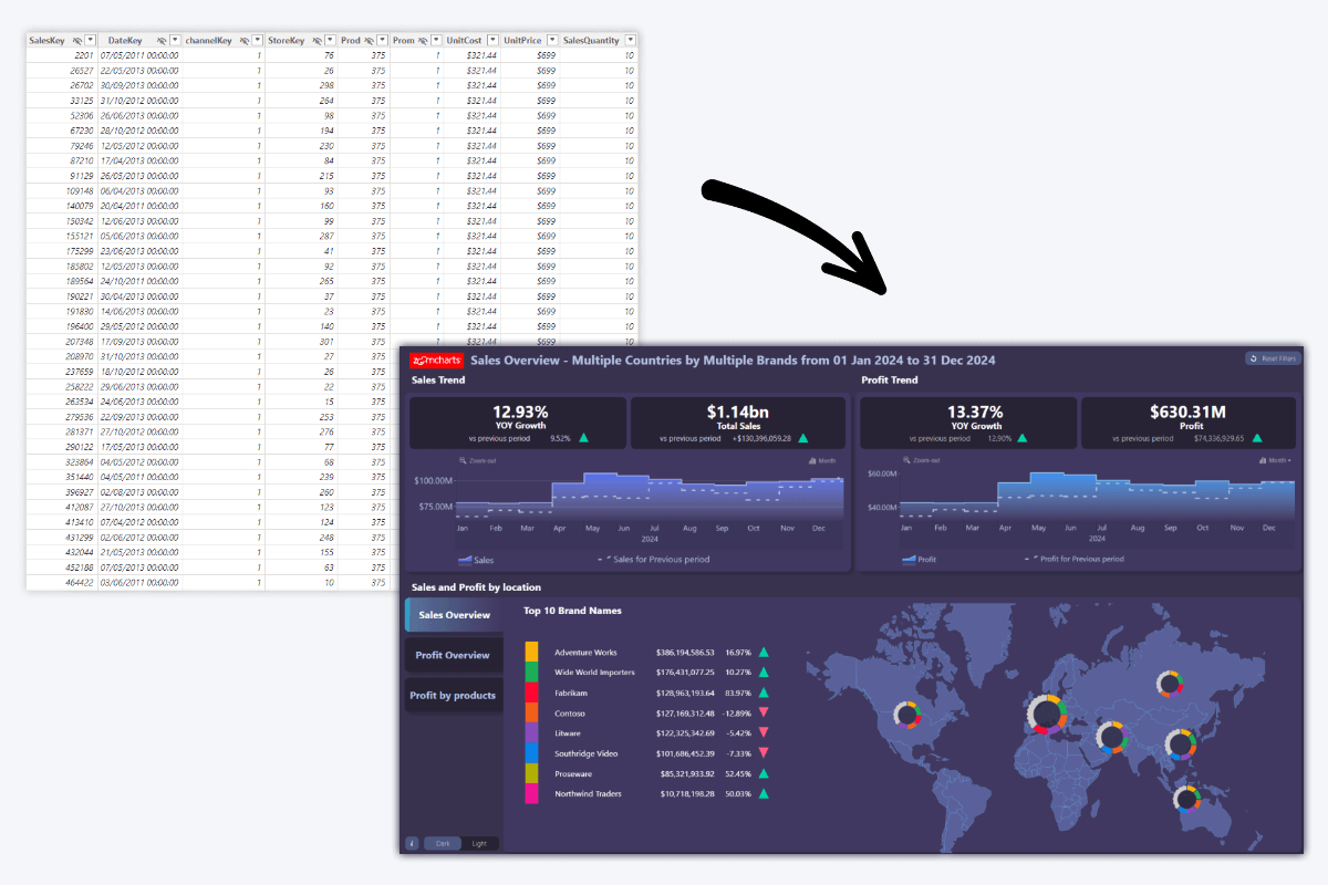
While other components of the business intelligence infrastructure gather, store and process data, without visualization it will most likely look like a table with numbers and text cells. By visualizing this data, users can gain insights without digging through raw data and see the findings in context.
There are many types of data visualization charts. For example, pie and donut charts can proportionally show how much each value contributes to a total; column and bar charts provide a visual comparison between multiple values; and time series charts make it easy to see changes over time. These visualizations make data more readable and insightful to the user than plainly showing numbers.
You can read more about different data visualization types in this article.
Data visualization has been used in statistics, academia, finance, and other industries since at least the 19th century, and many widely used productivity apps like Word, Excel and PowerPoint include simple data visualization tools. Furthermore, modern business intelligence tools like Power BI can be used to create interactive business intelligence dashboards and reports that visualize data in a way that can be filtered and drilled down for deeper analysis.
The Importance of Business Data Visualization
More and more businesses are making significant investments in business intelligence with the aim of becoming data-driven and staying ahead of the competition. The global business intelligence market in 2023 was valued at 29.2 billion USD and is expected to double in size by 2032 (Fortune Business Insights, 2024). Data visualization is the key that unlocks the maximum return on that investment.
Investing in a robust business intelligence infrastructure with efficient and reliable data gathering, storage and transformation solutions is crucial. That being said, an equally important factor beyond the technical side is the way users interact with data in their day-to-day work.
Reports and dashboards are how most users access and explore data, so the quality of your business data visualization will directly influence the value they receive from the BI tools. Ideally, business data visualization should be easy to understand for users of any experience level, produce clear and accurate insights, and provide user-friendly interactions to access deeper analysis on demand.
Business intelligence tools like Power BI already provide a lot of value to a business with their impressive technical prowess. However, they are also business data visualization tools, and by leveraging their reporting capabilities to the fullest, businesses can extract even more value from these tools.
5 Reasons Why Data Visualization is Important in Business
What is the endgame for any business that is implementing business intelligence? Achieving a strong data culture where users make data-driven decisions every day. Business data visualization directly impacts the user satisfaction with BI tools, adoption rate, and the quality and efficiency of decision-making.
Therefore, business data visualization is crucial for strengthening data culture and increasing the ROI of your investment in business intelligence solutions. Here are five ways how interactive and user-friendly visualization of business data can extract more value from BI.
1. Better Understanding of Data

BI tools integrate data from multiple sources, but without proper visualization, it can be overwhelming. Visualizing this data allows users to easily identify trends, correlations, and outliers, allowing businesses to make smarter, data-backed decisions.
With business data visualization, the report creator can tell a story that presents the most important insights to the user and puts the data in context. Furthermore, interactive reports allow the user to drill down and filter data when needed, and multiple visuals can work together to analyze the same data from multiple perspectives, which helps avoid tunnel vision and can reveal insights that could be otherwise missed.
This means that the user can see an at-a-glance overview of the entire situation, and drill down to investigate the underlying reasons behind the results – all within the same report. This will allow users to fully understand the data and use the findings to make confident, fully informed decisions.
2. Time and Resource Savings
Business data visualization saves time in two distinct ways. First, the brain processes visual information faster than text. Data visualization allows the user to immediately gain insights at the first glance – some examples include pie chart proportions, upward or downward trendlines, or colors like green for ‘positive’ or red for ‘negative’. The user can instantly discern what is important and what data needs their attention.
Second, business data visualization is an important tool to reduce time-to-insight, allowing users to analyze data and take away the necessary insights faster. In an interactive report, users can filter and drill down to find the data they need with just a few clicks. While static reports show only data that is present in the initial view, interactive reports allow the user to instantly delve deeper within the same report.
3. User Empowerment
Business data visualization removes a lot of barriers that stand in the way of data analysis. Visualizations simplify complex data and make it easier to understand for users without a background in data science. This also reduces the required time for training and onboarding, saving valuable resources and allowing more people to take part in data exploration.
Intuitive and user-friendly data visualization will remove a significant barrier of entry and allow non-technical users to take part in data exploration. Ideally, the reports should be just as simple to use as smartphone apps or other widely used UIs so that they are familiar and intuitive to most users. The most important navigation and filtering interactions should be easy to access and readily apparent so that more users can find them and engage in data exploration.
4. Improved Data Literacy
According to The State of Data & AI Literacy Report 2024 by DataCamp, 86% of leaders believe that data literacy is important for their teams’ daily tasks, with some of the main reasons being faster and more accurate decisions and a stronger capacity for innovation. Conversely, poor data literacy leads to slow and inaccurate decisions, decreased productivity, employee burnout, and higher turnover.
Business data visualization is a crucial tool for improving data literacy and strengthening the data culture within your organization. As we described before, it can empower users with the ability to analyze complex data to gain valuable insights. Making data simple and easy to approach will boost employees’ confidence with their data skills and motivate more employees to develop their data skills.
If the user perceives data analytics as something arcane that requires years of training, they will be dissuaded from even trying to understand it. Conversely, if the user interacts with data that they can easily understand, it may leave the impression that they too can take part in data exploration, it is something that is useful to them, and there is nothing stopping them from improving their data skills.
5. Increased Adoption Rate

One of the main factors that limit your ROI from business intelligence tools is poor user adoption. Without user adoption, your investment in BI solutions lies dormant, and you do not achieve your goal of becoming a data-driven company. But convincing employees to change their existing workflow and start using new tools can be tough. Here are four important stats:
- On average, only 25% of employees actively use BI and analytics tools, and the biggest barriers that prevent adoption are lack of training, data quality, budget, and ease of use. (BARC, 2022)
- When new business software is introduced, 40% of employees delay or avoid its adoption or use minimal features if they have negative experience with it. Conversely, after a positive experience, 41% of employees explore its features further. (Gartner, 2021)
- 74% of employees feel overwhelmed when working with data, which causes them to procrastinate data-related tasks, find methods to complete them without using data, or avoid them entirely. (Accenture, 2020)
- 77.6% of the surveyed executives claim that cultural / people / procedural / organizational aspects are the greatest challenge to becoming a data-driven organization, rather than technical limitations. (Wavestone, 2024)
In our article “Data-Driven Decision-Making: Full Guide”, we highlighted the importance of becoming a data-driven company and outlined the main steps to nurture a strong data culture where employees actively use BI tools. These steps include a clear data strategy, a robust technical framework, training and data literacy programs, and employee encouragement.
Another factor that impacts the adoption rate of BI platforms is the user experience, ease of use and the perceived value of their use. Since reports and dashboards are how most users interact with BI tools, the quality of business data visualization will directly shape their experience.
If the visualizations present clear and easy-to-find insights, the users will find value in exploring data. If the reports are intuitive and easy to use, the users will not be discouraged from using them. Furthermore, reports that leave a good first impression and provide hassle-free user experience will invite users to explore data and make them less hesitant to adopt BI tools.
Good Business Intelligence Data Visualization Examples
We have talked about the value of business data visualization and its importance as the medium between data and the users. However, the term ‘data visualization’ can cover anything from a simple pie chart in a PowerPoint slide to even the most advanced business intelligence data visualizations.
What makes an effective visualization that can achieve the five benefits described above? As we explored in our article “Top 5 Power BI Report Design Mistakes You Should Avoid”, data visualization can reach its full potential only if it adheres to the following principles:
- It must meet the user’s needs and answer their questions.
- It must use the correct visuals, look visually appealing, and present the insights clearly.
- It must provide features that allow users to easily find relevant insights and filter data.
- The user interactions for filtering and exploring data must be intuitive, familiar and readily apparent.
- It must provide feature parity and equal experience for touch controls and mouse/keyboard.
Reports and dashboards that follow these rules will provide a smooth and enjoyable user experience that makes data exploration faster, easier and more insightful. We will explore three of our ZoomCharts Experience Reports for Power BI that were designed with these design principles in mind. You can try and download more report examples in our Report Gallery.
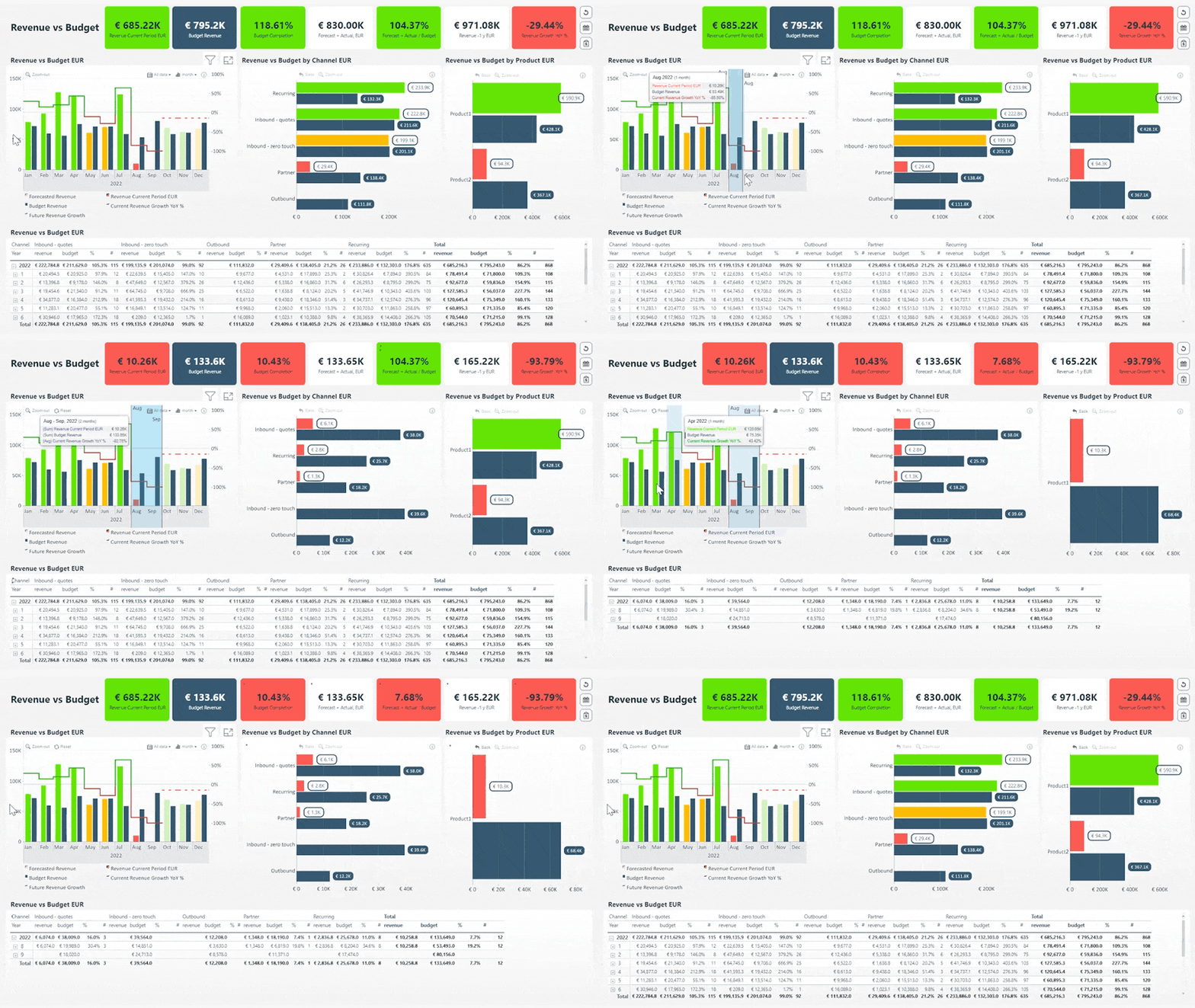
1. Revenue vs. Budget – Business Intelligence Dashboard Example
This business intelligence dashboard example puts the most important data at the forefront. The KPI cards on the top provide quick insights into the overall business performance, while the interactive timeline chart allows the user to explore historical data to spot trends. The two bar charts visualize revenue vs. budget comparison across different channels and products.
What makes this report stand out is the interactions between multiple visuals. For example, if you make a selection on the timeline chart, all other visuals will filter data to that specific time period. Or, if you drill down to a specific sales channel in the bar chart, the report will apply a filter to just that channel. In addition, conditional formatting uses color to tell a story at the first glance, with green signifying positive results, and red marking areas that need attention.
Try Live Demo of Revenue vs. Budget Report
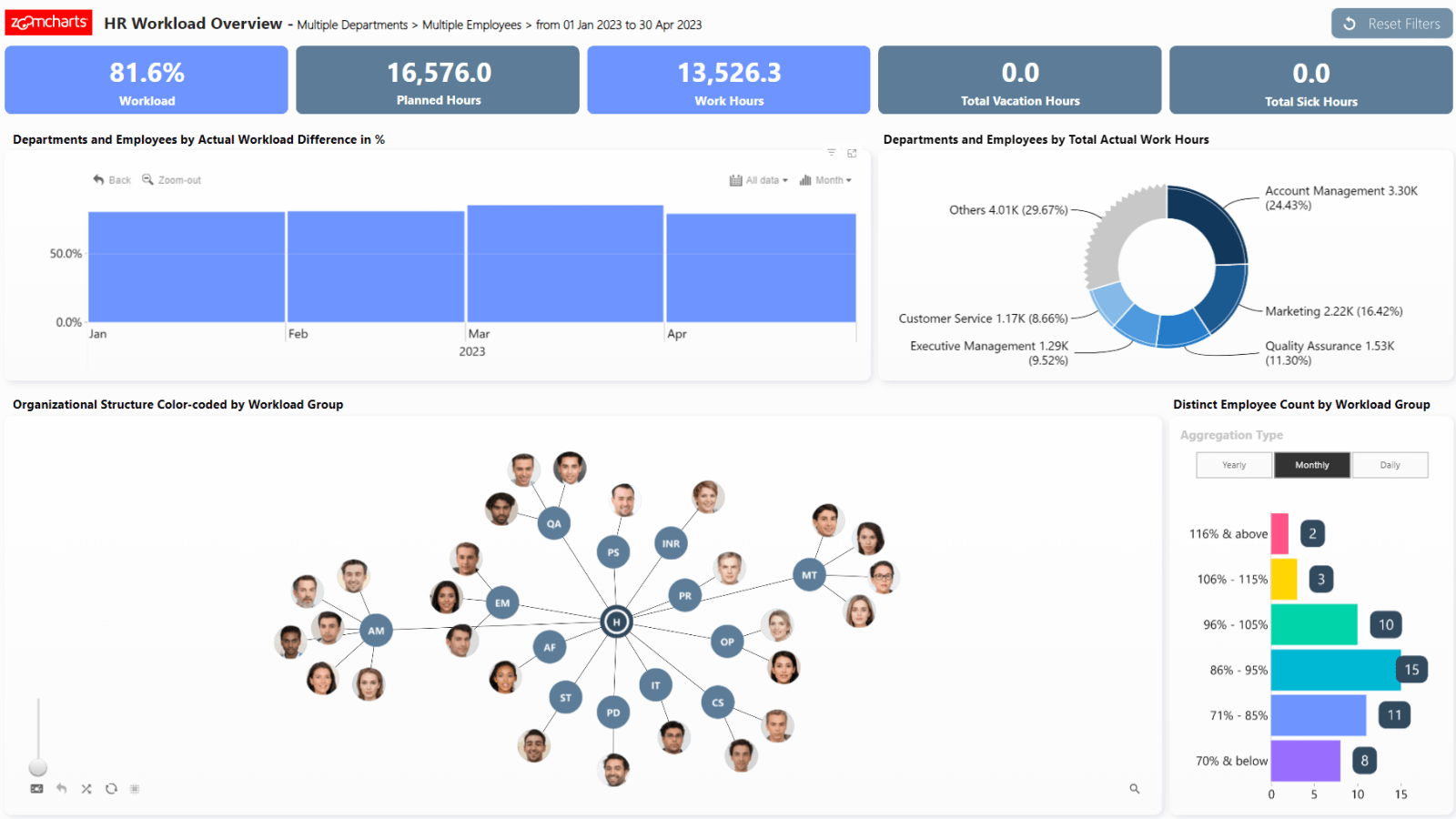
2. HR Workload Overview Report - Business Intelligence Dashboard Example
Power BI can be a valuable asset for HR management, as showcased by this clean yet versatile business intelligence dashboard example. With just five KPI cards and four carefully placed visuals, this report provides valuable insights into the employee workload across the company.
The donut chart shows the workload distribution across multiple departments, but it also can act as a slicer to filter data for a specific department. The graph chart shows the organizational structure, and the user can select one or multiple employees to drill down and see their workload.
Try Live Demo of HR Workload Overview Report
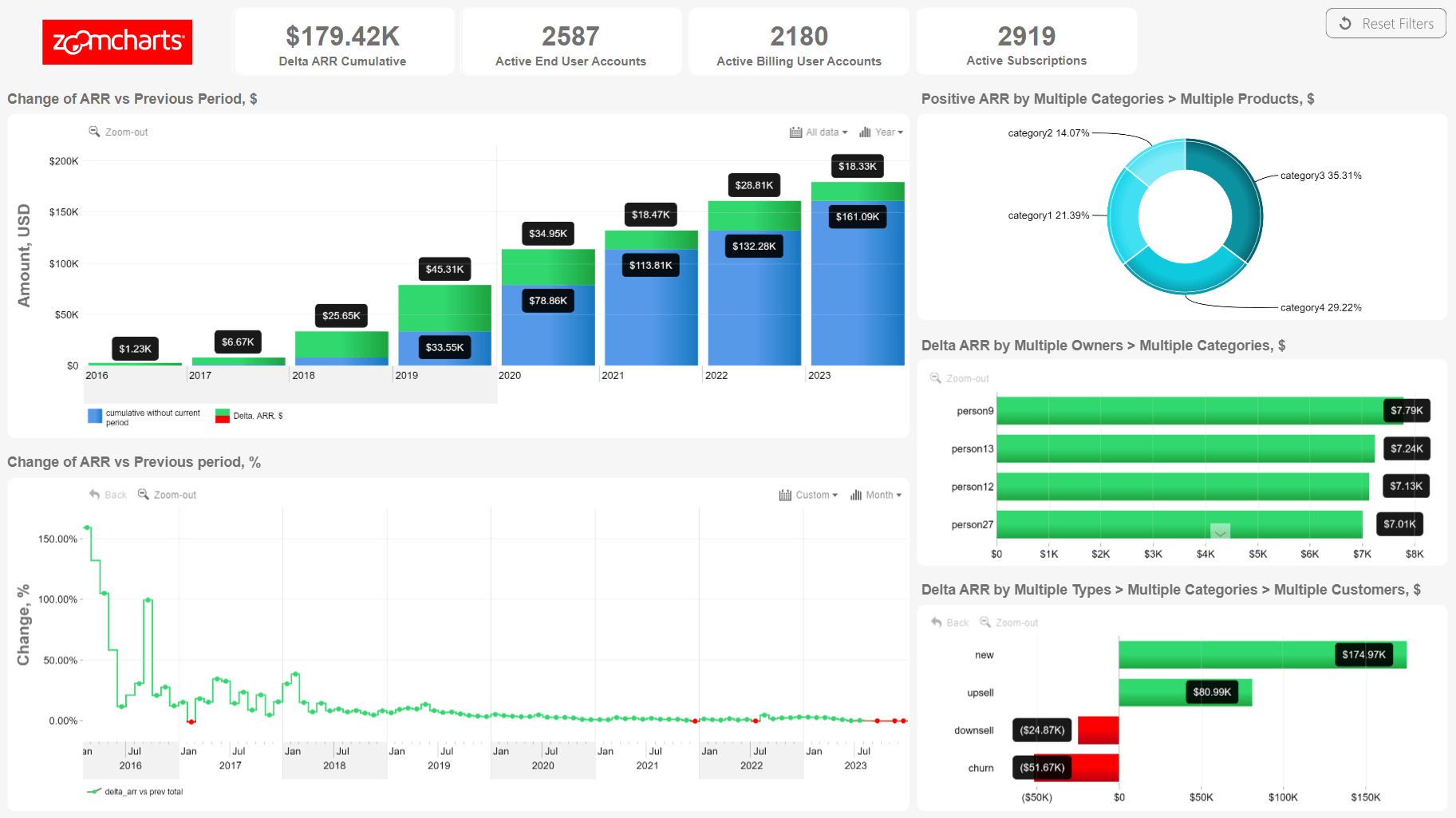
3. Annual Recurring Revenue Report - Business Intelligence Dashboard Example
This Power BI report visualizes annual recurring revenue across multiple products in a simple, easy-to-explore way. It puts two timeline charts as the centerpiece – one for monetary revenue, and the other for growth percentage. Selecting a specific time range on either will filter all other visuals, and vice versa.
The user can explore data further with the donut chart that shows the ARR growth per each category or product, bar chart that shows the revenue per each product owner, and another bar chart that displays the revenue change from new deals, upsells, downsells and churns. This ARR report makes it easy to see the overall situation, spot trends and identify areas that need attention to improve your sales performance.
Get More Value from Business Data Visualization
As we discovered in this article, data visualization is a crucial component that can directly increase the ROI of your investment in business intelligence. User-focused report design can make data exploration faster and more efficient, provide better and clearer insights for data-driven decisions, empower more users to use data, and motivate users to adopt business intelligence in their work.
Is your organization using Power BI and looking to get more value from your existing reports or design new ones from the ground-up? We provide a special service called ZoomCharts Experience Reports that includes a tailor-made report designed by our team of Power BI professionals, in addition to our custom visuals and training for your team. Explore live demos of ZX Reports in our Report Gallery and see how they can make data exploration faster, more user-friendly, and more insightful!

Want more info like this?
Subscribe to our newsletter and be the first to read our latest articles and expert data visualization tips!
