🏆 1st place $300 Amazon gift card
🥈 2nd place $200 Amazon gift card
🥉 3rd place $100 Amazon gift card
About 4U Report Challenge
Improve your Power BI data visualization skills and demonstrate strong professional credibility.
In this challenge, you’ll be provided with a business case dataset to analyze and visualize in Power BI. Each month, a new dataset is released, giving you the opportunity to build high-demand Power BI reports and dashboards for your portfolio, gain recognition within a community of 20k+ BI professionals, and win amazing prizes from ZoomCharts.
Benefits of 4U Report Challenge:
- Workshops & 1:1 Mentoring: Learn directly from experienced Power BI professionals through live workshops on report-building best practices, 1:1 mentoring sessions to review your report, and get tailored advice.
- Get Personal Feedback: Every participant receives detailed, personalized feedback on their report - a great opportunity to improve based on real feedback.
- Free Power BI accounts for using Power BI Desktop: If you don’t have a Microsoft work or school account, you can acquire your own ZoomCharts account for building your challenge report without restrictions.
- Free ZoomCharts Visuals License: All participants get a ZoomCharts Developer License (worth hundreds of dollars) that gives full access to the Drill Down PRO visuals library.
- Free Report Downloads: Each challenge participant with a validated report will receive 5 free downloads from the Power BI Report Gallery.
Prize Pool:
🏆 The best 3 overall reports will receive a 300$/ 200$ / 100$ Amazon Gift card.
Being selected in the Top 5 will grant you +10 free downloads from the Power BI Report Gallery.
Winners Announcement
April 30, the top 5 reports and prize winners will be announced during the Live Webinar "Top 5 Executive KPI Reports in Power BI"
Webinar recordings
How to participate in the challenge
1. Register for the Challenge
- Register using the form above.
- Download the challenge dataset using the "Get the Dataset" button.
- Activate Free ZoomCharts Drill Down Visuals Developer License for Power BI: If you have your own Microsoft account, select the option "See My License" (watch the setup video or follow the step-by-step instructions).
- If you don’t have a work or school Microsoft account, you can activate a Free Microsoft account provided by ZoomCharts exclusively for challenge participants by selecting the option "See My Account" which will give you access to ZoomCharts visuals in Power BI Desktop.
2. Build Your Report in Power BI
- Add your ZoomCharts license to Power BI Desktop (watch the setup video or read the step-by-step guide).
- Add ZoomCharts visuals from the Power BI visuals library or Microsoft Marketplace.
- Build your report using the challenge dataset
- Your report must include at least two ZoomCharts Drill Down Visuals on the same page
3. Improve Your Report and Learn New Skills
- Join the challenge workshop to learn how to use ZoomCharts visuals and the dataset.
- If you need help, book a free consultation with the ZoomCharts team.
- Browse past challenge submissions for inspiration and ideas.
4. Submit Your Challenge Entry
- Upload your report in .pbix format using the submission form on this page.
If your report does not meet the challenge requirements: You will receive an email explaining what needs to be fixed. You can update your report and submit it again.
Validation timeline:
- Your report will be reviewed within 1–2 business days.
- Once validated, you will receive a Publish to Web link you can share publicly or add to your portfolio.
- You will also receive personalized feedback from the evaluation team within 1–2 business days.
- Use this to improve your report and resubmit before the deadline.
Note: You can resubmit your entry as many times as needed before the final deadline.
5. Finalize Your Participation to Compete for Prizes
- Share a LinkedIn post showing your finished report (image, screenshot, or video).
- Tag @ZoomCharts and use the hashtags #4UReport and #builtwithzoomcharts.
- Follow ZoomCharts on LinkedIn.
6. Attend the Live Closing Webinar
- The ZoomCharts team reviews and analyzes the Top 5 Challenge entries during the live webinar. You will learn best practices, improvement tips, and see how others solved the challenge.
- The winners of the challenge will be announced during the live webinar and afterward on the ZoomCharts LinkedIn page.
Challenge Brief
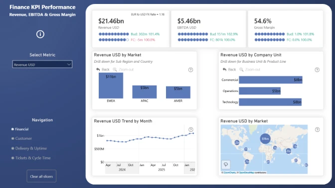
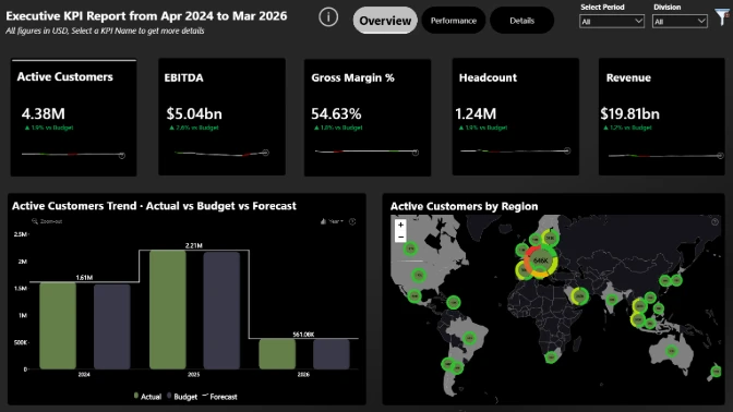
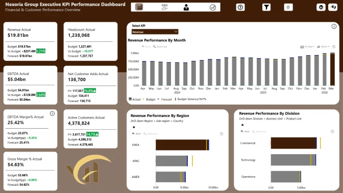
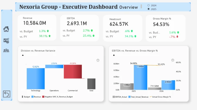
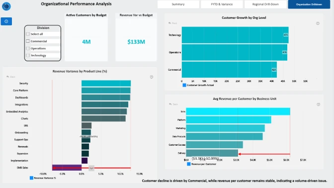
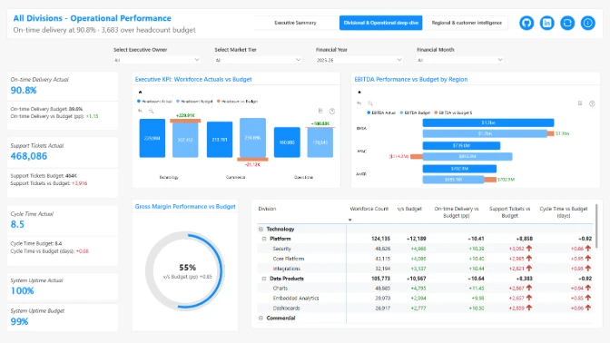
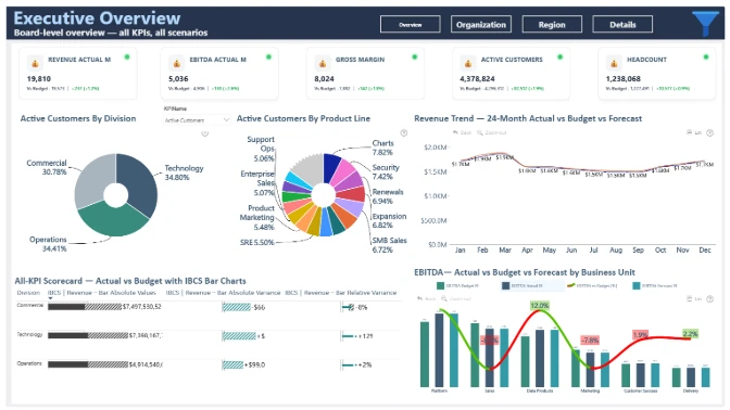
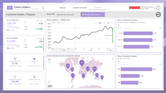
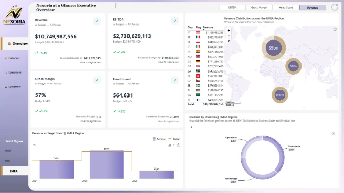
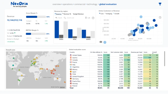
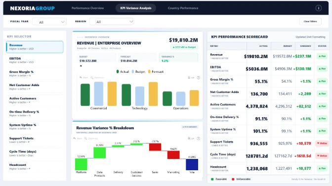
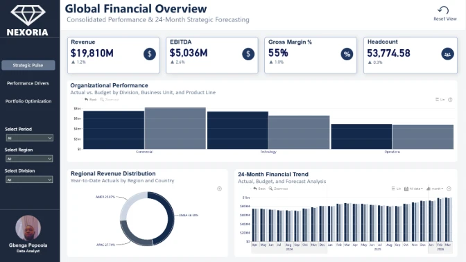
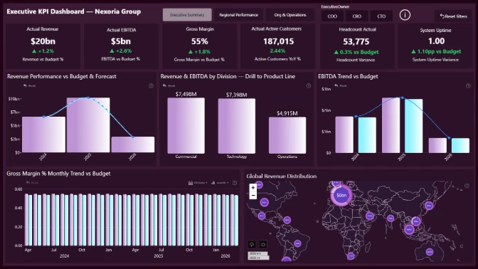
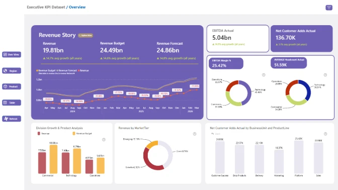
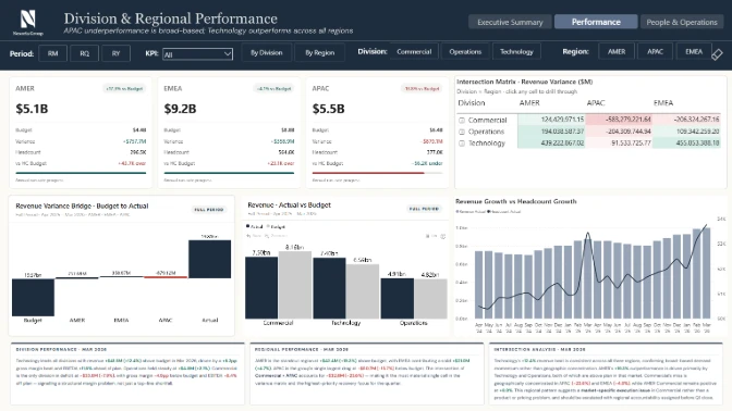
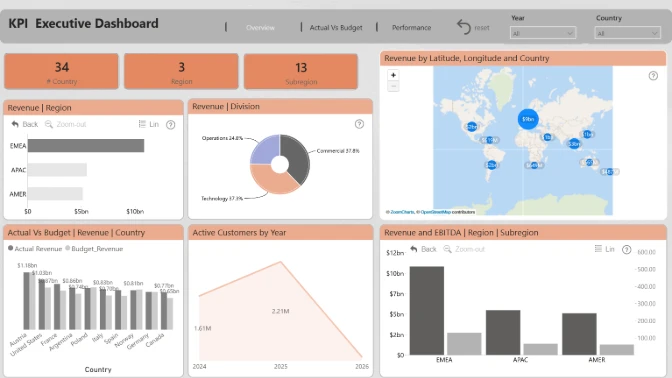
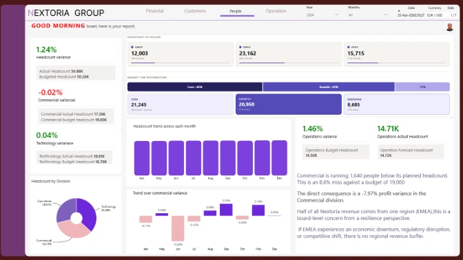
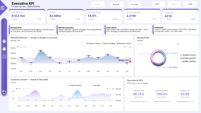
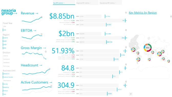
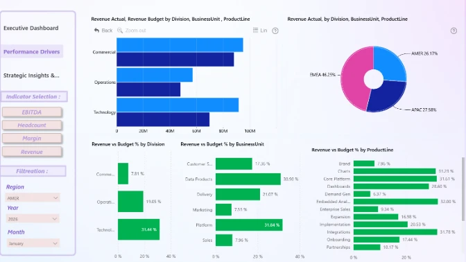
You are tasked with building a board-ready Executive KPI Report in Power BI for a fictional global enterprise, Nexoria Group. The company operates across multiple divisions (Technology, Operations, Commercial) and regions (AMER, EMEA, APAC). The executive team is preparing its March board reporting package and needs a clear, insight-driven Power BI report that summarizes performance and enables deep drill-down analysis.
The dataset includes 24 months of data with Actual, Budget, and Forecast scenarios, covering financial, customer, people, and operational KPIs. March-April represents board reporting and strategic planning season, where hiring decisions, margin pressure, and regional performance differences must be clearly explained.
Report Requirements
- Build your report using Power BI.
- The recommended number of pages in the report is up to 3 pages, including drill-through pages.
- Canvas size is 16:9 (Default Power BI size) or Full HD size = w:1920 - h:1080.
- The report should contain at least 2 ZoomCharts Drill Down PRO visuals (custom visuals for Power BI) within a single page.
What your report should demonstrate
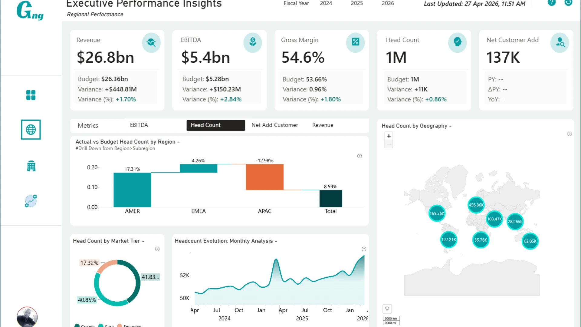
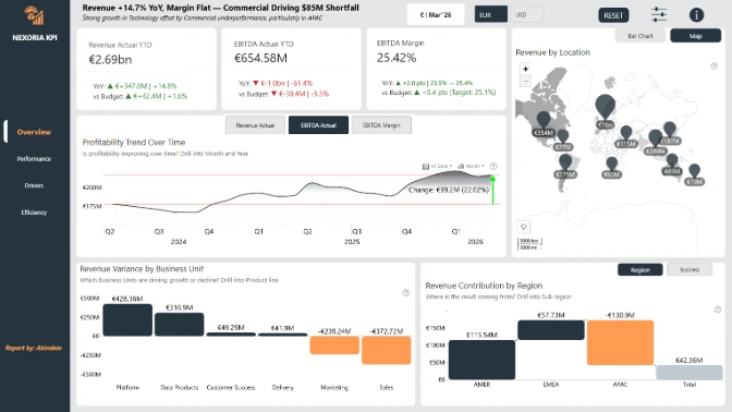
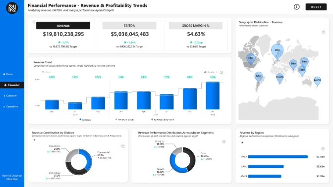
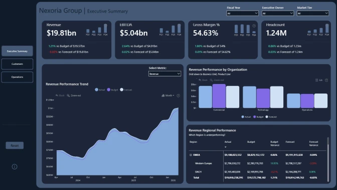
- Clear executive-level KPI summary (Revenue, EBITDA, Margin, Headcount, Customer Growth).
- Actual vs Budget vs Forecast comparison suitable for board reporting.
- Organizational drill-down (Division → Business Unit → Product Line).
- Strong UX storytelling with clean layout and logical navigation.
Your objective is to design a clean, executive-focused Power BI report that communicates high-level performance while allowing stakeholders to explore drivers through hierarchy-based drill-down paths.
Judging criteria
Each submission is evaluated based on four main criteria: Inspiring, Intuitive, Interactive, and Insightful. These dimensions ensure that the solution is visually compelling, easy to understand, engaging to use, and capable of delivering valuable insights.
Inspiring: How visually clear, modern, and purposeful the report looks. (max 15 points)
- Visually Appealing Design: Is the design harmonious, with a modern color palette, consistent formatting, and a clear presentation of information?
- Clear and Focused Visualizations: Are only the necessary visualizations used, avoiding clutter and keeping focus on key insights?
- Readability: Are color contrasts appropriate and text elements (fonts, sizes) easy to read across different devices and screen sizes?
Intuitive: How clear and easy it is to understand the report at a glance? (max 15 points)
- Logical Navigation: Is the report organized with intuitive navigation paths, reset options, and a structure that allows users to explore at their own pace?
- Storytelling through Data: Does the report present data in a logical and compelling narrative that supports decision-making?
- Streamlined Information: Is the report focused on key data without overwhelming the user with unnecessary details?
- Tooltips and Labeling: Are tooltips, titles, and legends clear, helpful, and supportive of understanding without cluttering the design?
Interactive: How engaging and seamless is the report exploration and interaction with data? (max 15 points)
- Dynamic User Controls: Are slicers and interactive elements designed so users can easily adjust and explore different data views?
- Cross-Chart Integration: Are charts connected in a way that filtering and interactions feel smooth and unified across the report?
- Drill-Down Functionality: Can users intuitively dive deeper into data layers to explore additional details and insights?
- Guided Learning Aids: Are there helpful tutorials, hints, or onboarding elements that support users in understanding and navigating the report?
Insightful: How accurate, complete, and meaningful is the data in driving decisions? (max 15 points)
- Depth of Analysis: Does the analysis provide meaningful insights and fully address the problem using effective methods?
- Data Accuracy: Is the data consistent across visuals, and are calculations and aggregations applied correctly?
- Performance Optimization: Is the report optimized for fast loading and smooth performance, even with larger datasets?
- Data Cleanliness: Is the data well-prepared, free from redundancies or gaps, and structured to support reliable analysis?
What is "4U Reports"?
4U Reports is a framework for designing data reports that people actually want to use. Reports that don't just display data, but help people understand it and make confident decisions from it.
A report only delivers value when someone opens it, navigates it, explores it, and walks away with a real insight.
The 4U Reports break data exploration into four stages:
- Unique (Engagement) - The report captures attention and motivates people to open and use it. It looks clear, purposeful, and relevant to the business problem.
- Uncovering (Exploration) - Users immediately understand how to navigate the report without training. The layout feels natural, and interactions are easy to follow.
- Uncovering (Exploration) - Users can explore the data freely and investigate important questions. They can move from overview to detail and analyze patterns from different perspectives.
- Understanding (Insights) - Users quickly find insights and understand what is happening in the business. The report helps them identify causes, trends, and actions.
Outcomes
User outcome: They quickly find insights and understand why it is happening.
- Save time finding answers
- Feel confident in decisions
- Stay focused on their work
- Solve problems independently
- Reduce stress and frustration
Company outcome: Employees take more informed decisions.
- Faster decision-making (reduced decision time)
- Better business outcomes (improved KPI performance)
- Increased value from BI investments (higher report usage and adoption)
Developer outcome: Transformation from regular report builder to decision enabler.
- Developers spend less time fixing and reworking usability issues
- More reports are used by more people
- Demonstration of high professional credibility
Why This Matters in the Challenge
The goal of this challenge is not just to build a visually appealing report. It is to demonstrate professional credibility as a report creator by building a report that delivers real value to users.
A strong 4U Report shows that you can:
- Build reports people want to use
- Design reports that are easy to understand
- Enable users to explore data confidently
- Help decision-makers understand what is happening
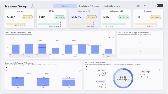
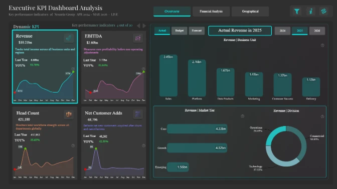
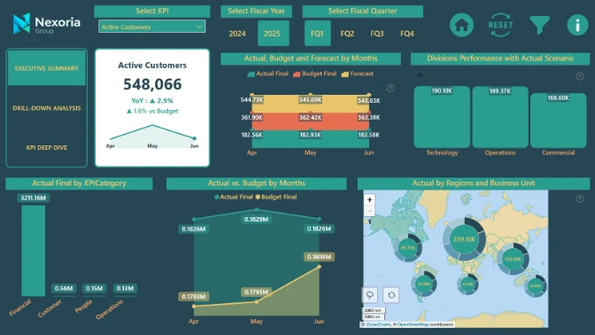
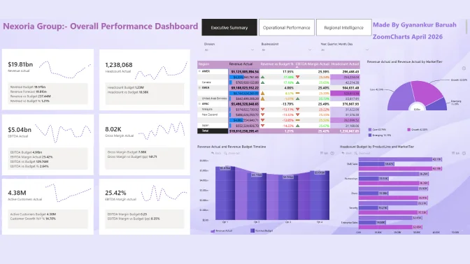
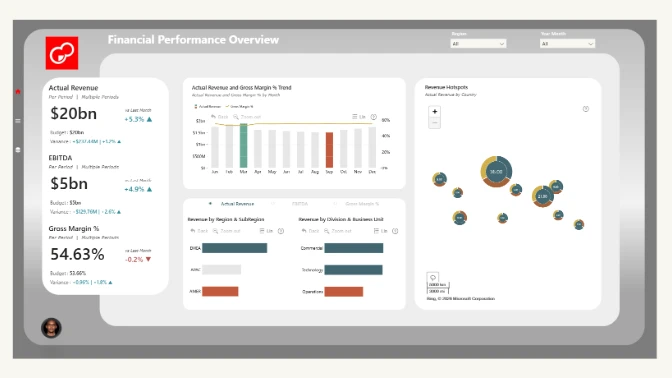
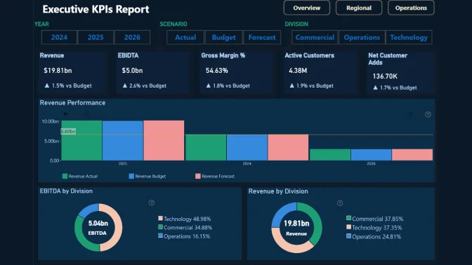
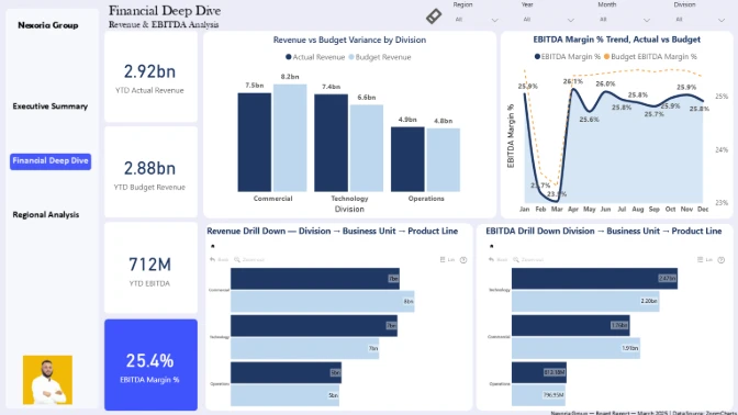
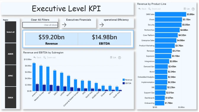
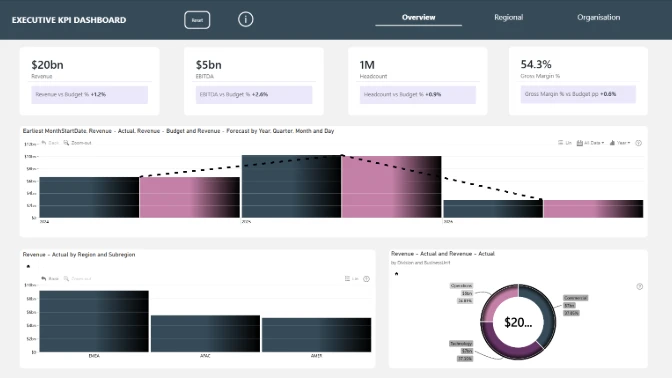
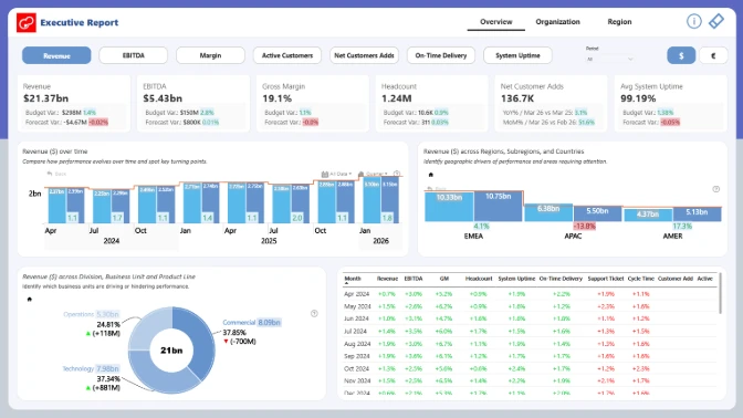
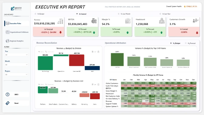
See past ZoomCharts Power BI Challenge challenges
See past challenges