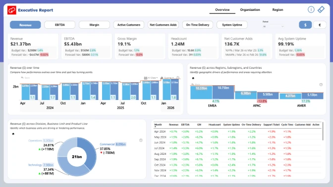
This finance dashboard example shows how Power BI can be used to analyze executive KPIs, financial performance, regional results, operational efficiency, and customer growth in one interactive report.
Built with ZoomCharts Drill Down custom visuals for Power BI, the report helps users track key finance and business metrics such as revenue, EBITDA, gross margin, headcount, active customers, net customer adds, on-time delivery, system uptime, support tickets, and cycle time. The report was submitted to the ZoomCharts “4U Reports Challenge” in April 2026.
The dashboard is designed for finance teams, executives, business analysts, operations leaders, and regional managers who need a clear way to compare actual results vs. budget vs. forecast, review performance by region, and understand which business areas are driving growth or pressure.
What you can analyze
Use this Power BI finance dashboard to track:
- Revenue vs. budget
- EBITDA vs. budget
- Gross margin performance
- Headcount vs. budget
- Actual vs. budget vs. forecast trends
- Revenue distribution by region
- Revenue by division, business unit, and product line
- Operational KPIs such as cycle time, on-time delivery, support tickets, and system uptime
- Customer KPIs such as active customers and net customer adds
- Regional performance across AMER, APAC, and EMEA
Report pages
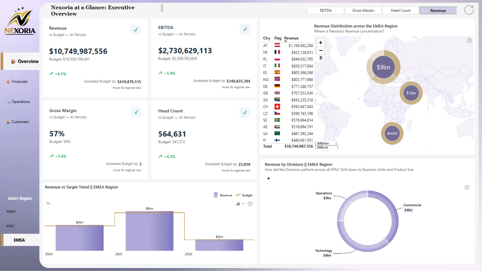
- Executive overview: monitor revenue, EBITDA, gross margin, headcount, regional revenue distribution, and revenue vs. target trends.
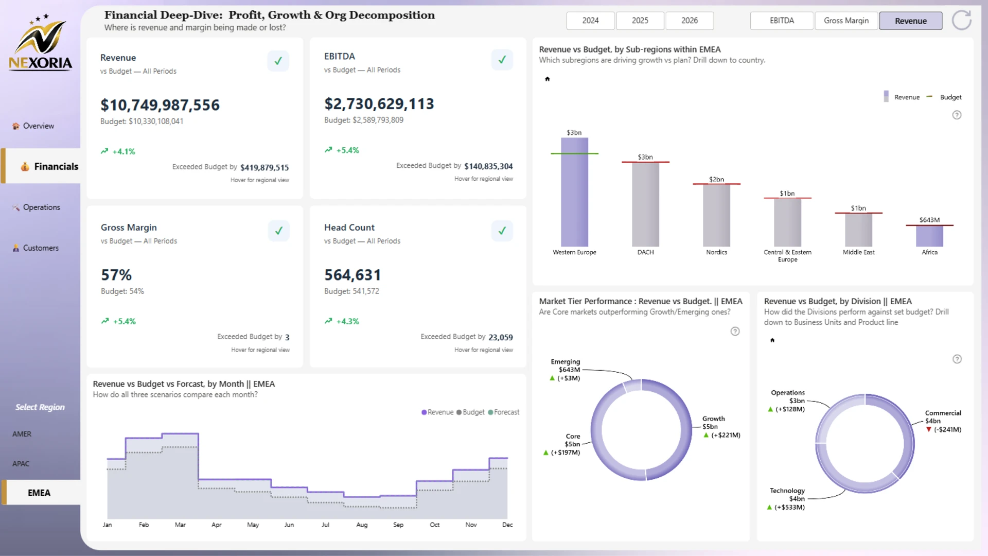
- Financials: compare revenue, EBITDA, gross margin, and headcount against budget and forecast across regions, subregions, divisions, and market tiers.
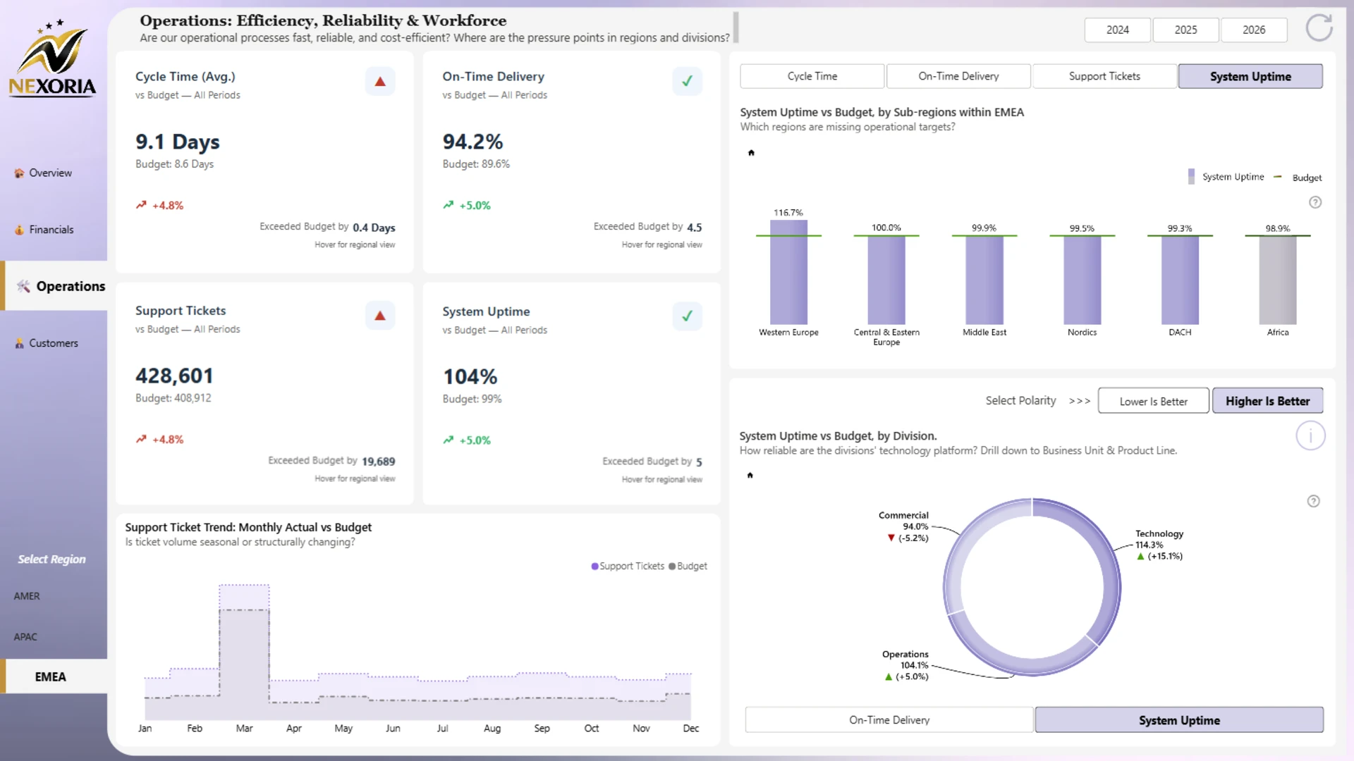
- Operations: review operational efficiency, reliability, support tickets, cycle time, on-time delivery, and system uptime.
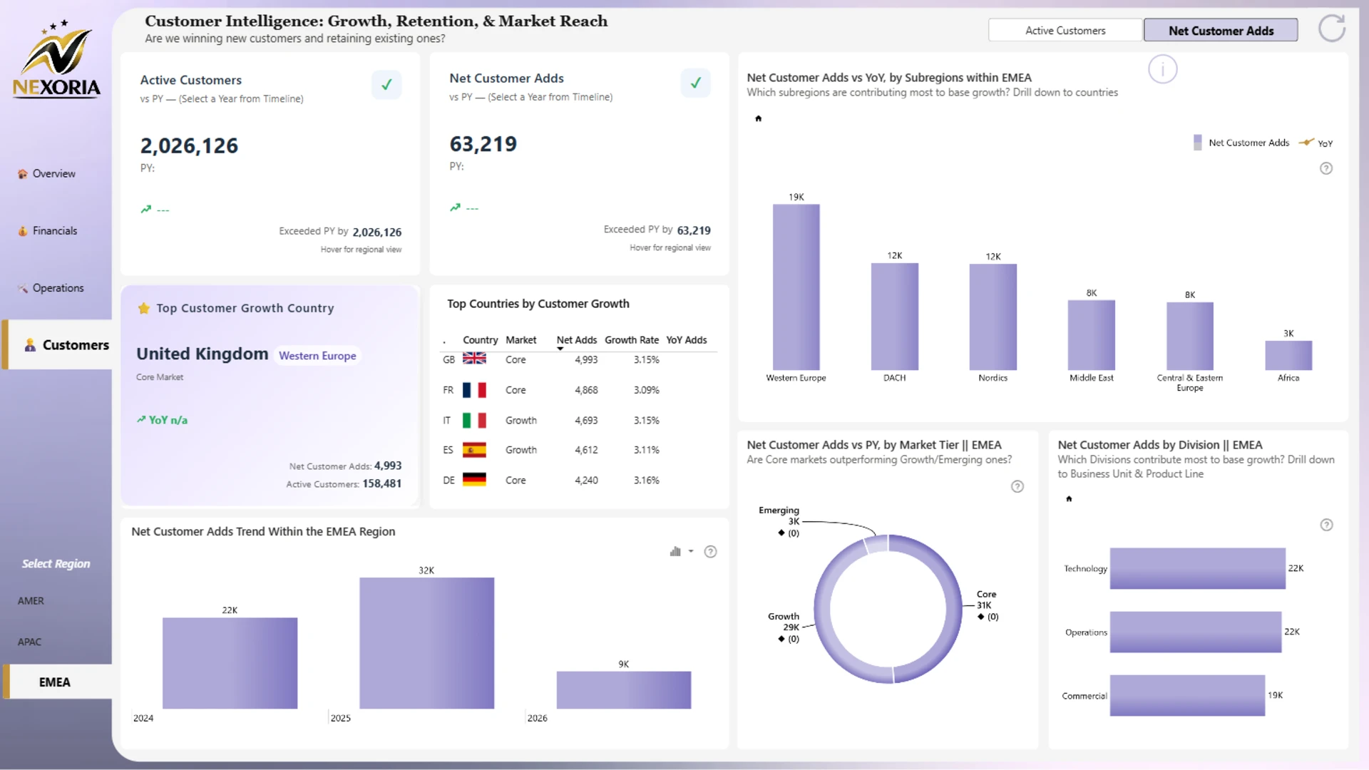
- Customers: analyze active customers, net customer adds, customer growth by country, market tier, and division.
Interactive features
This report uses ZoomCharts Drill Down custom visuals for Power BI to make finance and KPI analysis easier to explore. Users can switch between KPIs, select regions, compare years, drill down from divisions to business units and product lines, and review regional performance with interactive charts, maps, and KPI cards.
Explore this Power BI finance dashboard example to see how interactive reporting can support executive reviews, finance performance analysis, budget tracking, regional analysis, and strategic decision-making.