2172
Power BI Revenue Dashboard Example for Executive Reporting
Power BI Revenue Dashboard Example for Executive Reporting
More Report pages
Report Author: Ivan Baldin
2172
Share template with others
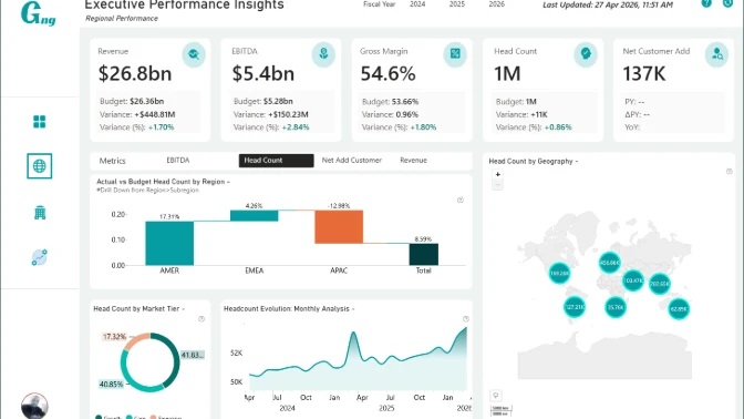
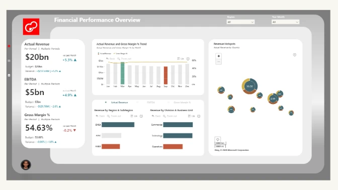
This Power BI executive KPI dashboard example shows how business leaders can monitor financial, regional, and operational performance in one interactive report.
Built with ZoomCharts Drill Down custom visuals for Power BI, the report helps users explore key executive metrics such as revenue, EBITDA, gross margin, headcount, net customer adds, active customers, on-time delivery, system uptime, support tickets, and cycle time. It was submitted to the ZoomCharts 4U Reports Challenge in April 2026.
The dashboard is designed for executives, finance teams, operations leaders, sales managers, and business analysts who need a clear way to compare actual results vs. budget vs. forecast, review regional performance, and identify where business performance needs attention.
What you can analyze
Use this Power BI KPI dashboard to track:
- Revenue, EBITDA, and gross margin
- Actual vs. budget vs. forecast performance
- Year-over-year KPI variance
- Regional performance across AMER, EMEA, and APAC
- Revenue vs. gross margin by region
- Headcount and customer growth
- Net customer adds and active customers
- On-time delivery and system uptime
- Support tickets and cycle time
- Performance by division and business unit
Report pages
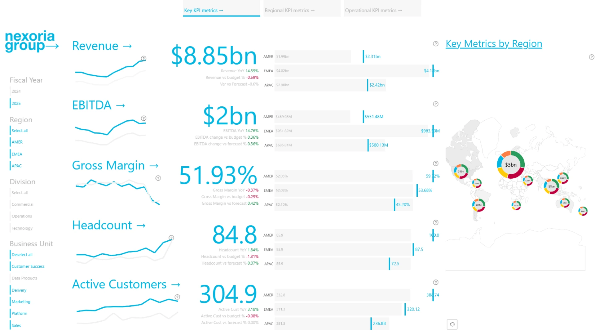
- Key KPI metrics: review executive-level business performance across revenue, EBITDA, margin, headcount, customer growth, and other core KPIs.
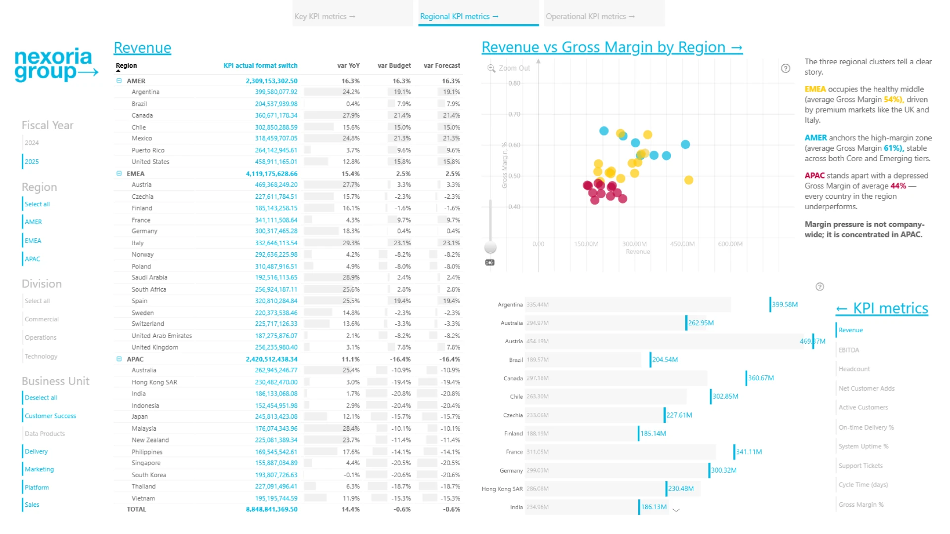
- Regional KPI metrics: compare revenue and gross margin across regions and countries, with clear regional insights for AMER, EMEA, and APAC.
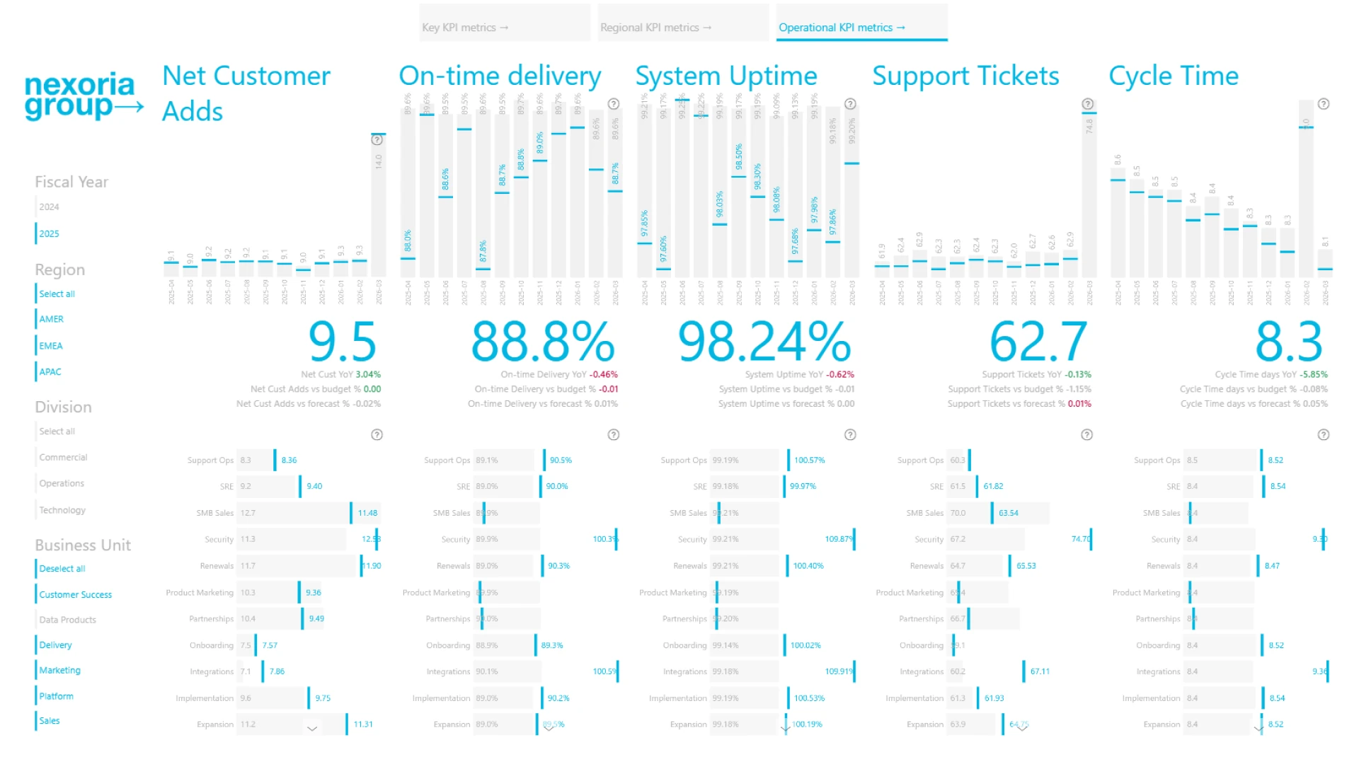
- Operational KPI metrics: monitor operational performance across net customer adds, on-time delivery, system uptime, support tickets, and cycle time.
Interactive features
This report uses ZoomCharts Drill Down custom visuals for Power BI combination with native Power BI visuals to support interactive executive analysis. Users can filter by fiscal year, region, division, and business unit, switch between KPI categories, drill into regional performance, and compare actual results against budget, forecast, and prior-year performance.
Explore this Power BI executive KPI dashboard example to see how interactive reporting can support strategic decision-making, financial performance reviews, regional analysis, and operational KPI tracking.
ZoomCharts visuals used
4U Report Challenges
Participate in data challenges, build and submit reports to get free template downloads.
Join CommunityMobile view allows you to interact with the report. To Download the template please switch to desktop view.
Was this helpful? Thank you for your feedback!
Sorry about that.
How can we improve it?