1827
Power BI Budget Dashboard for Executive Reporting
Power BI Budget Dashboard for Executive Reporting
More Report pages
Report Author: Eszter Kovacs
1827
Share template with others
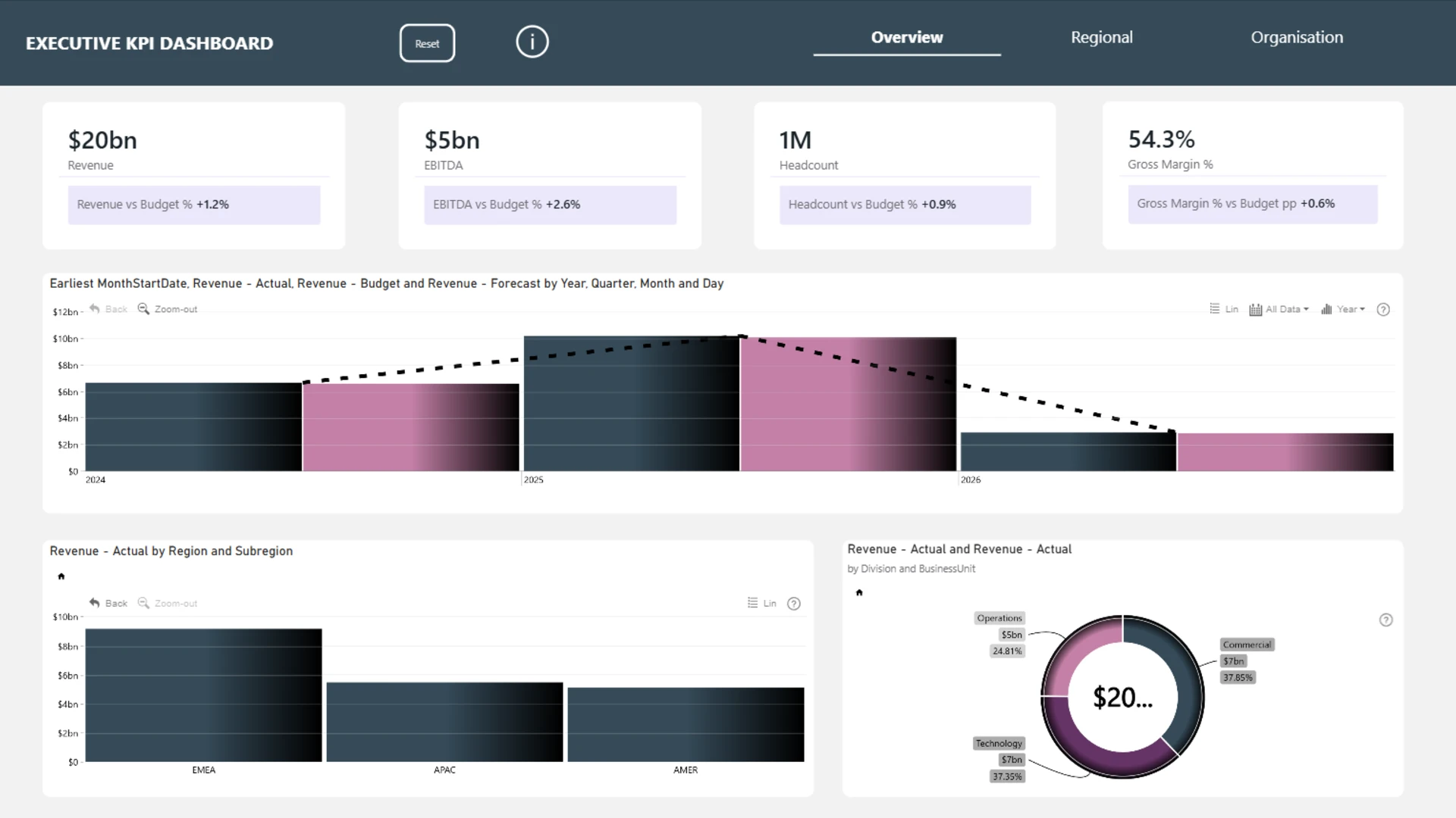
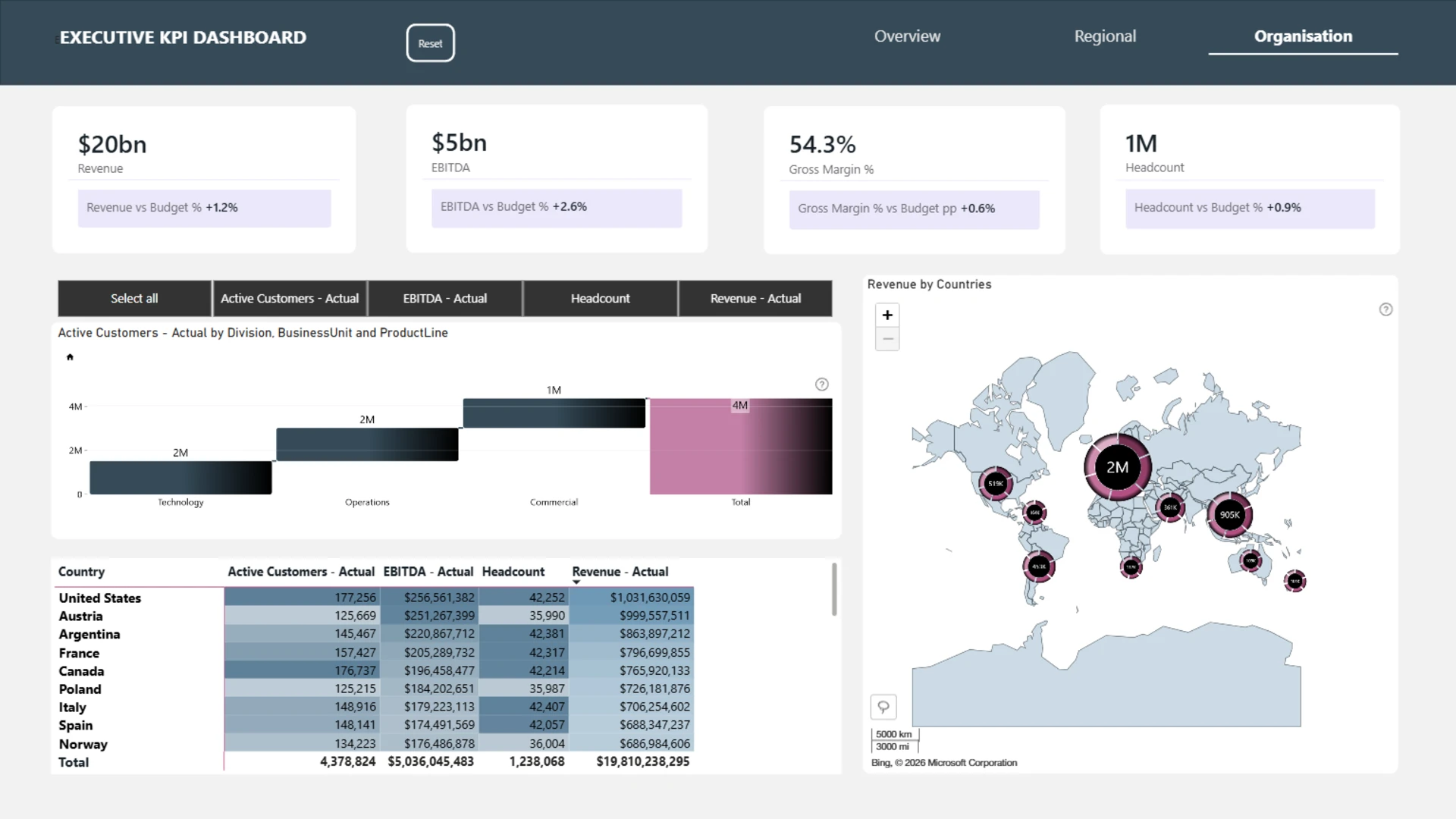
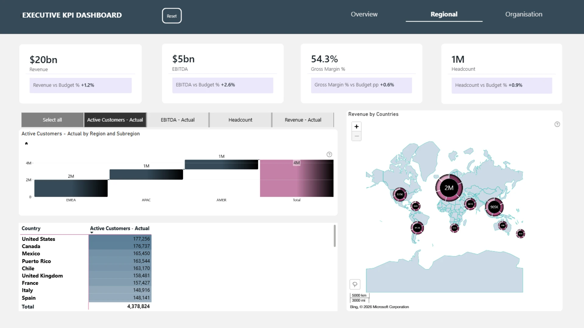
This budget dashboard example shows how Power BI can be used to compare actual business performance against budget across revenue, EBITDA, gross margin, headcount, regions, and business units.
Built as an executive KPI dashboard, the report helps business leaders, finance teams, operations managers, and analysts monitor high-level financial and organizational performance in one interactive view. The report was submitted to the ZoomCharts “4U Reports Challenge” in April 2026, using ZoomCharts Drill Down custom visuals for Power BI.
Users can quickly see whether key metrics are above or below budget and explore performance by region, country, division, business unit, and product line.
What you can analyze
Use this Power BI budget dashboard to track:
- Revenue vs. budget
- EBITDA vs. budget
- Gross margin % vs. budget
- Headcount vs. budget
- Revenue by year, quarter, month, and day
- Revenue by region and subregion
- Revenue by country
- Revenue by division and business unit
- Active customers by region, division, and product line
- Budget variance across key executive KPIs
Report pages
- Overview: monitor top-level executive KPIs, including revenue, EBITDA, headcount, gross margin, and revenue performance over time.
- Regional: compare KPI performance by region, subregion, and country using charts, map visuals, and detailed tables.
- Organisation: analyze revenue, active customers, EBITDA, and headcount by division, business unit, product line, and country.
Interactive features
This report uses ZoomCharts Drill Down custom visuals for Power BI together with executive KPI cards, budget variance indicators, drill-down charts, regional maps, tables, and navigation buttons to make budget analysis easier to explore.
Users can compare actual vs. budget performance, switch between KPI views, drill into regional and organizational results, and reset the dashboard with one click.
Explore this Power BI budget dashboard example to see how interactive reporting can support executive reviews, financial planning, regional performance analysis, and budget tracking.
ZoomCharts visuals used
4U Report Challenges
Participate in data challenges, build and submit reports to get free template downloads.
Join CommunityMobile view allows you to interact with the report. To Download the template please switch to desktop view.
Was this helpful? Thank you for your feedback!
Sorry about that.
How can we improve it?