23181
Invoice Explorer
Invoice Explorer
Report Author: ZoomCharts
23181
Share template with others
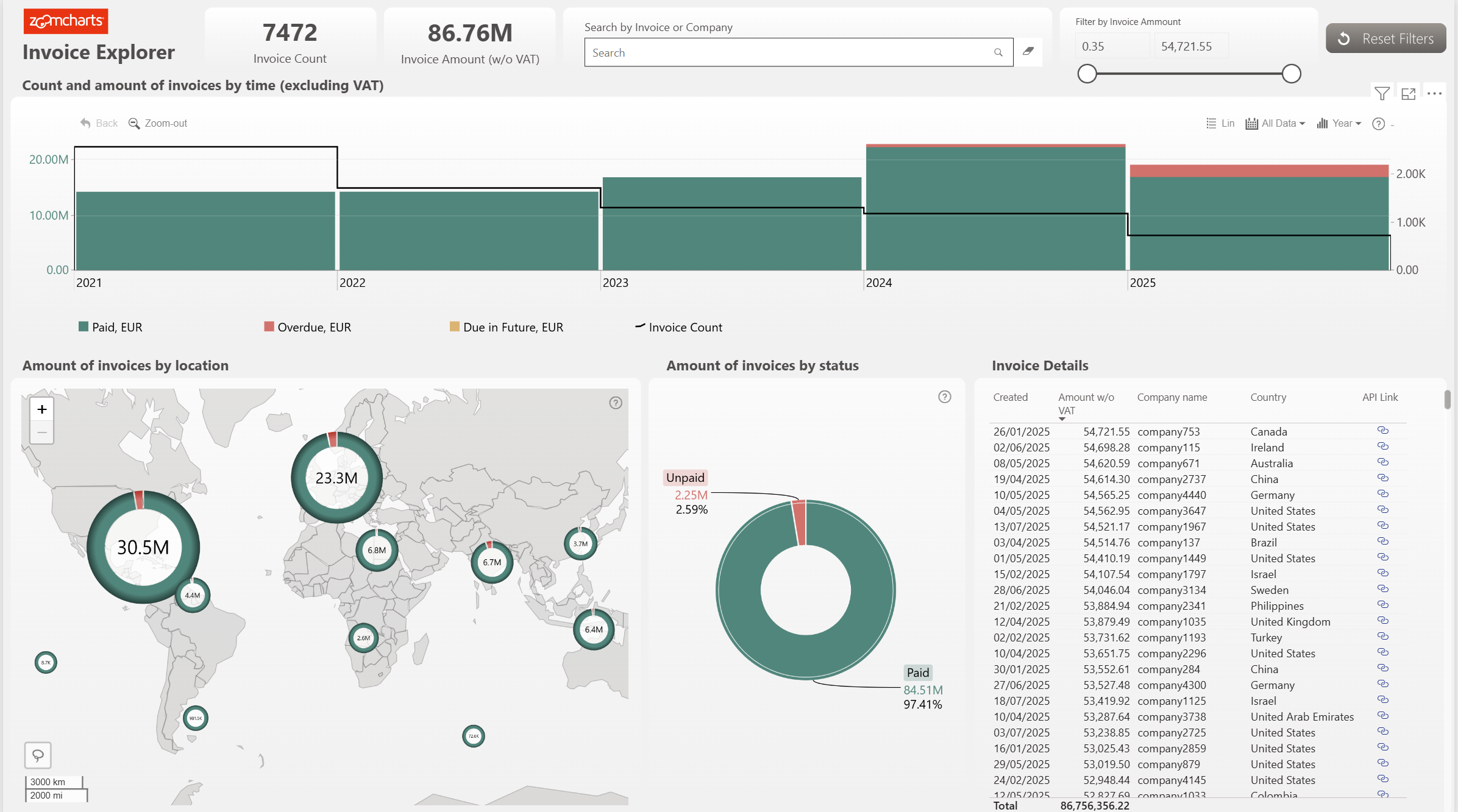
Summary
With this Power BI accounting dashboard, you’ll be able to easily see the total invoice count and identify paid, overdue, and unpaid invoices.
The donut chart acts as a filter for the rest of this Power BI invoice dashboard, making it easy and convenient to sort invoices by their status. The custom map visual shows you the total paid and unpaid invoice amount by their respective location, due to its unique donut chart feature.
Experience how Power BI data driven reports can speed up your invoice analysis process! This Power BI invoice template report supports cross-chart filtering, making all the charts work together. This will enable users to answer any questions on the fly. You can also view your invoice data in a closer detail on a table.
Key Features
- Drill Down Map PRO lets you easily visualize and customize map charts.
- Drill Down Donut PRO lets you create stunning donut charts with up to 9 levels of hierarchy.
- Drill Down Timeline PRO lets you visualize and drill down time-based data using DAX calculated measures.
- Cross-chart filtering.
- Search bar and table to easily find more precise data.
How To Use This Power BI Accounting Dashboard Template
To interact with this Power BI invoice dashboard, simply click any active elements directly on the charts. Download this report to see all the settings, formulas, and calculations. Try it out with your own data and explore the customization options!
Author:ZC
4U Report Challenges
Participate in data challenges, build and submit reports to get free template downloads.
Join CommunityMobile view allows you to interact with the report. To Download the template please switch to desktop view.
Was this helpful? Thank you for your feedback!
Sorry about that.
How can we improve it?