Feb 22, 2023
Filters in Power BI: Everything You Need to Know
Filters in Power BI reports are a game changer when you’re looking to make big decisions with interactive data visualization. Rummaging through static infographics can get frustrating, thus impacting business management. Fortunately, dynamic Power BI reports can pack large amounts of crucial data into a single report. This article looks at one of the most important parts of interactive data analysis – filters in Power BI reports.

Filters in Power BI reports are a game changer when you’re looking to make big decisions with interactive data visualization. Rummaging through static infographics can get frustrating, thus impacting business management. Fortunately, dynamic Power BI reports can pack large amounts of crucial data into a single report. This article looks at one of the most important parts of interactive data analysis – filters in Power BI reports.
What are filters in Power BI
Power BI reports that hold a lot of relevant data are great. But focusing on all the numbers all at once can get confusing for the human brain. Sometimes you don’t need every single metric on display to answer a specific question or find a correlation. That’s where filters in Power BI come in.
How do I apply filters in Power BI?
Filters in Power BI, as the name suggests, filter data according to parameters set by the report user.
Report creators can add a Filters pane to a report with pre-set categories. This Filters pane will appear the same to the user and allows them to filter large categories.

Report creators can give users the option to either check certain categories of interest out of a list or choose a range of numbers. The Power BI report will filter only what the user has selected.
There are three kinds of filters you should remember:
- Report level filters affect all data within the Power BI report. All the components on all pages (if there are multiple within the report) will adjust to reflect that filter.
- Page level filters only affect a certain page of a report. This is useful if you have a report with multiple pages of mutually unrelated data.
- Visual level filters filter data only on a visual basis, without affecting the rest of the report page or the report itself.
What is cross-chart filtering and how can it help data analysis?
Cross-chart filtering in Power BI means that a user can use one visual in the report as a filter for the rest of the components within the report. For example, you can select a slice from the donut chart, and it will apply automatic filters to the other present visuals, revealing only data that’s relevant to that slice.
Within the default Power BI platform slicers perform cross-chart filtering, which makes the data exploration feel more seamless, instead of going back and forth to the Filters pane.
What are slicers in Power BI?
Slicers are visible on the report page itself just like any other report component, and they let users choose how to filter and display the data they want to see. Without going to the Filters pane, users can filter out they data they want to see on-the-go by just using the slicer.
Slicers are a step above the Filters pane, as they are already visible on the report, thereby being more user friendly and accessible to newcomers to the report. However, their drawback is that report creators must take into account the space their slicers will take up. This can mean taking attention away from your nicely made charts and to a selection of tick boxes. You can utilize hidden slicer panels, however, your users will have open those every time they want to filter their data.
How do Drill Down Visuals improve cross-chart filtering?
Drill Down Visuals have in-built cross-chart filtering. This means that when you interact with one Drill Down Visual in a Power BI report, it will automatically affect all the other visuals. For example, you can perform a drill down using Drill Down Donut PRO, and it will filter the rest of the report.
This feature is a huge boost to user-friendliness, as it requires less clicks or focus on any outside boxes. All eyes are on the charts themselves, letting users explore their data in a more hands-on way.
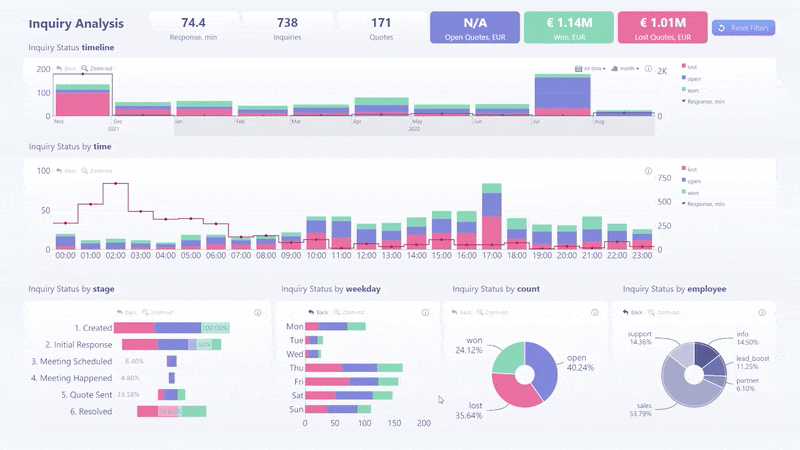
In-built cross-chart filtering use case: Inquiry Analysis report
Our Inquiry Analysis from our gallery of free examples of Power BI reports is a great use case of successfully implemented cross-chart filtering.

This Power BI report uses four of our Drill Down Visuals – Drill Down Timeline PRO (which recently made it as a Microsoft AppSource Editor’s Pick. Read more about this visual in our other blog post!), Drill Down Combo PRO, Drill Down Combo Bar PRO, and Drill Down Donut PRO.
Filter with a simple click
By interacting with one visual, it will immediately affect all the others, revealing data pertaining to what the user has selected.
How does this aid data analysis? Well, if you wanted to find out more about inquiries that you have won, you can start by simply clicking on the pertaining slice on the donut chart labelled ‘Inquiry Status by count’.
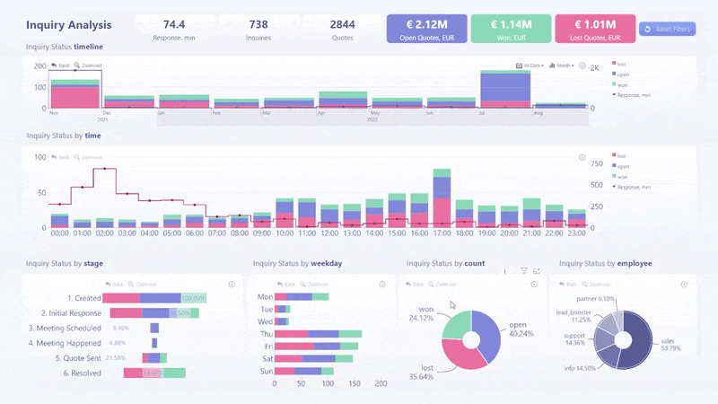
In a seamless animation, the report will adjust to reveal information about which department secures the most won inquiries, when you have received the most won inquiries, and how soon your employees gave a response.
By combining all of these metrics, users can find valuable insights for future inquiry management, and look at their data from any angle using a single report.
Reset button
If you want to get back to the beginning, we always add a reset button to let our users do exactly that. The Reset button will clear all active filters from the respective visual and return it to its initial state. There is also a Reset button for the Power BI report itself, letting you restart your data exploration journey from the beginning.
The Reset button removes any need to fiddle around with slicers or the Filters pane to get back to the initial view of the report.
On-chart interactions
To simplify the data exploration experience even more, all interactions, in addition to the cross-chart filtering feature, take place on the charts themselves. This includes highlights, selections, and the toolbar options. This feature also works on mobile devices, enabling users to analyze their data at any location at any time.
This proves to be a big help during meetings as it streamlines the discussion process. Users can easily separate their talking points i.e., talk about won, open, and lost inquiries separately, or discuss the performance of separate departments or employees.
If you’re feeling curious and want to try out our cross-chart filtering feature for reports pertaining to other types of data and industries, you can do exactly that by visiting our Report Gallery!
Conclusion
Filters in Power BI are a core part of the data exploration process. When it looks like there are countless metrics packed with a report, filters allow users to pick and choose the information they want to focus on. Drill Down Visuals innovate on the default Power BI cross-chart filtering experience with fully on-chart interactions. Without diverting attention to the Filters pane or a slicer box, users can fully immerse themselves into their data.

Want more info like this?
Subscribe to our newsletter and be the first to read our latest articles and expert data visualization tips!