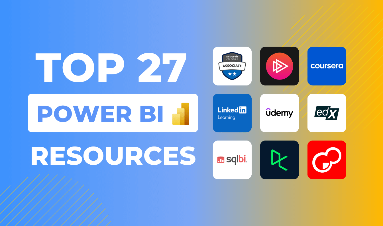
Sep 08, 2025
Best Free Power BI Custom Visuals for Data Analysis in 2025
These are the best free Power BI custom visuals every report creator should try. Find out the main differences between native and AppSource visuals, and learn how to add custom visuals to your report.
These are the best free Power BI custom visuals every report creator should try. Find out the main differences between native and AppSource visuals, and learn how to add custom visuals to your report.
Effective analytics depends on how well data is visualized, and Power BI offers a wide range of built-in visuals to help users present their data clearly. However, for those looking to go beyond the standard options, Microsoft AppSource provides access to many additional custom visuals, including both free and paid solutions.
In this blog post, we focus specifically on the best free custom visuals available for Power BI. Before diving in, we’ll first look at the key differences between built-in (native) visuals and those found on AppSource.
- Native visuals (also called core or built-in visuals) are already included within Power BI. These include standard chart types like bar charts, line charts, maps, KPIs, and pie or donut charts. They are easy to use, well-supported, and require no separate installation.
- AppSource custom visuals are created by third parties or Microsoft and require importing from Microsoft’s AppSource marketplace. These designs can expand your dashboard’s capabilities with specialized and engaging visual types.
Best free Power BI custom visuals from AppSource
Now that we've understood what native visuals are and what are their key capabilities, it's time to turn our attention to the free visuals available on Microsoft AppSource.
In fact, Microsoft has begun adding new built-in visuals directly into Power BI, gradually replacing some AppSource options. While most users rely on native visuals and non-coders typically stick to pre-built ones, some do present limitations, especially in design flexibility. Custom visuals offer greater control over features like hover effects, dynamic filters, real-time animations, and interactive storytelling, surpassing the scope of native visuals.
Beyond these free custom visuals, in AppSource you’ll also find premium solutions like ZoomCharts visuals, which can significantly enhance your reports.
Without further delay, let’s look into the specific features and distinct qualities of these AppSource visuals in greater detail.
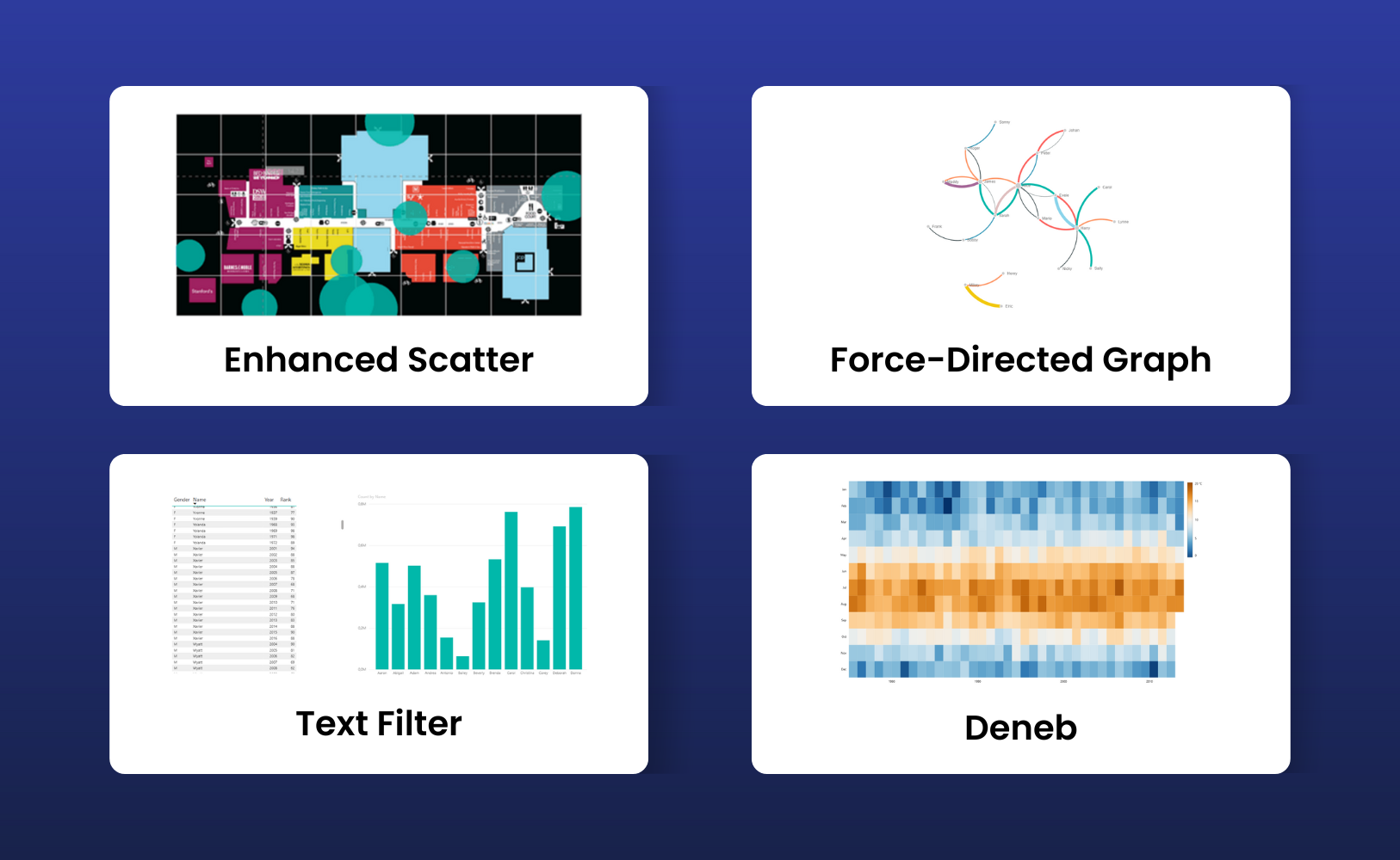
Text filter
Text Filter is a Power BI custom visual that provides a search box that can be added to a report page, where users type in text to filter data. The visual applies a “text contains” filter to a selected field, and other visuals on the same page that depend on this field update based on the search input. An eraser icon is available to clear the text and remove the filter.
This primary purpose is to offer an alternative to traditional slicers or dropdown menus, facilitating the identification of specific values without the need to navigate through extensive lists. Its formatting capabilities are intentionally limited, focusing on fundamental adjustments such as size, background, and borders.
It is important to recognize that the Text Filter visual does not function as a comprehensive slicer; rather, it offers only basic keyword search functionality. Unlike some of Power BI’s more advanced native features, it lacks broader filtering capabilities.
Enhanced Scatter
This Power BI visual, Enhanced Scatter, takes the standard scatter chart to a more professional level. Instead of being limited to basic dots, users can select from a variety of marker shapes, making complex data easier to distinguish and analyze.
One standout capability is the option to layer charts over background images, like maps, diagrams, or floor plans. This adds essential context, you can transform basic reports into visually compelling, business-ready presentations. Enhanced Scatter also offers developer crosshairs, so data points land exactly where intended on the chosen background.
The visual is open source – that gives organizations and developers the flexibility to review or customize the code as needed, ensure transparency and adaptability for unique business requirements.
Deneb
Deneb is a Power BI custom visual created by Daniel Marsh-Patrick and certified by Microsoft. Its distinguishing feature lies in allowing users to craft charts using Vega or Vega-Lite JSON specifications, thereby eliminating the necessity for traditional programming languages such as R, Python, or JavaScript.
All requisite libraries are integrated within the visual itself, ensuring seamless operation across Power BI environments, including the service, report server, and mobile platforms, without the burden of external dependencies.
Visual definitions are processed within Power BI, which can also help with consistent rendering for users. Deneb is open source and released under the MIT License, making its code available for review or modification if needed. Because it is a certified visual, it follows Microsoft’s standards for functionality, security, and performance.
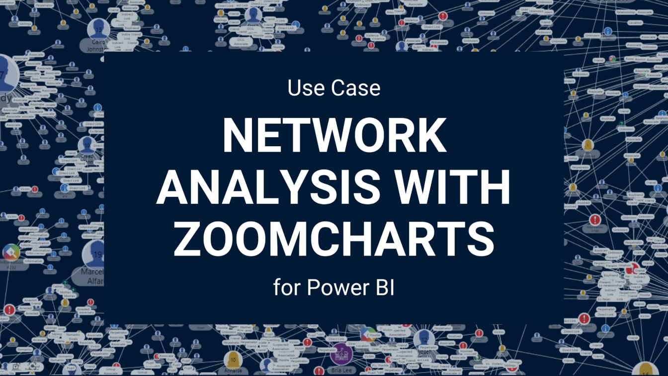
Force-Directed Graph
Force-Directed Graph is a free custom visual, based on a D3 force layout diagram where nodes represent entities and are positioned according to their relationships. The connections between nodes can vary in thickness to indicate the strength of the relationship, and users have the option to drag nodes manually to adjust the layout.
This visual typically requires two dimensions, such as source and target fields, along with an optional measure that defines the weight of connections, but it can also function with more limited input. As an open-source visual, its code is available for review and customization.
While this visual is free and useful for showing basic network relationships, it also comes with certain functional limitations:
- Restricted formatting options
- Scalability issues
- Static layout control
Because of these constraints, many organizations choose more advanced alternatives. One example is Drill Down Graph PRO, which provides extended capabilities and has been adopted by clients who need more flexible and interactive graphing tools.
Beyond the options above, there are also two additional free custom visuals that are worth mentioning.
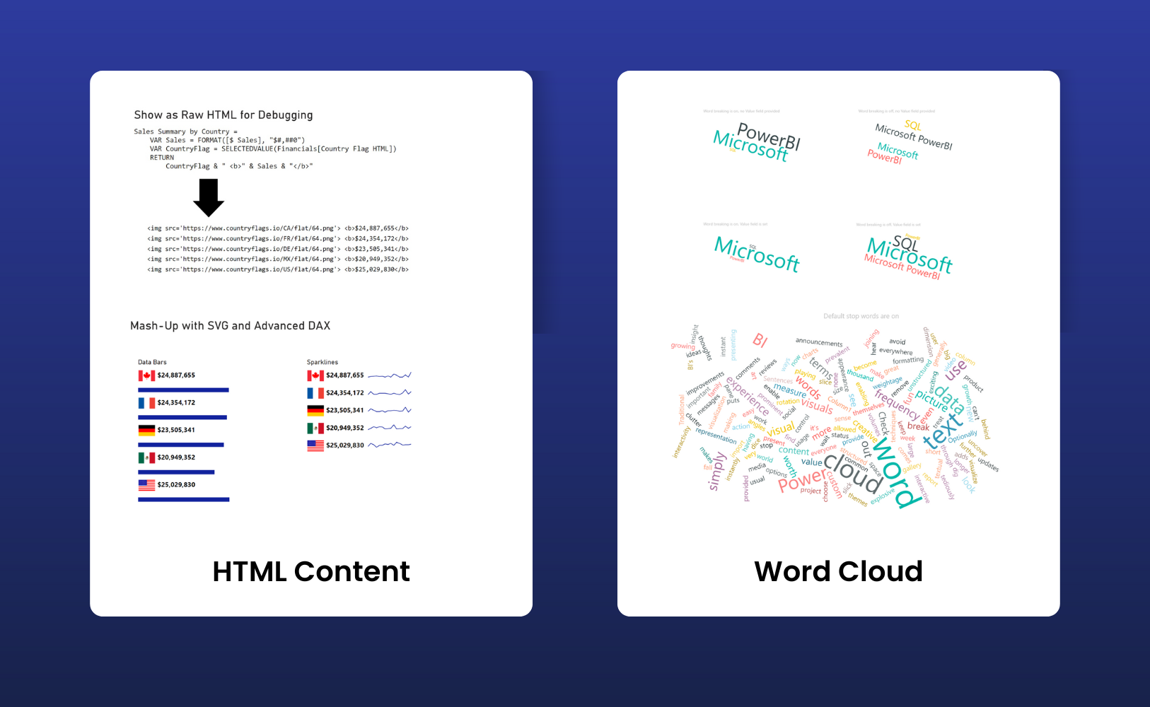
HTML Content
The HTML Content visual allows Power BI reports to display HTML or Markdown content directly within the report canvas, which gives you a lot of flexibility for formatted text, tables, lists, or embedded images. You can generate the content dynamically using DAX measures or source it from fields in your data model. That makes it pretty valuable for contextual notes, custom KPIs with styling, or specific report elements you want to personalize.
Everything you need is built into the visual. There’s no need for extra libraries or external dependencies. It’s open-source under the MIT License, so you can modify or extend it if needed.
Word Cloud
Word Cloud is a visual designed for text analysis. It processes a selected text field and displays words in a layout where the size of each word directly reflects its frequency or significance, depending on your chosen metric. This visual format streamlines the task of identifying key terms within large text datasets.
Typical use cases include exploratory data analysis, survey responses, customer feedback, or product reviews- basically, any context where you’re dealing with unstructured text. By default, common stop words (like “the” or “and”) are filtered out, but the stop word list is fully customizable to match specific analytical needs.
Notable features include configurable font size and rotation, integration with other Power BI visuals for interactive dashboards, a setting to limit the maximum number of displayed words, and straightforward options for color and background formatting.
Certified vs. Not Certified: What’s Free, What’s Paid, and What’s Worth It
Crafting visuals in Power BI can honestly feel kind of confusing. Sure, the native visuals get the job done for basic reporting, but let’s be real, sooner or later, you’ll need visuals that actually stand out or handle more complex needs. That’s where custom visuals start to make a real difference. You’ll find some at no cost, some with Microsoft’s official “certified” label, and the premium ones you’ll need to budget for.
- Certified visuals get a security and reliability check from Microsoft, which is a big deal if you’re working in a corporate setting. Companies want peace of mind, knowing the visuals are secure and stable.
- Non-certified visuals can be innovative and might offer unique features, but they haven’t been through Microsoft’s validation process. For quick internal projects, they’re probably fine, but for any external or big projects, most organizations stick with certified options.
When it comes to free vs. paid visuals - free visuals from AppSource are a solid starting point and can definitely add value where the built-in visuals fall short. But you’ll bump against limits. Maybe you need deeper customization, or you’re working with massive datasets.
Premium visuals, like for example, the ZoomCharts Drill Down PRO, goes well beyond what free visuals offer. It brings highly interactive drill-down capabilities, letting you explore time-series data down to millisecond precision or navigate complex network relationships dynamically.
One standout feature? Cross-chart interactivity. Click on a segment in one chart, and the rest of your visuals update instantly- no extra slicers needed. It’s seamless, efficient, and frankly, a big time saver when you’re presenting insights to stakeholders or clients.
How to Add Custom Visuals to Power BI?
Once you've downloaded the custom visuals you need, the next step is to bring them into your Power BI report. Here's a step-by-step guide to make that happen, based on the Microsoft documentation:
- Open your report in Power BI Desktop (or Power BI Service).
- In the Visualizations pane, locate and click the ellipsis icon.
- Choose "Get more visuals". This opens the Microsoft AppSource marketplace.
- Use the search bar or browse through categories to find the right visual for your data. Microsoft and its partners publish these visuals, and many are free.
- Click "Add" to import the visual into your report. It will then appear among the built-in icons in the Visualizations pane.
- To use the visual, simply select its icon and add it to your canvas. If you want to reuse it in future reports, right-click and choose "Pin to visualization pane" for easy access.
And that’s all it takes! Power BI provides many free and built-in visuals to help turn data into insights. By knowing how to choose and customize the right ones, you can create engaging, interactive reports. Start exploring AppSource and tools like ZoomCharts to make your dashboards stand out and deliver even greater value.
Related content
- Power BI Chart Types: Choosing the Right Visuals for Your Data
- How to Make Power BI Network Charts Step-By-Step
- Tooltips in ZoomCharts Power BI Visuals Explained

Want more info like this?
Subscribe to our newsletter and be the first to read our latest articles and expert data visualization tips!