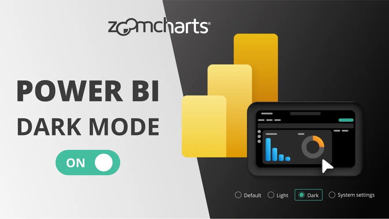
May 07, 2024
What’s New in Drill Down Visuals: May 2024
We have released updates to our TimeSeries, Map, Pie, Donut and Graph visuals that have added various useful features and quality-of-life improvements.
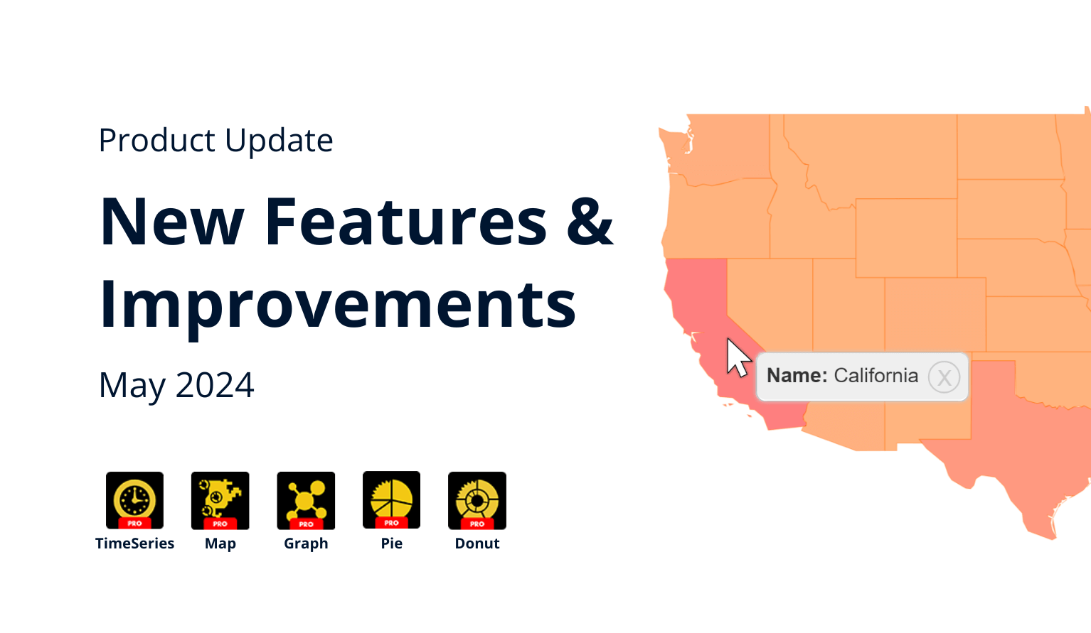
We have released updates to our TimeSeries, Map, Pie, Donut and Graph visuals that have added various useful features and quality-of-life improvements.
Make sure that you have updated your visuals to the latest version! You can check your current version by pressing the “?” (Info) button at the top right corner of the visual, or by right-clicking the visual’s icon in the Visualizations pane and opening the About screen.
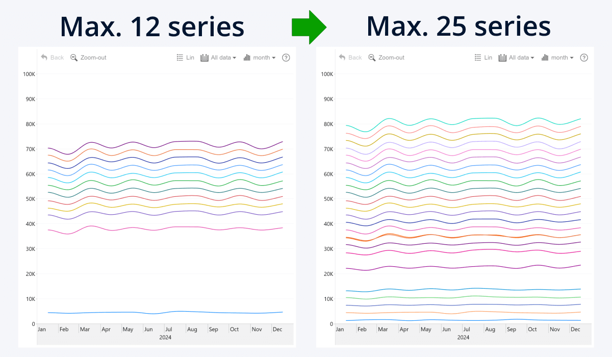
TimeSeries PRO: Now Supports Up To 25 Series
With the v1.11.7.0 update for Drill Down TimeSeries PRO, we have significantly increased the maximum number of series that you can display in the same visual, raising it from 12 to 25. You can now compare more data in the same visual and have more flexibility. This update brings TimeSeries PRO in line with our Combo, Combo Bar, and Timeline visuals.
The Build Visual tab of the Visualizations pane contains separate fields for each series (Series 1-25), and you can add a numeric column to each field to visualize it as a separate series. You can configure the appearance of each series separately in its own Series Configuration section of the Format Visual tab.
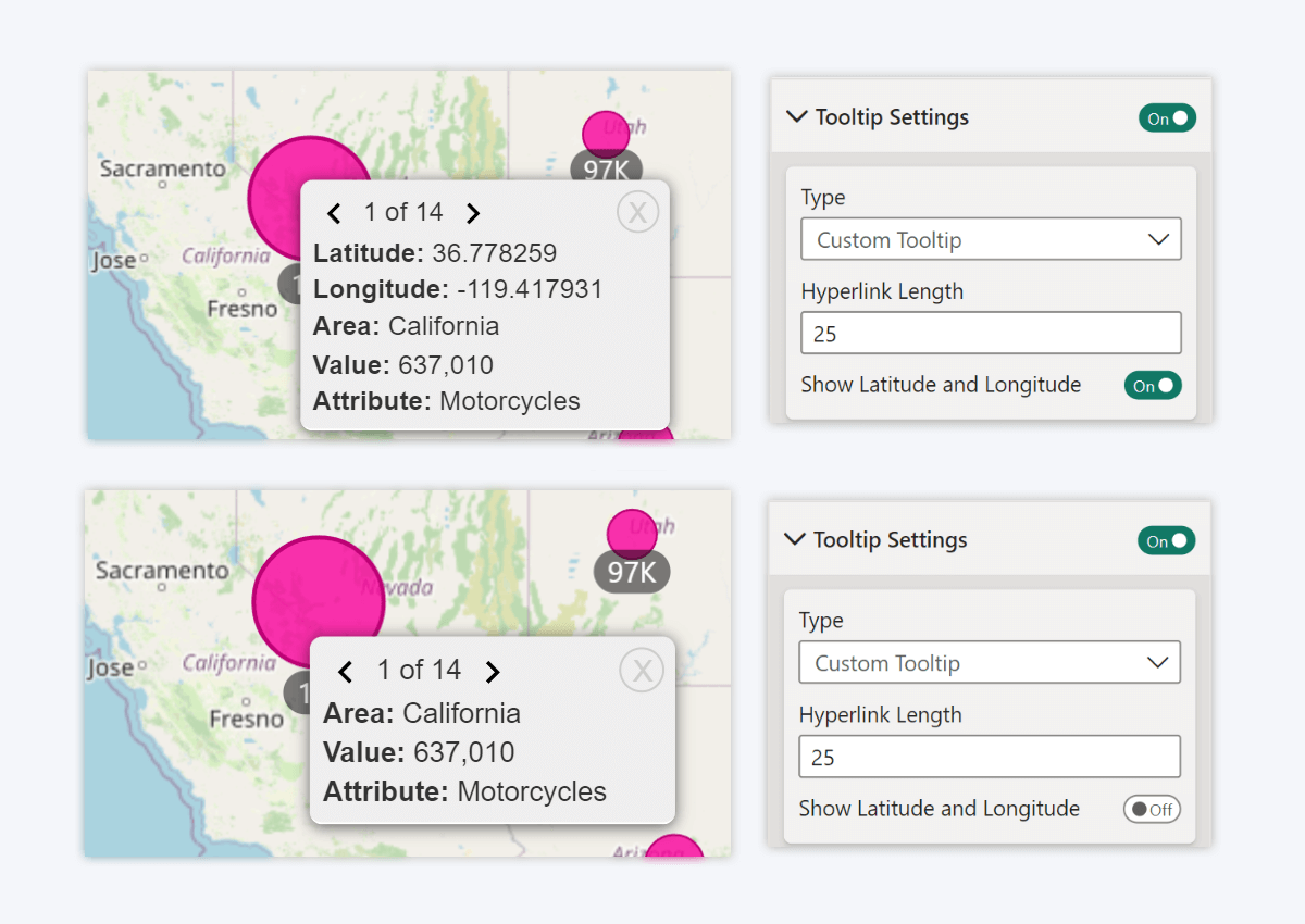
Map PRO: Hide Latitude and Longitude from Tooltips
Tooltips in Drill Down Map PRO are a convenient way to display useful information related to each node. By default, tooltips will show the latitude and longitude values for each node, in addition to columns that you have added to Tooltip Fields. The v1.11.13.0 update for Drill Down Map PRO introduces an option to hide the Latitude and Longitude values from the tooltip.
Head to the Tooltip Settings section of the Format visual tab where you will find the “Show Latitude and Longitude” toggle. By disabling this toggle, you hide the node coordinates and show only Tooltip Fields content in the tooltip. This way, you can simplify your chart and remove data that’s irrelevant to the end user.
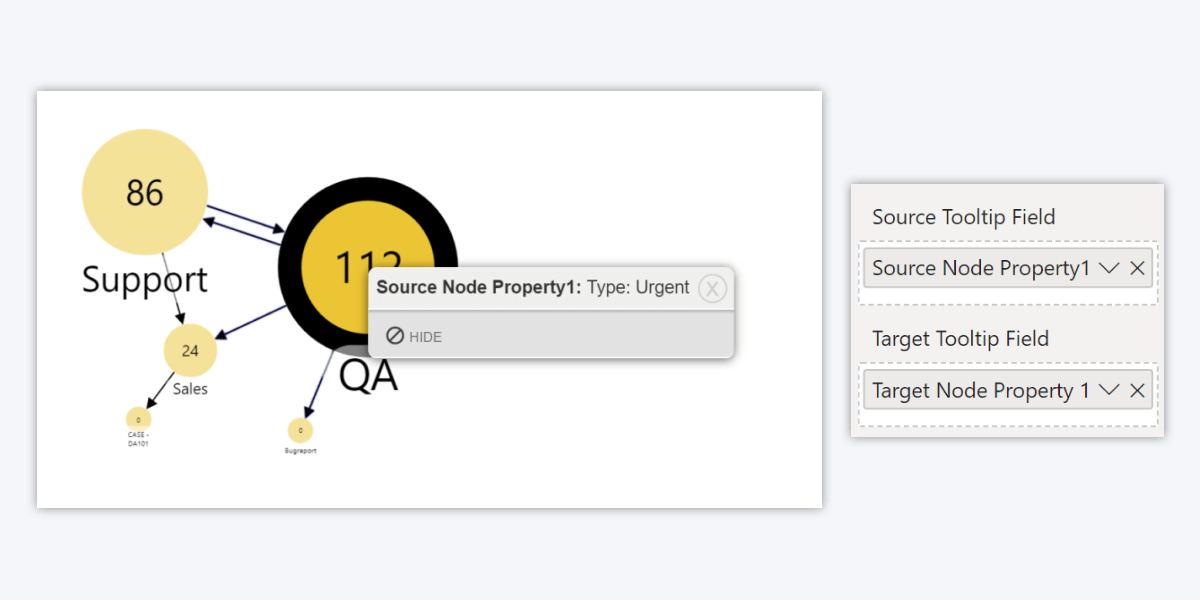
Graph PRO: Separate Tooltip Fields for Source and Target Nodes
As of v1.11.13.0 version of Drill Down Graph PRO, the Tooltip Content field is now replaced by two different fields – Source Tooltip Field and Target Tooltip Field.
Previously, the tooltip content was always applied to the source node. Now, you can choose if the tooltip content is applied to the source node or target node of the data point. You can also use both fields at the same time.
Note: If you are using both fields, and a data point is a source and target node at the same time, then Source Tooltip Field will take priority over Target Tooltip Field.
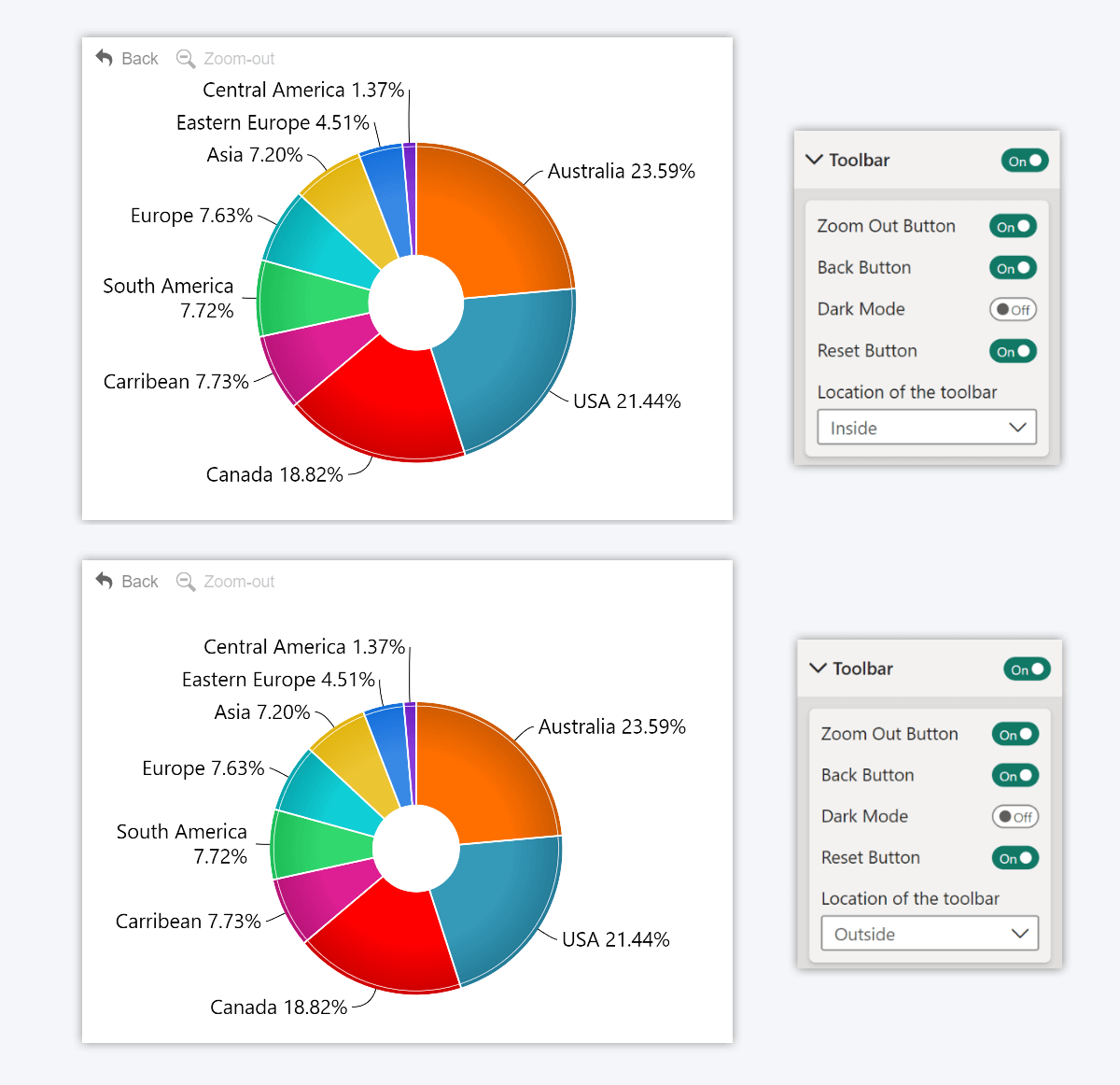
Donut PRO & Pie PRO: Location of the Toolbar
Drill Down Donut PRO v1.11.15.0 and Drill Down Pie PRO v1.11.13.0 introduces a new setting – “Location of the toolbar”. It can be found in the Toolbar section of the Format visual tab and with this setting, you can choose how the toolbar is displayed within the visual’s viewport in relation to the chart.
If you select Inside, the toolbar buttons will overlay the chart, and the chart will use all available space within the viewport. Choosing Outside will create a “safe zone” for the toolbar to ensure that it never overlaps with the chart or other elements, and the chart will be resized to accommodate the toolbar.
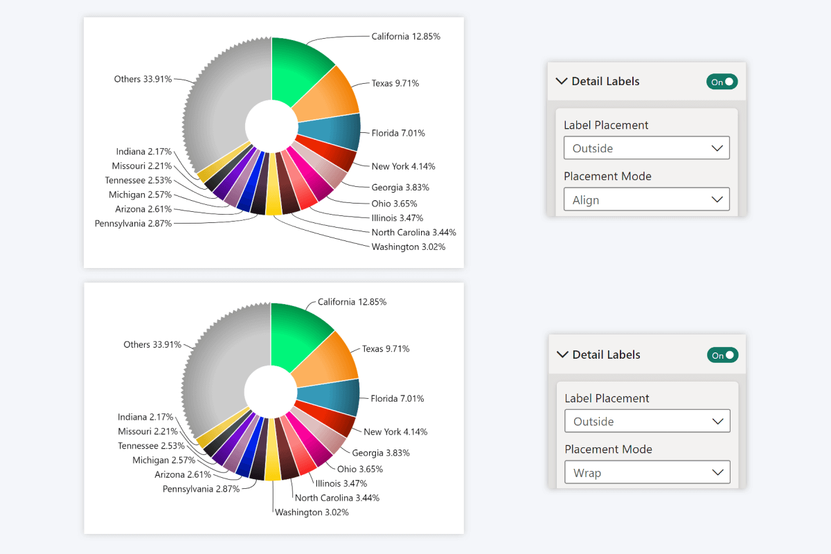
Donut PRO & Pie PRO: Detail Label Placement Mode
The same update also introduces an additional way to customize the detail labels. If your selected detail label placement is Outside, you will now see an additional setting called “Placement Mode”. It affects how the visual determines the location of each label.
The default setting, Align, will align all labels in two vertical columns, just like before. What’s new is the Wrap option, which will spread out the detail labels around the entire chart so that they are closer to their respective slices. This way, you can use the visual’s space more efficiently.
All Visuals: High Resolution Toolbar Icons
Lastly, we want to mention a little quality-of-life improvement that has been added to all our visuals. The toolbar icons have been upgraded from PNG raster images to SVG vectors, which means that they will remain sharp and crystal-clear at any scale.
Get Started with Drill Down Visuals
Be sure to download the latest version of Drill Down Visuals to enjoy these new additions, along with hundreds of other features! With a free trial available, you can see for yourself how these powerful visuals can take your Power BI reports to the next level.

Want more info like this?
Subscribe to our newsletter and be the first to read our latest articles and expert data visualization tips!