Aug 20, 2025
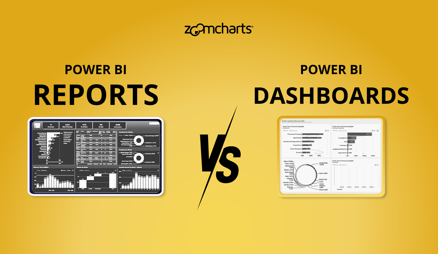
Power BI Dashboard vs Report: What’s the Difference and Which One Should You Use?
Discover how Power BI dashboards and reports differ, the best use cases for each, and how combining them can deliver both quick insights and deep analysis.
Discover how Power BI dashboards and reports differ, the best use cases for each, and how combining them can deliver both quick insights and deep analysis.
When working with Power BI, you’ll often hear about dashboards and reports. At first, they might seem similar, both use charts, visuals, and data to tell a story. But in practice, they serve very different purposes, and knowing how to use each one can make your data analysis far more effective.
Definition
- A Power BI dashboard is a single page view that brings together selected visuals from one or more reports. It is useful for combining information from different reports or subject areas into one place, making it easy to monitor key metrics at a glance.
- A Power BI report is an interactive document that can contain one or multiple pages and may use one or several data sources. Reports are designed for detailed analysis.
In simple terms, a Power BI report is like a detailed information board. You can explore it page by page, apply filters, drill down into categories, and uncover deeper insights. A report can be based on one or multiple data sources, giving you a structured environment for thorough analysis.
A Power BI dashboard, on the other hand, works more like Pinterest. You don’t bring over the entire report, instead, you “pin” specific visuals from different reports that are most important for monitoring. Each pinned visual, or tile, updates automatically with the latest data. The result is a single page that shows the highlights you care about most, without needing to open and navigate through full reports.
Choosing Between Dashboard or Report
Dashboards are the right choice when you need a quick overview of your business. They provide a single page canvas made up of pinned visuals from one or more reports, refreshing automatically to reflect the latest data. This makes them especially useful for quick monitoring, executive summaries, or checking whether business goals are on track. Dashboards are also designed to consolidate information from different data sources into one unified view, which means you can track sales, supply chain, and customer service performance all in the same place.
Reports, on the other hand, are best used when you need to perform detailed, interactive analysis of your data. Unlike dashboards, reports are based on a single dataset and offer exploration tools such as filters, slicers, drill down and drill through, bookmarks, and comments. This makes reports the go-to option for answering complex questions and understanding the deeper context behind trends.
How Reports Work in Practice?
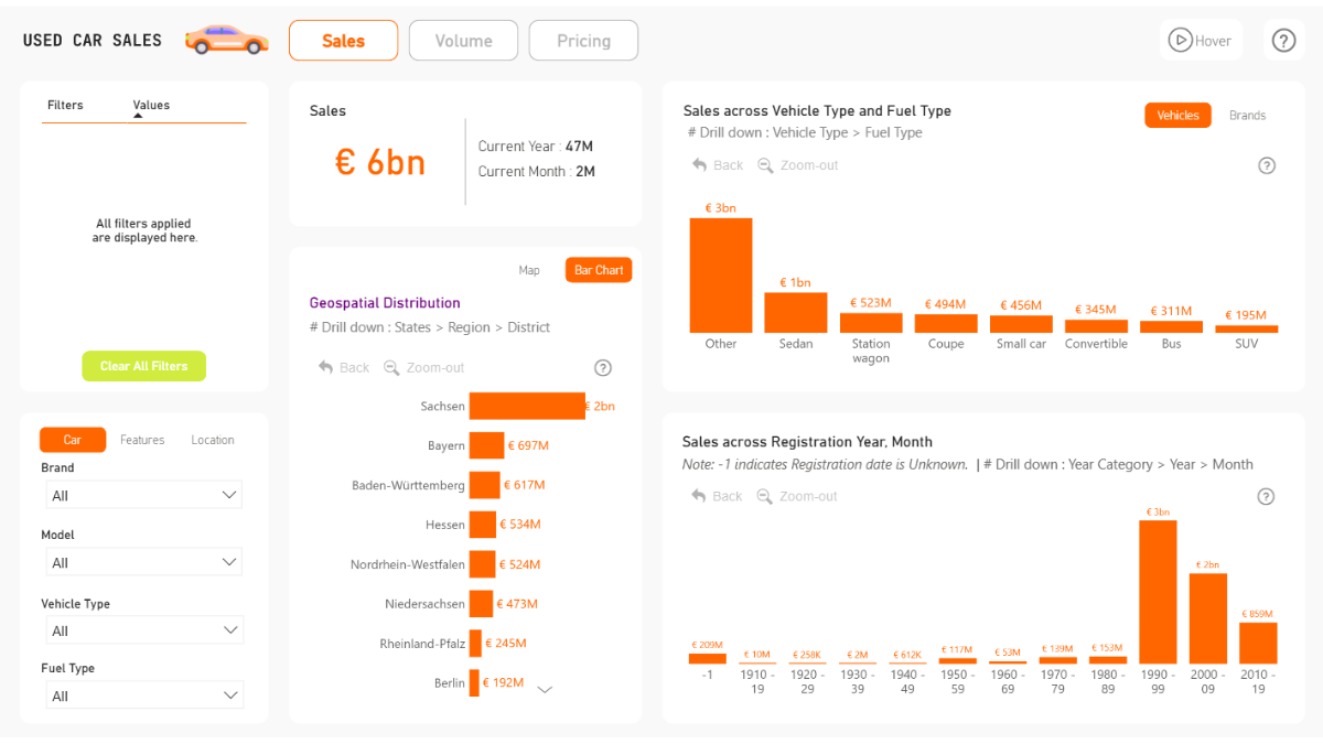
Used Car Sales Analytics Report by Prathamesh Sawant. Try live demo & download PBIX!
Reports are useful when you need to answer why something is happening. For example, a sales report might show a dip in revenue for a specific quarter. By interacting with the visuals, applying filters, and drilling down, you can discover that the drop was concentrated in one product line, in one region, and linked to a supply chain delay. In the image, we can see an interactive sales performance report for used car marketplace featuring several key visualizations.
To begin with, the report includes a geospatial drill-down chart. This visualization enables users to examine sales distribution across various regions, starting at the state level and allowing for detailed exploration down to the district level. Such functionality facilitates a nuanced understanding of regional performance.
It is integrated with an interactive timeline chart, allowing you to move from a year view down to specific month and quickly identify the exact week a sales spike occurred after a new campaign launch.
These visuals (all from Drill Down Visuals suite for Power BI) seamlessly integrate together and cross-filter each another, instantly providing insights from multiple dimensions. You can try live demo or download this report template (and many more) in our Report Gallery!
How Dashboards Work in Practice?
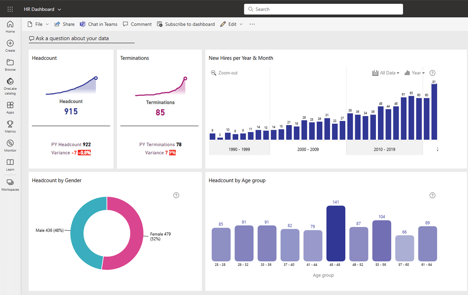
Dashboards in Power BI are designed to give business leaders a clear, instant snapshot of key performance indicators. The main function of a dashboard is quick monitoring: users can see whether targets are being met and spot problems without navigating through detailed analysis.
Consider the HR dashboard as an example. Prominently displayed KPI cards present essential statistics, such as the current number of employees and terminations, alongside year over year comparisons. This enables immediate assessment of workforce stability. Additionally, demographic breakdowns by gender and age group offer clear insights into the workforce’s composition, supporting diversity and inclusion analysis.
Collectively, these components provide a comprehensive, real-time snapshot of HR trends. Furthermore, dashboards incorporate valuable features: users can set alerts for critical metrics, employ natural language queries to explore data, and access dashboards via mobile devices.
Keep in mind that not all custom visuals support pin-to-dashboard feature, and interactions between visuals may be different from how they behave in reports. If you want to use ZoomCharts for your dashboards, our visuals are available as PIN versions that are designed for use in dashboards and support pin-to-dashboard. Read more about them here!
Reports and Dashboards: How Businesses Use Both
In most organizations, dashboards and reports don’t operate as separate entities for business intelligence. A dashboard is like the command center for managers and executives, it’s where you get a birds-eye overview on your entire operations. If you see something unusual, you move into a report to find out why it happened.
A marketing director might start the day by checking a dashboard and noticing that the overall conversion rate from a recent campaign has dropped. By clicking the visual, they open the campaign performance report, where they can identify which channels are underperforming and adjust ads accordingly.
Building Reports and Dashboards
If you are about to create your first Power BI report or dashboard, it’s worth understanding how each one works and when to use it. Even though both use the same data, the way you build and use them is very different.
Reports are all about detailed exploration. You start by connecting to your data; maybe it’s an Excel sheet, a database, or an online source. Before you even think about visuals, you’ll spend time cleaning and shaping the data so it’s accurate and well structured. Then you can create multiple pages, each with charts, tables, and maps that show different views of your information. Filters, slicers, and drill through options let you move from big trends to very specific details. They’re perfect when you need to answer "why" something happened.
Dashboards, on the other hand, are created in the Power BI Service after your report has been published. You can think of a dashboard as a single page control panel that combines the most important visuals from one or more reports. Each visual you "pin" to the dashboard becomes a tile that updates automatically when the underlying data changes. The main goal here is quick insight you glance at the dashboard and instantly see if sales targets are being met, if delivery times are improving, or if there’s an issue that needs immediate action.
Key Takeaways
- Dashboards are single-page overviews that combine data from multiple sources, making them perfect for quick monitoring and decision making.
- Reports are multi page and focus on a single dataset, allowing for detailed analysis and problem solving.
- Used together, they create a complete system for understanding your business. One that helps you not just see what’s happening, but also why, and what to do next.

Want more info like this?
Subscribe to our newsletter and be the first to read our latest articles and expert data visualization tips!