Nov 14, 2025
How to enhance KPI cards in Power BI
In this article you will see various KPI card design ideas. Explore how to embed timeline, column, half-donut and other commonly used charts directly into your KPI cards by using ZoomCharts visuals.
In this article you will see various KPI card design ideas. Explore how to embed timeline, column, half-donut and other commonly used charts directly into your KPI cards by using ZoomCharts visuals.
In this article, we’ll show you great examples of how to incorporate different charts directly into your KPI cards. While key performance indicators can be shown with the dedicated KPI, card or gauge visuals, classic KPI cards alone often aren’t enough anymore. With a bit of creativity in measures and formatting, you can display KPIs in more interesting and efficient ways.
KPI cards with Line and Area indicators
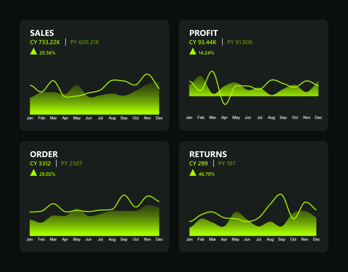
This example showcases how the Combo PRO visual combines line and area elements to compare key yearly metrics side by side. The smooth color transition from vivid green to a softer shade is achieved using the “Gradient to Single Color”option in the chart’s fill settings. Here’s how to set it up:
- Select your base color (e.g., green #8FFF00).
- Enable Gradient Fill.
- Choose “To Single Color” as the gradient type.
- Adjust the opacity or brightness of the ending color to create depth.
Result: a line-and-area chart with a green gradient that makes yearly trends stand out.
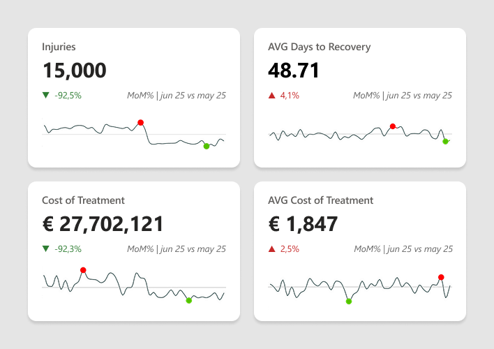
KPI cards with Bar, Column, and Lollipop charts
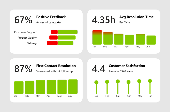
The Positive Feedbacks KPI card has been enhanced with the Drill Down Combo Bar PROvisual, which provides insights into the distribution of negative and positive feedback across departments.
All the other KPI cards are created in combination with the Drill Down Timeline PRO visual, which is highly customizable and allows the creation of a variety of chart types such as columns, lollipop charts, and more.
Avg Resolution Time KPI card
- Combined with timeline chart
- Provides a shortcut to IT support ticket resolution time over time
- Conditional formatting highlights peak times
First Contact Resolution % KPI card
- Created using a columns timeline within the Drill Down Timeline PRO visual
- Shows the context of distribution over the months
Customer Satisfaction Rate KPI card
- Combined with lollipop chart using the Drill Down Timeline PRO visual
- Provides a clear view of feedback distribution over time
Half Donut charts with KPI cards
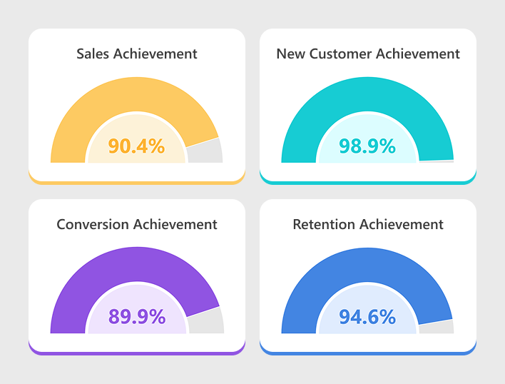
Instead of creating two separate visuals - a KPI card and a donut - you can use just one visual, the Drill Down Donut PRO, which allows you to create both the KPI card and donut in the same chart. Here’s how to create a Half-Donut Gauge with KPI Card:
- Insert the ZoomCharts Drill Down Donut PRO visual into your Power BI report. Assign data fields by dragging a category field such as Region or Product Category into Category, and a KPI measure such as Total Sales or Completion % into Value.
- Open the Format pane → open 'Donut' dropdown to fine-tune the appearance by adjusting the inner radius, label visibility, and segment colors. in Donut settings, enable the half-donut gauge by locating “Enable Gauge” and toggling it ON - this instantly converts the donut into a semicircle.
- To display a KPI inside the donut, use the new KPI Card feature. In the Fields section, assign your numeric measure (for example Achievement % or Total Sales) to KPI Value, also you can add text field such as Sales Achievement or Goal Reached to KPI Label. The KPI Value shows the number, while the KPI Label appears below or beside it.
- Finally, open Format pane → KPI Card to style the display: set alignment to center, adjust font size and weight, choose text color, add an optional background, and format the value with “%” or decimals as needed.
Result: a sleek half-donut gauge with a KPI value and descriptive label neatly centered inside.
KPI cards with Thresholds and Benchmarks
In this KPI card example, you can see how combining the KPI card with the Drill Down Timeline PRO visual enhances the chart with thresholds and min/max point benchmarks, providing a quick snapshot of the highest and lowest values on the line chart. Using this simple approach to enhance your KPI cards, you can streamline report reviews and more easily identify critical peaks.
You can also apply conditional formatting, color indicators, or data labels to highlight performance changes and make key insights stand out even more.
Benefits of including charts in KPI cards
- Save space in the report – KPI cards condense key metrics into compact tiles, freeing up more space for detailed charts, tables and timelines on the same page.
- Simplify performance tracking – They bring the most important numbers (targets, actuals, variance) into one place, making it easier to quickly understand how performance is evolving without digging through multiple visuals.
- Highlight progress and status – With colors, icons and small trend indicators, KPI cards clearly show whether performance is improving, declining or on track, helping users spot progress at a glance.
Want to experiment with KPI card designs in Power BI? Get a ZoomCharts Visuals Developer License, which allows you to use the full ZoomCharts visuals bundle without limits in Power BI Desktop. Explore visual appearance, design, and features to create powerful, insight-packed reports!
FAQ
What are KPI cards in Power BI?
KPI cards in Power BI are visual elements that display key performance indicators: single, focused metrics such as revenue, conversion rate, or customer satisfaction. They help users quickly assess performance against set targets or benchmarks.
How to create a card in Power BI?
To create a KPI card, open Power BI Desktop, go to the Visualizations pane, and select either the Card or KPI visual. Drag your desired measure into the Fields section. You can then adjust formatting, titles, and colors in the Format pane.
How do you change the color of KPI cards in Power BI?
You can change colors by selecting the visual → Format pane → Data colors or KPI indicators. In ZoomCharts visuals, you can also use Conditional Formatting or Gradient Fill to color-code performance values (for instance, green for growth, red for decline).
How do I populate a KPI in Power BI?
To populate a KPI visual, drag your main measure (e.g., Actual Sales) into the Indicator field, your comparison metric (e.g., Sales Target) into Target goals, and a date or time field into the Trend axis.
Can I use a slicer for multiple KPIs in Power BI?
Yes. You can apply a single slicer to control multiple KPI visuals by connecting them to the same dataset or related fields. This way, selecting a value (e.g., region, department, or time period) automatically filters all KPI visuals on the page.
Related content

Want more info like this?
Subscribe to our newsletter and be the first to read our latest articles and expert data visualization tips!