Jul 15, 2025
July 2025 Update: Tooltip Fields for Map Shapes
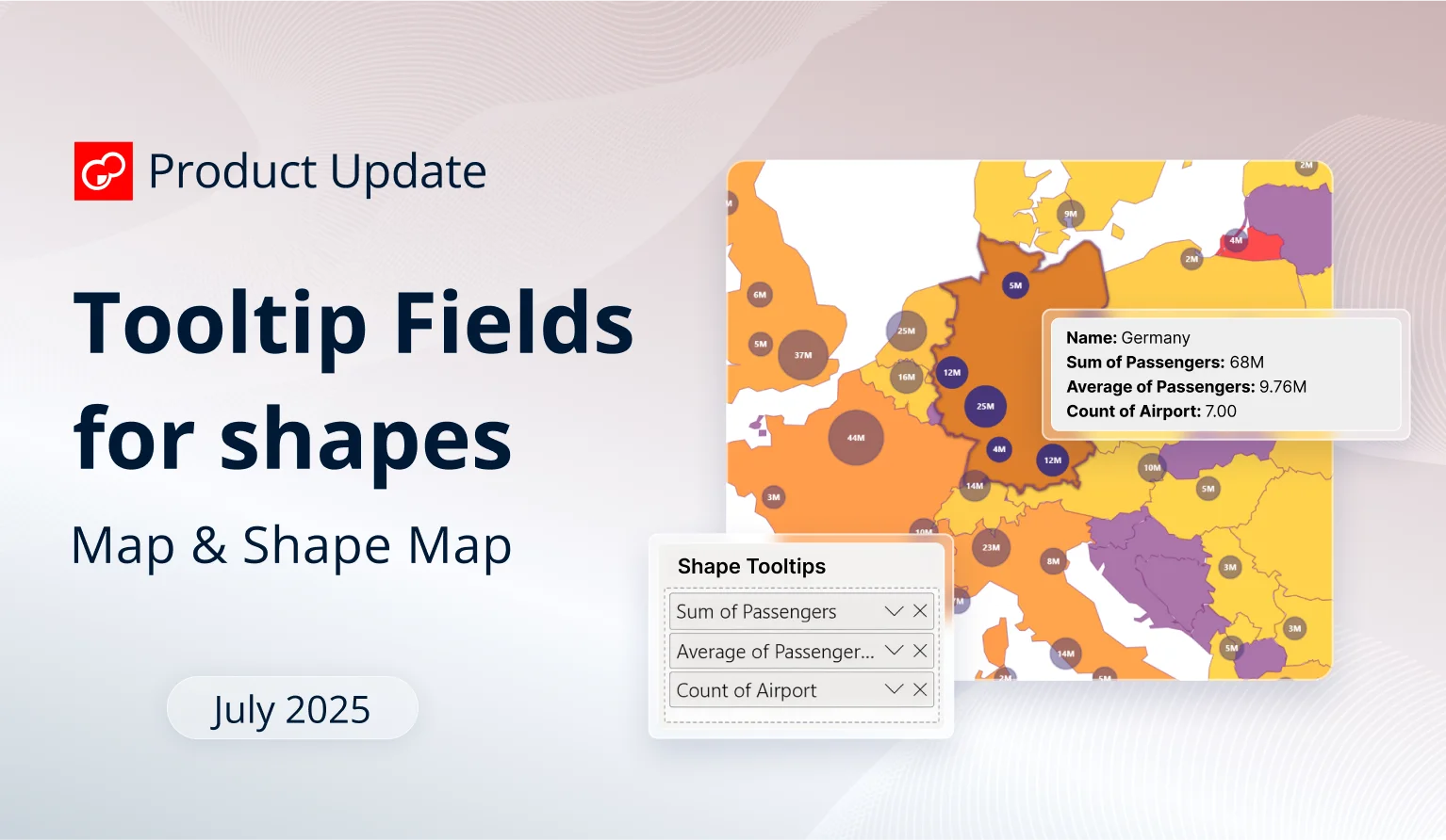
The latest ZoomCharts update brings a new field to Map and Shape Map visuals, which allows you to display columns or measures in shape tooltips for additional insights.
The latest ZoomCharts update brings a new field to Map and Shape Map visuals, which allows you to display columns or measures in shape tooltips for additional insights.
While our main focus for the past months has been the launch of two new visuals – the recently released Drill Down Line PRO, and a new visual which is coming soon (stay tuned!), we’ve also made continuous improvements to our existing line-up.
Most of it has been various bugfixes (for example, we’ve resolved the issue that prevented applying different node outline types for Graph and Scatter). We also implemented support for Power BI Modern visual tooltips, and done other under-the-hood improvements. Let’s go through the highlights of the most recent ZoomCharts release!
Your visuals should update automatically from AppSource. If your visuals have not received the updates automatically, read this documentation article that explains the manual update process.
Map, Shape Map: New Field for 'Shape Tooltip'
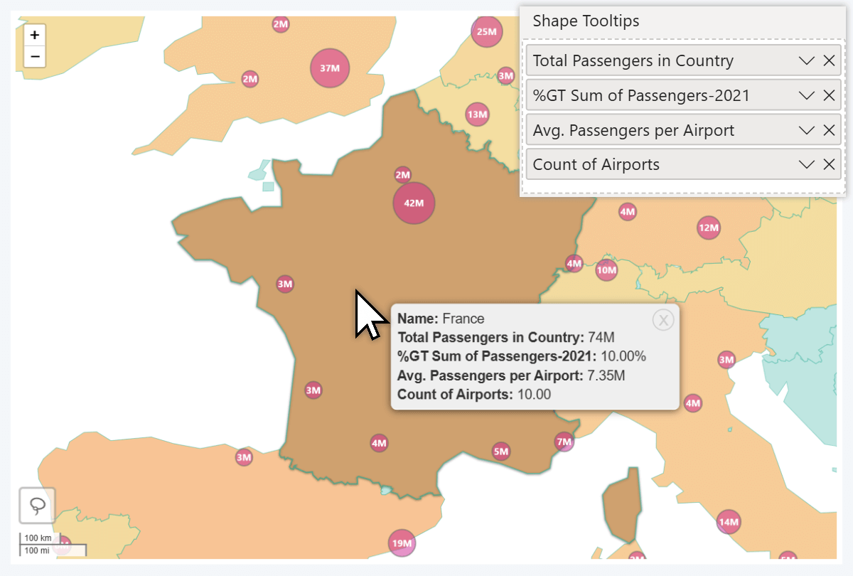
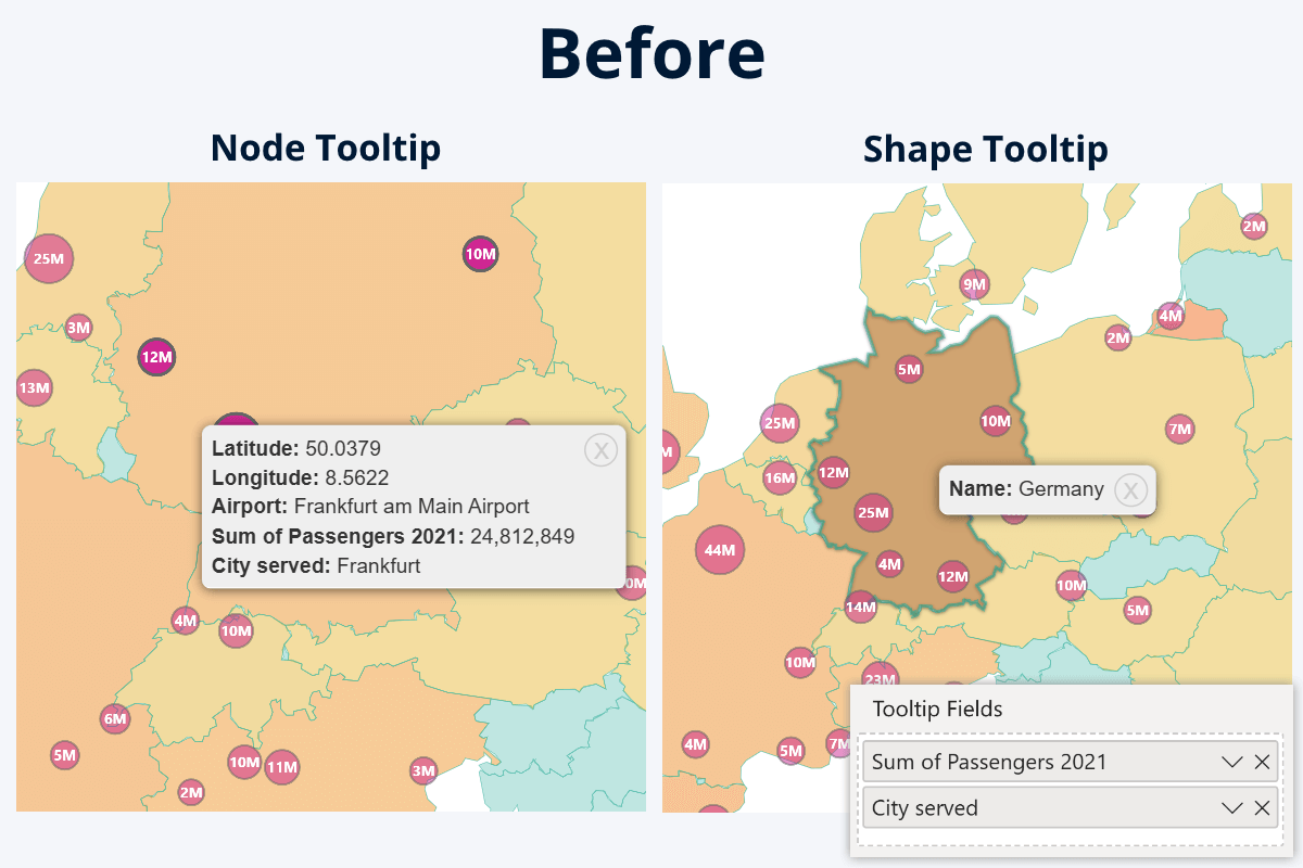
The latest update to our Map and Shape Map visuals have replaced the old Tooltip Fields with two new fields – Node Tooltips and Shape Tooltips. With this change, you can display additional insights to the user in the tooltip when they right-click on a shape – previously, Tooltip Fields would only apply to node tooltips and not shapes.
Why it matters: In both of our Power BI map visuals, you can enable up to 10 different shape layers: country/state borders, custom Lasso Tool shapes, or external KML/GeoJSON files (only in Map). They can be used to visually distinguish multiple regions, and act as a convenient way to select all data within a region with just a click.
Previously, when you added columns or measures to Tooltip Fields, that data would only display when right-clicking directly on a node. The shape tooltip would not be affected and show just the shape’s name.
Now, with the two separate fields, you can control what is displayed in node tooltip, and what is displayed in shape tooltip.
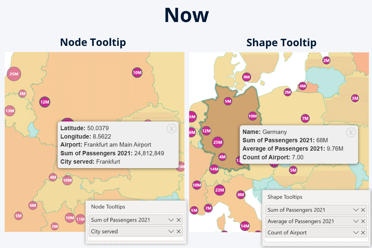
If you wish, you can use different columns or measures to display different insights for each. Alternatively, you can add the same column or measure to both fields, in which case the node tooltip will show the individual value for the row, but the shape tooltip will show aggregated value of all nodes within that shape. Some use cases for shape tooltip fields:
- Sum: show the total revenue of all retail locations in a country.
- Average: average income, user spending, rating, or age in the region.
- Count: show how many nodes (retail locations, users, traffic reports etc.) are within the region.
- Minimum/maximum: highlight the best-performing retail location in the country.


 Documentation: Map PRO, Shape Map PRO, Map PIN
- Node Tooltips
- Shape Tooltips
All Visuals: Vector Icons in 'Visualizations' Pane
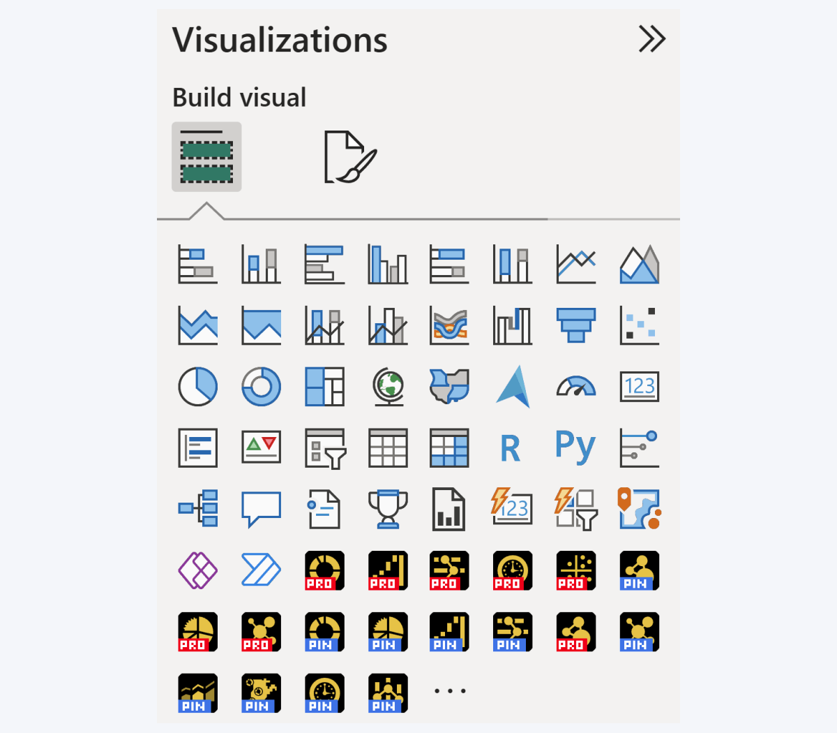
Here’s a nice-to-have quality improvement to all our visuals – we have upgraded the product icons from raster PNGs to vector SVGs. Now, the icons will look sharp and crystal-clear on any screen size and DPI setting. Note the product version label font, which appears ‘blocky’ – that is an intentional design choice to ensure readability at any zoom level.
Get Started with ZoomCharts
Be sure to download the latest version of ZoomCharts Visuals to enjoy these new additions, along with hundreds of other features! With a free trial available, you can see for yourself how these powerful visuals can take your Power BI reports to the next level.

Want more info like this?
Subscribe to our newsletter and be the first to read our latest articles and expert data visualization tips!