Most Power BI dashboards are built correctly and still fail. The data is connected, the visuals are placed, the slicers are configured. Then the stakeholder opens the report, clicks through twice, and asks for an Excel export instead.
The problem is almost never the data. It is that the dashboard was designed to display information rather than to enable exploration. A truly interactive Power BI dashboard is one where users follow their own questions by clicking directly on visuals. The charts, maps, and donut segments become the navigation layer, not a filter panel they have to configure before they can see anything useful.
This guide covers every step of building one: from data connection and DAX measures through visual selection, cross-chart filtering, and conditional formatting to publishing. It also covers the design principles that separate dashboards users adopt from dashboards users abandon. Technical correctness alone is not enough.
What Is an Interactive Power BI Dashboard?
An interactive Power BI dashboard is a report where users explore data by clicking directly on visual elements. Clicking a bar, map region, or donut segment instantly filters every other visual on the page to match. No slicer adjustment. No page navigation. No configuration step before the answer appears.
This is fundamentally different from a standard dashboard with slicers. Slicers require users to know what they are looking for before they start. Interactive dashboards let users discover what they are looking for by exploring.
Three Mechanisms That Create Interactivity
Most Power BI tutorials focus on slicers. Genuinely interactive dashboards rely on three additional mechanisms that most guides skip.
How to Build an Interactive Power BI Dashboard: 7 Steps
These seven steps take you from a blank Power BI Desktop file to a published interactive dashboard. Each one includes the interactivity consideration that most step-by-step guides omit.
Connect Your Data
500+ connectors, free in Power BI Desktop
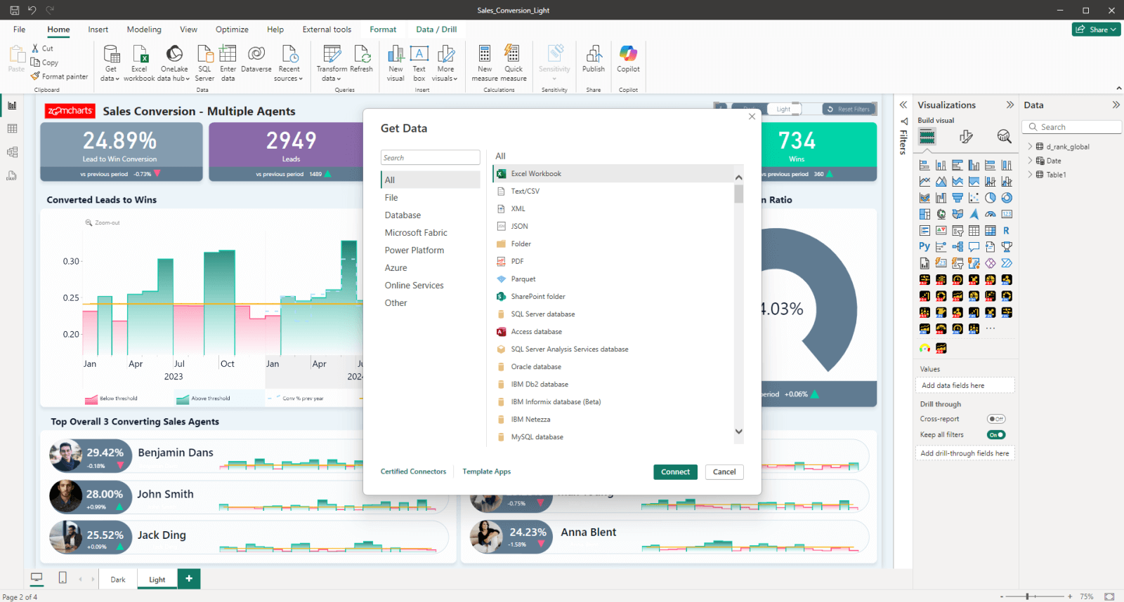
Open Power BI Desktop and click Get Data in the Home ribbon. Power BI supports Excel, SQL Server, Azure, Salesforce, Google Analytics, SharePoint, REST APIs and hundreds more via connectors. Select your source, choose the tables you need, and click Transform Data to open Power Query where you can clean, filter, and reshape before loading.
Cross-chart filtering works across tables with defined relationships. If your data lives in multiple tables, plan your relationships before loading. In particular, make sure date fields are recognized as Date or DateTime type, not text. This is what enables drill-down hierarchies in time-based visuals later.
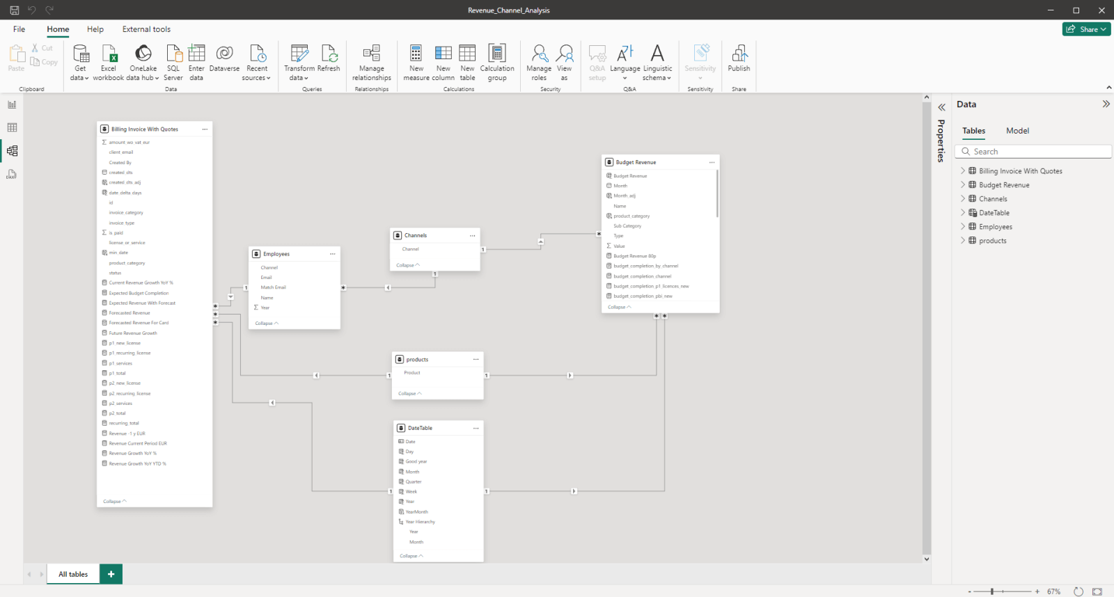
Build the Data Model
Define relationships, hierarchies, and DAX measures
Switch to Model View and define relationships between your tables by dragging fields to connect them. This is what allows clicking a visual in one part of your data model to filter visuals in another.
Cleaning your data first: Transform Data
Before building relationships, open Transform Data (Power Query) to clean your tables. Common steps: rename columns to consistent names across tables so relationships are detected automatically, remove blank rows and null values in key join columns, change data types so dates are Date or DateTime rather than text, and split or merge columns where the raw data is not analysis-ready. Clean data at this stage prevents relationship errors and incorrect DAX measures later.
Relationship types and when to use each
By default, a relationship filters in one direction only: from the "one" side to the "many" side. A Product filter flows into Sales but not the reverse. If you need filters to flow both ways, enable Bidirectional in the relationship properties. Use it only when necessary. Bidirectional filtering can slow performance and create ambiguous filter paths in complex models.
Create your core DAX measures in Data View before touching the report canvas. Build measures for your primary KPIs first. If you are new to DAX, our guide to 12 essential DAX formulas covers the calculations every report creator uses daily.
Build hierarchies into your category and date fields now. A date hierarchy (Year, Quarter, Month, Week) enables drill-down in timeline visuals. A category hierarchy (Category, Sub-Category, Product) enables drill-down in bar charts. Without these field hierarchies defined upfront, drill-down has nothing to navigate into.
Design the Dashboard Layout
Visual hierarchy that answers the primary question in 3 seconds
Before placing a single visual, sketch your layout. The most important information should be the largest and highest. Every dashboard has a primary question: "is the business on track?", "where is margin being lost?", "which region is underperforming?", and users should be able to answer it within three seconds of opening the report without clicking anything.
This is the Inspiring principle from the 4U Reports framework. A dashboard that earns attention before the user clicks anything will get used. A dashboard that requires configuration before it makes sense will not.
Limit to six visuals per page on the summary view. Everything else belongs on a second page for detailed analysis. A summary page with more than six visuals signals to users that they are expected to do the organizing work themselves, and they will not. For a detailed look at the most common layout and design errors, read our guide on the Top 5 Power BI Report Design Mistakes You Should Avoid.
Choose and Configure Your Visuals
Match every visual to a specific question, then add drill-down
Every visual on the dashboard should answer one specific question. If you cannot state in a single sentence what question a visual answers, it should not be on the page. This is the selection filter that keeps dashboards focused and prevents the visual overload that drives users away.
| Question | Visual | Drill-down levels |
|---|---|---|
| How is this metric trending? | Timeline PRO | Year to month to day |
| Which category drives the most? | Combo Bar PRO | Category to sub-category |
| What is the proportional split? | Donut PRO | Segment to sub-segment |
| Where is this happening geographically? | Map PRO | Region to country to city |
| Do two metrics correlate? | Scatter PRO | Click to isolate data point |
| How do values build up or break down? | Waterfall PRO | Click bar to see components |
How to enable drill-down
For native Power BI visuals: add multiple fields to the Axis or Category well in order from highest to lowest level (for example: Year, Quarter, Month). Then click the drill-down arrow icon in the visual header to activate it. Users can then click data points to go deeper level by level.
See it in action
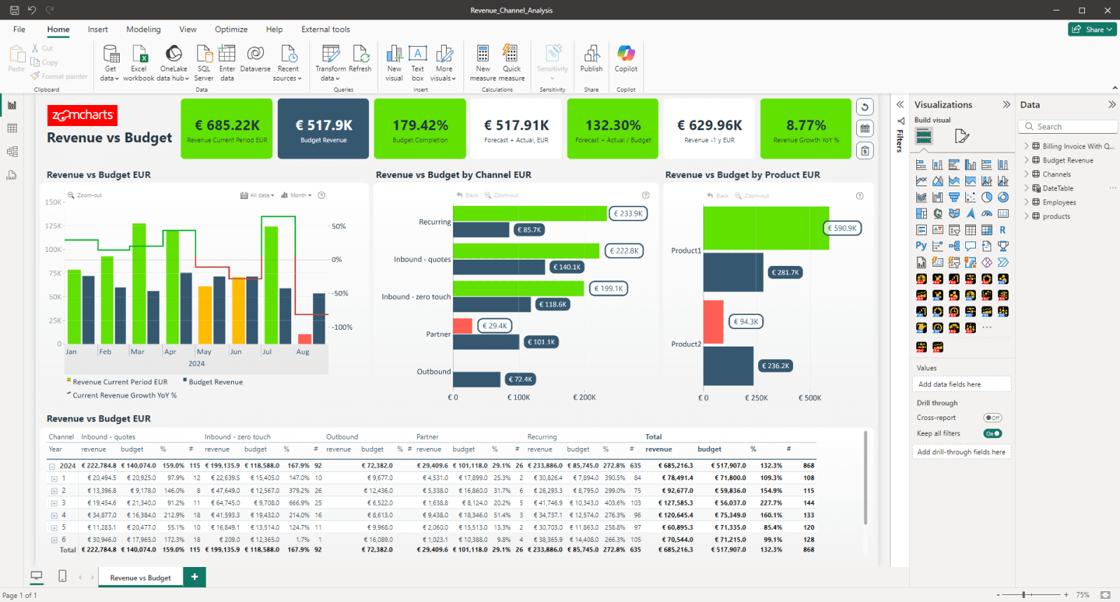
The video below shows cross-chart filtering and multi-level drill-down working together in a real Power BI report. Notice how clicking a segment in one visual instantly refocuses all other visuals, and how drilling into a timeline narrows the view without losing any other active filters.
Configure Edit Interactions
Go to the Format tab and click Edit Interactions. Select each visual and configure how every other visual responds when it is clicked: Filter (shows only matching data), Highlight (dims non-matching data), or None (unaffected). Set your KPI cards to None so they always show overall totals regardless of what the user has clicked. This is the Intuitive principle from the 4U Reports framework: users should always have a reference point.
Drill-Through: Deep Dives Without Extra Pages
On-demand detail pages that appear only when a user asks for them
Drill-through is different from drill-down. Where drill-down reveals the next level inside the same visual, drill-through takes the user to a dedicated detail page that is pre-filtered to the data point they right-clicked. It is perfect for situations where the detail view requires different visuals. For example, a summary page showing sales by region, with a drill-through page showing every individual order in the selected region.
How to set up drill-through
- Create a new report page and name it by the question it answers, for example "Order Detail" or "Agent Performance."
- On that page, find the Drill through section in the Visualizations pane (bottom right of the Fields area).
- Drag the field you want to drill through on (for example
RegionorProduct Category) into the Drill through well. - On your summary page, users can now right-click any data point that contains that field and select Drill through from the context menu. The detail page opens pre-filtered to that value.
- Power BI automatically adds a back button to the detail page so users can return to the summary.
Use drill-down (via ZoomCharts visuals) when the detail is a more granular version of the same metric: going from year to quarter to month in the same chart. Use drill-through when the detail requires completely different visuals: going from a sales summary to a table of individual transactions, for example. Drill-down is faster and keeps context; drill-through is better for truly different views.
Tooltip pages: detail on hover
Report page tooltips let you build a rich, custom tooltip that appears when a user hovers over a data point, replacing the default tooltip with a mini-report containing multiple visuals, KPI cards, or tables. This is one of the most underused features in Power BI and one of the most effective for keeping dashboards clean while still providing depth.
- Create a new report page and name it "Tooltip: [topic]" to keep it organized.
- In the Page information section of the Format pane for that page, toggle Allow use as tooltip to On.
- Set the page size to Tooltip in the Canvas settings (320 x 240px is a good starting size).
- Add whatever visuals you want on the tooltip page: KPI cards, a small table, a sparkline. They will all respond to the hover context automatically.
- On your main report page, select the visual you want to use this tooltip on. In its Format pane, find Tooltip and set the Type to Report page, then select your tooltip page by name.
A tooltip page that answers "why is this bar this height?" is more valuable than one that repeats the number already on screen. Use the tooltip to show the breakdown behind a total. For example, hovering over a monthly sales bar could show a small table of the top 5 products that month, or a KPI card showing how that month compares to the same month last year.
Apply Conditional Formatting
Color as signal, not decoration
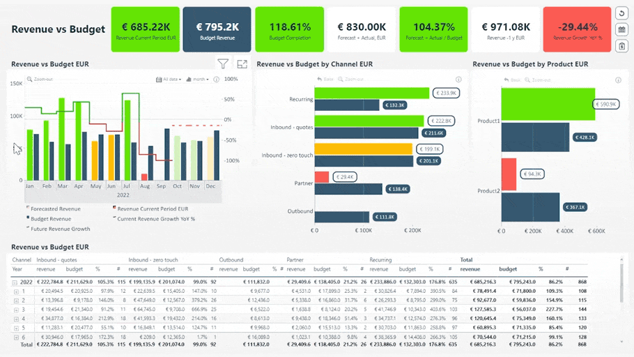
Conditional formatting is what makes insights visible before the user reads a single number. A KPI card that turns red when a metric falls below target communicates instantly. A bar chart where the highest bar is automatically highlighted draws the eye before the user reads a label.
Use a consistent three-color system throughout the dashboard. Pick one color for positive variance, one for negative, one for neutral, and apply these same colors in every visual. If green means "above target" in the KPI card, it should mean "above target" in the bar chart too. Inconsistent color encoding forces users to re-learn the legend on every visual.
- In ZoomCharts visuals, open the Format pane, navigate to Series settings, and set colors per series or apply field-based rules
- For native KPI cards, use Format pane and set callout value color rules based on measure thresholds
- For tables, apply background color rules to cells using your positive/negative/neutral system
- Never use color purely for visual interest. Every color on the page should carry meaning the user can rely on
Define your color system as DAX measures rather than hardcoded hex values. For example, create a Status Color measure that returns "#0f6e56" when above target and "#a32d2d" when below. Bind this measure to the conditional formatting rule. This way, if your target changes, the colors update automatically across every visual.
Publish and Share
From Desktop to your team in three clicks
Save your .pbix file, then click Publish in the Home ribbon. Sign in with your Power BI account and select the destination workspace in Power BI Service. Once published, open the report in a browser and verify that all cross-chart filtering and drill-down behaviors work correctly outside of Desktop.
Share the report URL directly with your team rather than pinning visuals to a Power BI dashboard. Pinned dashboard tiles lose their cross-chart filtering behavior. They become static snapshots. For the full interactive experience, share the report link or distribute it via a Power BI App in your workspace.
In Power BI, a report is built in Desktop and supports full interactivity including drill-down, cross-filtering, and custom visuals. A dashboard is created in Power BI Service by pinning tiles from reports onto a single canvas. Dashboards have less interactivity. For the experience described in this guide, always share the report directly.
The Design Framework Behind Dashboards People Actually Use
Building a technically correct interactive dashboard is the first challenge. Getting people to use it consistently is the second. Research shows that fewer than 30% of employees actively use BI tools on a regular basis. The gap is almost never in the technology. It is in how the report was designed.
The 4U Reports framework gives Power BI developers a structured review checklist for each stage of the user experience. Run through these four questions before publishing any dashboard.
The primary metric is visible in 3 seconds. The color system signals meaning. Whitespace creates breathing room. The user's first reaction is "this is relevant to me" not "this is overwhelming."
Users never ask how to use it. There is a reset button. KPI cards are stable. Pages are named by the question they answer, not by the data they show. Tooltips explain what metrics mean.
Every click reveals something. Drill-down gives users more detail without leaving the page. Cross-chart filtering connects all visuals. The data has depth that rewards exploration.
The dashboard answers why, not just what. Variance is shown alongside actuals. Correlation is visible. Users leave with a clear next action, not just a number they need to think about.
Interactive Power BI Dashboard Examples
The fastest way to understand what a genuinely interactive Power BI dashboard looks and feels like is to interact with one. These examples demonstrate the principles covered in this guide and are available as interactive live demos.
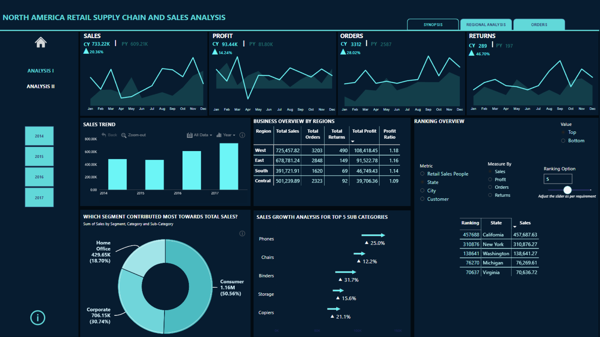
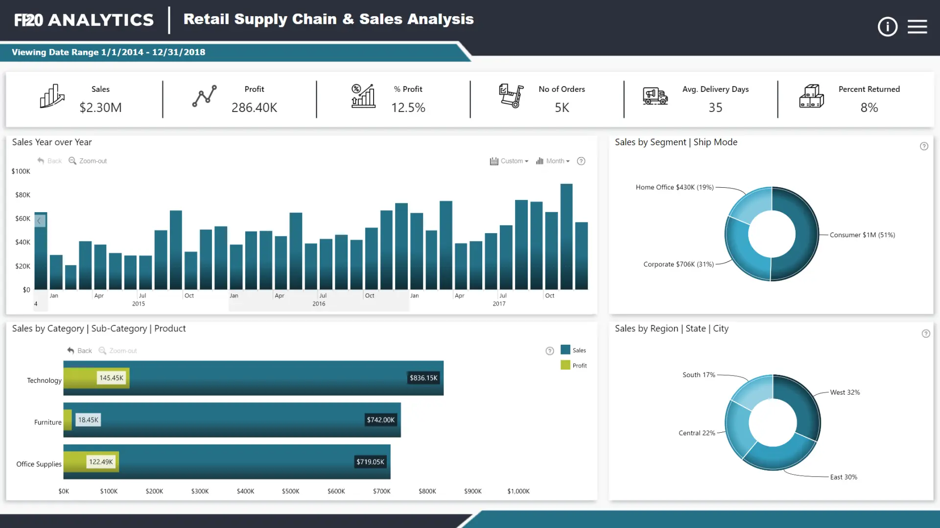
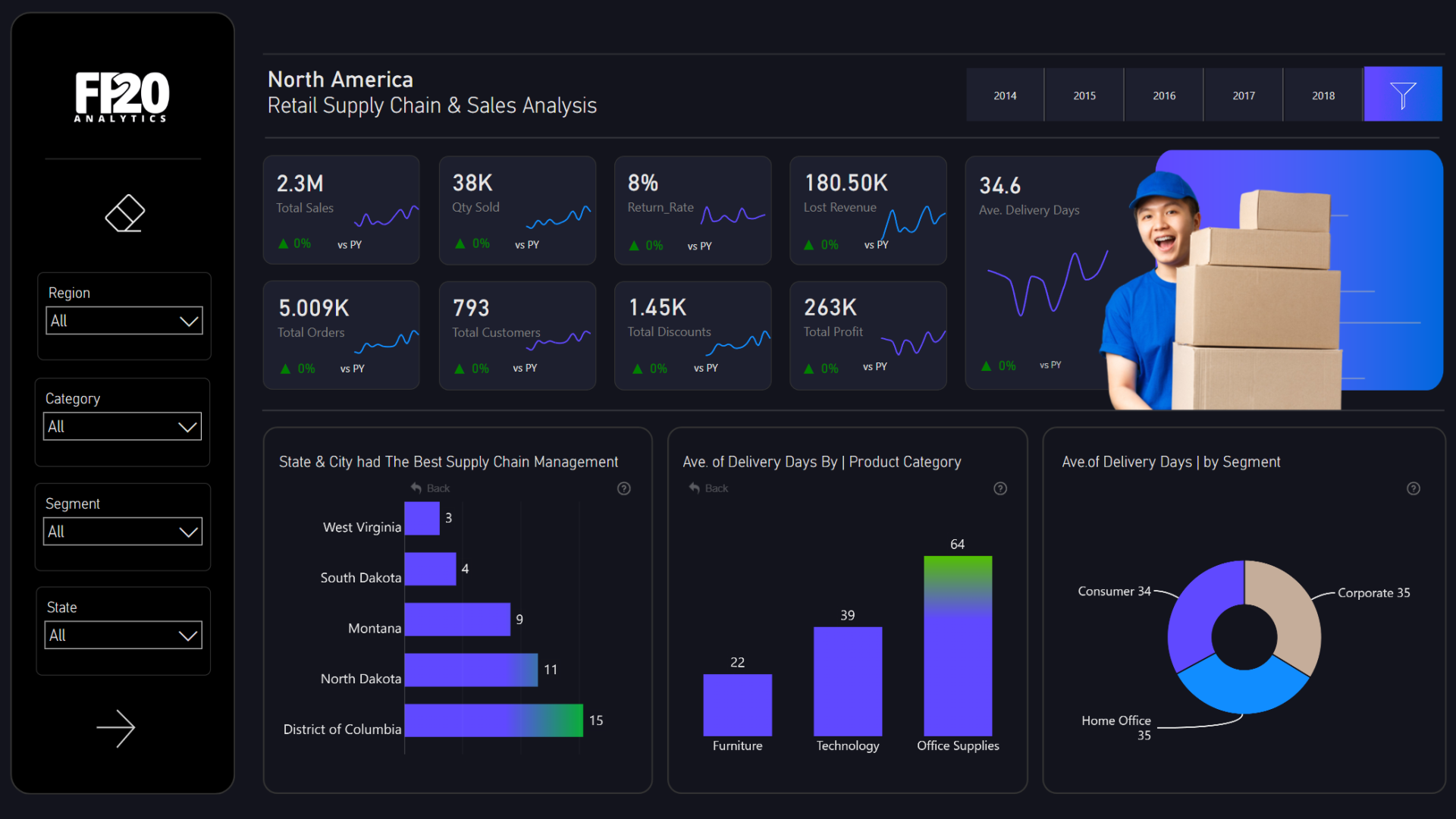
Browse the full ZoomCharts Report Gallery for interactive Power BI dashboard examples across supply chain, executive KPI, finance, sales, HR, and customer service analytics, all available as live demos and .pbix downloads.
Frequently Asked Questions
What is an interactive Power BI dashboard?
An interactive Power BI dashboard is a report where users explore data by clicking directly on visual elements such as bars, donut segments, timeline ranges, and map regions. Every click instantly filters all other visuals on the page through cross-chart filtering. Users follow their own questions through the data by clicking, not by adjusting slicers or navigating between pages.
How do I make a Power BI dashboard interactive?
Three mechanisms create interactivity in Power BI: cross-chart filtering (clicking one visual filters all others), drill-down (clicking within a visual reveals the next level of hierarchy without leaving the page), and Edit Interactions (controlling exactly which visuals respond to which clicks and how). Cross-chart filtering is on by default. Drill-down requires hierarchy fields bound to your visuals. Edit Interactions is configured via Format, Edit Interactions in the toolbar.
What is the difference between a Power BI report and a dashboard?
A Power BI report is built in Power BI Desktop with full interactivity, multiple pages, drill-down, cross-filtering, and custom visuals. A dashboard is created in Power BI Service by pinning individual visuals from reports onto a single canvas. Pinned tiles lose their cross-chart filtering behavior. For the full interactive experience, share the report URL directly rather than creating a dashboard from pinned tiles.
How do I add drill-down to a Power BI dashboard?
Add multiple fields to the Axis or Category well of a visual in order from highest to lowest level. For example, Year, Quarter, Month for a time chart or Category, Sub-Category, Product for a sales chart. Click the drill-down arrow in the visual header to enable it. Users then click into the visual to move down the hierarchy. ZoomCharts Drill Down Visuals extend this with up to 9 levels, a back button, and full cross-chart filter context preserved at every drill level.
Why do most Power BI dashboards fail to get adopted?
Most Power BI dashboards fail because they are built to display data rather than to enable exploration. Users who cannot answer their questions within a few clicks stop using the report. The solution is to apply the 4U Reports framework: make key metrics visible without interaction (Unique), design navigation that needs no instruction (User-friendly), enable drill-down and cross-filtering so every click reveals something (Uncovering), and surface the why behind the numbers not just the numbers themselves (Understandable). Read the full 4U Reports framework introduction for a deeper explanation.
What are the best visuals for interactive Power BI dashboards?
The best visuals for interactive Power BI dashboards are those built specifically for click-to-filter and drill-down interaction. ZoomCharts Drill Down Visuals are designed for exactly this: Drill Down Timeline PRO for time-based trends with year-to-day drill-down, Drill Down Combo PRO and Combo Bar PRO for category analysis, Drill Down Donut PRO as a segment filter control, Drill Down Map PRO for geographic exploration, Drill Down Scatter PRO for correlation analysis, and Drill Down Waterfall PRO for sequential value breakdown. All are available on Microsoft AppSource.
Build your first interactive Power BI dashboard
ZoomCharts Drill Down Visuals add multi-level drill-down and seamless cross-chart filtering to Power BI. Explore the full visual library on AppSource, browse report templates with .pbix downloads, or read the 4U Reports introduction for the design principles that make dashboards people actually use.
Explore ZoomCharts visuals Browse report templates Read the 4U Reports introduction


