Written by the ZoomCharts team. ZoomCharts Drill Down Visuals are used in Power BI reports across more than 25,000 organizations in 100+ countries. Published: April 2026.
Three quarters of employees feel overwhelmed when working with data. Most respond by avoiding it entirely. The reports get built. The dashboards go live. And then nobody opens them.
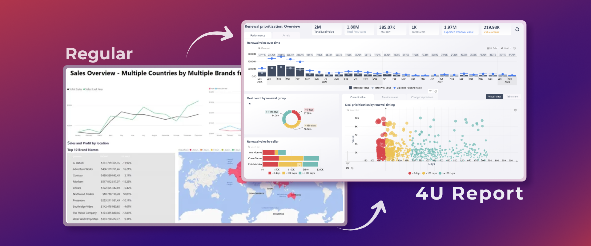
This is not a technology problem. Every organization with low BI adoption had capable tools. It is a UX and design problem: reports are built for data coverage, not for the person using them. And 4U Reports is the framework built to solve it.
4U Reports is a Power BI report UX design framework built around four user-centered stages: Unique, User-friendly, Uncovering, and Understandable. Together they guide users through a natural engagement chain: the design attracts attention, the interaction invites exploration, cross-chart filtering and drill-down follow the "why," and formatting makes the insight clear. A report only creates value when it is opened, explored, understood, and acted upon.
Why BI Adoption Is Still the Core Problem
Organizations have long assumed better tools lead to better decisions. Research consistently shows otherwise. The gap is not in data availability or technology. It lies in the UX and design of the reports themselves. When reports feel complex or overwhelming, users stop using them. When they feel clear and purposeful, adoption follows.
of employees actively use BI and analytics tools on a regular basis. Active usage remains concentrated among analysts and power users.
BARC, 2022 confirmed by Gartner, Microsoft and Salesforce 2023 to 2025of employees avoid or minimize use of a tool after a single negative first experience. 41% increase usage after a positive one.
Gartner, 2021of employees feel overwhelmed or unhappy when working with data. Many respond by avoiding it entirely or finding manual workarounds.
Accenture and Qlik, 2020, supported by DataCamp 2023 to 2024of executives say culture and people, not technology, are the main barrier to becoming data-driven. This figure has grown more relevant since 2024.
Wavestone, 2024, aligned with Gartner 2023 to 20253-year ROI from Power BI when it is actually adopted. The gap between potential and reality involves data quality, governance, and training. But the most immediately fixable factor, and the one most often ignored, is UX and report design.
Forrester: The Total Economic Impact of Microsoft Power BIThe pattern across all of this research is consistent: adoption, not technology, is the bottleneck. The situation has intensified in 2026. More data sources, more reports, more tools, and higher expectations compete for the same limited human attention. Usability and simplicity have never mattered more.
The 4U Reports Value Chain: 4 Stages from Attention to Action
The four stages are not independent properties. They are a chain where each stage creates the condition for the next one. This mirrors how people naturally engage with information: first the design earns their attention, then the obvious interaction invites them to explore, then cross-chart filtering and drill-down let them follow the "why," and finally the formatting makes the insight clear enough to act on.
The design earns attention before the user clicks anything. The layout signals purpose: this was built for you. The most important insight is visible within three seconds. A well-designed report attracts the eye, shows the answer, and makes the user want to continue.
Nobody reads the manual for a report they use every day. User-friendly means the interaction is obvious enough that users see the opportunity to explore and take it, without being shown how. No walkthrough, no training session, no "how do I use this?" message.
The user's second question is always more important than their first. Every click does two things: cross-chart filtering updates the whole page to the selected context, and drill-down goes one level deeper within the clicked visual. Together they let users follow the "why" naturally, without rebuilding filters.
A number without context is just a number. A 4U Report shows what is happening and what is driving it: chart formatting outlines the insight, and the cross-filtered surrounding visuals confirm it from every angle. The user leaves knowing what to do next, not just what the data says.
Miss one stage and the chain breaks. A report can be visually clean but impossible to navigate (Unique without User-friendly). It can be easy to navigate but provide no depth (User-friendly without Uncovering). Or it can surface plenty of data without explaining what it means (Uncovering without Understandable).
How to Recognize a 4U Report
You can usually identify a 4U Report within seconds of opening it. Look for these signals:
- 01 The design draws the eye and the most important metric is visible before the user interacts with anything
- 02 Clicking any visual updates everything else on the page without touching a filter panel
- 03 Users can go from the headline metric to the individual record driving it in under three clicks
- 04 A new user can navigate without asking anyone how it works
- 05 The report gets opened without being required. Users choose to return to it because it genuinely helps them do their job
A 4U Report in action: every click cross-filters all visuals and drills deeper simultaneously. View live demo
Who Benefits and How
4U Reports create value for three distinct groups. The benefits compound when all three are aligned. And when they do, the return on the underlying BI investment changes significantly.
A Forrester study commissioned by Microsoft found a 366% three-year ROI from Power BI when it is actually adopted. Most organizations never reach this. Not because the data is wrong or the tool is limited, but because the reports do not get used. 4U Reports close that gap by making adoption the outcome of the design itself, not of training programs or change management.
How to Build 4U Reports: The 4i Chain
Users experience the 4U value chain. Developers create it through a complementary set of design principles called the 4i chain. These are not features to implement. They are qualities to design toward at every layer of a report. The 4i chain is how developers think. The 4U value chain is what users feel as a result.
The primary metric answers the user's first question before they click anything. Layout, size, and color do the work that labels and titles cannot. A user who opens the report should never have to search for the main point.
If a user needs to be told what a visual does, the visual is not working yet. Intuitive design means clicking a bar filters the page, clicking a segment narrows the view, clicking back restores context. No explanation required.
Filter panels are a tax on exploration. Every slicer a user adjusts before seeing an answer is a moment where they might give up. In an Interactive report, the charts are the navigation. Click once and two things happen: the whole page updates to match, and the clicked visual goes one level deeper in the hierarchy.
Showing that revenue dropped 12% is useful. Showing that it dropped because one product category lost margin in three regions where discounts were 40% above average is what enables a decision. That is the difference between a report that informs and one that changes behavior.
The Interactive and Insightful stages depend on visuals that respond to clicks and reveal hierarchy. ZoomCharts Drill Down Visuals are built specifically for this: every visual supports direct click-to-filter interaction and multi-level drill-down with cross-chart filtering preserved at every level. They are the practical tool for the third and fourth stages of the 4i chain.
4U Reports in Practice: Real Examples
One of the best ways to learn the 4U framework is to compete in a 4U Reports Challenge and see how other developers apply the principles to the same dataset. The guides below show the framework applied step by step with real data, real DAX measures, and real report examples.
Step-by-step guide with DAX measures, CALCULATE with polarity-aware variance logic across 10 KPIs
Applied to a real $979M spend dataset with maverick spend, delivery performance, and supplier risk
Built on 9,994 real orders with discount trap analysis, sub-category profit divergence, and shipping efficiency
Key Takeaways
- 4U Reports is a Power BI UX design framework with four user-centered stages: Unique, User-friendly, Uncovering, and Understandable. Together they form a chain: attention, invitation, exploration, comprehension.
- The 4i chain (Inspiring, Intuitive, Interactive, Insightful) is how developers build reports that deliver those four stages.
- Adoption is the problem. Only 25 to 30% of employees actively use BI tools. The failure is in UX and design, not technology. Power BI delivers 366% ROI when actually adopted.
- The framework benefits all three groups: users who save time, organizations that get better ROI, and developers who earn credibility.
- ZoomCharts Drill Down Visuals are the practical implementation tool for the Interactive and Insightful stages: every click cross-filters the whole page and drills deeper simultaneously.
Frequently Asked Questions
What are 4U Reports in Power BI?
4U Reports is a Power BI report design framework built around four user-centered stages: Unique, User-friendly, Uncovering, and Understandable. Together they guide users through a UX engagement chain from first attention to confident decision-making. The framework addresses why most Power BI reports fail to achieve adoption despite technically capable data and tools.
What does 4U Reports stand for?
4U Reports stands for Unique, User-friendly, Uncovering, and Understandable. These are the four stages that describe how a well-designed report guides users from initial engagement all the way through to actionable insight and confident decision-making.
What is the 4i chain and how does it relate to 4U Reports?
The 4i chain stands for Inspiring, Intuitive, Interactive, and Insightful. It is the developer-facing counterpart to the 4U value chain. While 4U Reports describes what users experience, 4i describes the design principles developers apply to create that experience. The 4i chain is how you build it. The 4U value chain is what users feel as a result.
Why do Power BI reports fail to get adopted?
Most Power BI reports fail to get adopted because they are designed for data coverage rather than for the person using them. Research shows 74% of employees feel overwhelmed when working with data. When reports require training, hide navigation behind filter panels, or show data without explaining what it means, users stop opening them. The 4U Reports framework addresses each of these failure points directly.
What is the difference between a traditional Power BI report and a 4U Report?
A traditional Power BI report is designed to display data. A 4U Report is designed to guide users toward a decision. The difference lies in intent: 4U Reports are built around specific user needs and decision contexts, with interaction patterns and visual design chosen to reduce cognitive load and guide users toward insight naturally rather than to maximize data coverage on the page.
How do I apply the 4U Reports framework in Power BI?
Apply the framework through the 4i chain at each stage of report design. Make the most important metric visible without interaction (Inspiring). Ensure navigation works without instruction (Intuitive). Replace filter panels with direct click-to-filter and drill-down interaction (Interactive). Surface the drivers behind metrics, not just the metrics themselves (Insightful). See step-by-step applications in the 4U Executive KPI Report guide and the 4U Procurement Report guide.
Is low BI adoption still a problem in 2026?
Yes, and the evidence suggests it has intensified. Self-service BI tools have improved, but user expectations have risen alongside them. More data sources and more reports compete for limited human attention. The core barriers including training burden, data overwhelm, and poor first experiences remain largely unchanged. Research from Wavestone in 2024 found that 77.6% of executives now cite culture and people, not technology, as the main barrier to becoming data-driven.
See 4U Reports in action
See what a 4U Report feels like compared to a standard Power BI dashboard. Open any template in the gallery, interact with it directly, and notice the difference between a report designed for data coverage and one designed for the person using it.
Explore 4U Report examples Explore ZoomCharts visuals


