logo
For Power BI Report Templates
  • Products
    • Custom Visuals for Power BI
    • Report Templates
  • Resources

      Resources

    • Documentation
    • Report Examples
    • Blog
    • Webinars
    • Video Tutorials
    • Visuals Gallery

    Support

    • ZoomCharts Assistance
    • Contact Sales
    • Contact Support
    • FAQ

    Challenges

    Challenges

    Improve your report creation skills by participating in free challenges for report creators.

    Learn more
    Get Developer License
  • Services
    • Power BI Report Development
    • Custom Visual Development
  • Challenges
  • Pricing
Request a quote Get Developer License Sign in
Request a quote Book a Demo Get Developer License Sign in
Get it now
Go back

Contents

Blog Product Updates March Update: Dynamic Thresholds and Filtering From Legend Categories

Mar 24, 2026

March Update: Dynamic Thresholds and Filtering From Legend Categories

This product update focuses on two key improvements:

1. dynamic thresholds that adapt automatically to data context

2. More precise interaction through subcategory selection

Title image
Title image

This product update focuses on two key improvements:

1. dynamic thresholds that adapt automatically to data context

2. More precise interaction through subcategory selection

Contents

Share this article

Power BI developers rarely struggle with building visuals. The real complexity comes from everything around them.

Thresholds that need constant updates. Interactions that require slicers. Logic that lives outside the visual layer. Over time, reports become harder to maintain, not because of the visuals, but because of the work required to support them.

This update focuses on reducing that overhead.

Two key improvements are introduced:

  • Dynamic thresholds that adapt automatically to data context
  • More precise interaction through subcategory selection

Both features reduce manual work and make reports more responsive to user exploration.


Dynamic Thresholds: Context Aware Reference Lines and Areas

Thresholds are used to represent targets, limits, or expected ranges. In most reports, they are static. This means they must be manually updated or recalculated through measures when data changes.

This creates unnecessary complexity and maintenance effort.

Dynamic thresholds allow thresholds to be defined using data fields or measures that automatically respond to filters and context.

What’s New:

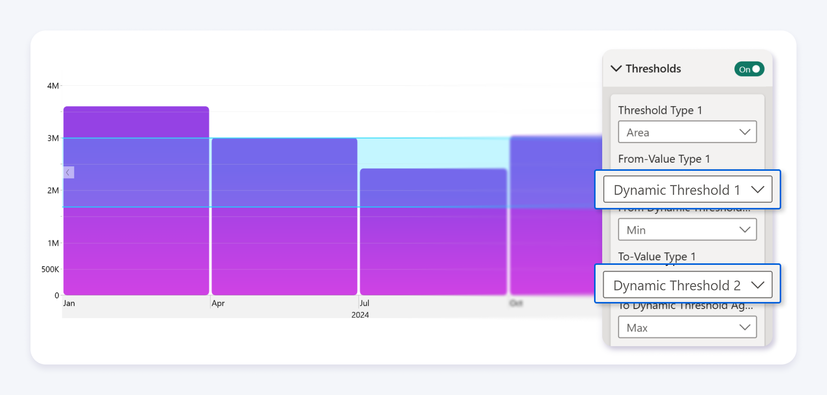
  • Two dynamic threshold fields called Dynamic Threshold 1 and Dynamic Threshold 2
  • Support for both measures and data columns
  • Automatic activation when values are assigned
  • Adaptive behavior depending on how many thresholds are provided

Supported Visuals:

  • Drill Down Combo
  • Drill Down Combo Bar
  • Drill Down Timeline
  • Drill Down Waterfall

How to Configure Dynamic Thresholds:

  1. Add a supported ZoomCharts visual to your report
  2. Add your category and value fields to visual
  3. Assign a measure or column to Dynamic Threshold 1
  4. Optionally assign a second measure or column to Dynamic Threshold 2
  5. Open the Format pane to adjust styling and visibility

Threshold Behavior

The visual automatically determines how thresholds behave based on the provided fields:

  • If only one threshold is defined the visual displays a line
  • If two thresholds are defined the visual displays an area between values

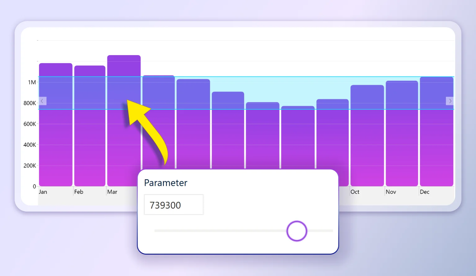
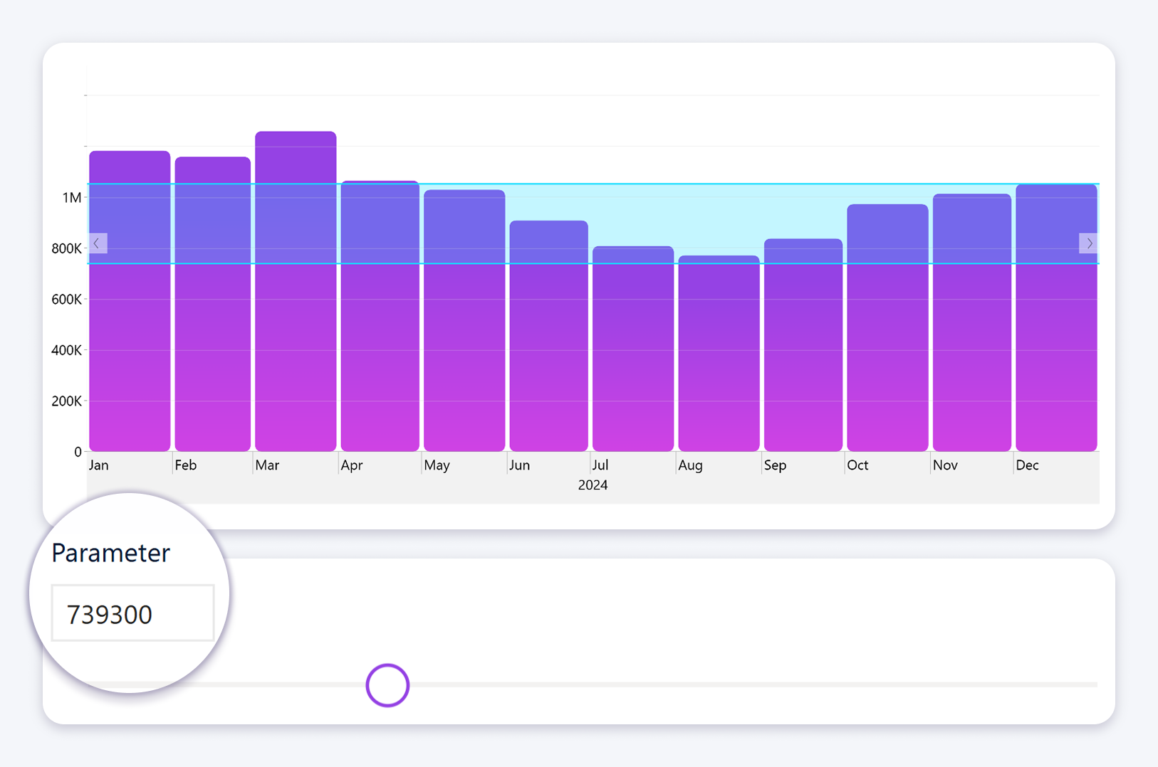
The threshold values can also be driven by Power BI parameters.
When a parameter is used in the underlying measure or column, the threshold will automatically shift based on the selected parameter value.

This allows users to interactively adjust targets, limits, or ranges directly in the report, without modifying the visual or recalculating logic.

As the parameter changes, the threshold updates in real time, reflecting the new context defined by the parameter.

This removes the need to manually configure threshold types or logic.


Advanced Configuration for Timeline

The Drill Down Timeline visual supports additional aggregation options for dynamic thresholds.

Available aggregation options include:

  • Average
  • Sum
  • Count Distinct
  • Minimum and Maximum
  • Median
  • Standard Deviation
  • Variance

This allows developers to control how thresholds behave across time based data.

Why It Matters

Dynamic thresholds remove the need for static configuration. Instead of recalculating thresholds manually, they adjust automatically based on filters and context.

This results in less DAX, more accurate visuals, and lower maintenance effort.


Improved Interaction: Subcategory Selection in Combo Charts

Filtering data inside visuals often requires slicers or additional report elements. This creates extra steps for users and additional work for developers.

This update introduces more precise interaction directly inside the chart.

What’s New

Users can now select individual subcategories within a column or bar when a legend is present.

How It Works:

  • Hover over a subcategory segment within a column or bar
  • Click the segment to select that specific subcategory
  • The rest of the report filters based on that selection

At the same time:

  • Clicking the category label selects the entire category
  • Drill down behavior remains unchanged when multiple hierarchy levels are used

Configuration Requirements:

  • A single category must be placed in the Category field
  • A second category must be placed in the Legend field

If multiple categories are used for drill down, clicking will trigger drill behavior instead of selection.

Why It Matters

This enables more precise filtering without additional slicers. Users can explore data directly within the visual while developers can simplify report layouts.

The result is cleaner reports and faster interaction.


What This Update Changes for Power BI Developers

This update reduces two common sources of complexity.

Static logic that requires manual updates and recalculation.

Indirect interaction that depends on slicers and additional visuals.

By moving these capabilities into the visual layer, reports become easier to build and easier to maintain:

  • Less reliance on DAX for threshold calculations
  • Fewer supporting visuals and slicers
  • More intuitive interaction patterns
  • Lower long term maintenance cost

Final Thoughts

This update focuses on practical improvements that affect real development workflows.

Dynamic thresholds reduce manual configuration. Improved interactions reduce dependency on additional report elements.

Together, these changes make reports more adaptive and easier to manage:

  1. Less manual logic
  2. More responsive visuals
  3. Better reporting workflows
envelope icon

Want more info like this?

Subscribe to our newsletter and be the first to read our latest articles and expert data visualization tips!


Find out more

May 12, 2026

Blog Thumbnail
Use cases

Why Consulting Teams That Use 4U Reports Deliver Power BI Projects That Get Adopted

74% of BI implementations fail at adoption. This guide shows how consulting teams use the 4U Reports framework to deliver Power BI reports clients actually open and achieve 366% ROI.

May 14, 2026

Blog Thumbnail
Power BI tutorials

Power BI Trends 2026: 10 Structural Shifts Every BI Team Needs to Act On Now

The 2026 Power BI design pattern separates into three layers: the semantic layer holds trusted, AI-prepared definitions; the visual layer becomes exploratory, interactive, and drill-first; and the operational layer connects reports directly to real-time data, alerts, and decisions. Teams that treat these as separate trends will adopt them slowly. Teams that see them as one connected redesign of how analytics works will move significantly faster.

May 06, 2026

Blog Thumbnail
Product updates

May Update: Smarter Waterfall Labels and Series Total Tooltip Customization

ZoomCharts May 2026 update: smarter threshold label positioning for Waterfall PRO, a new comma-separated label format, and Series Total tooltip customization for Timeline, TimeSeries, Combo, and Line PRO.

Apr 28, 2026

Blog Thumbnail
Data visualization

Power BI drill-through vs drill-down: key differences

Power BI drill-through vs drill-down is one of the most common navigation questions report builders face. Both features help users move from summary numbers to deeper detail, but they do it in very different ways. Choose the wrong one, and your report can feel slow, confusing, or overloaded with unnecessary pages.

Apr 28, 2026

Blog Thumbnail
Power BI tutorials
Data visualization
Tutorials

How to Build an Interactive Power BI Dashboard: Step-by-Step Guide

Learn how to build an interactive Power BI dashboard with cross-chart filtering, drill-down, and real DAX measures. Included with live demo.

Apr 22, 2026

Blog Thumbnail
Tutorials
Data visualization

How to Build a 4U Procurement Report in Power BI

Procurement data is some of the most decision-critical data an organization holds. It touches budgets, supplier relationships, delivery risk, and compliance, all at once. Yet most procurement reports get built the same way: tables of spend, a few bar charts, and a handful of slicers. Users open them, feel overwhelmed, and go back to spreadsheets.
  • 1
  • 2
  • 3
  • 4
  • 5
  • ...
  • 16
  • »

Contents

Share this article

Want more info like this?

Subscribe to our newsletter and be the first to read our latest articles and expert data visualization tips!


Thank you!

Check your inbox to verify your email address.

logo
[email protected]
+44 204 577 3993
logo

Products

Drill Down Bubble PRO Drill Down Line PRO Drill Down Network PRO Drill Down Waterfall PRO Drill Down Graph PRO Drill Down Combo PRO Drill Down Combo Bar PRO Drill Down Donut PRO Drill Down Pie PRO Drill Down TimeSeries PRO Drill Down Timeline PRO Drill Down Map PRO Drill Down Scatter PRO All Visuals

Resources

Report Examples Webinars Blog ZoomCharts Academy Visuals Gallery Documentation Custom Visual Development Subscribe to News

Solutions

Custom Visual Development

Company

Pricing About Us Partners Leave feedback Join PowerGroup EU Funding

Help

ZoomCharts Assistance Contact Sales Contact Support FAQ AI Information

Drill Down Line PRO Drill Down Bubble PRO Drill Down Network PRO Drill Down Waterfall PRO Drill Down Graph PRO Drill Down Combo PRO Drill Down Combo Bar PRO Drill Down Donut PRO Drill Down Pie PRO Drill Down TimeSeries PRO Drill Down Timeline PRO Drill Down Map PRO Drill Down Scatter PRO All Visuals

Report Examples Webinars Blog ZoomCharts Academy Visuals Gallery Documentation Custom Visual Development Subscribe to News

Custom Visual Development

Pricing About Us Partners Leave feedback Join PowerGroup EU Funding

ZoomCharts Assistance Contact Sales Contact Support FAQ AI Information
+44 204 577 3993
[email protected]

Ready to get in touch?

Contact our experts with any question about Power BI and ZoomCharts for Free!

Contact us

© 2026, Data Visualization Software Lab

U.S. Patents No. 11,645,343; 11,921,804; 12,346,389

Cookies
Privacy Policy
Global
Legal
Patent
warning

Error message

success

Success info: Done!

ZoomCharts AI Assistant

We noticed you're using an old OS version.

For the best experience, we recommend upgrading to ensure that all website features display correctly.

Cookie settings

We use necessary cookies for site functionality, as well as statistic, marketing, and preference cookies to enhance your experience. For more information and to manage your preferences, please visit our Cookie policy