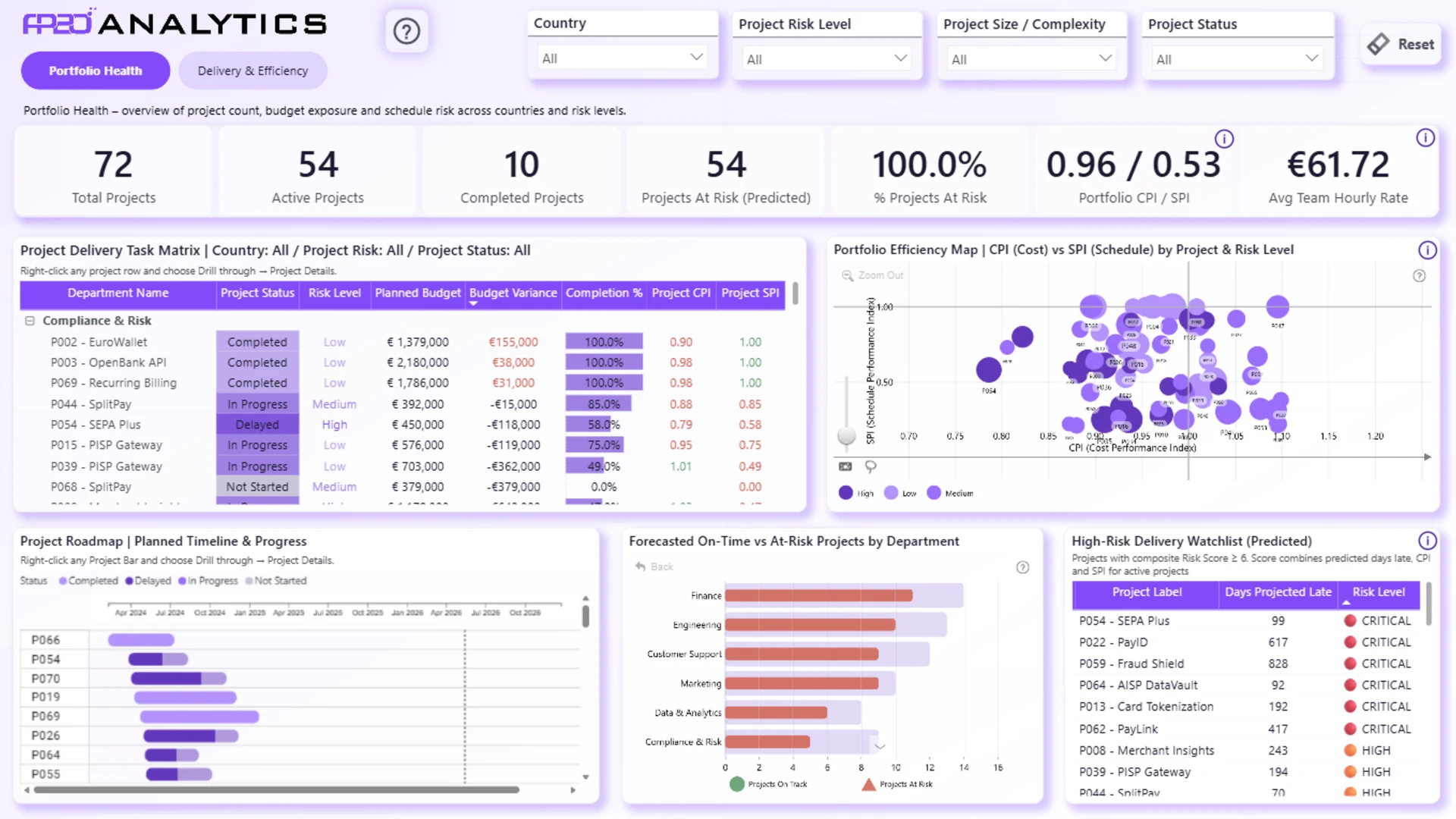
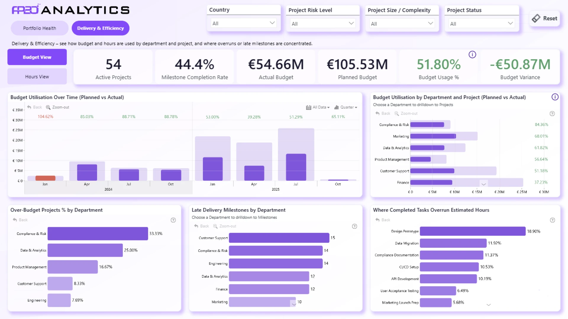
This Power BI project management dashboard helps users analyze project portfolio health, delivery efficiency, budget usage, schedule risk, and at-risk projects in one interactive report.
Built for project managers, PMO teams, analysts, and executives, the report provides a clear view of project count, active projects, completed projects, budget performance, CPI, SPI, project risk, and team hourly rates. It was submitted to the FP20 Analytics ZoomCharts Data Challenge 32 in November 2025.
The dashboard includes two main report pages:
- Portfolio health: track project count, active projects, completed projects, predicted at-risk projects, portfolio CPI and SPI, project risk levels, project roadmap progress, and high-risk delivery watchlist items.
- Delivery and efficiency: analyze budget utilization, milestone completion, actual vs. planned budget, budget variance, over-budget projects, late delivery milestones, and completed tasks that overrun estimated hours.
The report uses interactive filters for country, project risk level, project size or complexity, and project status, helping users explore project performance from different angles. With clear KPI cards, drillable visuals, roadmap views, scatter plots, and budget trend charts, this report is a useful project management dashboard example for anyone looking to build a Power BI report for project delivery, portfolio monitoring, and project risk analysis.