806
Onyx data DNA challenge
Onyx data DNA challenge
Report Author: Nur Zaenal Wahyu Hidayat
806
Share template with others
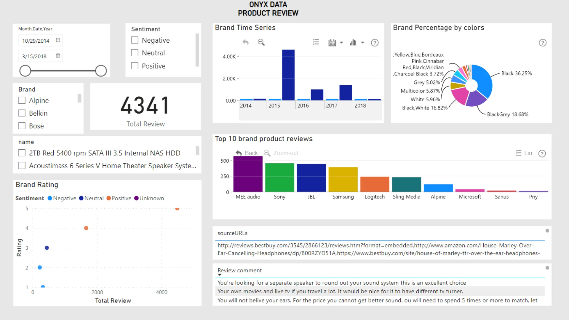
Report submitted for Onyx Data DataDNA ZoomCharts Mini Challenge, February 2024. The report was built based on Electronics Product Data Ratings dataset and includes ZoomCharts custom Drill Down PRO visuals for Power BI.
Author's description:
I want to share my Power BI dashboard Onyx Data. I am using data within removing outliers from helpful user review. Relationship between product ratings and recommendation status is Positive. We can see on the scatter plot chart visualization. The brands have the highest average customer satisfaction is MEE Audio and the most colors user like is Black. I also added 2 ZoomCharts Drill Down Visuals in one report page. You can see the Brand time series and percentage ZoomCharts Drill Down.
4U Report Challenges
Participate in data challenges, build and submit reports to get free template downloads.
Join CommunityMobile view allows you to interact with the report. To Download the template please switch to desktop view.
Was this helpful? Thank you for your feedback!
Sorry about that.
How can we improve it?