Registration Open
Registration Open
01 October | 04:00
-
Reset your password
We'll email you instructions on how to reset your password
Step into the role of a data analyst at the Consumer Financial Protection Bureau (CFPB), ensuring fairness and accountability in the financial sector.
Workshop | Using Power BI for Consumer Financial Complaints Analytics
Workshop | Using Power BI for Consumer Financial Complaints Analytics
14 October | 08:00
-
Webinar | Top 5 Power BI Reports on Consumer Financial Complaints
Webinar | Top 5 Power BI Reports on Consumer Financial Complaints
29 October | 09:00
01 October - 24 October
🏆 Main Prize: $300 Amazon Gift Card
ZoomCharts Mini Challenge is part of the global DataDNA – Dataset Challenge by Onyx Data, which unites 25K+ data enthusiasts worldwide, ranging from beginners to seasoned professionals, including Microsoft MVPs. Read more about the DataDNA challenge on the Onyx Data DataDNA website. Join the community on LinkedIn.
Why join ZoomCharts Mini Challenge?
🏆 Prize:
The creator of the best report submitted to the Mini Challenge will receive a $300 Amazon gift card. The ZoomCharts winner will be announced in a special live webinar session on October 29, where we will review the Top 5 entries from the challenge.
1. Register for the challenge:
2. Build your report in Power BI:
3. Improve your report and learn new skills:
4. Submit your challenge entry:
If your submission doesn’t match the challenge criteria, you will be notified by email indicating the reason. Don't worry if this happens! You can fix the issue and resubmit your report.
Note: Feel free to resubmit your entry as many times as necessary before the deadline.
5. Finalize your participation to compete for the prize
6. Attend challenge closing webinar to hear the results:
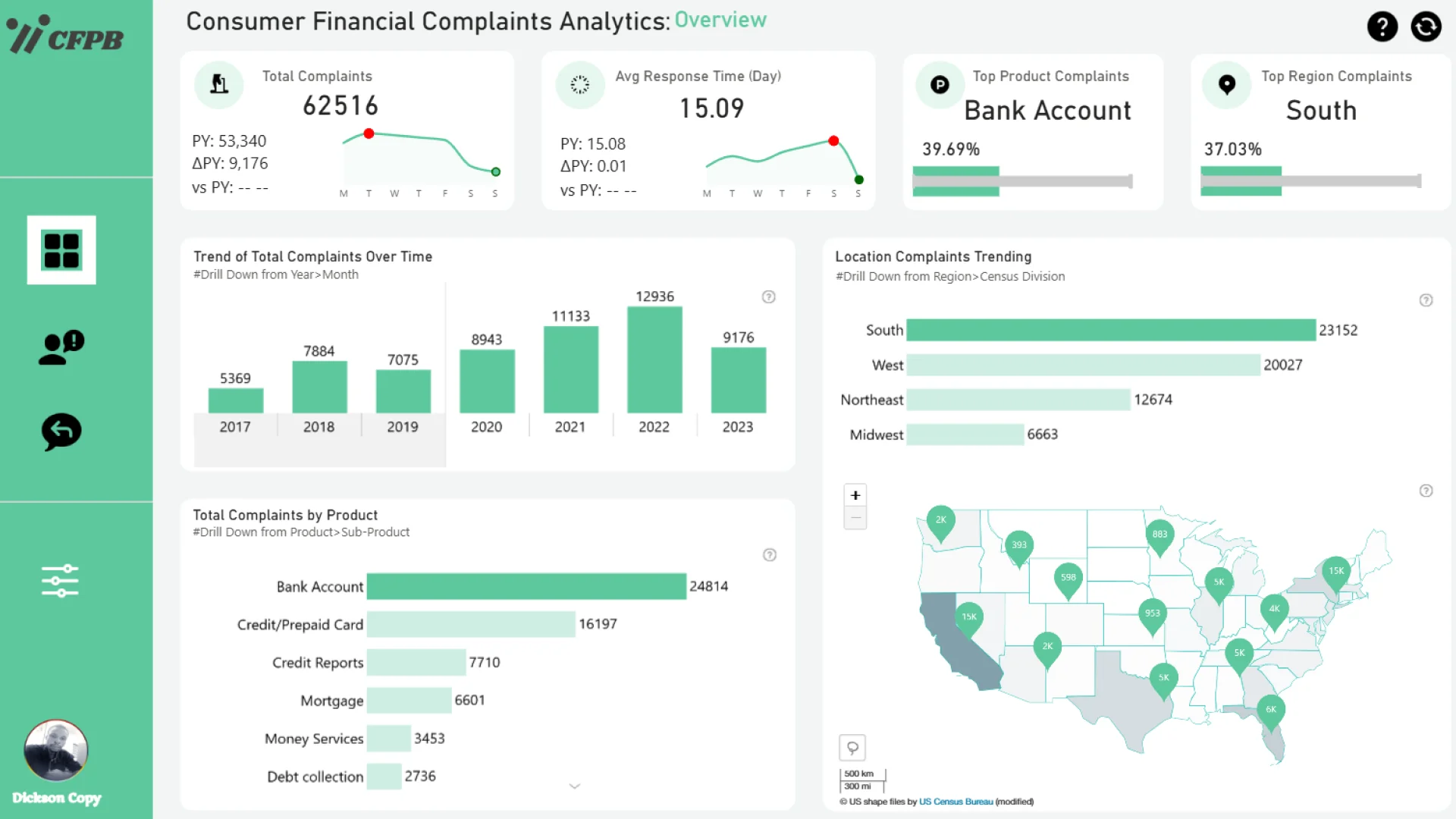
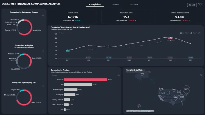
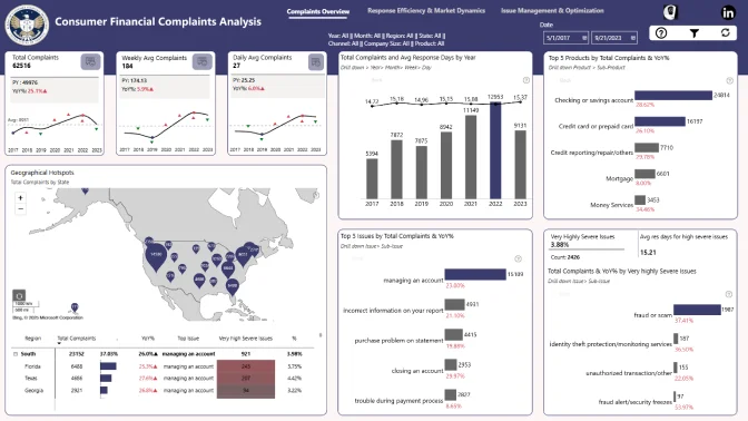
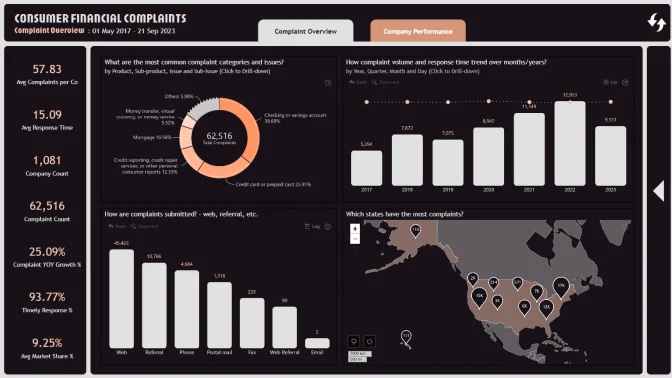
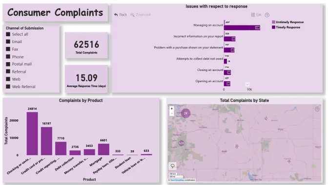
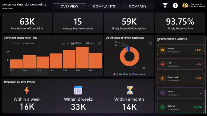
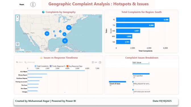
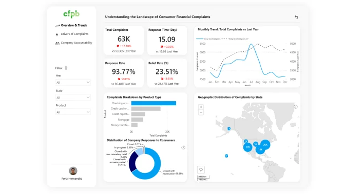
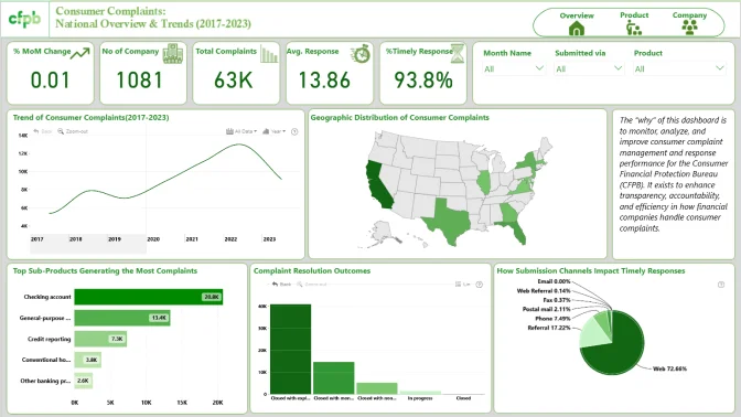
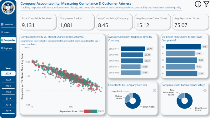
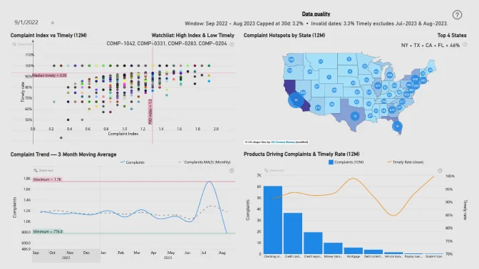
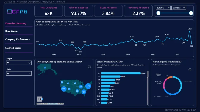
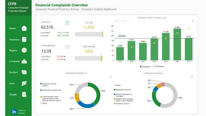
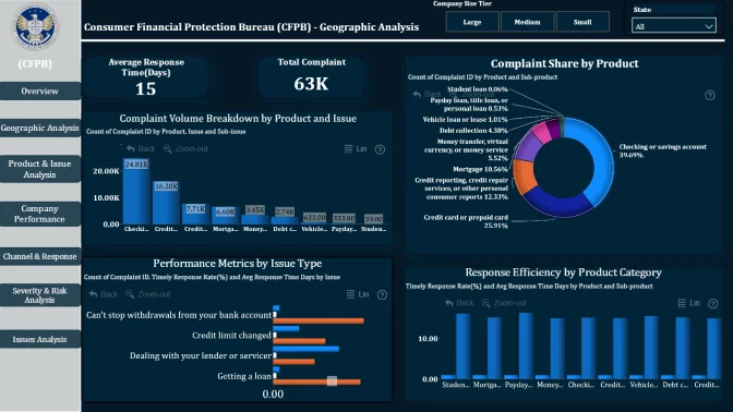
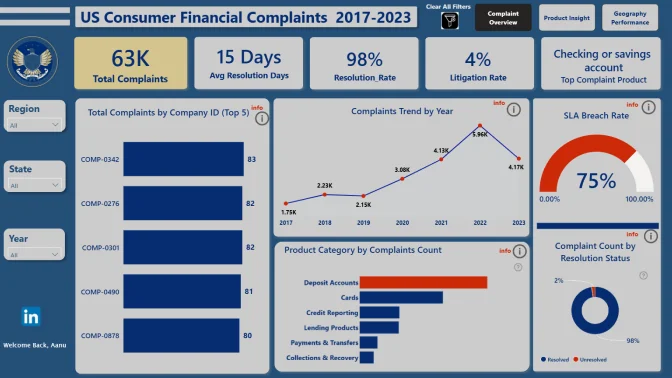
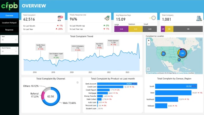
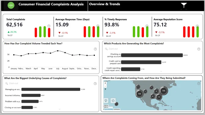
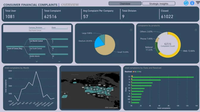
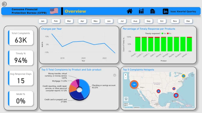
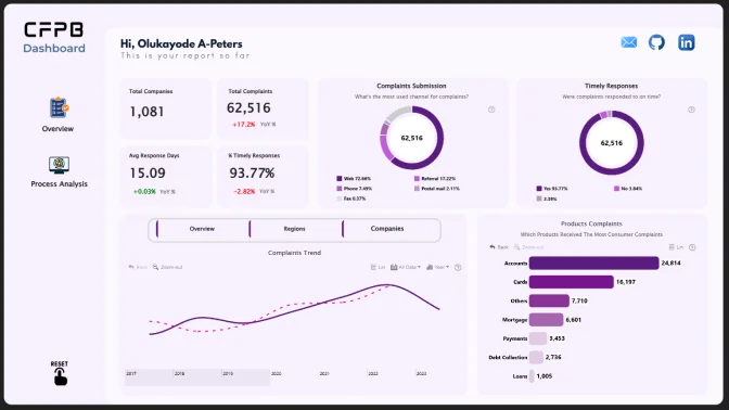
Step into the role of a data analyst at the Consumer Financial Protection Bureau (CFPB), a U.S. government agency ensuring fairness and accountability in the financial sector.
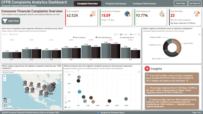
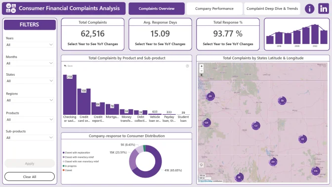
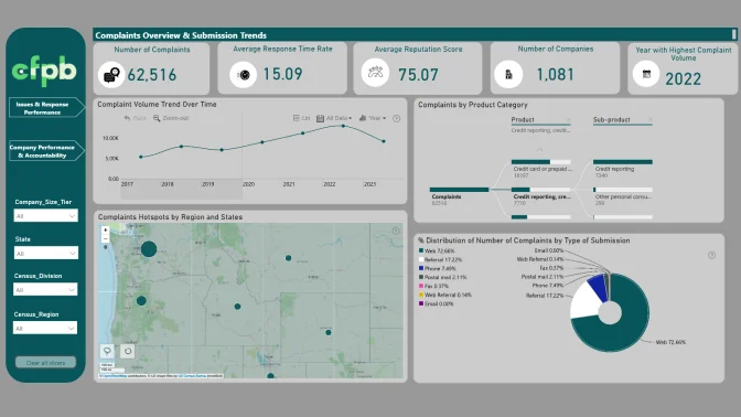
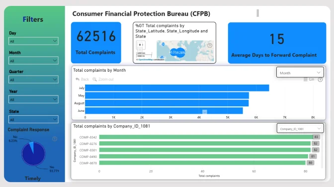
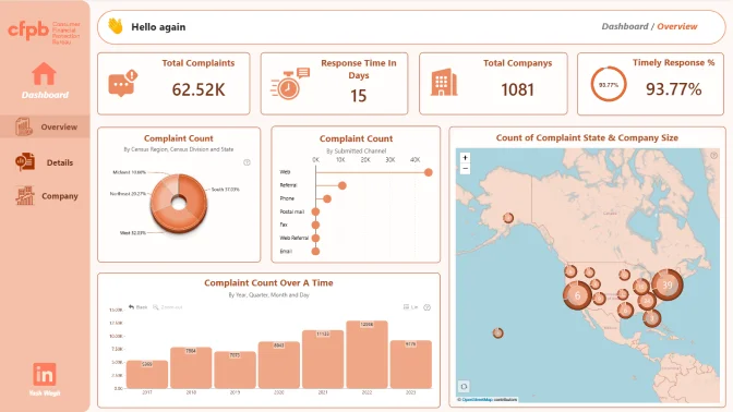
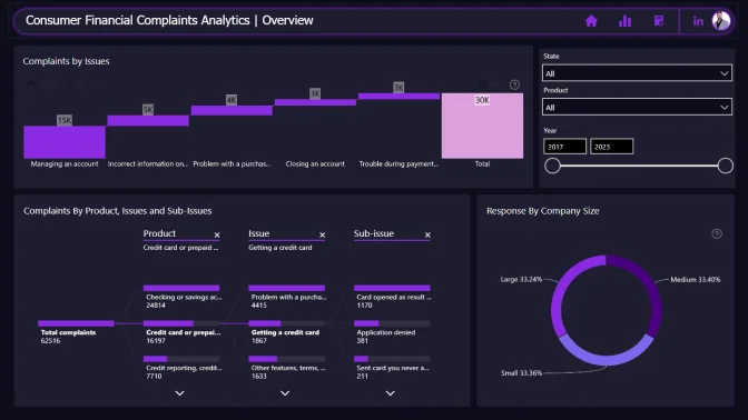
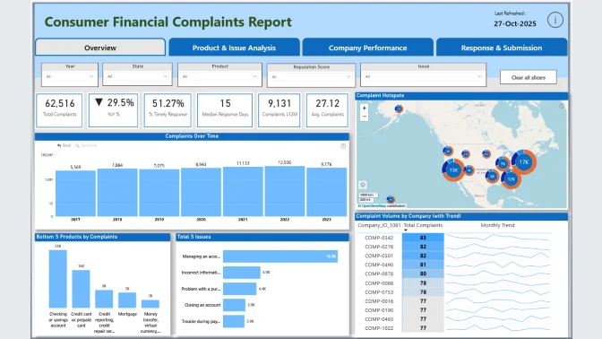
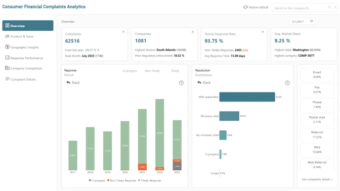
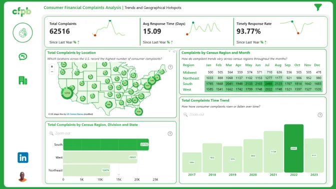
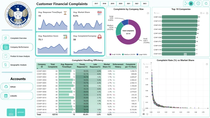
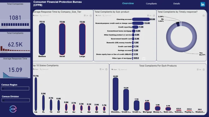
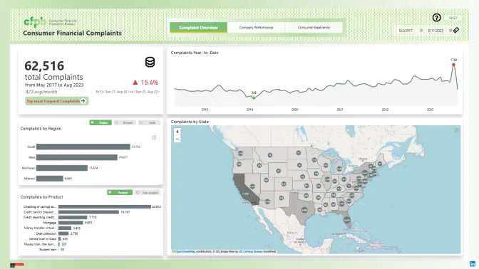
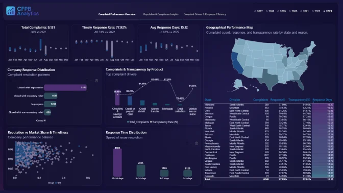
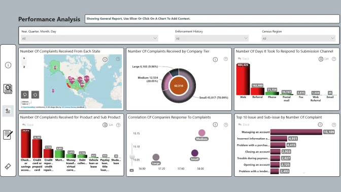
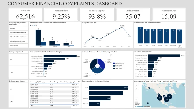
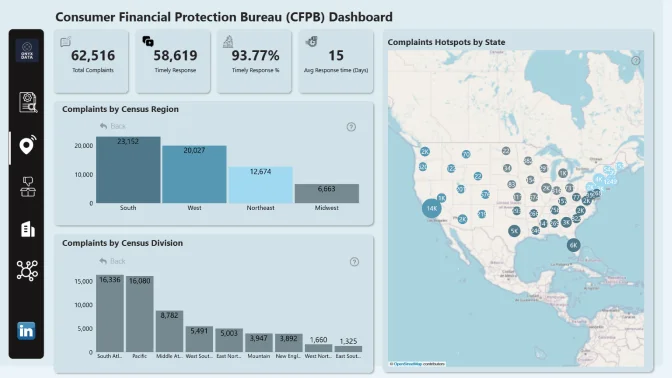
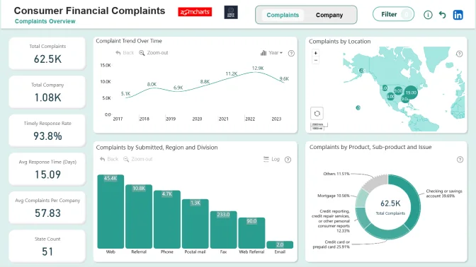
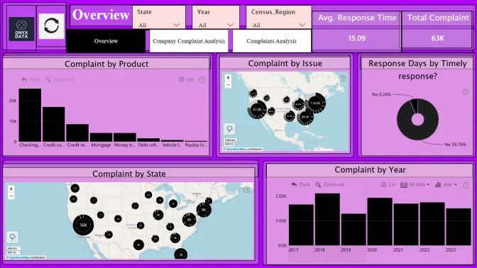
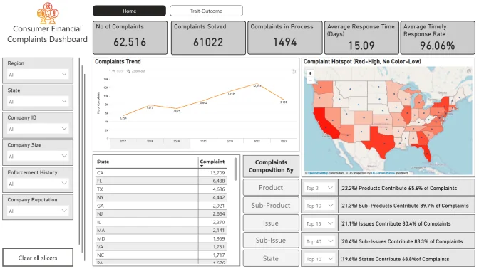
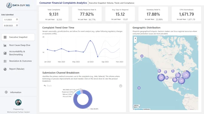
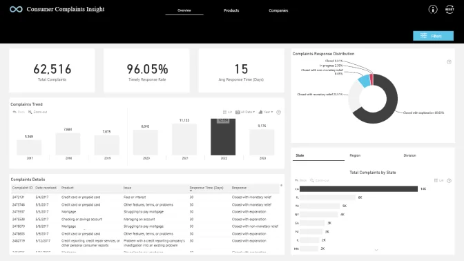
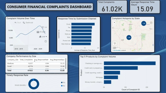
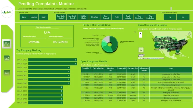
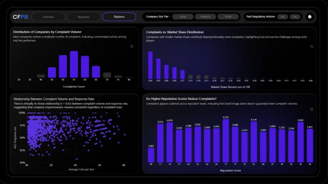
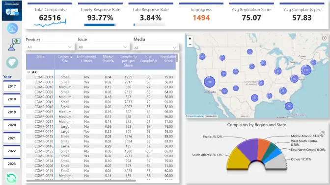
The CFPB collects complaints from consumers across the United States regarding financial products and services. Each complaint is tracked from submission through company response.
You’ve been provided with a dataset of consumer complaints spanning multiple financial categories, locations, and companies. Your mission is to create an analytical report that identifies patterns in complaints, evaluates company responses, and highlights areas of concern for regulators and consumers.
✨ Note: These questions are just starting points. You’re encouraged to explore the data in your own way and share any unexpected findings that could.
Your insights could help regulators strengthen consumer protection policies, support journalists in highlighting financial fairness issues, and provide consumers with more transparency about financial institutions.
Each report is evaluated based on three main criteria: intuitiveness, insightfulness, and interactivity. These factors ensure that the reports are not only accurate and functional, but also meet the target audience's needs and are ready to be presented to the end-users.
Workshop | Using Power BI for Consumer Financial Complaints Analytics
Workshop | Using Power BI for Consumer Financial Complaints Analytics
14 October | 08:00
-
Webinar | Top 5 Power BI Reports on Consumer Financial Complaints
Webinar | Top 5 Power BI Reports on Consumer Financial Complaints
29 October | 09:00
01 October - 24 October