Oct 06, 2026
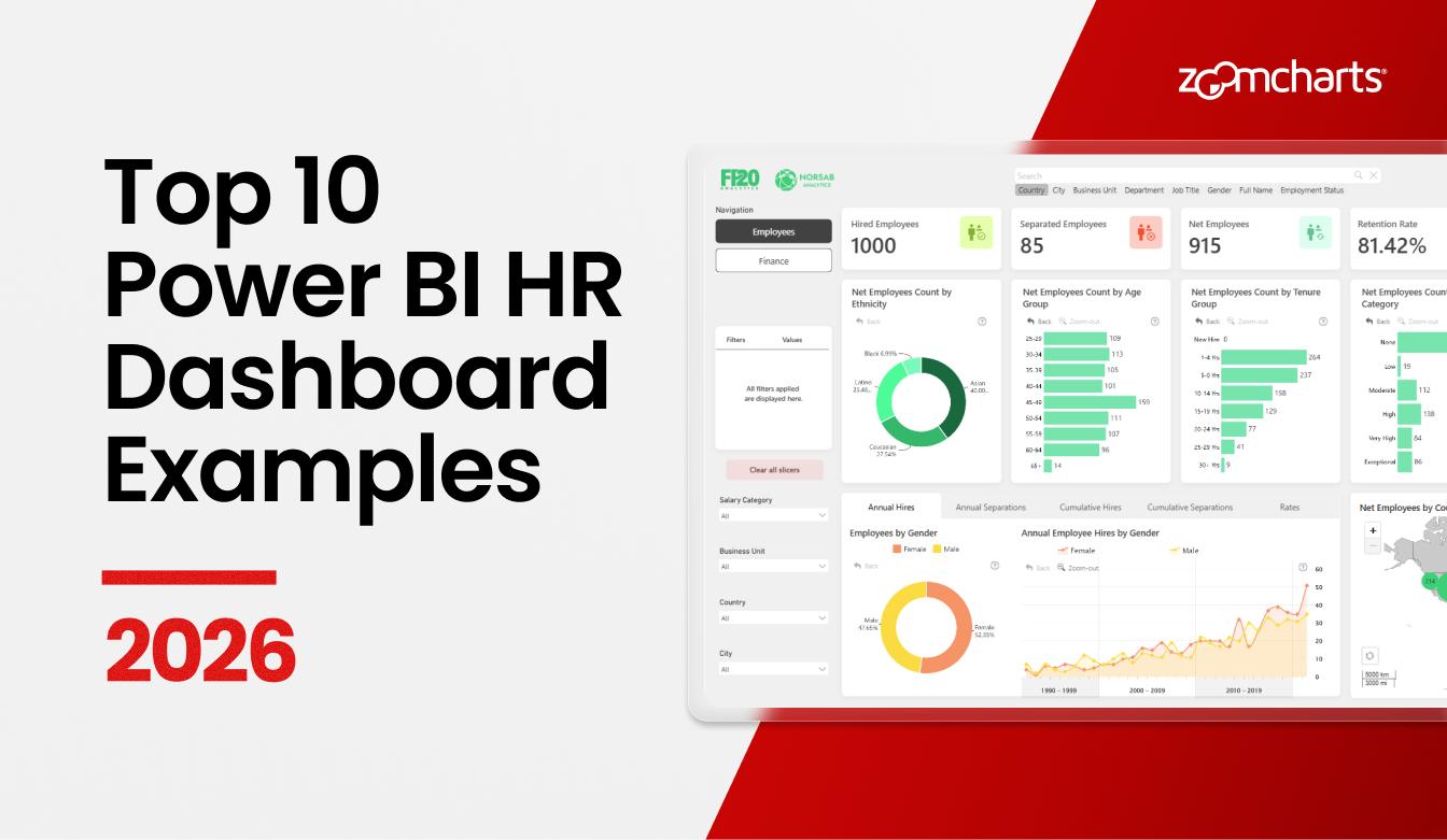
Top 10 Power BI HR Dashboard Examples for 2026
In this article, we review 10 real Power BI HR dashboards from the ZoomCharts Template Gallery. See examples for workforce planning, attrition, recruitment, compensation, and employee performance.
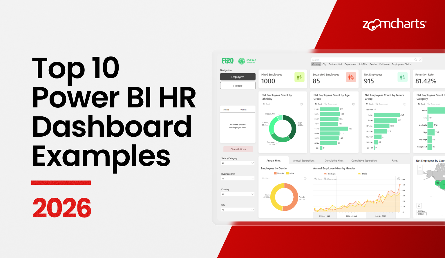
In this article, we review 10 real Power BI HR dashboards from the ZoomCharts Template Gallery. See examples for workforce planning, attrition, recruitment, compensation, and employee performance.
What a Good Power BI HR Dashboard Should Show
1. Power BI HR Dashboard for Workforce Risk and Planning
Best for: Seeing workforce risks and planning future staffing
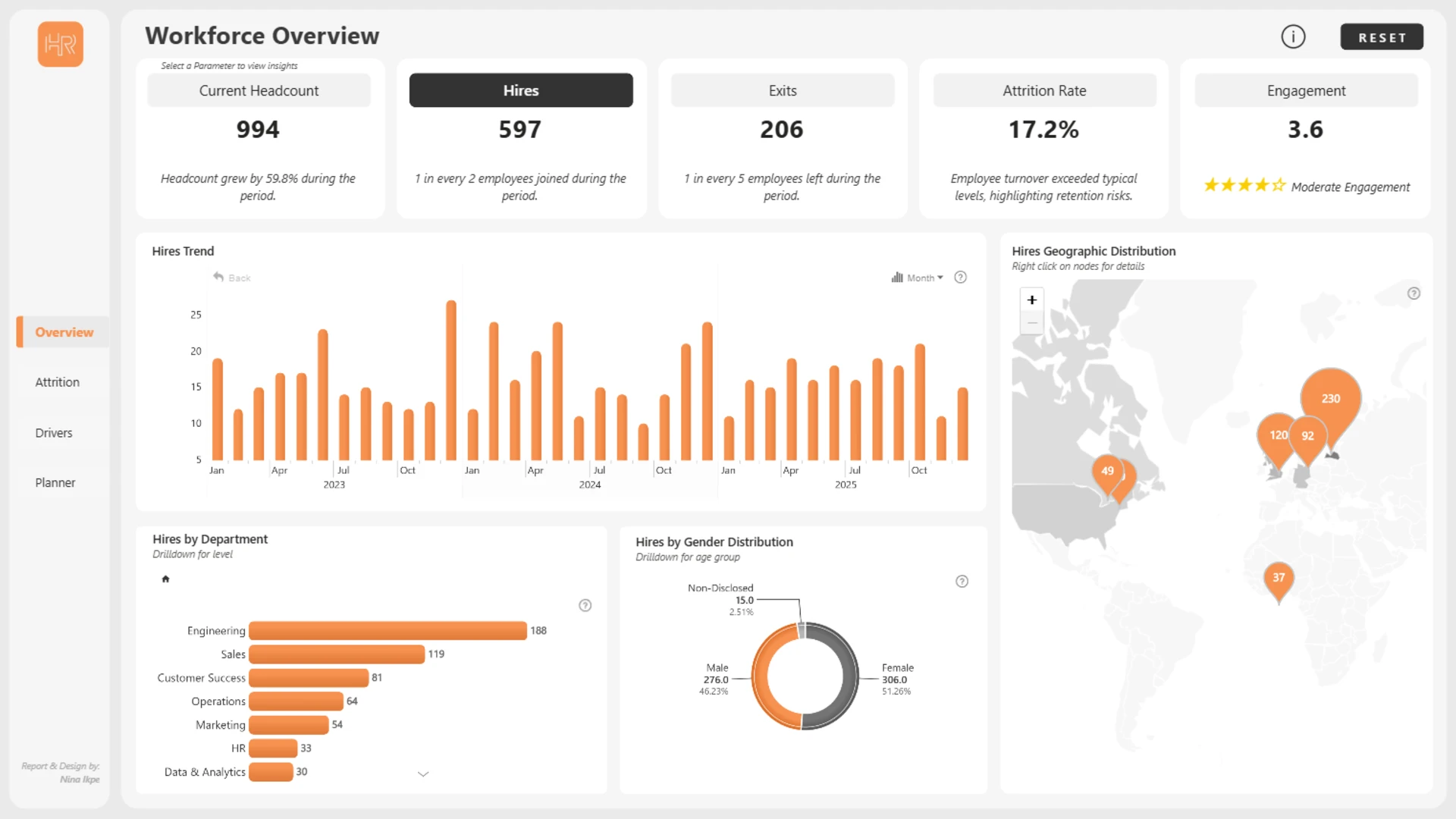
Nina Ikpe created this report for the July 2026 ZoomCharts 4U Report Challenge. It brings workforce, hiring, pay, and staffing data into one report. It also has a Workforce Planner. You can change hiring and attrition assumptions to see how future staffing may change.
This report works well for leaders and HR teams. It starts with a simple overview, then you can look at risks and future needs. Bubble, combo, combo bar, timeline, map, and donut charts show the same workforce story in different ways.
Explore this dashboard template
ZoomCharts visuals used:
Drill Down Bubble PRO, Drill Down Combo PRO, Drill Down Combo Bar PRO, Drill Down Map PRO, Drill Down Timeline PRO, and Drill Down Donut PRO.
2. HR and Workforce Analytics Power BI Dashboard
Best for: Seeing the main HR numbers and then looking deeper
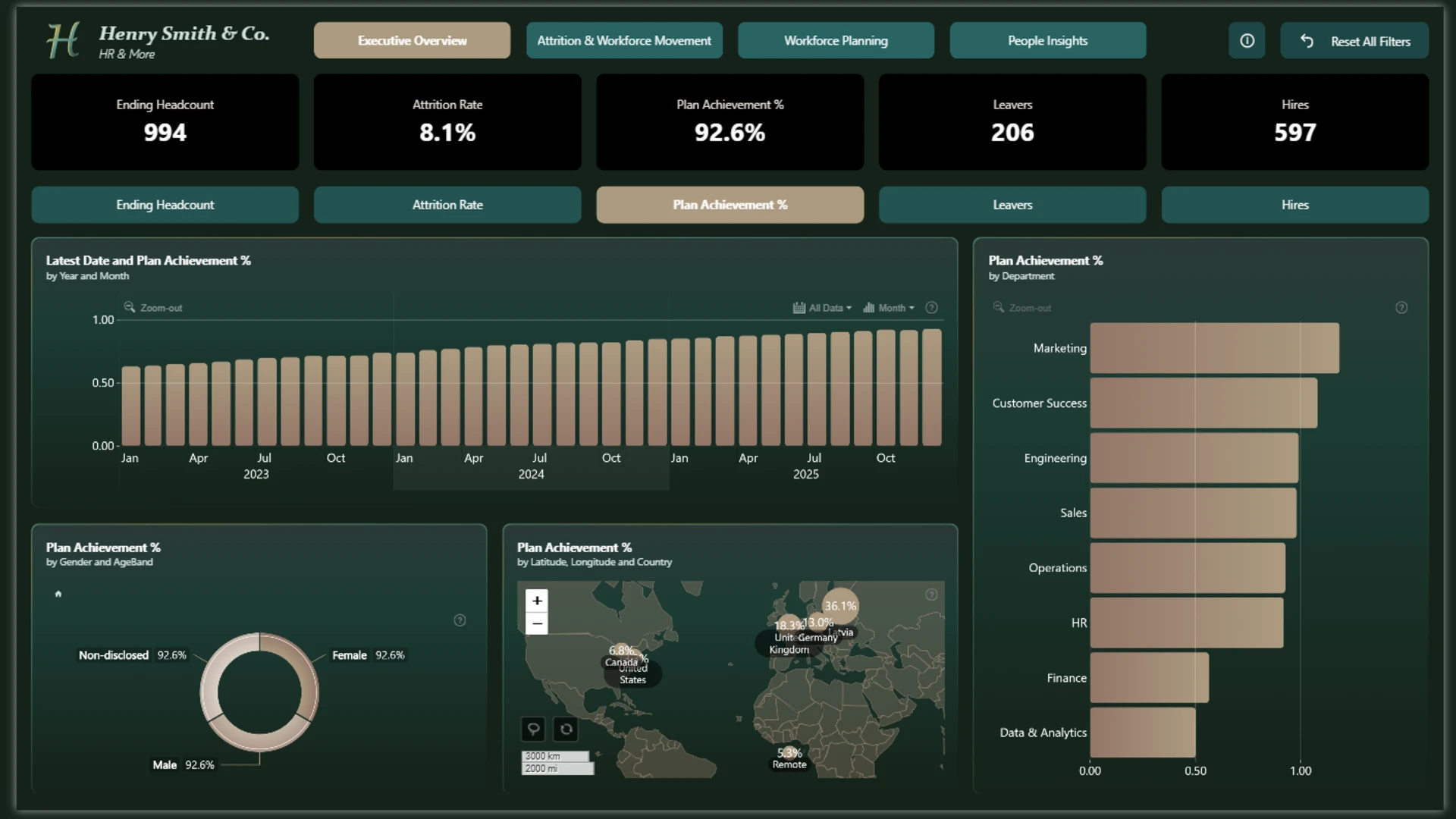
This ZoomCharts template puts key HR data in one place. It shows employee changes, staffing plans, hiring, and engagement. You can filter by team, role, location, employee group, or time. Then you can look deeper into attrition, staffing gaps, engagement, hiring, and performance.
The report is easy to start with, but it also has more detail. You can click chart parts and drill down to learn more. It is useful when a team wants one HR report instead of several separate reports.
Explore this dashboard template
ZoomCharts visuals used:
Drill Down Scatter PRO, Drill Down Combo Bar PRO, Drill Down Map PRO, Drill Down Timeline PRO, and Drill Down Donut PRO.
3. HR Power BI Dashboard for Employee Analytics
Best for: Comparing pay, employee groups, hiring, and people leaving
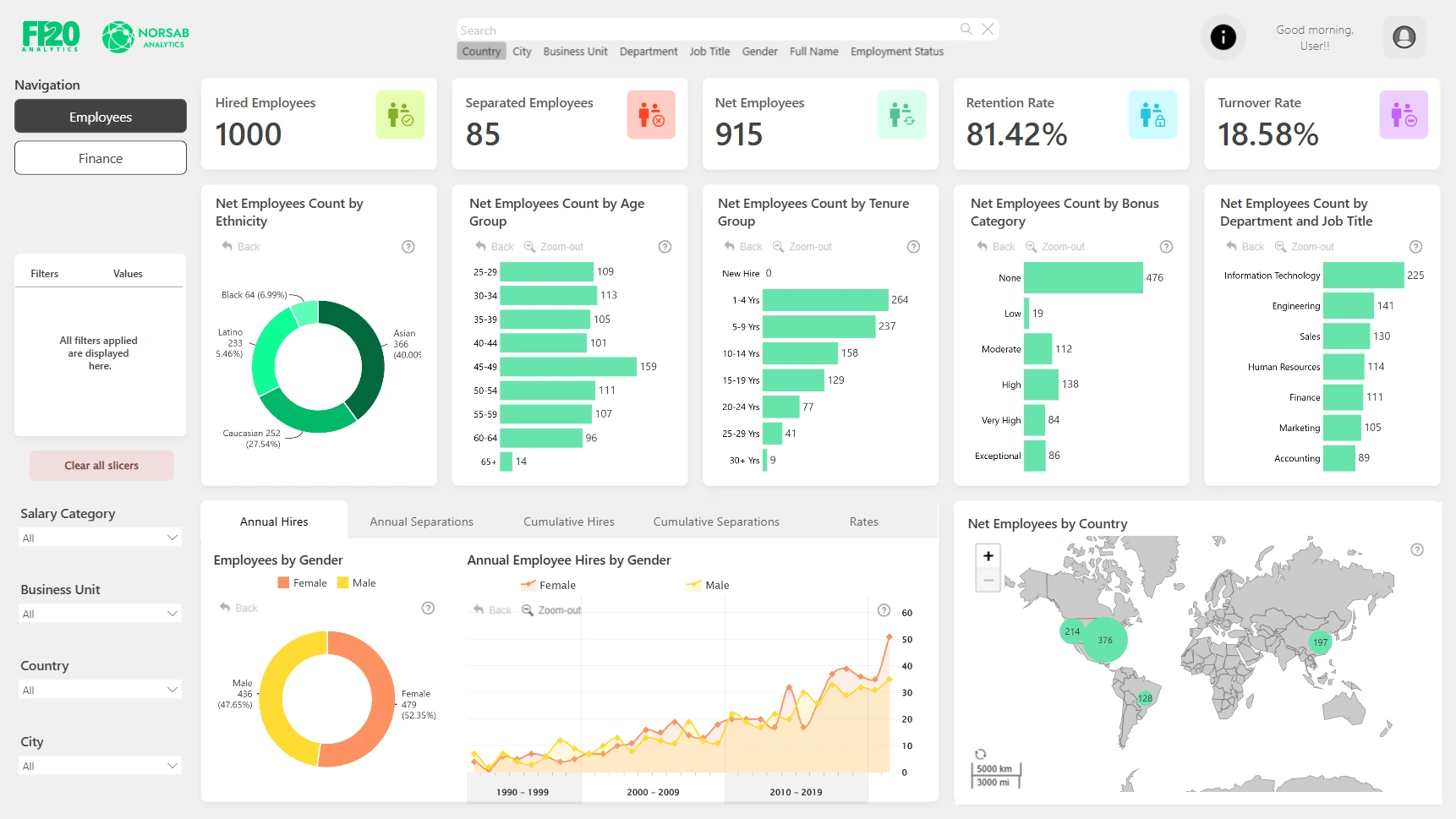
This updated report from the FP20 Analytics April 2024 ZoomCharts Challenge looks at workforce changes, pay, employee groups, and retention. It shows pay by team and employee group. It also shows hiring and people leaving over time.
The charts show who works at the company and how the workforce changes. You can click a chart item to filter the page. This makes it easy to move from the big picture to one employee group.
Explore this dashboard template
ZoomCharts visuals used:
Drill Down Donut PRO, Drill Down Combo PRO, Drill Down Combo Bar PRO, Drill Down Map PRO, and Drill Down Timeline PRO.
4. Power BI HR Dashboard for Headcount and KPI Analytics
Best for: A simple view of employees and workforce changes
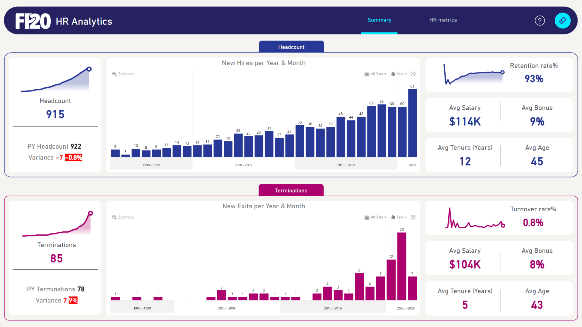
This two-page template shows headcount, hiring, people leaving, employee groups, and work locations. Page one shows the main workforce changes. Page two compares people by gender, age group, ethnicity, and location.
This is a good example for teams that want a simple HR dashboard. Click a gender or age group, and the other charts update right away.
Explore this dashboard template
ZoomCharts visuals used:
Drill Down Combo PRO, Drill Down Combo Bar PRO, Drill Down Timeline PRO, and Drill Down Donut PRO.
5. HR Attrition Trends Power BI Dashboard
Best for: Finding where people are leaving the company
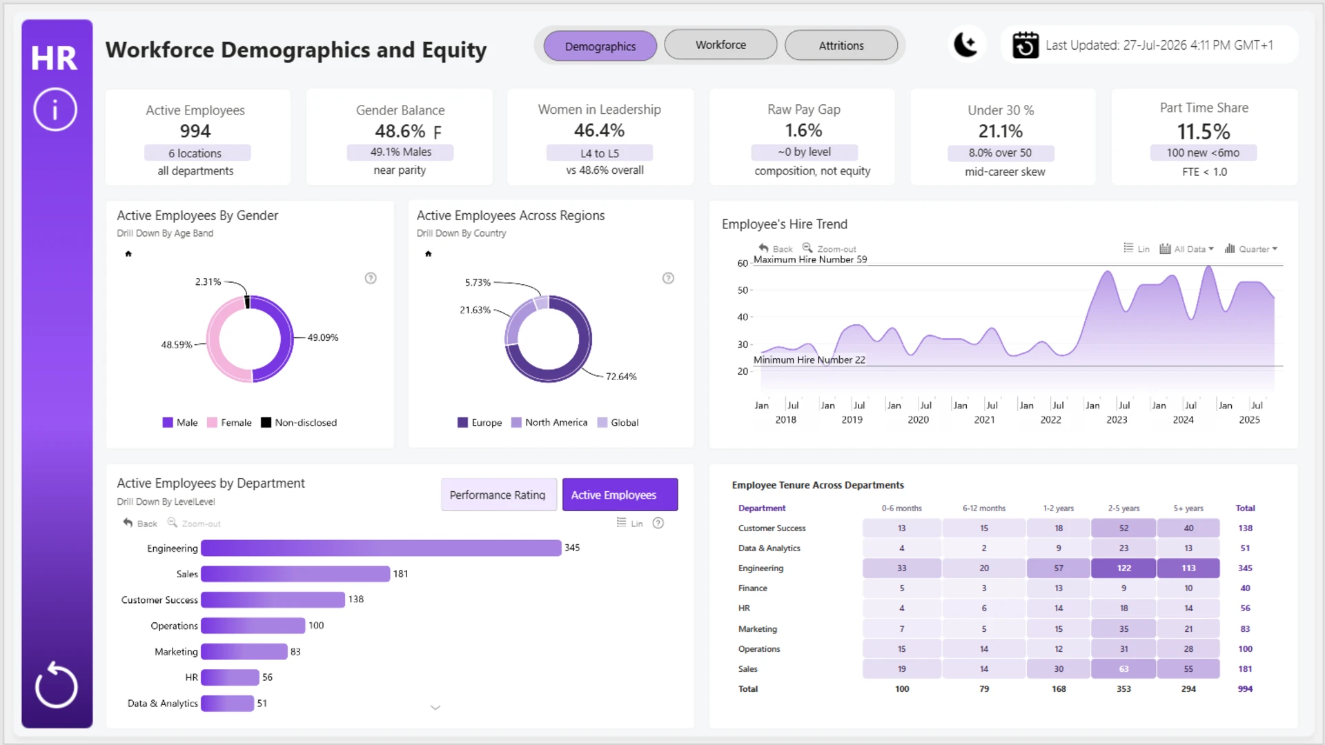
Built by Okeh Dono Efasa, this dashboard shows where employees are leaving. You can compare teams, roles, locations, and employee groups. Combo, combo bar, timeline, and donut charts make it easy to compare groups and see changes over time.
The goal is not only to see how many people left. It also helps you see where people left from. You can compare groups, follow the trend, and focus on areas that may need attention.
Explore this dashboard template
ZoomCharts visuals used:
Drill Down Combo PRO, Drill Down Combo Bar PRO, Drill Down Timeline PRO, and Drill Down Donut PRO.
6. Employee Attrition and Retention Power BI Dashboard
Best for: Seeing people leaving, hiring, and staffing plans together
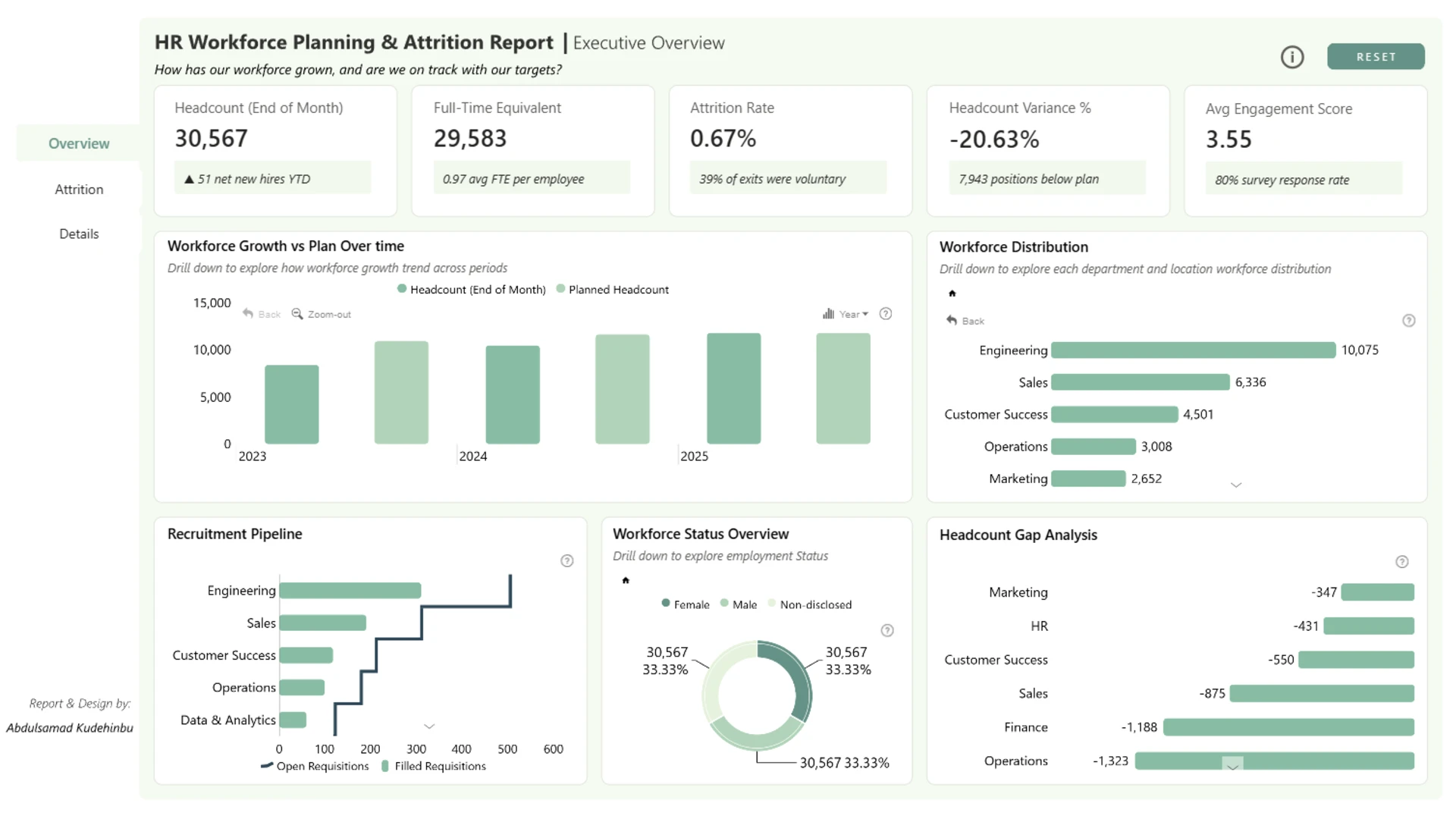
This report shows headcount, FTE, people leaving, engagement, performance, absence, hiring, and staffing targets. FTE means full-time equivalent. It is a way to show how much full-time work the team has. The report brings employee, hiring, and planning data into one place.
This helps you see the full story. You can see why people may leave, how hiring is going, and whether there are enough people to meet the staffing plan.
Explore this dashboard template
ZoomCharts visuals used:
Drill Down Bubble PRO, Drill Down Combo PRO, Drill Down Combo Bar PRO, Drill Down Timeline PRO, and Drill Down Donut PRO.
7. Power BI Strategic Workforce Planning Dashboard
Best for: Comparing the staffing plan with the real workforce
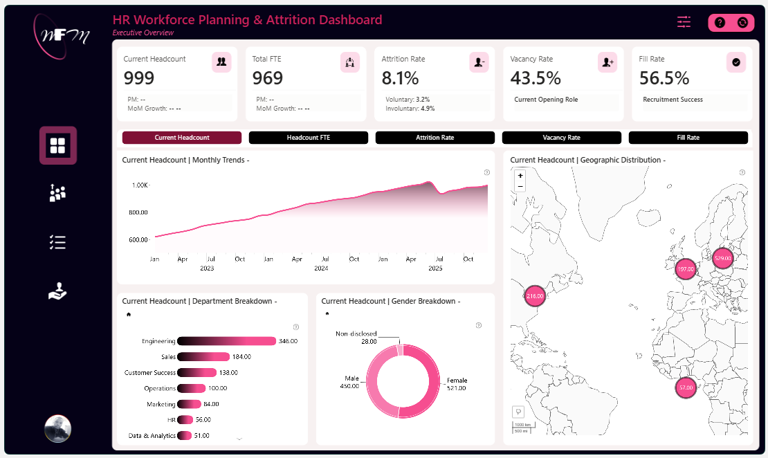
This four-page report compares staffing goals with the real workforce. It shows headcount, FTE gaps, hiring, people leaving, and workforce growth. Interactive charts help you see where the company is above or below plan.
A planning dashboard should make gaps easy to see. Show the goal, the real number, and whether the gap is getting better or worse. Scatter, combo, waterfall, map, timeline, and donut charts help you look at the gap in different ways.
Explore this dashboard template
ZoomCharts visuals used:
Drill Down Scatter PRO, Drill Down Combo PRO, Drill Down Waterfall PRO, Drill Down Combo Bar PRO, Drill Down Map PRO, Drill Down Timeline PRO, and Drill Down Donut PRO.
8. HR Workforce Performance and Attrition Dashboard
Best for: Seeing what may make employees leave
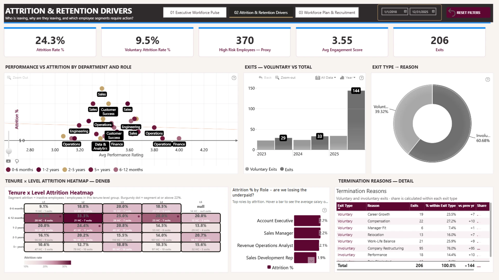
This three-page report looks at workforce health, reasons people may leave, and future staffing. It shows performance, engagement, absence, pay, retention, hiring, and staffing costs.
The pages follow a simple story. Page one shows how the workforce is doing. Page two looks at why people may leave. Page three shows what the company may need to do next.
Explore this dashboard template
ZoomCharts visuals used:
Drill Down Scatter PRO, Drill Down Combo Bar PRO, Drill Down Map PRO, Drill Down Timeline PRO, and Drill Down Donut PRO.
9. Employee Performance Power BI Dashboard
Best for: Checking employee performance, productivity, satisfaction, and turnover
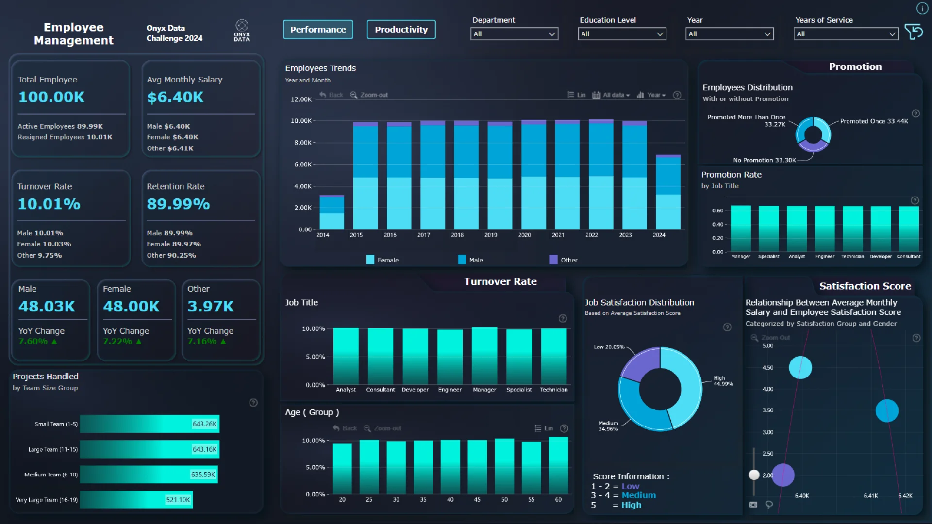
Created by Andreas Miftakhul Pratama for the Onyx Data October 2024 Challenge, this report looks at employee performance and productivity. You can check salary, turnover, retention, promotions, satisfaction, projects, and employee trends.
You can click the charts to compare teams, job titles, age groups, and other employee groups. This helps you see what is going well and where people may need more support.
Explore this dashboard template
ZoomCharts visuals used:
Drill Down Scatter PRO, Drill Down Combo PRO, Drill Down Combo Bar PRO, Drill Down Timeline PRO, and Drill Down Donut PRO.
10. HR Workload Analytics Power BI Dashboard
Best for: Seeing how work is shared across teams and employees
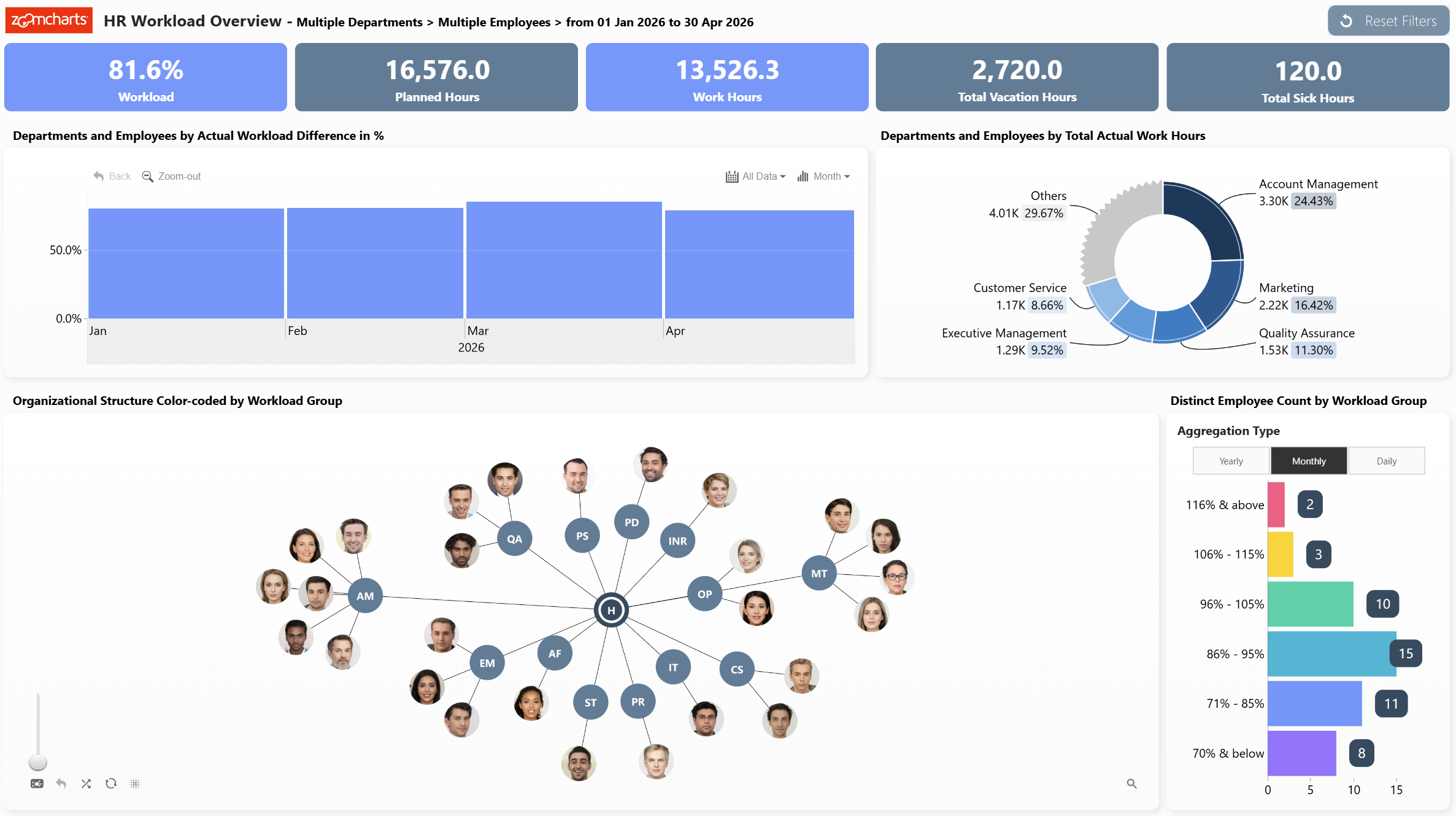
Created by ZoomCharts, this dashboard shows how work is shared across the workforce. You can compare planned hours, work hours, vacation time, sick time, and workload levels.
You can click chart parts and filters to compare departments and employees. You can also use the graph to see how people are connected in the organization. This can help you spot teams with too much or too little work.
Explore this dashboard template
ZoomCharts visuals used:
Drill Down Graph PRO, Drill Down Combo Bar PRO, Drill Down Timeline PRO, and Drill Down Donut PRO.
Ideas for your next HR dashboard
- Start with one question: Pick the main numbers that help answer the question for the meeting. For example: Do we have enough people? Are people leaving? Are we hiring fast enough?
- Show today and change: Use KPI cards for the key numbers now. Use time charts to show what is going up or down.
- Show the plan next to the real result: This makes it easy to see if a staffing gap is getting smaller or bigger.
- Click for more detail: Use filters and drill-down so you can move from the whole company to one team, location, role, or employee group.
- Keep employee data safe: Show group totals when possible. Only show details about one person when you have permission to see that information.
A good way to start your new HR Power BI dashboard is to find an example that answers a similar question. Look at the main numbers, filters, and drill-down. Then change the dashboard to fit your own data, HR rules, and security needs.
Browse more than 2,800 Power BI dashboard examples and templates in the ZoomCharts Power BI Template Gallery.
Try ZoomCharts Drill Down Visuals Free for 30 Days
Try the ZoomCharts visuals in your own Power BI reports. The free trial lasts 30 days. It also works in published and shared Power BI reports.
Start your free 30-day trial or see more Power BI report templates.

Want more info like this?
Subscribe to our newsletter and be the first to read our latest articles and expert data visualization tips!