Mar 13, 2024
NEW FEATURE: Legend Field in ZoomCharts Visuals
We have added the much-requested Legend field to Combo, Combo Bar, and Timeline visuals which makes it easier to split values into visually distinct segments.
We have added the much-requested Legend field to Combo, Combo Bar, and Timeline visuals which makes it easier to split values into visually distinct segments.
What Is The Legend Field?
The Legend field makes it faster and easier to split values into smaller segments. This field requires a column with category names which will be used to split the Series values and do the following:
- Display separate segments as a stack or cluster, showing how each segment contributed to the total Series value.
- Create legend items for each segment to quickly show/hide them without filtering.
- Apply custom fill colors to each segment.
- Show each segment value in the tooltip.
This field is available in Drill Down Combo PRO (v1.11.7.0 or later), Combo Bar PRO (v1.11.7.0 or later), and Timeline PRO (v1.11.8.0 or later). Make sure that you have updated your visuals to access the Legend field in the Visualizations pane. You can check the current version of your visuals by pressing the "?" (Info) button at the top right corner of the visual.
How To Use The Legend Field?
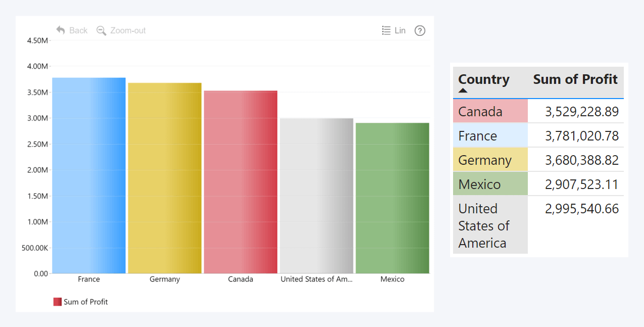
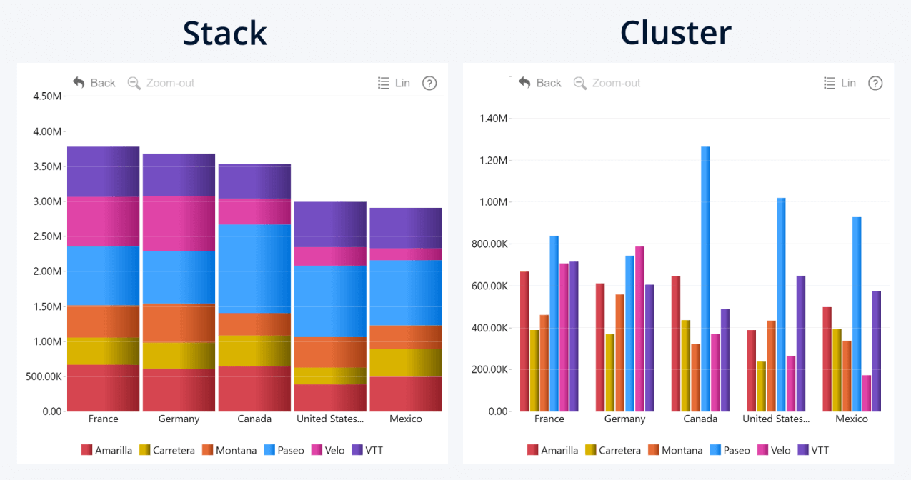
Let’s use an example. This Combo PRO column chart is created using two fields – Category (Country), and Series (Profit). Currently, we see the total profit per each country, but not much else.
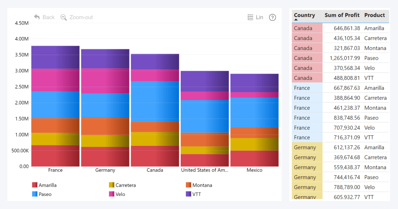
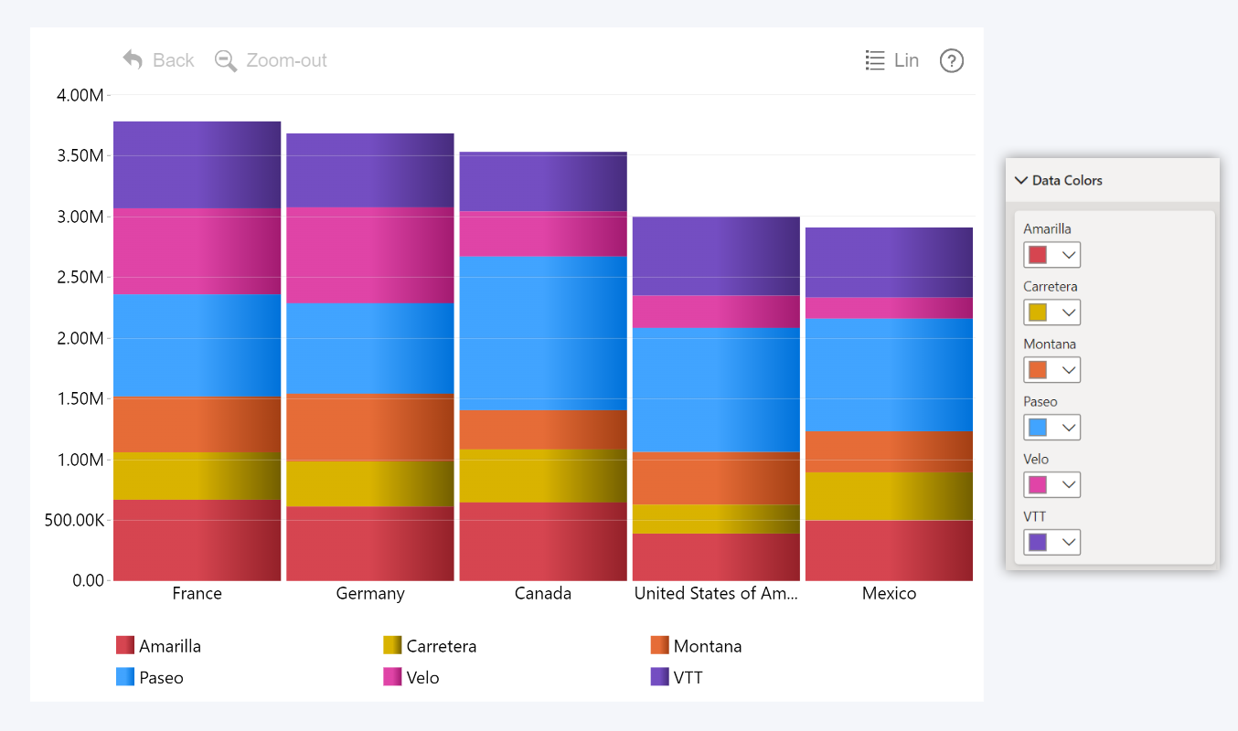
Let’s say that we want to see how much each of our products contributed to the total profit in each market. Our data has a text column Product that contains product names (Amarilla, Carretera, Montana, etc.) adjacent to each value. Once we drag this column to the Legend field, it will split the series values into segments that show how much profit each product earned in each country.
Previously, you could achieve this in Drill Down Visuals by using an inconvenient workaround. You would have to define each segment as a separate series (either in data or with measures).
Legend field makes this so much quicker and easier. Simply drag a column to the Legend field, and it will instantly split values from the Series column(s), with no extra work or measures needed. This also works seamlessly with drill down, dynamically splitting data for each hierarchy level that the user visits.
You can also choose whether the separated values are displayed as a stack or cluster – go to the Series Defaults (or Series X Configuration if you wish to adjust a specific series independently) and choose the preferred mode with the Display setting. You can further customize stack or cluster behavior in the Stack Settings or Column Padding sections.
How Would The Legend Field Work With Multiple Series?
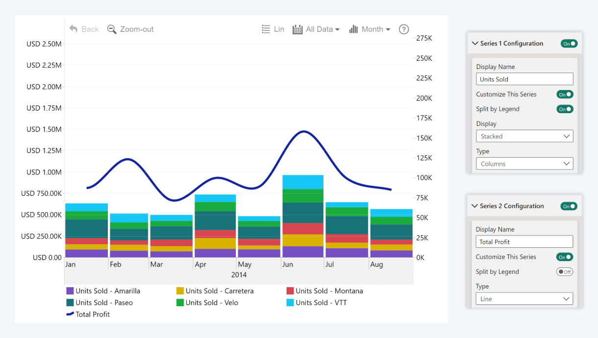
By default, the Legend field will split all series on the chart, but you can enable or disable splitting for each specific series. To do that, we can go to the Series X Configuration section for the series you want to adjust and disable the Split by Legend toggle, so the series isn’t affected by the Legend field.
In this example, we’ll create a Timeline PRO chart with two series: Units Sold (as columns) and Profit (as lines). We want to split the Units Sold series to see which products had the highest sales, but we don’t want to split Profit so we can see the total profits as a single line. That’s why we left the Split by Legend toggle enabled for Series 1, but disabled it for Series 2.
Other Benefits of The Legend Field
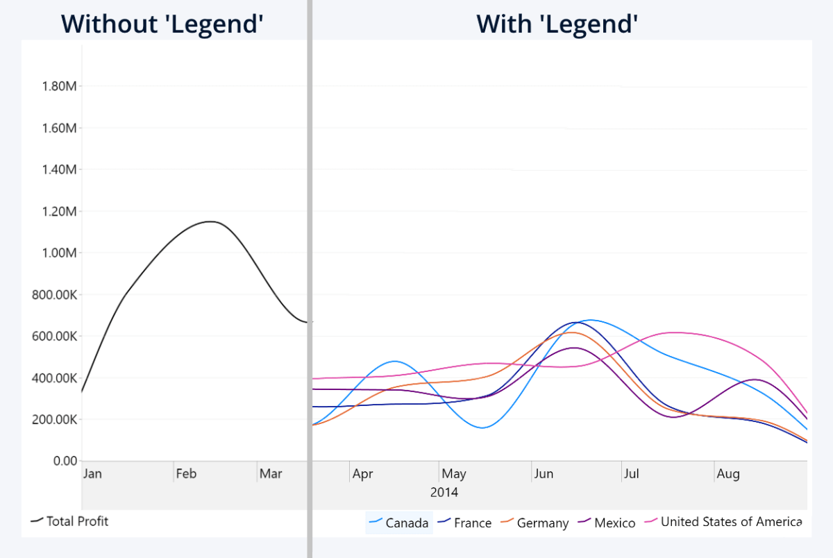
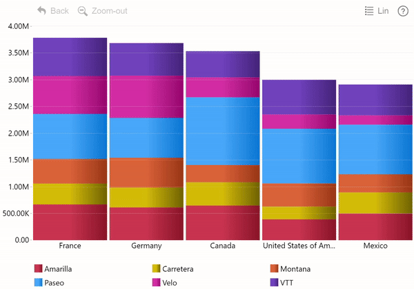
By default, the legends block will display each series as an item. However, when you use the Legend field, the legends block will show categories from the Legend field instead. If you’re showing multiple series, the Legend categories will be displayed separately for each series (you can exclude a series from the legends block with Show in Legend toggle in their Series X Configuration sections).
This is incredibly useful because in Drill Down Visuals, you can click on any legends block item to show or hide it from the chart. If you wish to exclude a specific subsegment from the total value and see, for example, the profit without a specific product, just click on its legend! This will simply hide the data from this visual and will not apply a filter on other visuals.
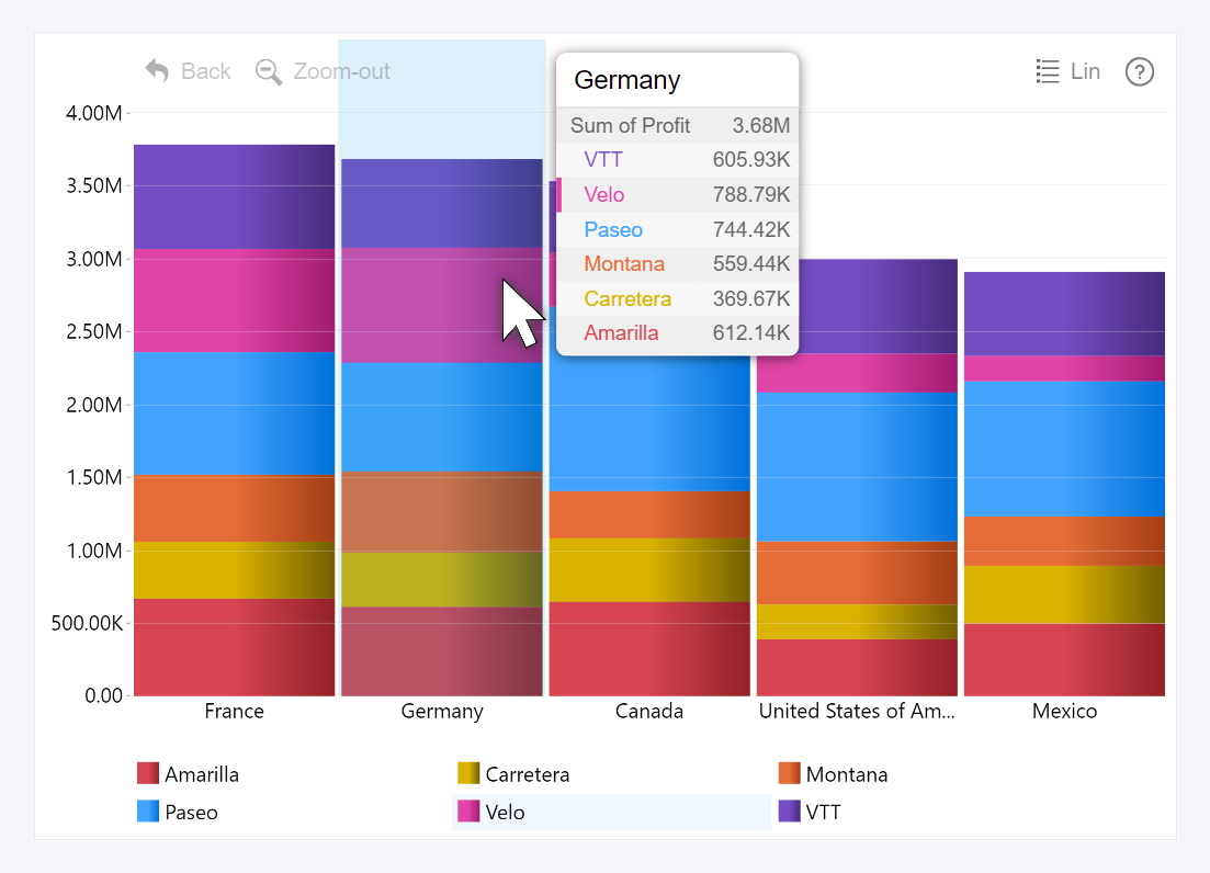
Furthermore, the tooltip will display not just the total value of the stack or cluster, but also each of the subsegments that you split using the Legend field. What’s more, it will show only values that are visible on the chart, so if you hid any subsegment by clicking the legends block items as described above, they will also not appear in the tooltip. With the tooltip, users can access more detailed insights by simply hovering over data.
Lastly, when you add data to the Legend field, a new section – Data Colors – will appear in the Format visual tab where you can assign a specific color for each legend category. These colors will be applied to any series that are split by the Legend field, overriding the default color settings or series configuration. If you wish to add a gradient effect to the colors, you can use options in the Fill Color Settings section.
Legend Field Use Cases
The most obvious benefit of the Legend field is how much faster and easier it is to break down a total value into smaller components. You don’t need to create calculated columns or apply measures to achieve this anymore, because Legend field splits data directly from the Series columns. It’s purely visual and makes no changes to the data itself.
Our example showed how Legend field separated the total profit into profit-per-product, but there are various other ways how report creators can use this feature. For example, you’re creating a demographics report and need to quickly separate data by age group or gender. Or you are analyzing website traffic, and you want to see how many visitors use mobile or PC, or what OS or browser versions are the most popular.
One nifty thing about the Legend field is that it is separate from the series and categories (or time units in Timeline), and it doesn’t affect the data or filters. When the user selects or drilldowns a category or series as usual, the visual will filter data and cross-filter other visuals; but showing/hiding legend subsegments will not apply a filter.
If you wish to provide a way for users to filter data by legend subsegments, simply create a slicer or a separate visual with cross-filtering (for example, Donut PRO) from the same column that you used in the Legend field. This means that you can have more control when planning the userflow and navigation of your report.

Want more info like this?
Subscribe to our newsletter and be the first to read our latest articles and expert data visualization tips!