Nov 30, 2022
How to Make Power BI Network Charts Step-By-Step
Here’s the thing about Power BI network charts – they aren’t as difficult to make as they might look. You just need the right tools and creating interactive and fully featured network graph visualizations will become a breeze. In this blog post, we share some tips and tricks for Power BI network charts and go through the most popular use cases for this kind of visual.
Here’s the thing about Power BI network charts – they aren’t as difficult to make as they might look. You just need the right tools and creating interactive and fully featured network graph visualizations will become a breeze. In this blog post, we share some tips and tricks for Power BI network charts and go through the most popular use cases for this kind of visual.
What is a network chart?
All data is just meaningless numbers if you don’t provide proper context to it. That’s why there are many types of charts out there, each of them suited for the kind of data you want to display.
In the case of a network chart, you would be visualizing categorical data. Each category is represented as a node or vertice, and they are mutually connected with links or edges to denote hierarchy. Most network charts will have one or multiple center nodes which will branch out into smaller subnodes.
Network charts for business intelligence are ideal for depicting corporate structures or any other network of relationships. They allow you to crunch down large numbers into smaller subsets and see their respective allocations.
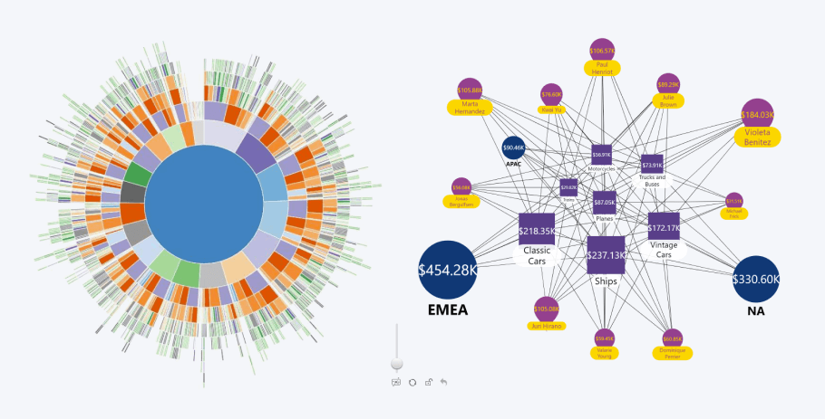
Some report creators try to adapt other data visualization types like pie or donut charts to show hierarchical data, and that’s how UX monstrosities like sunburst charts are born; confusing and hard-to-read. Network charts, on the other hand, will display this data in an easy-to-read and visually pleasing way.
What is the difference between a network and a graph?
Some of our most eagle-eyed readers might have noticed that among the ten custom visualizations in our Drill Down Visuals bundle, you can find Drill Down Network PRO and Drill Down Graph PRO. While it might look like they are used to create the same data visualizations, they each fulfill their own unique purpose.
Network chart
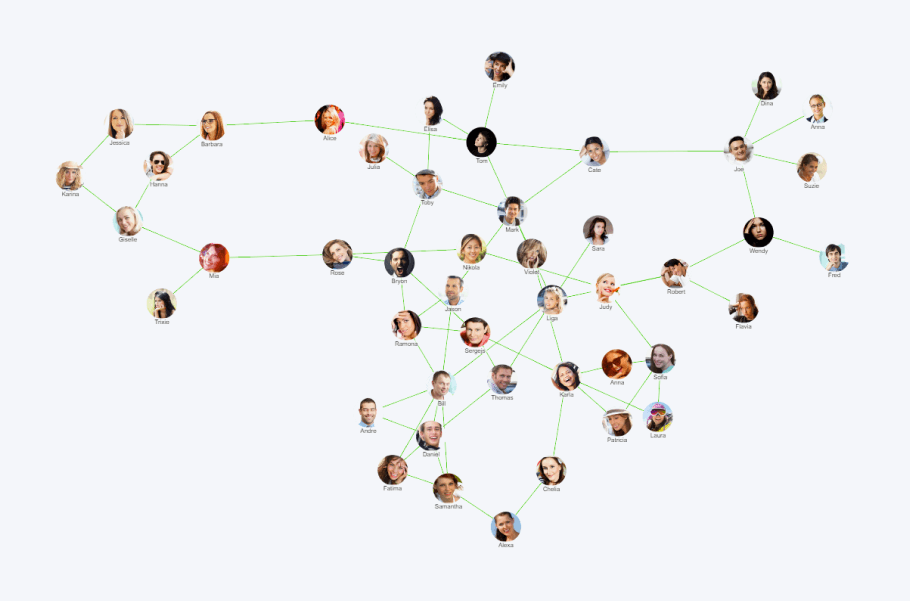
Drill Down Network PRO’s most notable quality is its simplicity. When using it to create your network diagram, it will automatically detect the relationships between nodes and create a simple network chart. However, this also means that you have less control over defining the relationships between nodes.
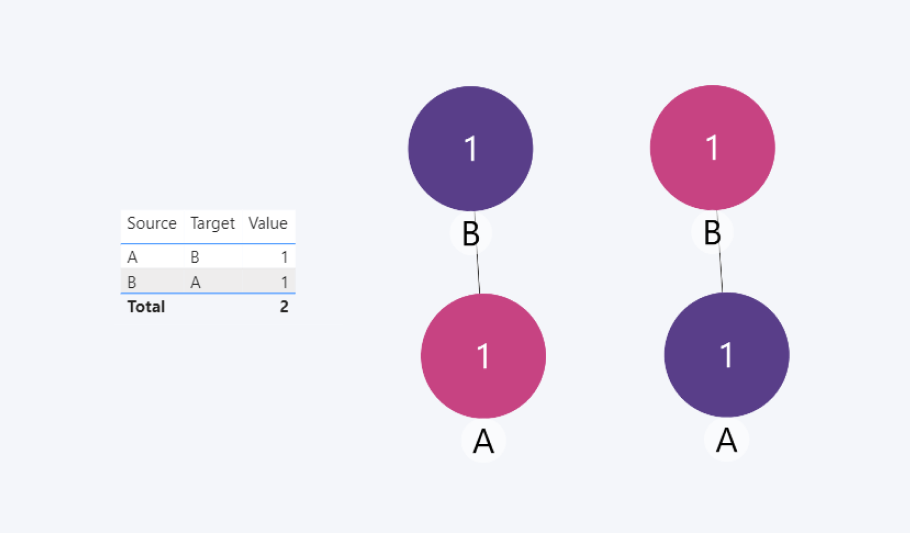
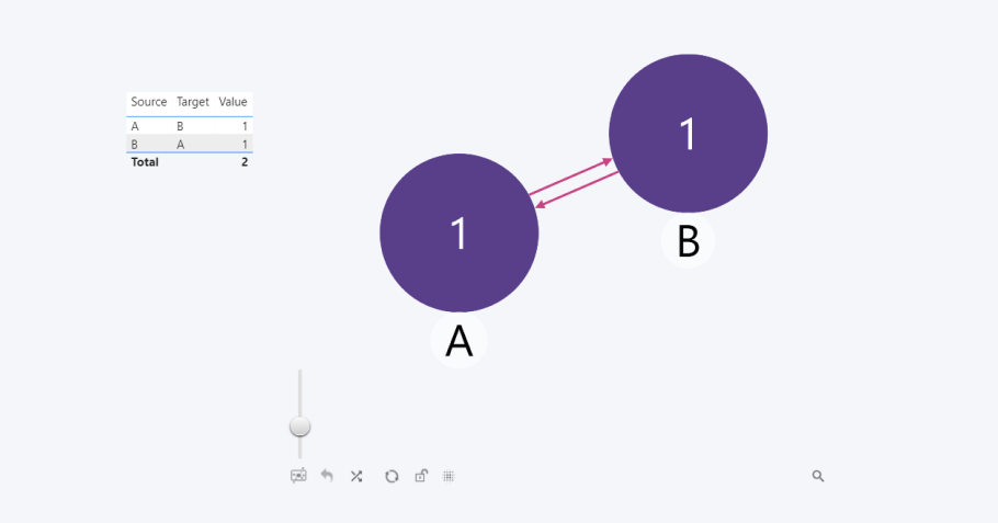
As shown in the table below, we have input our Source nodes A and B, and their respective Targets, B and A. Drill Down Network PRO recognizes these as separate values and displays them as such.
This makes Drill Down Network PRO great for displaying non-complex networks using category-based unique values. One way to use a network chart is by breaking down a large number into smaller subsets, showing the way you arrived at that total. For example, you can display the total amount of sales or revenue, and then break it down further into departments, countries, or sales agents. It’s a way to simplify complex data, making it a valuable tool for business intelligence.
Graph chart
For a social networking diagram, an org chart or an AML graph, our Drill Down Graph PRO visual would be a better fit. You can learn all about creating interactive and data-rich graphs and read about their use cases in our blog post Create a Power BI Org Chart & More with Drill Down Graph PRO.
In short, graph charts are excellent for showing the relationships between various nodes. You can manually set a source node, a target node, and a value for each data point, giving you complete control over the node relations.
For example, using Drill Down Graph PRO, you can define the link between two nodes to be bi-directional. That means that you have the option to configure node A and node B to display a relationship that holds weight in both directions, A to B and B to A, rather than just A to B.
How to create a network chart in Power BI Desktop
Microsoft Power BI is the undisputed leader in business intelligence software, and its large adoption rate means that even if there’s something missing from the core feature set, there’s more than likely a custom visualization created by Microsoft partners and third-party developers that will provide the functionality you need. You can browse AppSource to find a custom visual for your intended purpose.
ZoomCharts Drill Down Network PRO is a custom visualization for Power BI that you can use to create an interactive and easy-to-navigate network chart. To get started, simply download the visual from AppSource and add it to your Power BI report.
Afterward, drag in the categories that you want to display as Nodes, and then add the numerical value you want to display by dragging it into the Measure field. With just these two fields, Drill Down Network PRO will be able to create a beautiful and force-directed network chart.
Power BI network chart customization
Okay, I have made a network chart from my data. What now?
Time to explore the wide range of customization options! Drill Down Network PRO offers you many ways to increase the visual saliency of your data, or just make your report aesthetically pleasing. Make your chart truly yours by adjusting any visual aspect of the nodes, links, and labels, including their color, width, shape, and other options.
Furthermore, you can include custom hex codes for each category, and the visual will apply that color to their corresponding nodes. It’s an easy way to create a visual distinction between different categories. Of course, you can do the same with links as well.
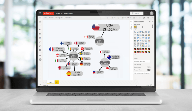
If you want to make your Power BI report more accessible for your users, you can also choose the shapes for your nodes to distinguish them from one another. For example, maybe some of your users have a form of color blindness that limits them from accurately distinguishing colors. Perhaps you’re making your report in greyscale, so to make it more visually interesting, you can assign different node shapes for the categories. Drill Down Network PRO has 3 shape options – circle, rectangle, and droplet.
As a cherry on top, you can add custom images for each category by including them in the Image field. One of our favorite ways to use this feature is adding country flags for each market when building a sales report or adding a logo for each subsidiary if it’s a financial report.

This is just a brief overview of the vast customization options offered by Drill Down Network PRO. To learn more, we recommend that you visit ZoomCharts Academy for a deep dive into all the features offered by this visual!
Use cases for Power BI network charts
First things first – network charts are not suited for every purpose. However, if your category-based data needs a simple visual representation of hierarchy, this visualization type is unmatched. Here are just a few examples of how you can use Drill Down Network PRO as a powerful data storytelling tool.
Logistics chart
Drill Down Network PRO can also be a key element in ensuring you never run into supply chain disruptions.
Microsoft recognized this visual’s potential and, along with Drill Down Map PRO, used it to build a platform meant exclusively for efficient supply chain management - Dynamics 365 Supply Chain Insights. Working together, our network and map visuals reflect manufacturer production plans, with the network showcasing how the network of their production hubs while the map visual adds geographical context to the data. If you found this use case interesting, you can read about it in more depth here!
If this got you interested in Drill Down Map PRO, you can read more about it here!
Project management chart
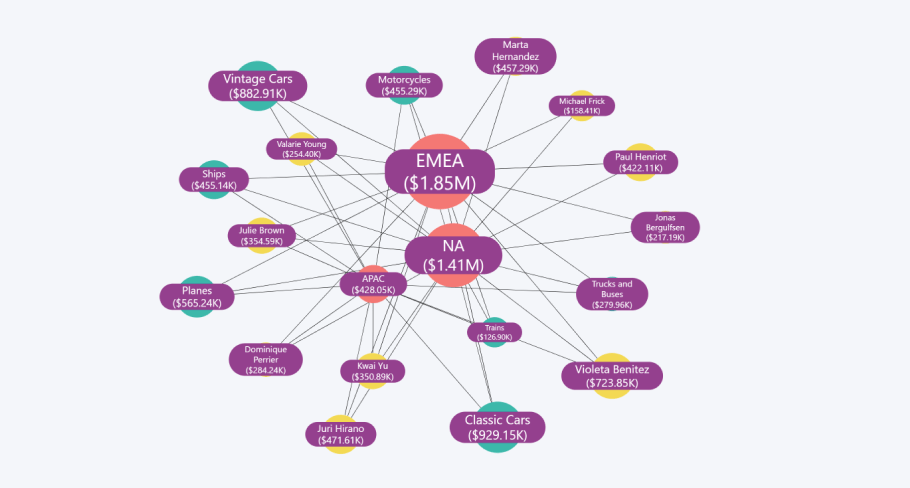
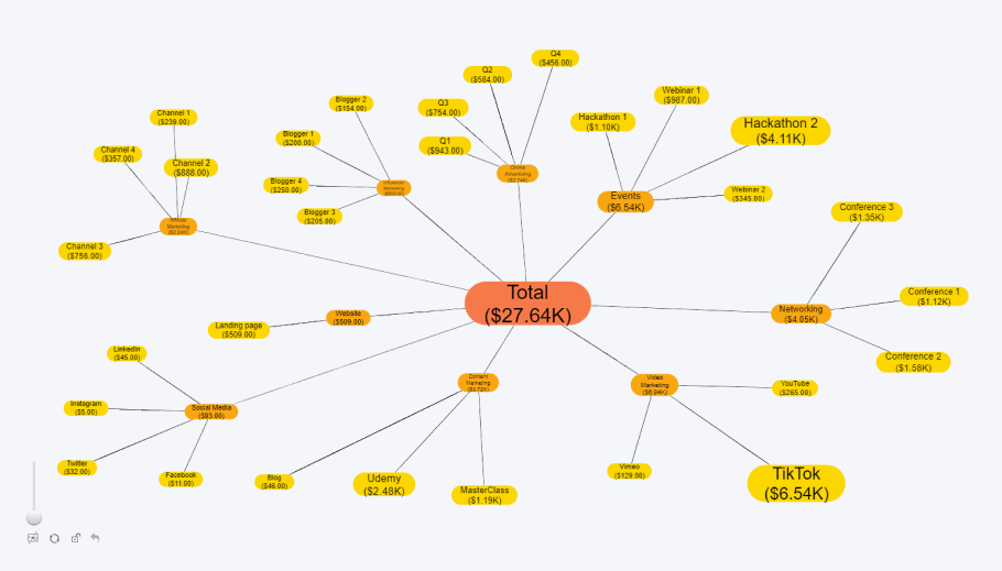
It’s one thing to simply have the project name and its budget in a financial report but having a detailed visual that shows how you arrived at that number is so much better. In a network chart you can have one or multiple central nodes representing the total costs of a project, and then branch out into each task group node which can expand further into individual expenses.
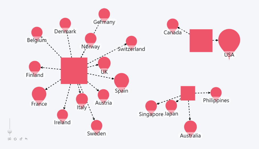
For example, if your company is planning a multi-channel marketing campaign, you can list each promotional activity (e.g., paid social media post, print ad on a magazine or a TV spot) and then categorize it by the channel (Facebook, LinkedIn, publication, or TV channel name).
If you have a column that sorts them into general categories (e.g., Social Media, Print, Retail, etc.), each of them will be represented as larger nodes from which all of the other categories will branch out. And, of course, in the middle you can place the central node that will show the total budget of the project.
No matter what kind of project you are undertaking, a clear and concise way to visualize it will go a long way in making things more organized and transparent.
Human Resources chart
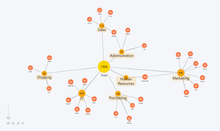
How do you track salary data across multiple departments in your company? That’s right – you create a network chart. Using Drill Down Network PRO, you can create comprehensive network diagrams that show financial information, such as expenses or income, for different branches within your company. This is a great way to easily see how your budget is being spent.
With the central node showing the total budget, and each subnode corresponding to the divisions of your company, you can easily see at a glance how much of your budget goes to each department. You can even branch out further to include each employee as a node and include their individual salaries.

Drill Down Network PRO is an excellent tool for salary data. The nodes can automatically change their size according to their numerical values, making it easy to see which departments or employees receive the biggest share of the budget.
Keep in mind that the chart shown in the example above is not an org chart, which requires a more detailed depiction of category relations. For that purpose, Drill Down Graph PRO will work perfectly!
Integrating a network chart into a Power BI report
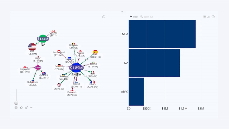
If you want to provide additional context to your data when creating a Power BI report, you can easily add additional ZoomCharts custom visualizations alongside your network graph. They will work together to bring relevant info as you drill down without the need of slicers, making your report truly interactive and easy-to-use.
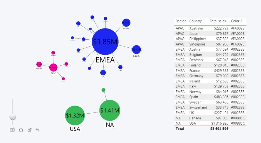
This feature is called cross-chart filtering, and you can use it to show relevant and context-sensitive data to your user. For example, when building a report that reflects profit from sales by location, you can display each country as nodes in a network, and place a bar chart right next to it that lets you filter by location while comparing the value of each corresponding category. All filtering happens instantaneously through a few clicks directly on the charts.
How a good network chart enhances the data analysis process
Visual charts have a major advantage over static reports that contain long rows of tables. Putting your data into a visual context emphasizes the data story you are trying to decipher, helping your colleagues enhance their information retention and comprehension skills.
This is why interactive Power BI reports can boost your team’s performance while upping the satisfaction level when they’re working with data. To take this a level further, custom visuals like Drill Down Visuals focus on giving report creators the option to maximize user experience through features such as vast customization options, smooth animations, and powerful drill down and cross-chart filtering capabilities.
Drill Down Network PRO is no exception. This custom visual comes with many features and options that can be used to create the perfect network diagram. Attempting to showcase hierarchies and interwoven connections between categories can get tricky on a simple Excel spreadsheet, thus the speed at which you deliver information to your users can experience a significant slow-down.
However, visualizing that same information as a network diagram communicates your data story far more effectively. The context of your data is established momentarily, and users can get straight to the data analysis process.
Conclusion
Network charts are an incredibly useful method for showing the hierarchy of category-based data in an easy-to-read way. If you want to create beautiful, intuitive, and interactive network charts, Drill Down Network PRO is exactly what you need. Get the 30-day free demo and try it out for yourself!

Want more info like this?
Subscribe to our newsletter and be the first to read our latest articles and expert data visualization tips!


