Jul 04, 2024
July 2024: Latest Features in ZoomCharts Visuals
A brand-new user interaction, plus expanded customization features and other improvements to our Combo, Combo Bar, Pie, Donut, Map, Timeline, Waterfall and Graph visuals – here’s what’s new in ZoomCharts visuals in July 2024.
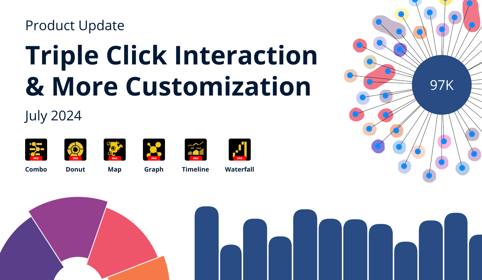
A brand-new user interaction, plus expanded customization features and other improvements to our Combo, Combo Bar, Pie, Donut, Map, Timeline, Waterfall and Graph visuals – here’s what’s new in ZoomCharts visuals in July 2024.
Your visuals should update automatically from AppSource. If you do not see the new features, make sure your visuals are on the latest version by pressing the “?” (Info) button at the top right corner of the visual, or by right-clicking the visual’s icon in the Visualizations pane and opening the About screen.
Triple Click to Invert Selection
Intuitive user interactions are the signature feature of ZoomCharts visuals – simply click or tap on data to drill down, and hold to select data. With the v1.11.28.0 update for Pie/Donut visuals and v1.11.27.0 for Combo/Combo Bar, we have introduced a new interaction – triple click/tap to invert selection.
This interaction will instantly inverse your selection (deselect all data that was previously selected and instead select all data that wasn’t selected). For example, if you wish to quickly select all data except some specific columns or slices, you can simply select the ones you want to exclude and then triple click to invert it.
Map: Relative Scale for Conditional Formatting
In the June 2024 feature update, we talked about the addition of Reference Value field, which allows to apply conditional formatting using each shape’s own reference value, instead of comparing it against other shapes. We have iterated further on this feature and with the v1.11.32.0 update for Map PRO, you can now choose between absolute and relative scale.
Once you turn on Conditional Formatting in the Shape Layer X Settings section and enable the Use Reference Value toggle, you will find a new setting (Color Scale) which will affect how the reference values will be used to determine the fill color of each shape. You can choose between Absolute and Relative. You can read an in-depth explanation on how both modes work in this documentation article.
Here’s an example where we visualized the yearly difference in revenue (using 2015 revenue as the actual value and 2014 revenue as the reference value). In the absolute scale, Germany’s fill color is the greenest because it has the largest actual increase in EUR, but in the relative scale Ireland is the greenest because it had the largest percentage increase.
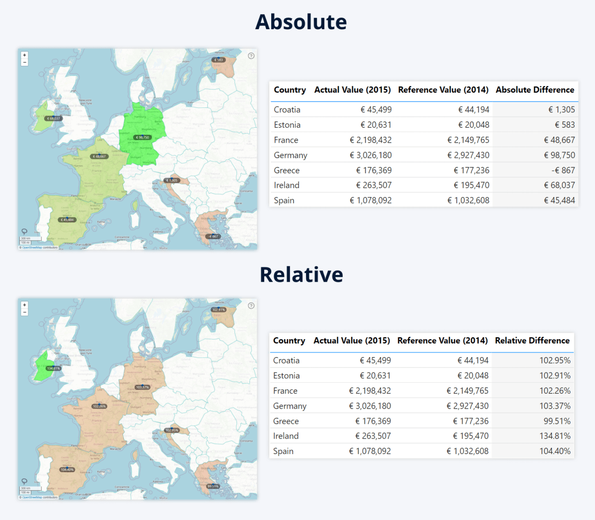
The relative scale will be useful in scenarios where there are stark differences in size, population, and other factors between different regions. While this could previously be achieved manually by creating a measure, the new relative scale setting does this automatically by calculating the percentage difference between both values and using it to apply formatting.
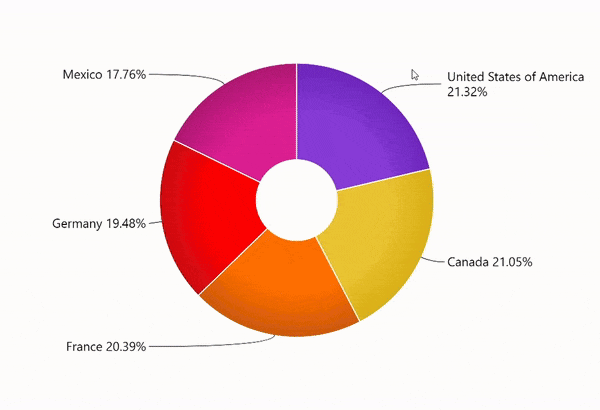
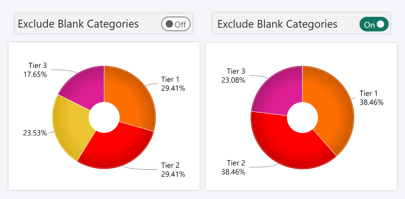
Pie and Donut: Exclude Blank Categories
Pie PRO (v 1.11.25.0) and Donut PRO (v1.11.27.0) visuals now have a new toggle – Exclude Blank Categories. If this toggle is enabled, the pie or donut chart will exclude all categories that have a blank name. They will not be displayed as slices and their values will be excluded from the total – effectively, the pie or donut chart will treat the blank categories as if they don’t exist. This will affect all drill down levels.
This setting will be useful in scenarios where you need to exclude untagged or unidentified values. For example, if the pie or donut chart is visualizing the support ticket distribution per each employee, then this toggle can be used to hide all tickets that have not been assigned to anyone. The Exclude Blank Categories toggle can be found in the Pie (or Donut) section of the Format Visual tab.
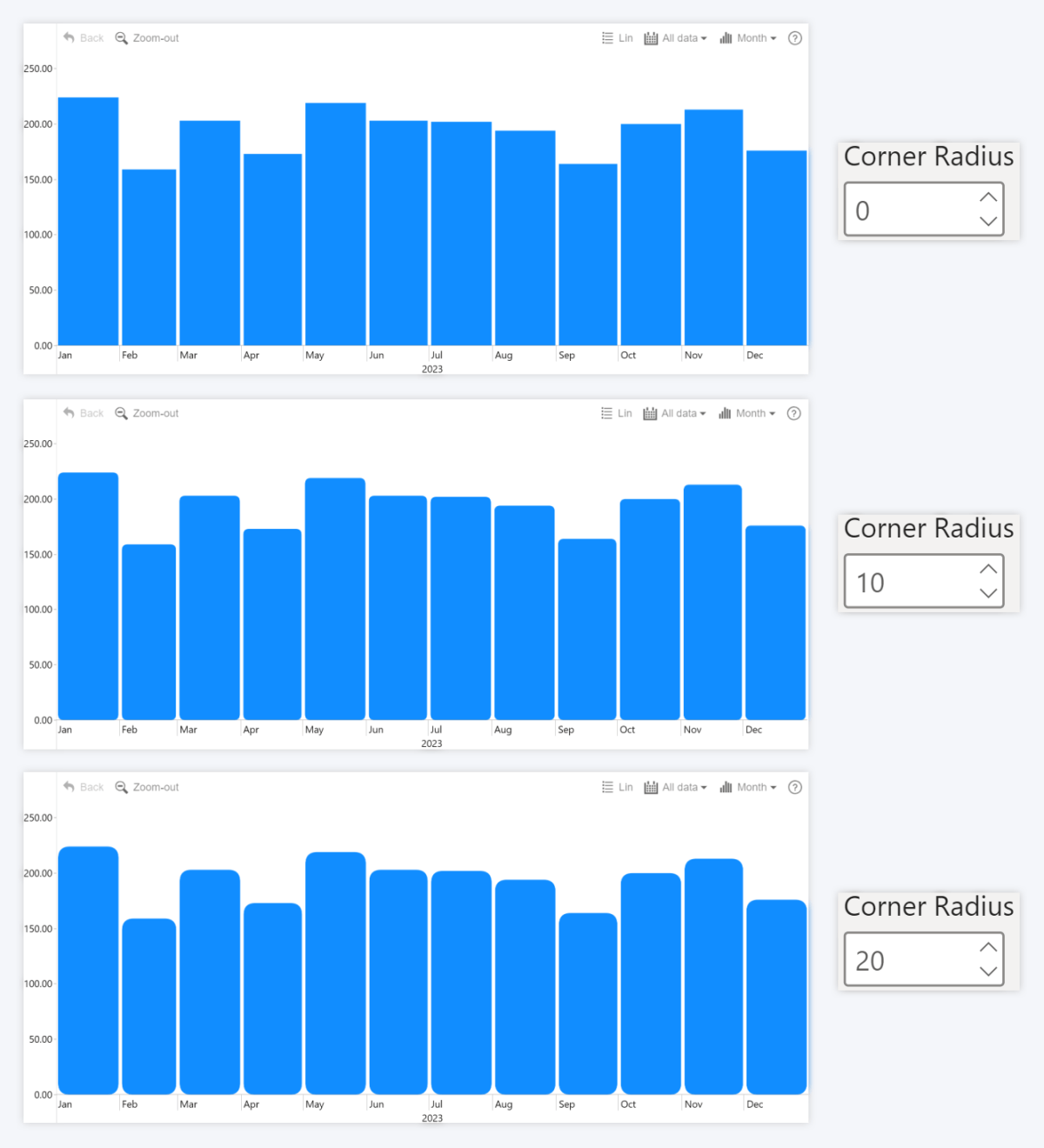
Timeline and Waterfall: Rounded Corners for Columns
The v1.11.34.0 update for Timeline PRO and v1.11.26.0 for Waterfall PRO brings the Corner Radius setting which is an additional way to customize the appearance of columns. You can select a value between 0-100, where 0 will leave the columns perfectly rectangular, but increasing the value will apply rounded corners for the columns. This setting was first introduced in Combo PRO and Combo Bar PRO visuals, and this update brings it to two more ZoomCharts visuals.
In Waterfall PRO, the Column Radius setting can be accessed in the Total Configuration, Positive Change Configuration and Negative Change Configuration sections. In Timeline PRO, it can be accessed in the Series Defaults or the Series X Configuration section of each series. The setting will be available if your selected series type is Column.
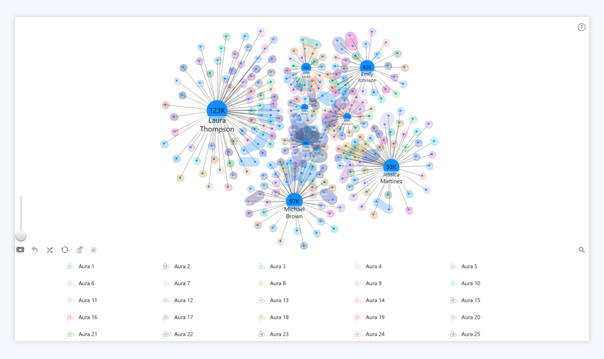
Graph: More Auras
One of the many customization features in Graph PRO is auras – colorful areas that visually distinguish nodes that belong to the same group independently of their actual relationships. The v1.11.26.0 version of Graph PRO increases the maximum amount of aura groups to 25, providing more flexibility to report creators. You can read more about setting up auras in this documentation article.
Get Started with ZoomCharts
Be sure to download the latest version of ZoomCharts Visuals to enjoy these new additions, along with hundreds of other features! With a free trial available, you can see for yourself how these powerful visuals can take your Power BI reports to the next level.

Want more info like this?
Subscribe to our newsletter and be the first to read our latest articles and expert data visualization tips!