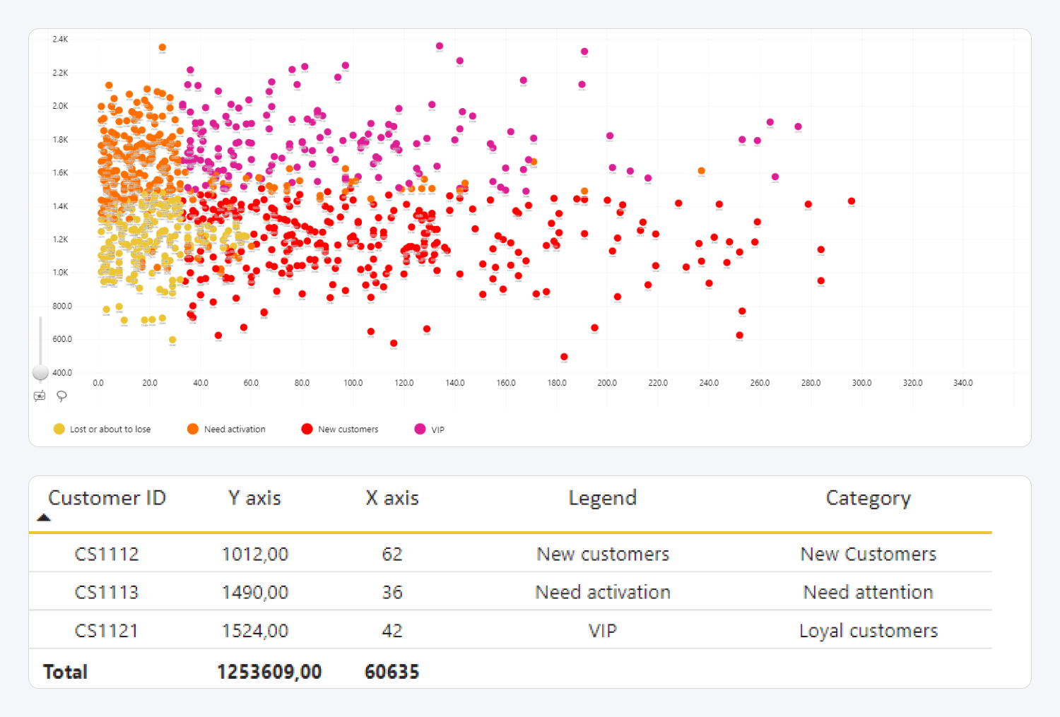
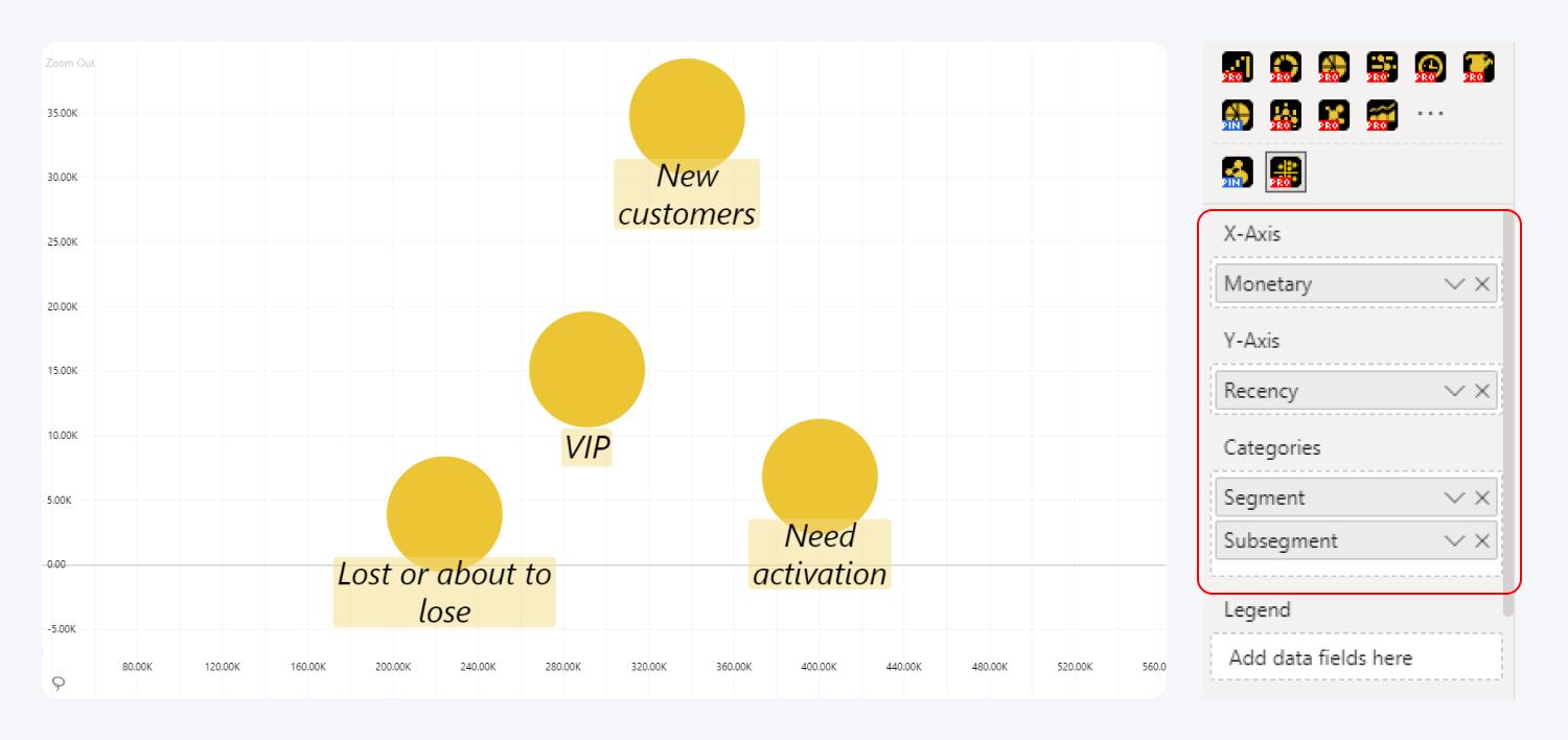
This visual requires two mandatory fields to create a scatter chart – X-Axis and Y-Axis, however without any other fields the visual will create just one aggregated data point. You will also need to use the Categories field to successfully plot the values as multiple data points.
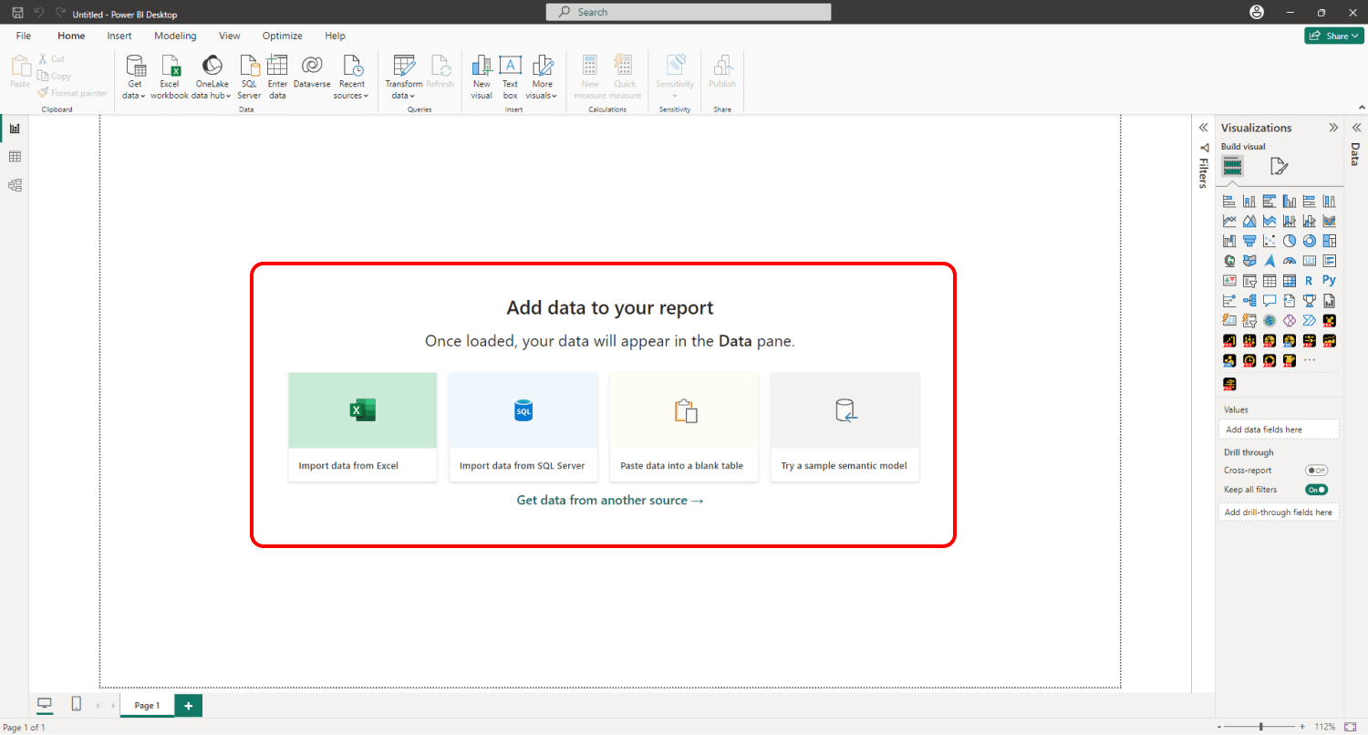
If you have downloaded this visual from Microsoft AppSource within Power BI Desktop, its icon should automatically appear in the Visualizations pane on the right side of your Power BI window.
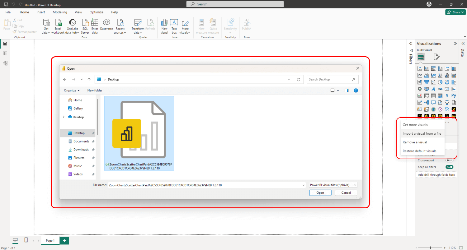
If you have acquired Drill Down Scatter PRO externally, you
may need to add it to Power BI manually. You can do that by clicking the
ellipsis button at the end of the visualizations list and pressing Import a
visual from a file. Locate the .pbiviz file and the visual will be added to
the Visualizations pane.
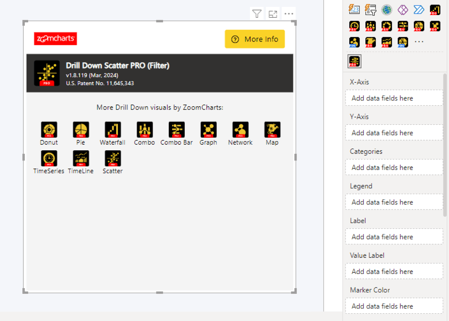
Even though only two fields are mandatory (X-Axis and
Y-Axis), it’s also recommended to add data to Categories or Legend
fields. If you use just the X-Axis and Y-Axis fields, the
visual will aggregate all values in both columns and display them as just one data
point.
.png)
To create a scatter plot with multiple data points, you’ll need to add at least one column to the Categories field. Each unique category name in that column will be plotted as a data point. If you wish to group multiple values into one data point, you can enter the same category name for multiple rows in the data table.
You can add multiple columns to this field to create a drill
down hierarchy (based on the column order in the Categories field from top
to bottom). Doing so will allow the user to click or tap on a data point and quickly
reveal the next level of hierarchy.
The Legend field can be used to assign data points
into groups that are represented as items in the legend block; and apply
specific color and shape settings to each legend group. This field can also
create data points when no Categories field is present. However, it’s
recommended to use Categories for the data structure and Legend for
customization purposes to get the most out of this visual.
In addition, you can use Label, Value Label, Marker
Color, Marker Shape, Marker Image, Data Point Group, and Tooltips optional
fields. Read more about data setup for Drill Down Scatter PRO in the Setting up Fields page of this documentation!
Customizing Your Scatter Chart
After adding the required data, you have now successfully
created a scatter plot. You can head to the Format visual tab of the Visualizations
pane and explore the wide variety of customization features available in
Drill Down Scatter PRO.
You’ll find various settings to alter the appearance and
behavior of this visual, including legend and label customization (e.g.
position, text font, size, color, and more), X and Y axis configuration, and data
point marker appearance (shape, color, size, etc.). In addition, you can enable
up to four threshold lines or areas on each axis and enable up to eight shaded
areas.
Furthermore, you can activate the Use As Filter toggle
to enable cross-chart filtering, which will dynamically filter data in other
visuals on the same page as you select nodes in your scatter chart, or vice
versa – filter your scatter plot as you explore other visuals.