207
Energy Analytics Power BI Dashboard Example
Energy Analytics Power BI Dashboard Example
More Report pages
Report Author: ZoomCharts
207
Share template with others
Energy Analytics Power BI Dashboard Example
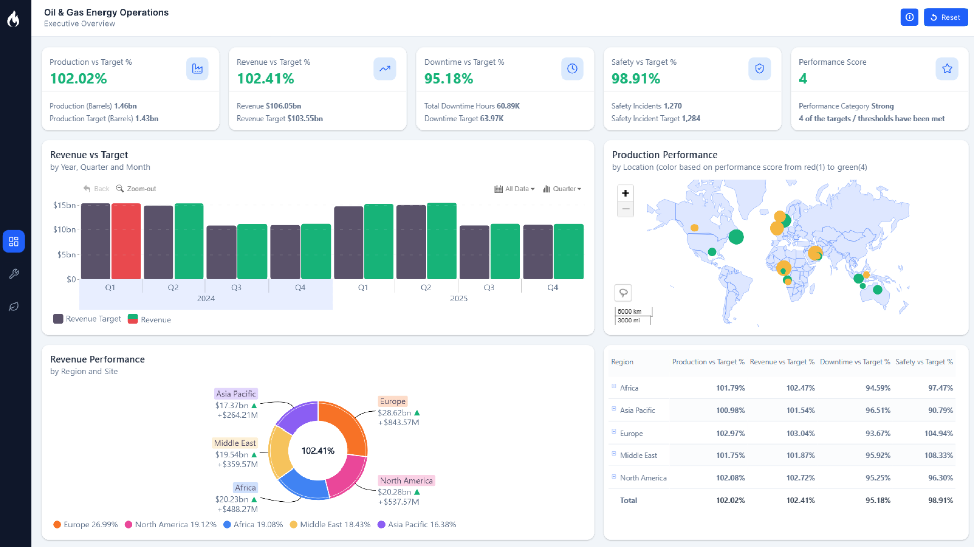
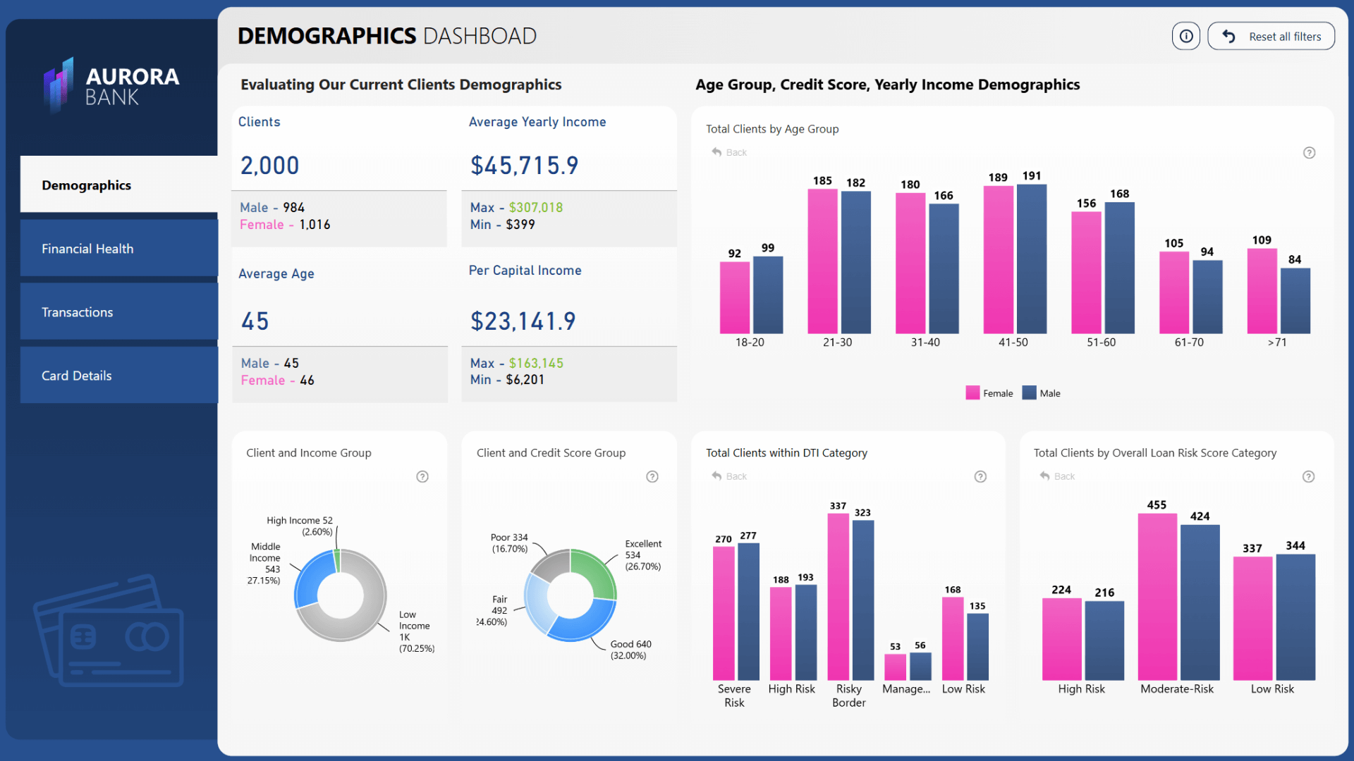
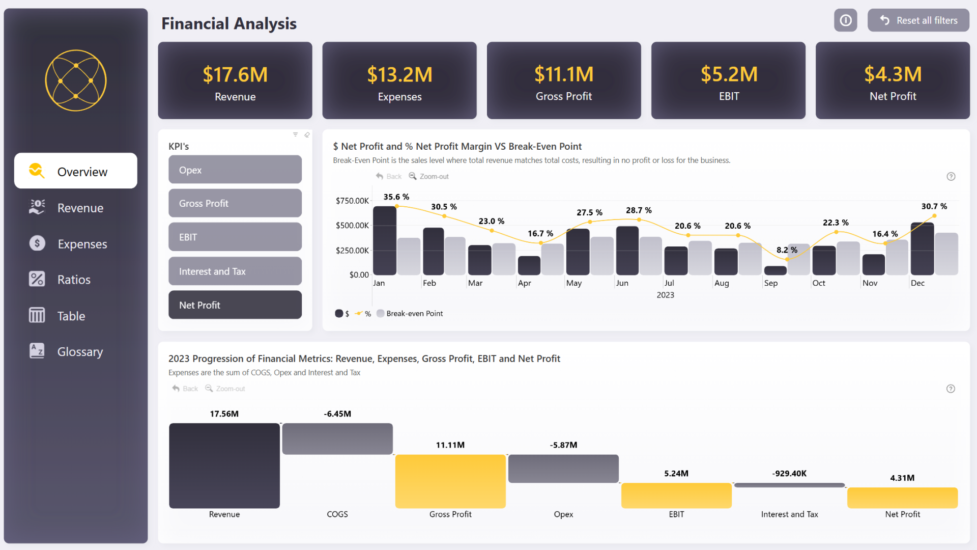
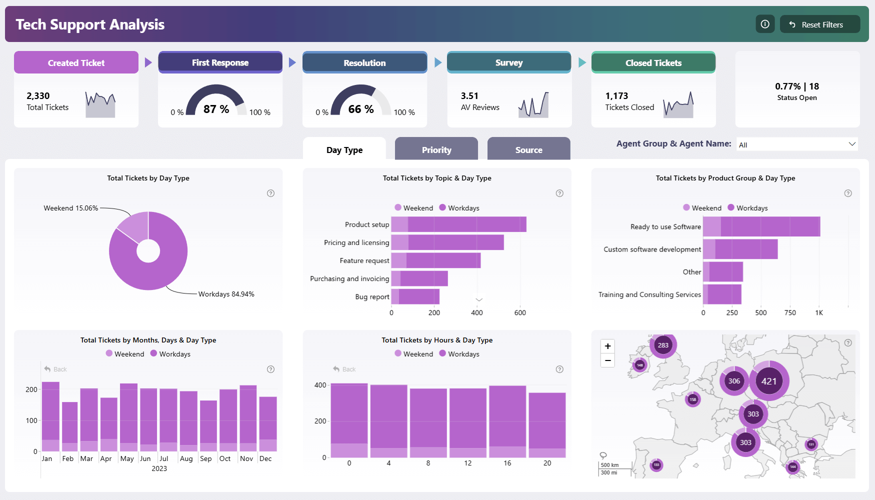
This Power BI energy dashboard example helps users explore oil and energy data through interactive map, timeline, bubble, donut, and combo bar visuals.
The Energy Analytics Power BI Dashboard Example is designed for analysts, BI developers, and energy-sector teams who need a practical report structure for reviewing patterns across locations, time periods, categories, and related metrics. The dashboard uses ZoomCharts Drill Down visuals in combination with natvie KPI cards to make energy data easier to explore from multiple angles in a single interactive report experience.
Rather than presenting oil and energy data as static tables, this report template supports a more visual workflow. Users can review geographic distribution, compare category composition, follow changes over time, and investigate relationships between data points using interactive Power BI visuals.
Geographic Energy View
Use the map-based view to examine how oil and energy data is distributed across regions and identify location-based patterns.
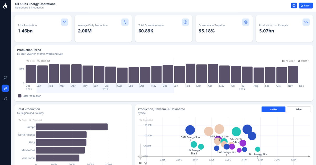
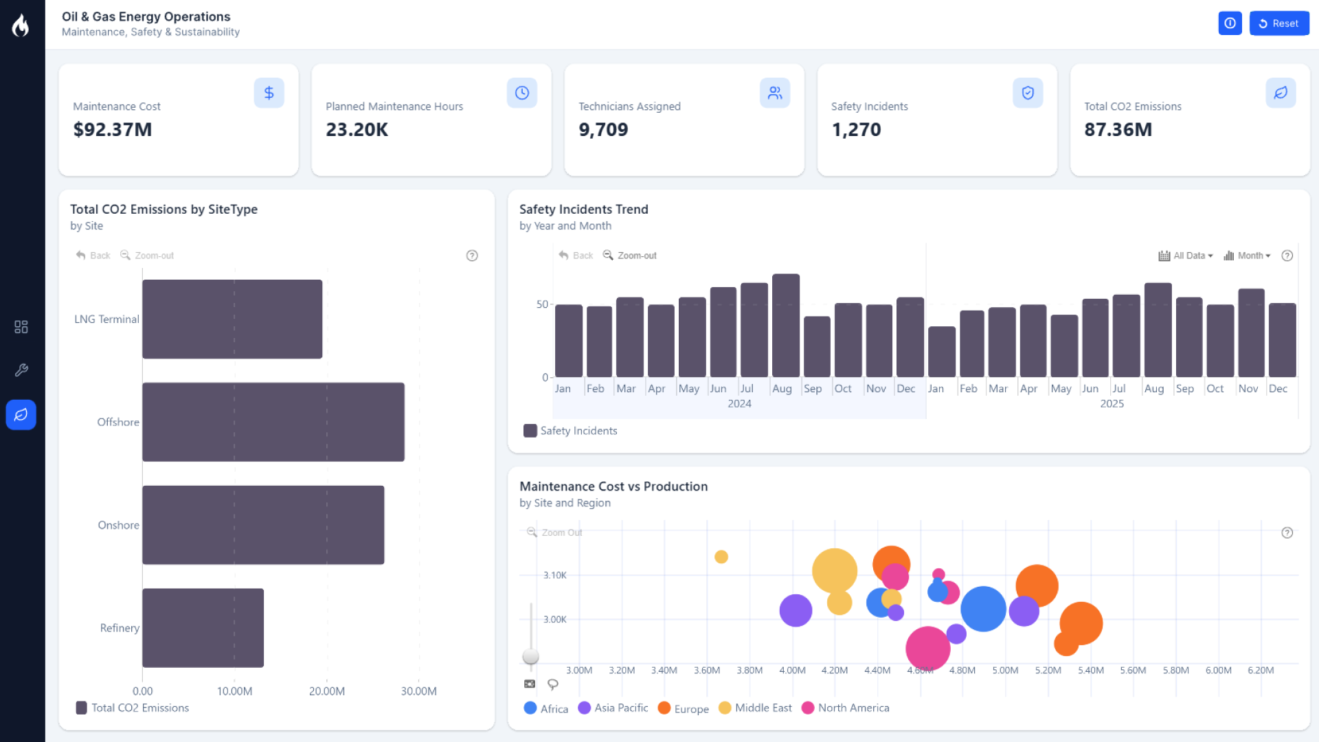
Time-Based Analysis
Review energy data across a timeline to understand how values shift over selected periods and where changes may need closer attention.
Category Breakdown
Analyze composition and proportional differences with donut and combo bar visuals that make category-level comparisons easier to scan.
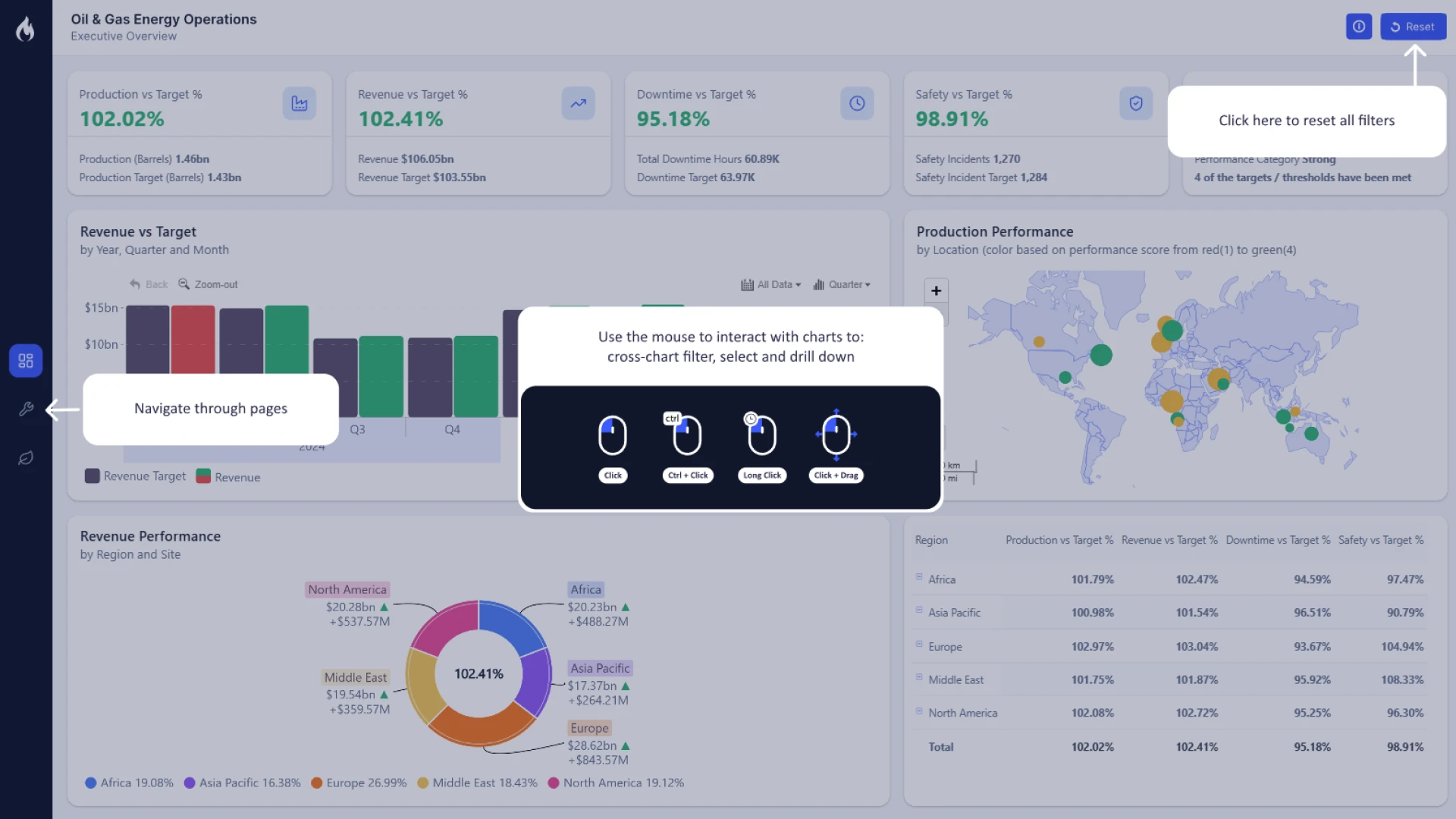
Standout Feature: Multi-View Drill Down Analysis
A key strength of this report is the combination of multiple ZoomCharts visuals in one energy analytics dashboard. The bubble, combo bar, map, timeline, and donut visuals give report users different ways to move from a high-level overview into more focused analysis without leaving the Power BI report page.
How to Use This Power BI Dashboard Example
Use this dashboard as a reference for building an energy analytics report in Power BI or as a starting point for a customized oil and energy reporting template. Analysts can interact with the visuals to compare regions, explore trends, review category distribution, and look for relationships across the available data views.
For Power BI report authors, the template also provides a useful example of how drill down visuals can be combined to create a more exploratory report experience for industry-specific data.
Download and Customize the Energy Dashboard Template
Download the Power BI report template to study the layout, explore the interactive visuals, and adapt the dashboard structure for your own oil, energy, or operational analytics reporting needs.
ZoomCharts visuals used
4U Report Challenges
Participate in data challenges, build and submit reports to get free template downloads.
Join CommunityMobile view allows you to interact with the report. To Download the template please switch to desktop view.
Was this helpful? Thank you for your feedback!
Sorry about that.
How can we improve it?