Your all-in-one visual for the most immersive and user-friendly Power BI reports is here. Visualize up to 25 series in the same visual as columns, lines, and areas, and enjoy smooth and intuitive user experience that invites you to explore data.
Start Free See it in action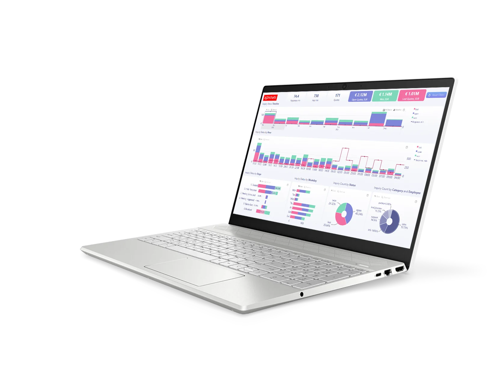
Enhance your data storytelling with visuals that perfectly balance data density with easy readability. Build interactive reports that make data exploration exciting.
ZoomCharts visuals provide intuitive user experience, allowing any user to explore data and quickly gain meaningful insights; even if it’s their first time using Power BI.
With ZoomCharts, data consultants can expand their services, increase customer satisfaction and foster stronger and more involved relationships with their clients.
Maximize the value of your investment in Power BI by increasing the user adoption rate with reports that users love to explore and start using every day.
Create and share reports that produce clear and reliable insights with no room for confusion. Strengthen data literacy and employee trust within your organization.
Enjoy peerless flexibility with more than 200 easy-to-use configuration settings in each visual and full support for touch screen devices and mouse/keyboard.
Our visuals seamlessy work together to create PRO Reports - the most immersive and user-friendly way to explore data.
See the full picture and uncover valuable insights by analyzing data across multiple visuals via cross-chart filtering.
Spend less time searching for answers. With ZoomCharts, the data you’re looking for is fewer clicks away.
See the full picture and uncover valuable insights by analyzing data across multiple visuals via cross-chart filtering.
Spend less time searching for answers. With ZoomCharts, the data you’re looking for is fewer clicks away.
Try live demos of incredible Power BI PRO Report examples created by ZoomCharts team and community members!
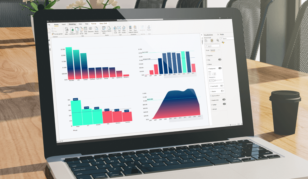
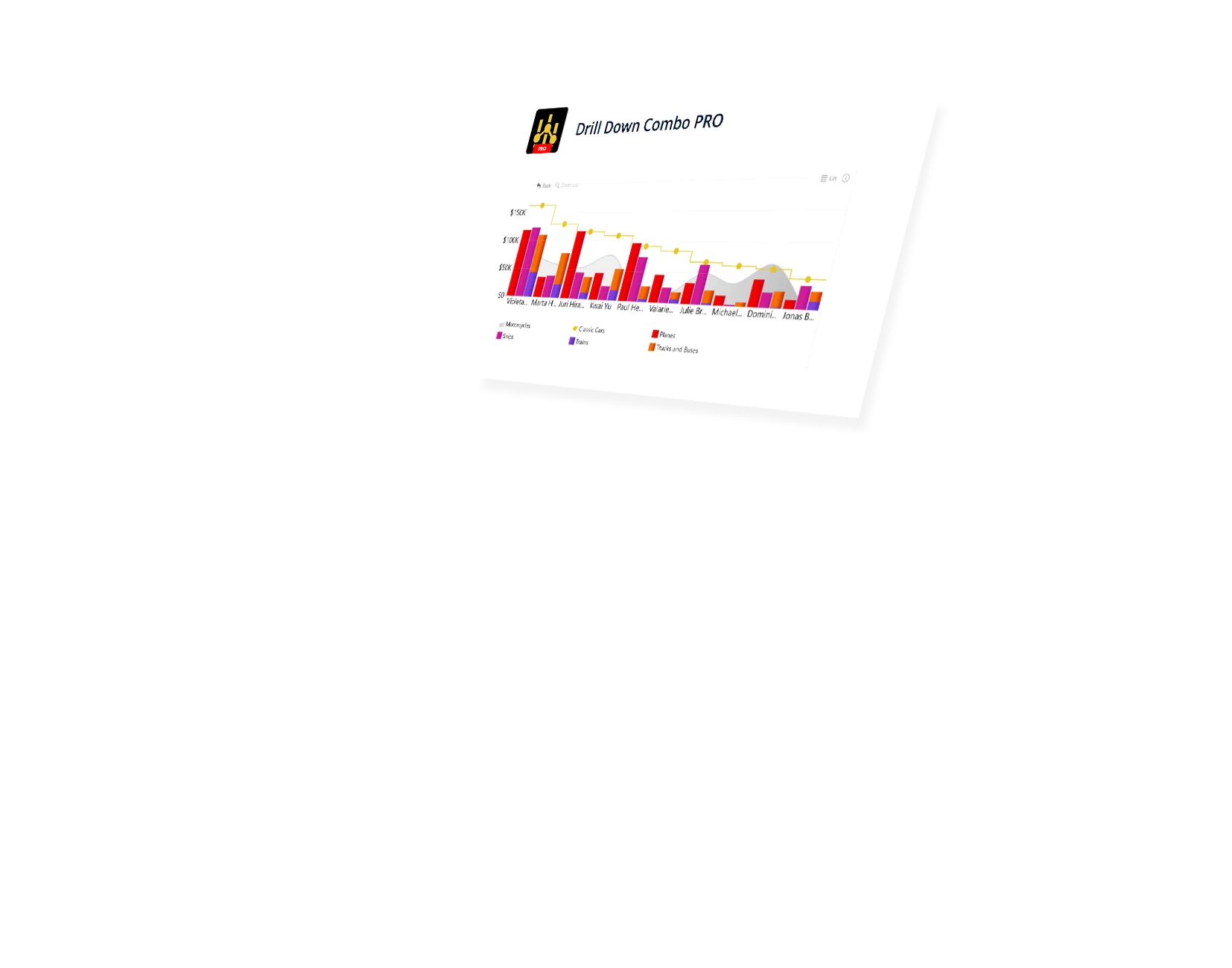
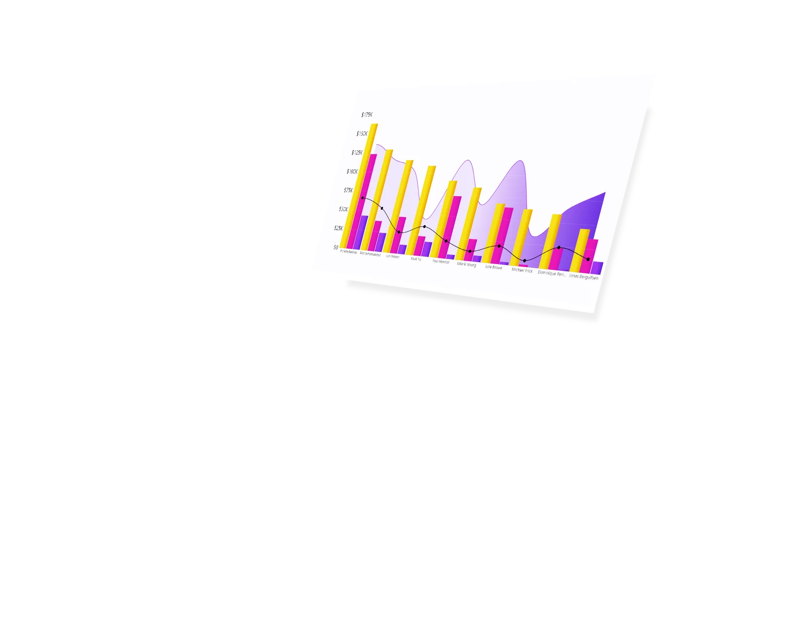
Build your perfect visual with a combination of column, line, and area charts. Feature up to 25 different series and unlimited categories within a single chart.
Lay out your data exactly how you want. Stack multiple values in a single column, overlay them on top of each other for a comparison, or show them side-by-side. In addition, you can decide between normal, zero-based or 100% stacking.
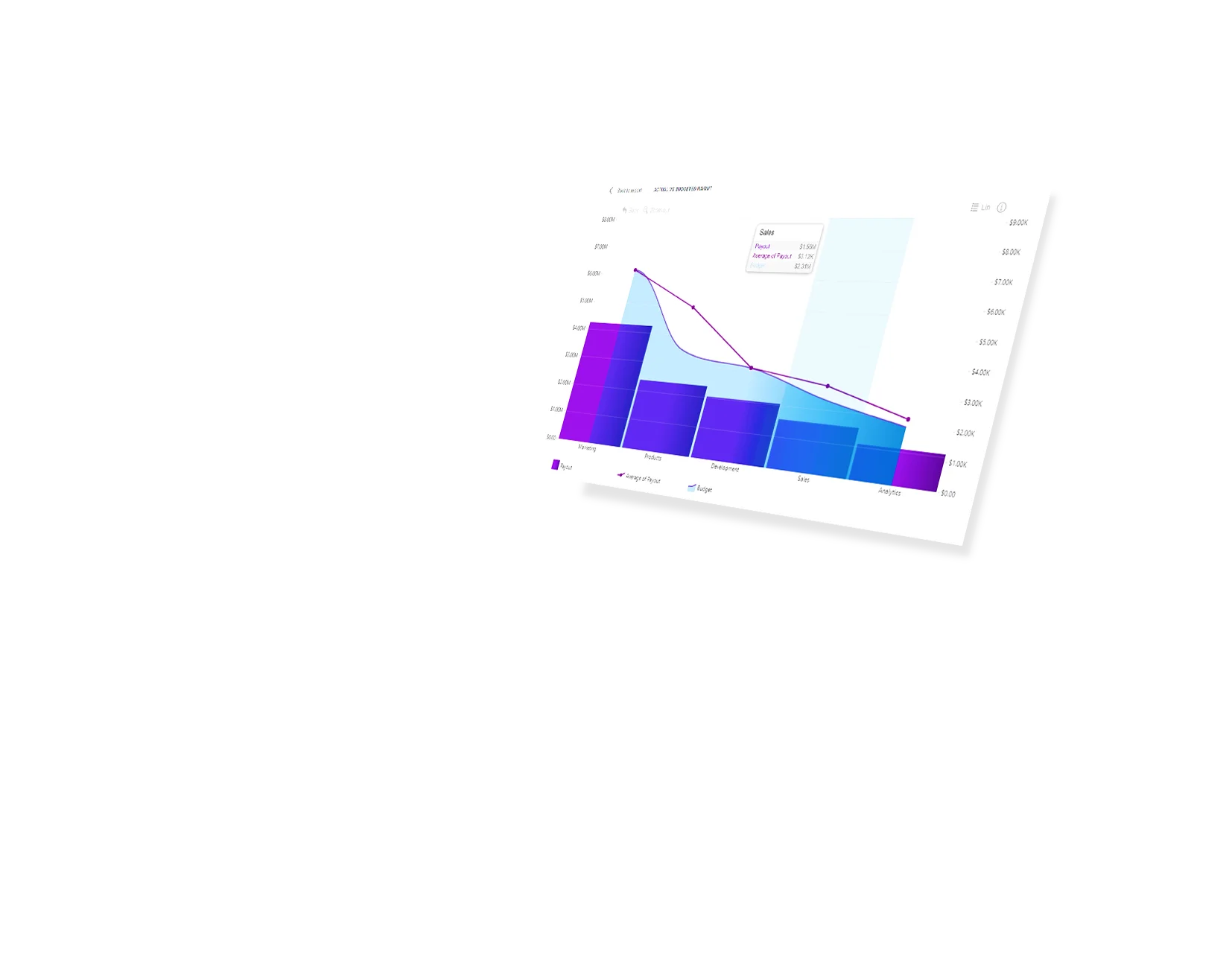
See how your numbers stack up against KPIs, benchmarks, or projections by setting static or dynamic thresholds. You can feature up to four different thresholds simultaneously.
Set conditions that will automatically apply custom formatting settings to your data. For example, you can mark your columns, areas or lines red if they are below the threshold, or green if they’re above.
Choose how the chart displays values with no data. You can pick between 3 options: Join to extend the data over that gap, Zero to replace the empty space with a zero value, or Skip to stop and begin the one at the next point.
Leave slicer menus in the past! Drill Down Combo PRO works together with other ZoomCharts visualization tools so you can create truly interactive and easy-to-use reports that will make finding relevant data a breeze.
Create bookmarks that will show your users exactly the data they need to see. Simply capture a specific view and add convenient shortcut buttons to your report.
Add your own creative flair to your reports or make it fit your brand guidelines with a wide range of customization options, including color, background, and label formatting, or even custom theme support.
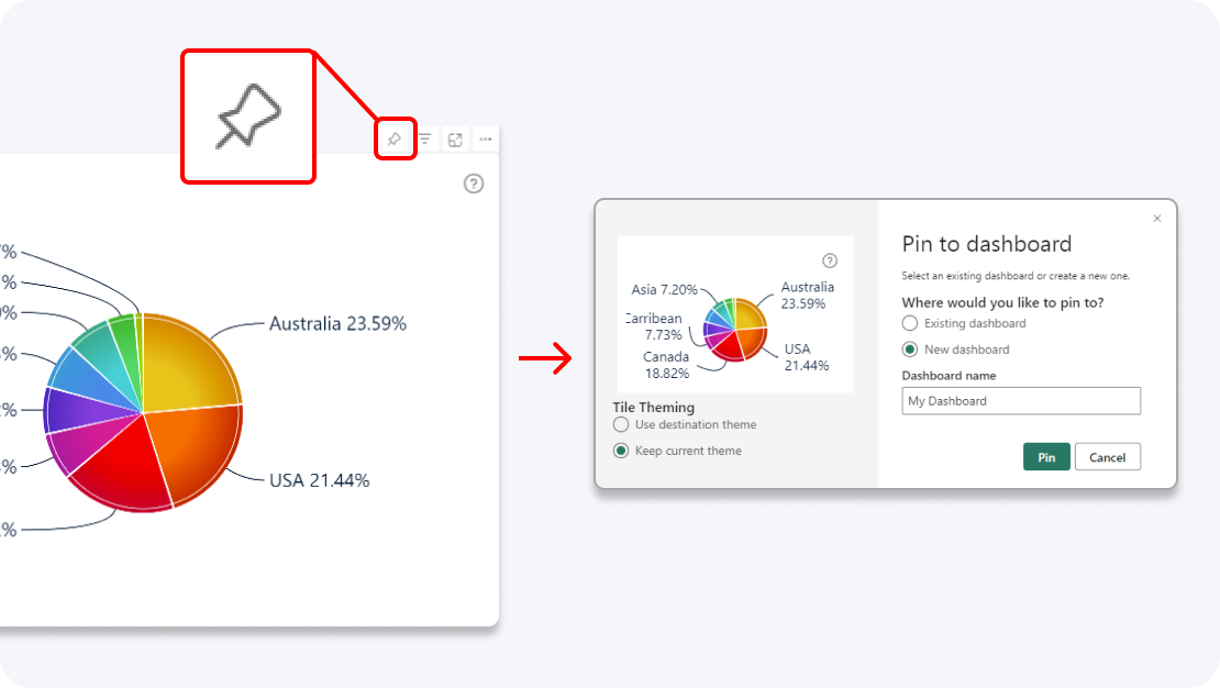
Enhance your dashboard with a stunning visual! Drill Down (Pin) supports the ability to pin the visual as a tile in Power BI dashboards.
Click and hold to select data, and triple-click to invert your selection. This way, you can quickly select all data except specific categories.
Filter and slice reports, or pin to dashboard - whichever you prefer.
Designed for engaging data exploration across multiple visuals.
Best choice for interactive PRO Reports in Power BI.
Uses filtering API to act as a slicer and filter data across multiple ZoomCharts or other visuals on the report.
Full customization and touch support.
Supports Pin to Dashboard for use with Power BI Service dashboards.
Optimized for lightweight datasets and single-visual drill down.
Uses selection API to highlight data in native Power BI visuals.
Full customization and touch support.
Supports Pin to Dashboard for use with Power BI Service dashboards.
Optimized for lightweight datasets and single-visual drill down.
Uses selection API to highlight data in native Power BI visuals.
Full customization and touch support.
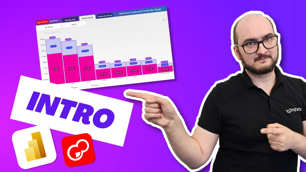
Watch this playlist of straightforward tutorial videos that cover all you need to know to start fully using Combo PRO in your reports, including data setup, axis and series configuration, and customization settings.
Watch video tutorialsShare a few details in the contact form so we can better help you and your company!
Learn even more about report creation with Drill Down Visuals.
There are 2 ways you can stack the series depending on the use case.
1. To stack only some of the series or create multiple stacks. All Series, once enabled, have a separate customization tab under formatting options called `Series X Configuration` in this tab you will find a setting called `stack` each series by default has its own stack number (e.g. Series 1 = stack 1, Series 2 = stack 2 etc.) To create a stack, all you need to do is make sure that all the series you want to stack have the same stack number.
2. You want to stack all Series in a single stack – Once you have added all the series to the visual, go to Formatting Options > Enable and open `Series Default` > change the first setting `Display` from Clustered to Stacked.
Once you have created the stack, what you would need to do is go to Formatting options and enable value labels for the series at the top (last series in the stack). To do this, open Series Configuration and enable `Customize This Series` after that enable `Customize Series Value Labels` and a new setting tab will be added to the list. Now open `Series Value Labels` and make sure that `Use Total Stack Value` has been set to Auto or True.
Once you have created the stack go to Formatting options > Stack Settings > Mode – and change this from `Normal` to `Zero Based` NOTE - Available options are - Normal, 100% Stacked, Zero Based.
Sure, go to Formatting Options > enable `Series Defaults`. Here you will see a list of properties that can be customized for all series together. NOTE - The settings applied here will not take effect on series for which individual series customization has already been enabled. This allows you to have the full flexibility of customizing groups or individual series and create unique chart variations.
Currently only Drill Down capability is available. The rest of these interactions will be added with future updates.
Sure, simply use the Drill Down Combo Bar Pro visual instead of Drill Down Combo PRO to achieve the wanted result. The transition is seamless - all you need to do is add the visual to the report > Select the visual on the report canvas > Click on the Combo Bar visual icon and it will be switched.
Was this helpful? Thank you for your feedback!
How can we improve it?