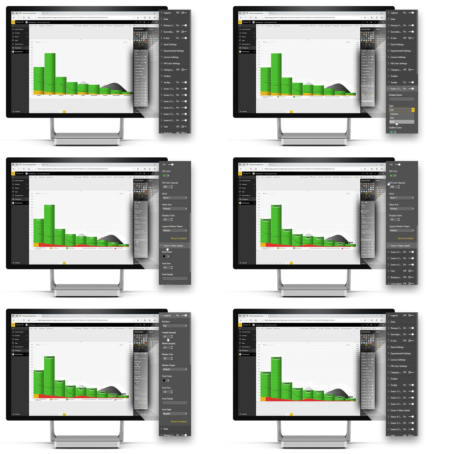
Present your data in a visually appealing way that makes your report stand out! Customize chart types, colors, labels, fonts, and other aspects of the chart. You can apply formatting options to the entire visual or adjust specific settings for each series individually:
- Series types: choose how to display each series – as a column, area, or line.
- Series fill: choose a solid color, gradient, or apply conditional formatting.
- Series outline: adjust the outline type (solid, dotted, or dashed), opacity, thickness, and color for each series.
- Stacking or clustering: choose how multiple series are displayed in a single category.
- No data policy: choose how the visual shows data points without a value – zero, join, or skip.
- Value labels: show values directly on the series and customize label font, position, background style, display units and other settings.
- X-axis customization: select font color, family and size, unit width, label orientation, and custom title for the x-axis.
- Y-axis customization: customize the font color, size and family, custom title, display units, value decimals and value affixes, tick color and width, gridline, value range, unit scale, and other settings.
- Legend customization: adjust legend placement and alignment, marker size and shape, legend content; and font color, size, and family.
- Tooltip customization: choose between ZoomCharts tooltips or default Power BI tooltips, and choose what data is displayed in the tooltips.
- Toolbar customization: choose what navigation buttons are available to the user in the toolbar.
- Dark mode: enable this setting to change the appearance of tooltips and toolbar buttons for better readability on reports with dark color schemes.

Was this helpful? Thank you for your feedback!
Sorry about that.
How can we improve it?