About FP20 Analytics ZoomCharts Data Challenge
🏆 Main Prize: $300 Amazon Gift Card
Want to learn to build PRO reports? With personalized feedback and informative workshops, this is your opportunity to take your report-building skills to the next level, build your professional portfolio, and network with like-minded people.
The ZoomCharts challenge is hosted in partnership with FP20 Analytics – a group that unites passionate and inspiring data enthusiasts, and helps new data analysts improve their skills and build a competitive portfolio. Join in and sharpen your skills together with this open and friendly data community. Read more about the challenges on the FP20 Analytics website. Join the community on LinkedIn.
Why join the FP20 Analytics ZoomCharts Challenge?
- Workshops & 1:1 Mentoring: Learn directly from experienced Power BI professionals through live workshops on report-building best practices, 1:1 mentoring sessions to review your report and get tailored advice.
- Get Personal Feedback: Every participant receives detailed, personalized feedback on their report - a great opportunity to improve based on real input from seasoned analysts.
- Free ZoomCharts PRO License: All participants get a ZoomCharts Developer License (worth hundreds of dollars) that gives full access to the Drill Down PRO visuals library.
🏆 Prize:
The best overall report using ZoomCharts visuals will win a $300 Amazon gift card. The ZoomCharts winner will be announced in a special live webinar session on November 5, where we will review the Top 5 entries from the challenge.
Webinar recordings
How to participate in FP20 Analytics & ZoomCharts challenge?
1. Register for the challenge:
- Register for the FP20 Analytics ZoomCharts Challenge using the form on this page.
- Download the Challenge dataset on this page or from FP20 Analytics website.
- Activate your free Drill Down Visuals Developer License for Power BI. Read license setup video or read the instructions
- Read the challenge brief (see "The Brief" section) for additional info about the dataset and use-case.
2. Build your report in Power BI:
- Add ZoomCharts License to your Power BI Desktop. Read the full guide.
- Add ZoomCharts visuals to your Power BI visualization pane from the Power BI visuals library or AppSource.
- Use the dataset to build a Power BI report including at least 2 ZoomCharts Drill Down Visuals in one report page.
- The recommended number of pages in the report is up to 3 pages, including drill-through pages.
- Canvas size is 16:9 (Default Power BI size) or Full HD size = w:1920 - h:1080
3. Improve your report and learn new skills:
- To learn more about applying ZoomCharts visuals in your reports, participate in the challenge workshop.
- If you have any questions or need advice, you can book a free individual consultation.
- Check out the submissions from past challenges for inspiration.
4. Submit your challenge entry:
- Log in to your account on this challenge page and submit your report in .pbix format for validation.
If your submission doesn’t match the challenge criteria, you will be notified by email indicating the reason. Don't worry if this happens! You can fix the issue and resubmit your report.
- Your report will be reviewed within 1–2 business days. Once it’s validated, you’ll receive a Publish to Web link via email. You can use this link to add the report to your portfolio or share it publicly online.
- All validated entries will also receive personalized feedback from the evaluation team via email within 1-2 business days. Use this feedback to revise your report and resubmit it before the deadline.
Note: Feel free to resubmit your entry as many times as necessary before the deadline.
5. Finalize your participation to compete for the ZoomCharts grand prize:
- Post the final version of your submission in PDF format on your LinkedIn profile.
- Use the caption "I am participating in FP20 Analytics ZoomCharts Challenge 31".
- Include a summary of your report's key insights and add the ZoomCharts publish to web link (if available).
- Use #FP20Analytics, #builtwithzoomcharts, tag @Federico Pastor and @Zoomcharts.
- Additionally, post your report in the FP20 Analytics LinkedIn Community group.
- Follow ZoomCharts on LinkedIn
6. Attend the challenge closing webinar:
- The submissions are evaluated by ZoomCharts team (see "Judging criteria" for more info). The submissions of Top 5 ZoomCharts Challenge finalists are analyzed live during the challenge closing webinar to share the best practices and learning opportunities with the community.
- The author of the best report is awarded a $300 Amazon gift card.
Technical requirements
- Build your report using Power BI
- The recommended number of pages in the report is up to 3 pages, including drill-through pages.
- Canvas size is 16:9 (Default Power BI size) or Full HD size = w:1920 - h:1080
- The report should contain at least 2 ZoomCharts Drill Down visuals within a single page. See a practical guide for using Drill Down PRO visuals.
The Brief
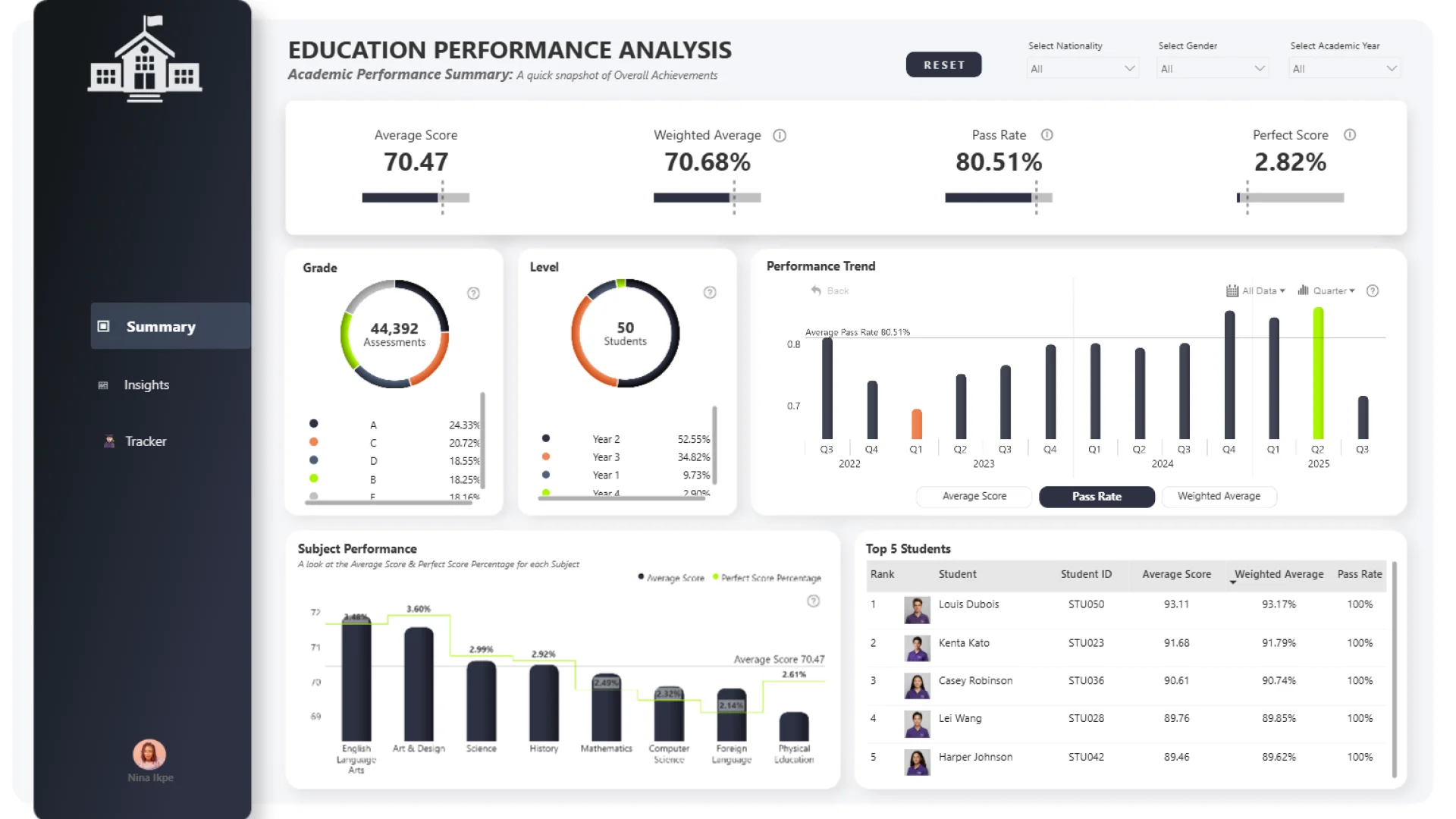
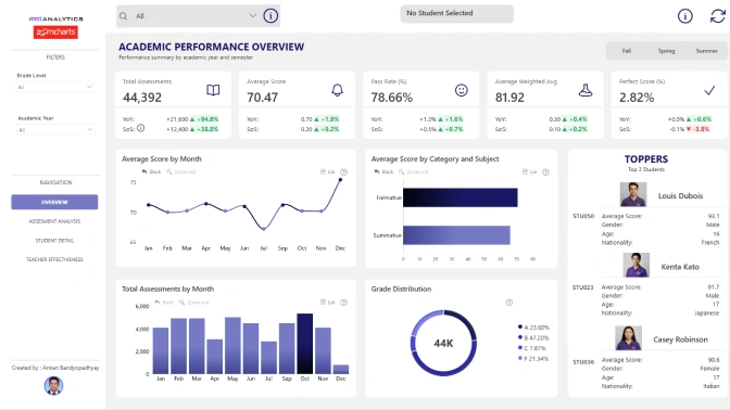
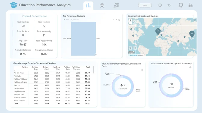
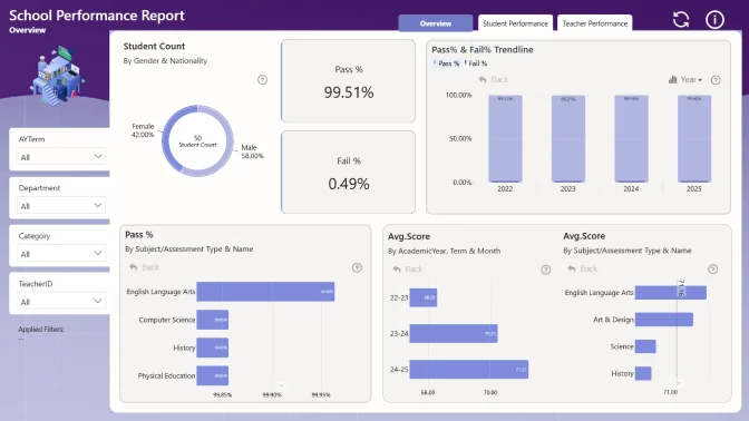
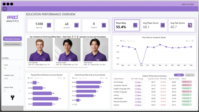
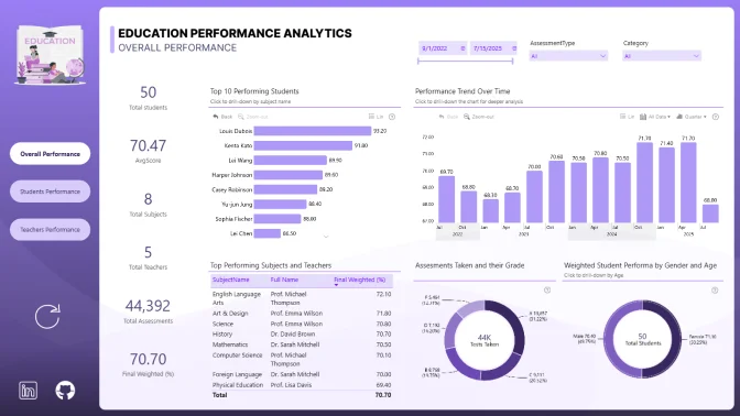
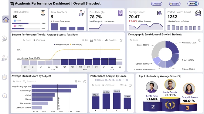
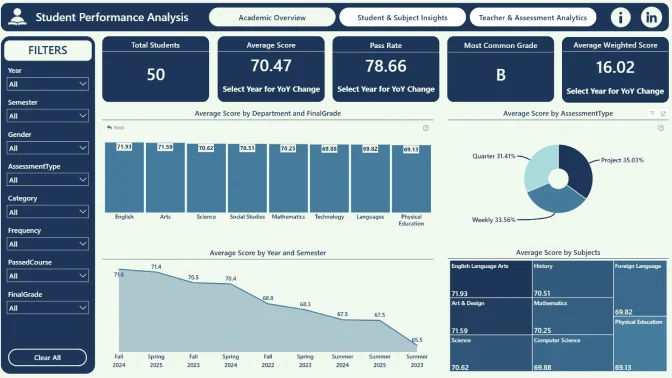
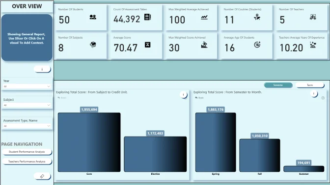
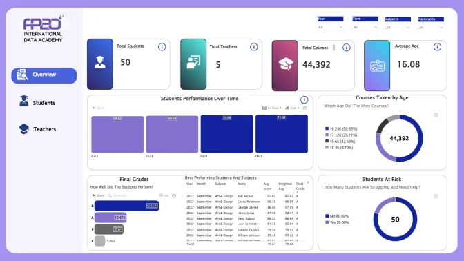
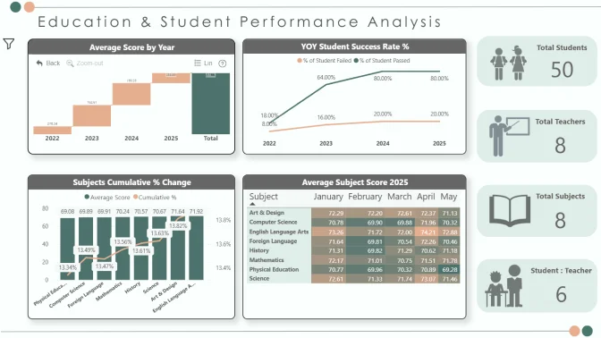
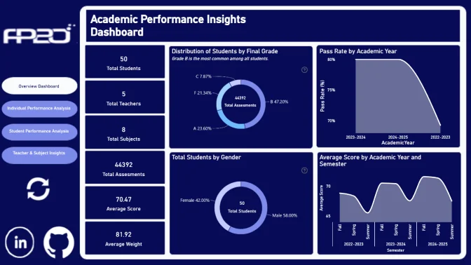
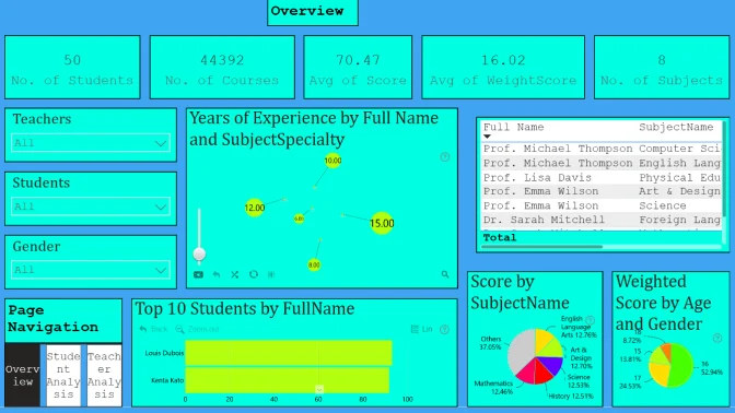
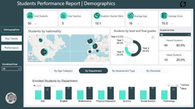
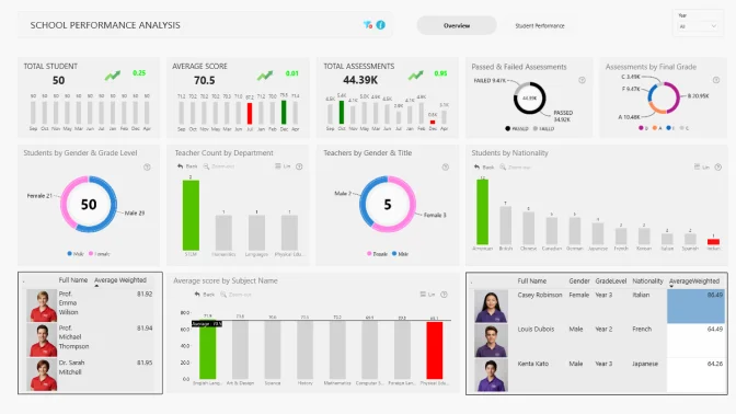
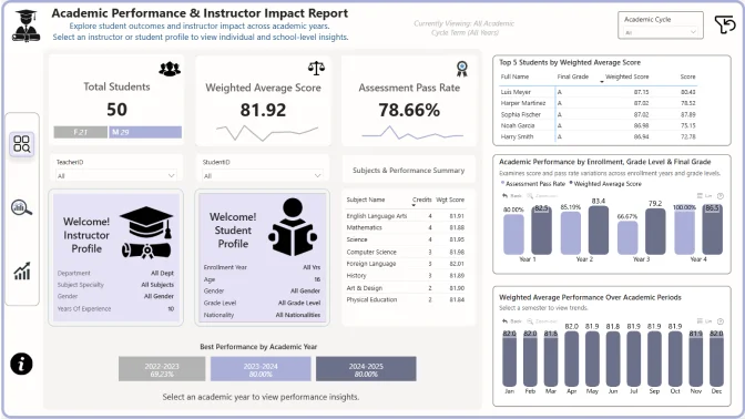
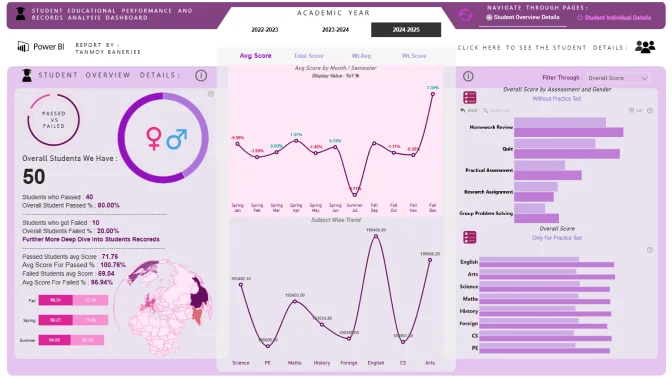
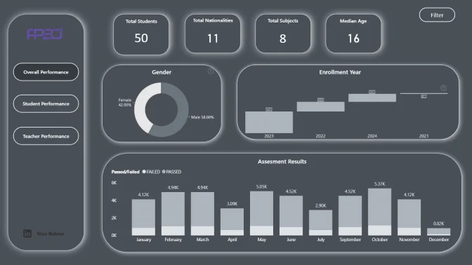
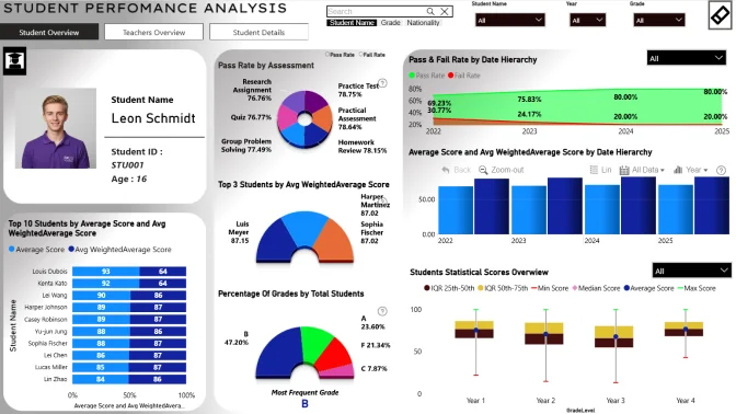
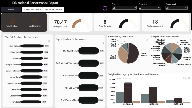
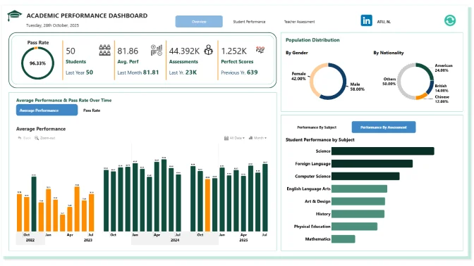
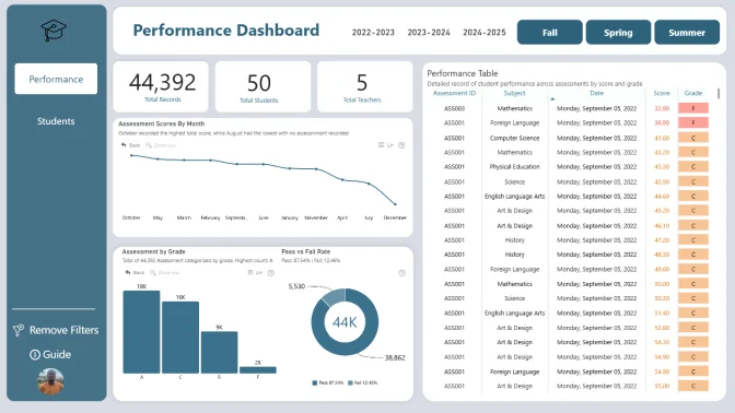
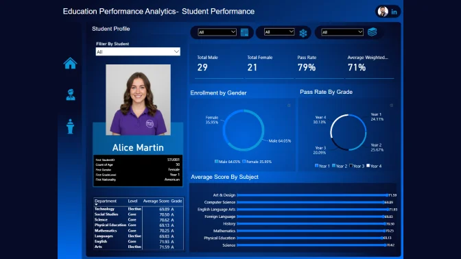
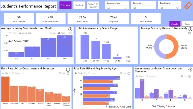
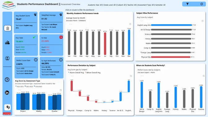
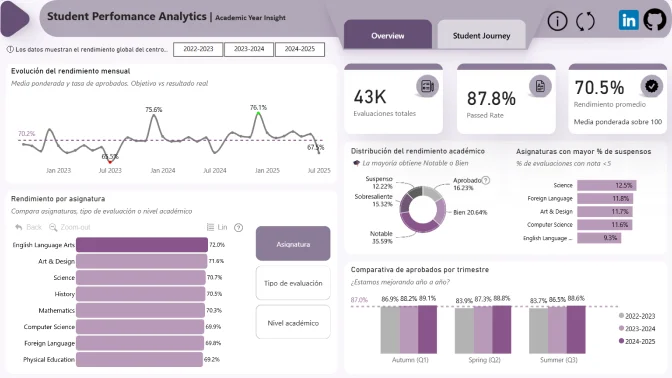
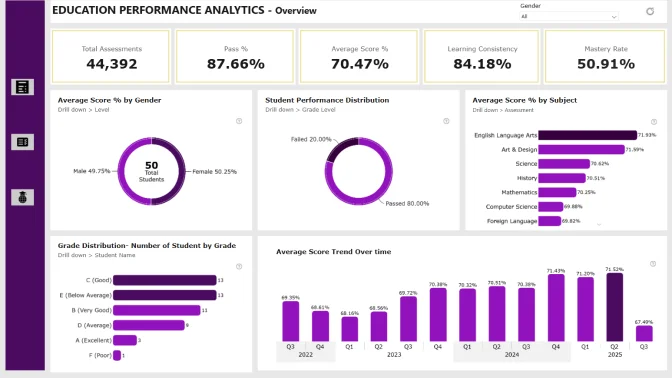
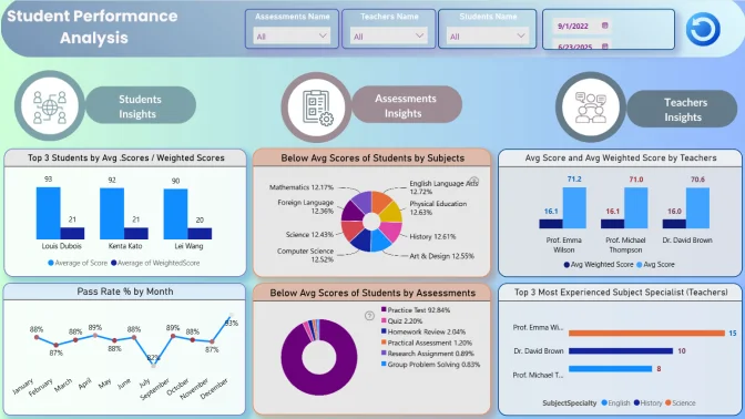
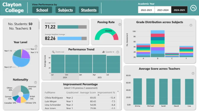
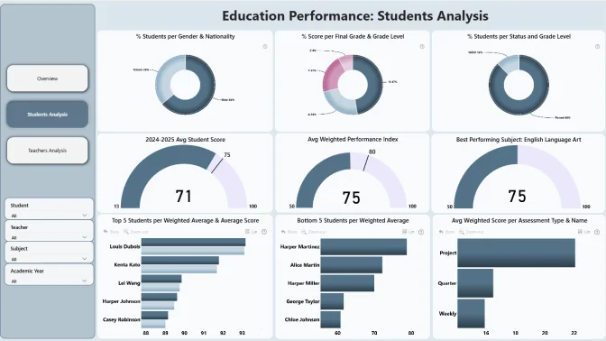
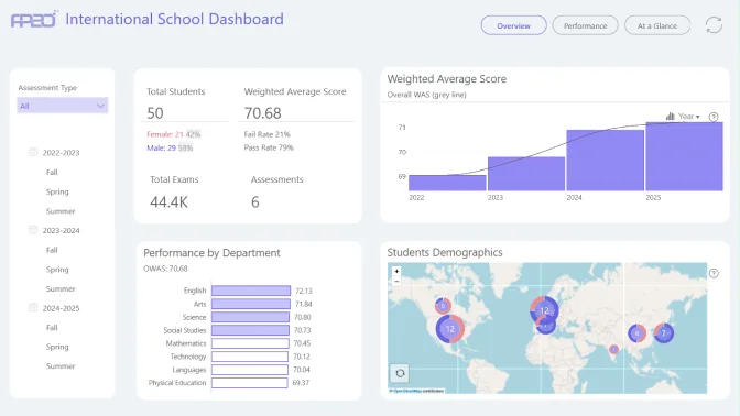
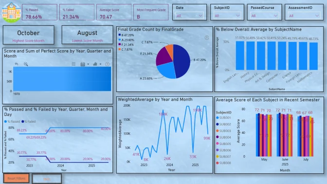
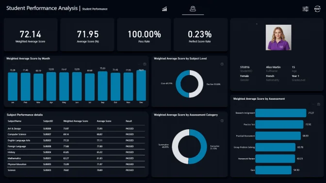
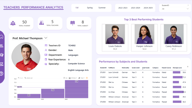
Student Performance Analytics Data Challenge
In this challenge, you’ll step into the role of a data analyst at the FP20 Analytics International Data Academy, working with a comprehensive Student Performance dataset that captures the academic journey of students. Your goal is to uncover insights that help the academy improve student engagement, teaching effectiveness, and long-term learner success.
Educators, administrators, and program managers can all use these insights to better understand student outcomes, track course completion, and evaluate teaching quality.
Use Case & Main Goal
This challenge focuses on a problem that every school and university faces: how to use data to track performance and guide improvements.
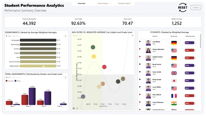
- Support students: Spot early which learners are excelling and which might need extra help.
- Help teachers: Show how teaching experience, subject specialty, and methods influence student results.
- Improve courses: Identify which subjects and assessment types are most effective.
- Guide institutions: Provide leaders with clear, data-driven insights to plan resources, update curricula, and raise overall performance.
Questions to Explore
Here are some guiding questions to help you start your analysis. You don’t have to answer all of them, feel free to follow your curiosity and explore the data your way:
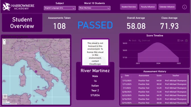
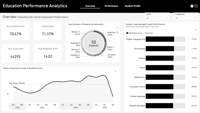
- Which groups of students (by age, grade, or nationality) are doing well, and which may need more support?
- Do certain subjects (math, science, languages, humanities, physical education) consistently show stronger or weaker results?
- How do different assessment types (quizzes, labs, exams, participation) affect final grades?
- Are there seasonal or term-based patterns in performance throughout the academic year?
- Does teacher experience, specialty, or department correlate with student achievement?
- How do formative assessments (practice tests, participation) compare with summative assessments (final exams, projects)?
- Can we identify groups of students such as high achievers, consistent performers, or at-risk learners?
Judging criteria
Business users use reports to make data-driven decisions. That’s why reports are called effective if they enable users to drill down and filter data quickly and intuitively to find answers to any question they might have, and analyse data in all possible directions and dimensions.
Each report is evaluated based on three main criteria: intuitiveness, insightfulness, and interactivity. These factors ensure that the reports are not only accurate and functional, but also meet the target audience's needs and are ready to be presented to the end-users.
- Intuitive: How clear and easy it is to understand the report at a glance? (max 15 points)
- Is the report visually appealing?
- Choice of charts and visual elements
- Does the report tell a story?
- Is it not overwhelming to the user?
- Choice of tooltips, titles, and legends
- Interactive: How engaging and seamless is the report exploration and interaction with data? (max 15 points)
- Clear navigation that allows user to explore the report
- Use of slicers and other interactive elements
- Smooth cross-chart integration
- Is report optimized for touch devices?
- Are tutorials and guiding elements helpful to the user?
- Insightful: How accurate, complete, and meaningful is the data in driving decisions? (max 15 points)
- Depth of analysis
- Data cleaning and preparation
- Does data show up accurately in the report?
- Is report optimized for quicker loading time?
- Does the report provide deeper exploration of data (drill-down)?