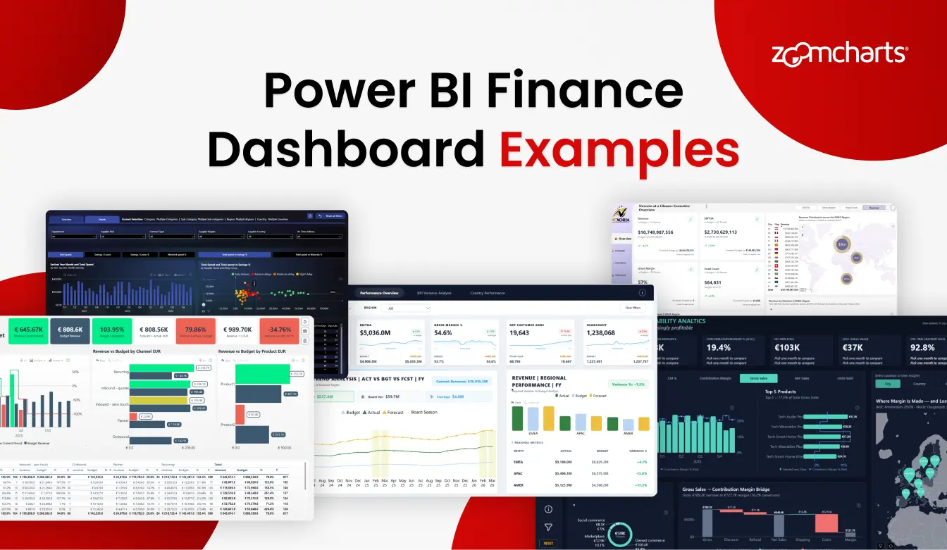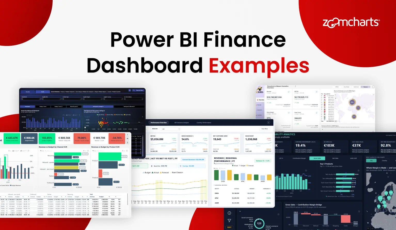
A good finance dashboard does more than place revenue, expenses, and profit on one page. It helps people move from the headline result to the reason behind it: which business line changed, where the budget gap appeared, how margins developed, or which customer segment needs attention.
That is why a real report is often the best starting point. The 16 examples below are all available in the ZoomCharts Power BI Template Gallery. Each one approaches finance reporting from a different angle, from income statements and executive KPIs to banking activity and practice area profitability.
Use them for layout ideas, metric selection, navigation patterns, and ready-made PBIX structures.
1. Power BI Financial Analysis Dashboard Template
Best for: Structured revenue, expense, and profit analysis across multiple report pages
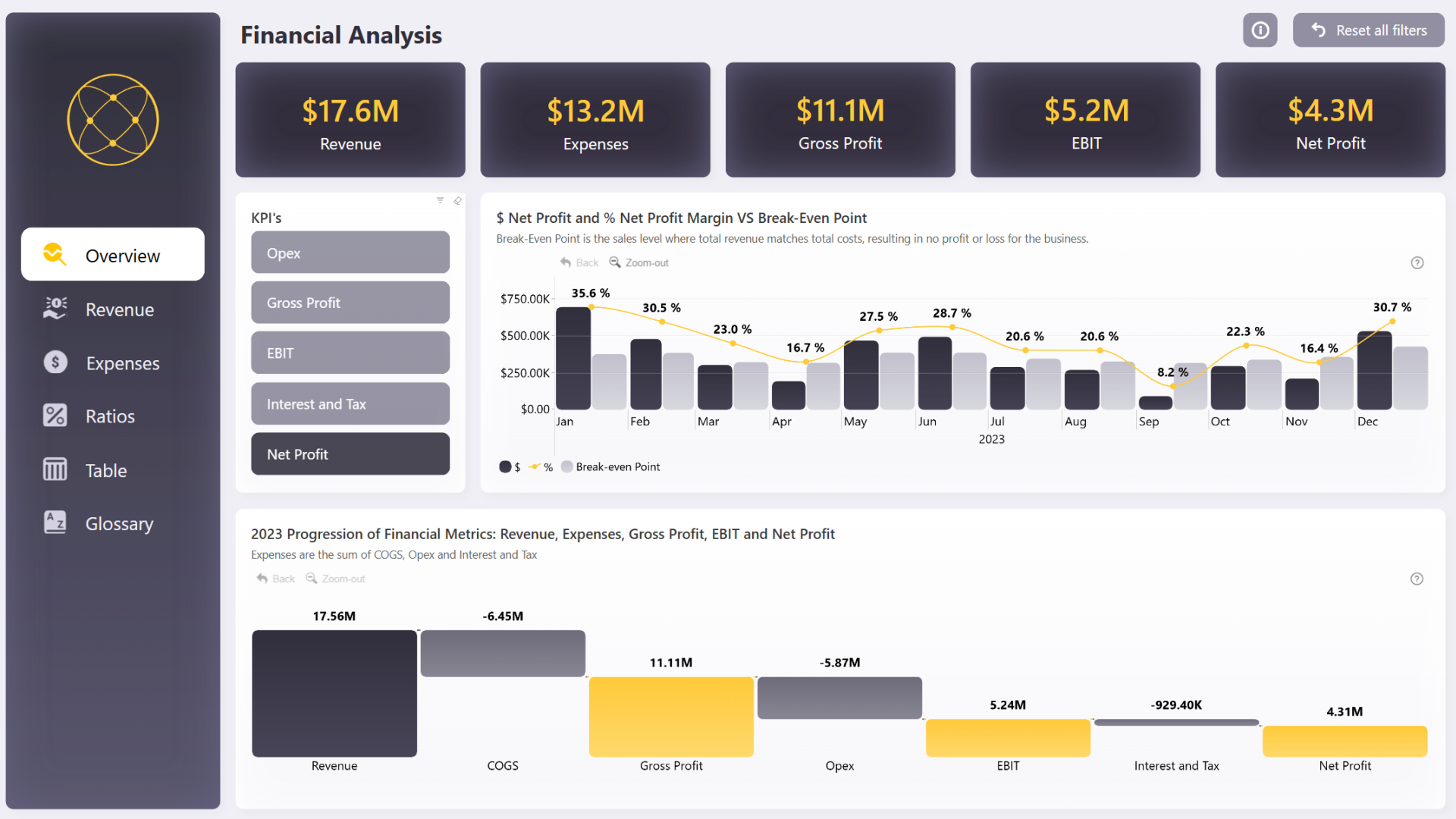
This six-page financial analysis report gives users a structured path from overview to detail. The gallery highlights revenue by category and channel, expenses by type and business line, profit trends, KPI comparisons, and the step-by-step progression from revenue to net profit.
Instead of forcing every measure into one canvas, the report separates related questions into focused pages. Interactive visuals filter the report together, so users can investigate the same result from several perspectives without creating a separate page for every slice.
Explore this financial analysis dashboard template
ZoomCharts visuals used:
Drill Down Combo PRO, Drill Down Waterfall PRO, Drill Down Combo Bar PRO, Drill Down Timeline PRO, and Drill Down Donut PRO.
2. Power BI Finance Dashboard Template
Best for: Income statement reporting and business line profitability
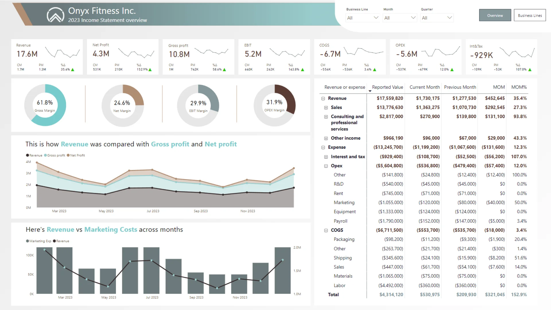
This two-view dashboard analyzes the financial performance of a fitness and sporting goods company. Its income statement overview brings together revenue, gross profit, net profit, EBIT, COGS, OPEX, interest, tax, and margin indicators. A second view compares sports equipment, sportswear, and nutrition and food supplements.
The template connects a formal financial statement with operating context. Monthly trends and a revenue-versus-marketing-cost comparison show how the figures developed, while the business line view shows where revenue, profit, and expenses are concentrated.
Explore this Power BI finance dashboard template
ZoomCharts visuals used:
Drill Down Waterfall PRO and Drill Down Combo Bar PRO.
3. Power BI Finance Report for Revenue EBITDA and Margin Analysis
Best for: Executive reviews that combine finance, operations, customers, and regional performance
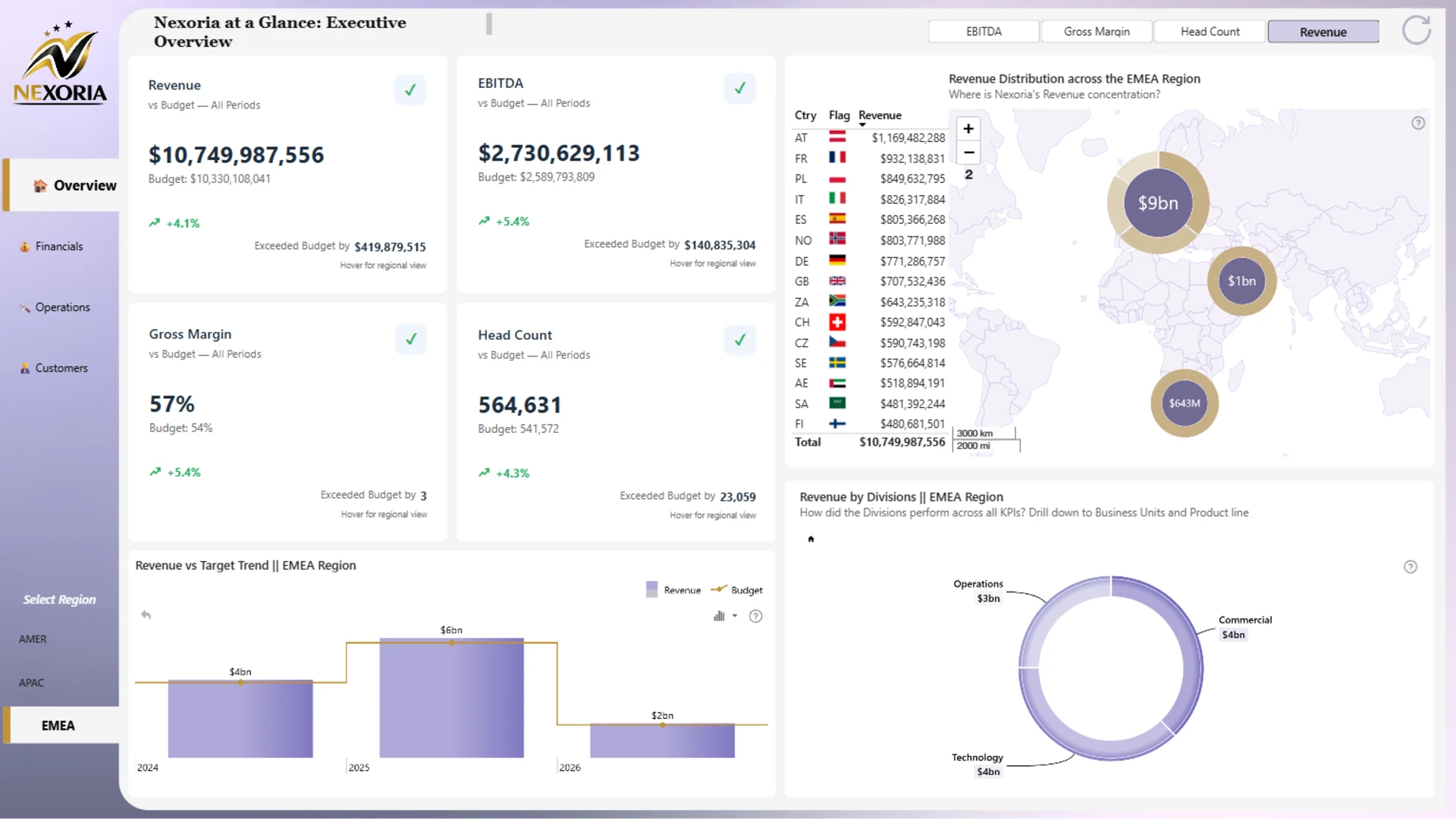
This four-page report combines financial, operational, and customer measures in one executive reporting experience. It tracks revenue, EBITDA, gross margin, headcount, active customers, net customer adds, on-time delivery, system uptime, support tickets, and cycle time.
Users can compare actual results with budget and forecast, review performance by region, and drill from divisions into business units and product lines. The Executive Overview, Financials, Operations, and Customers pages give each audience enough detail to continue the analysis without overloading the first page.
Explore this revenue EBITDA and margin dashboard
ZoomCharts visuals used:
Drill Down Combo PRO, Drill Down Timeline PRO, and Drill Down Donut PRO.
4. Power BI SaaS Financial Performance Report
Best for: SaaS revenue, expenses, and profit and loss analysis
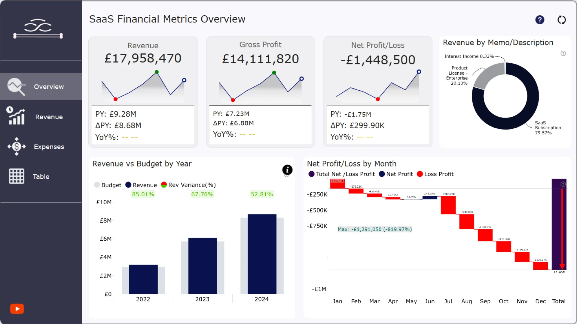
This SaaS finance report by Agbata Dickson Ukolojo brings revenue, gross profit, operating costs, and net profit or loss into a connected set of views. It includes actual-versus-budget comparisons, revenue and expense breakdowns, and a profit and loss statement.
Its overview places the main figures beside revenue comparisons and a waterfall view of monthly profit or loss. Separate report pages let finance teams examine revenue and expenses in more detail.
Explore this dashboard template
ZoomCharts visuals used:
Drill Down Waterfall PRO, Drill Down Combo Bar PRO, Drill Down Timeline PRO, Drill Down Donut PRO.
5. Executive KPI Dashboard Example in Power BI
Best for: Executive scorecards, budget variance, and regional performance reviews
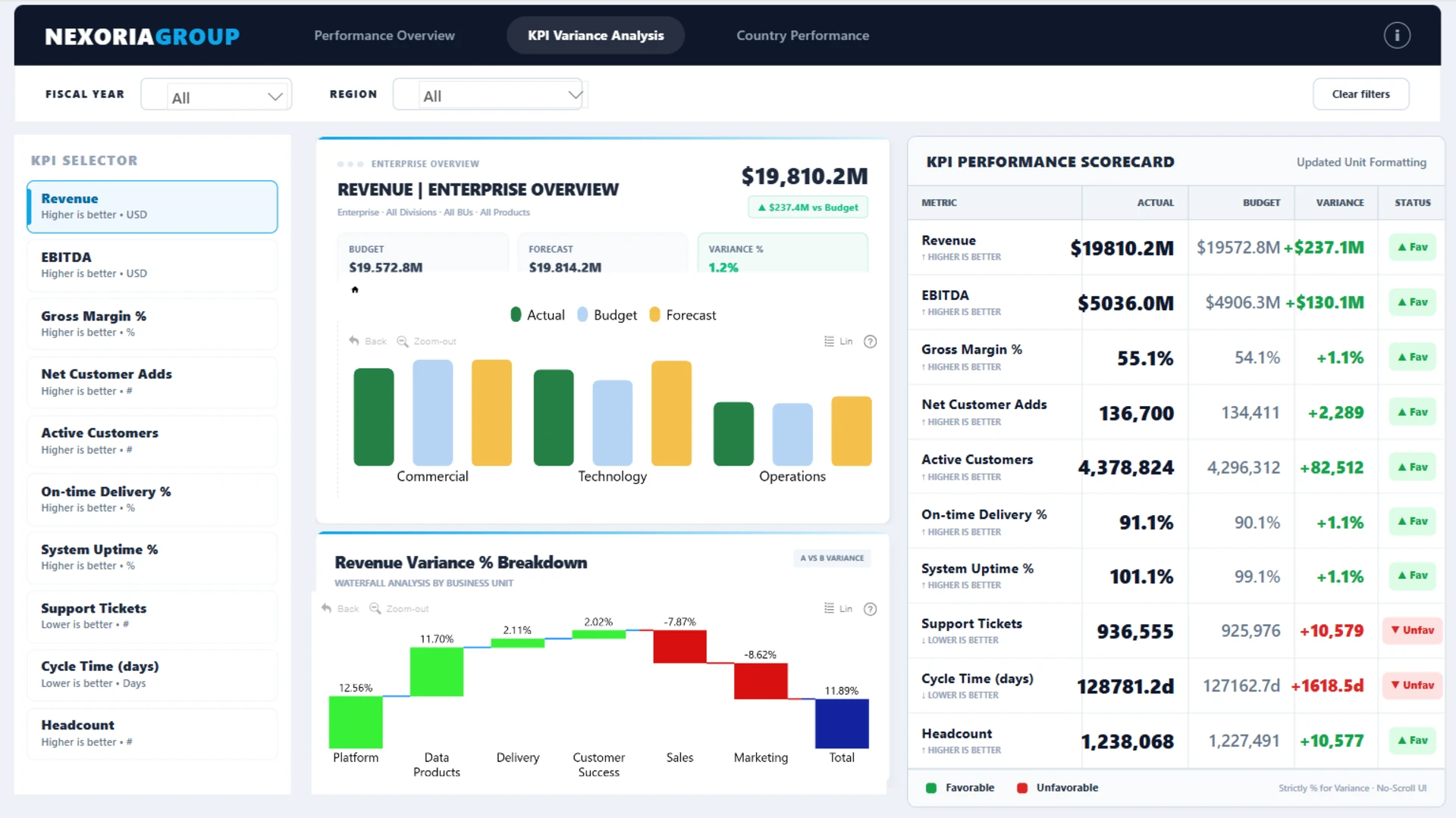
This three-page dashboard covers revenue, EBITDA, gross margin percentage, headcount, net customer adds, budget variance, forecast gaps, and regional performance. It is organized into a Performance Overview, KPI Variance Analysis, and Country Performance.
The report does not stop at an actual-versus-budget figure. It also presents favorable and unfavorable performance, a KPI scorecard, variance drivers by business unit, and country-level rankings. Users can filter by fiscal year and region and switch between KPI views.
Explore this executive KPI dashboard
ZoomCharts visuals used:
Drill Down Combo PRO, Drill Down Waterfall PRO, and Drill Down Combo Bar PRO.
6. Power BI Banking Dashboard Example
Best for: Banking revenue, cost, customer, product, channel, and location analysis
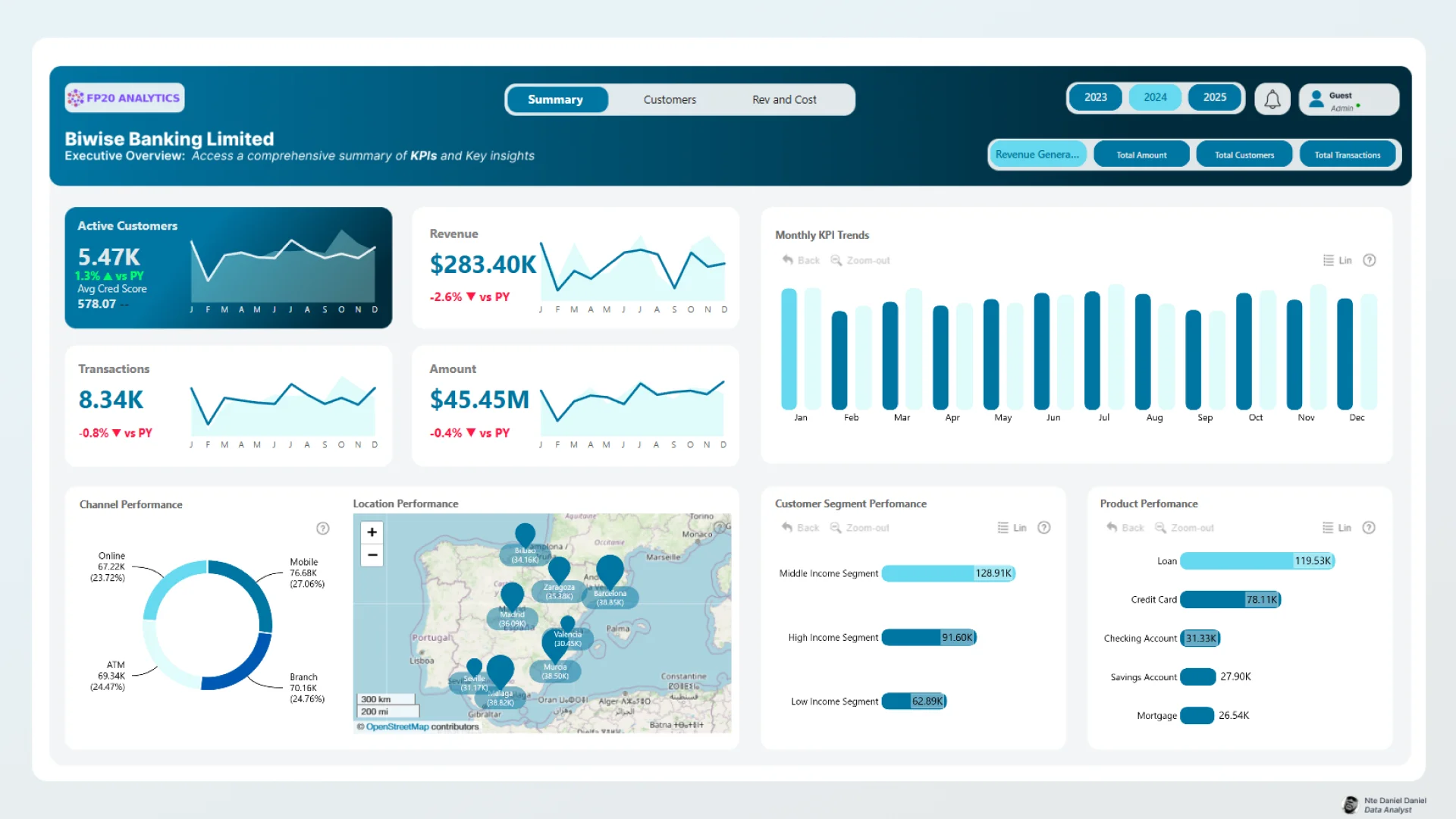
This three-page banking report is organized into Summary, Customers, and Revenue and Cost views. It tracks active customers, total revenue, transaction count, transaction amount, average credit score, product performance, fees, channel usage, and customer segment behavior.
The template connects financial outcomes with customer behavior. Revenue and cost analysis can be explored alongside income segments, product categories, transaction types, channels, and locations. An interactive map adds a geographic view of banking performance.
Explore this Power BI banking dashboard
ZoomCharts visuals used:
Drill Down Combo PRO, Drill Down Combo Bar PRO, Drill Down Map PRO, and Drill Down Donut PRO.
7. Budget vs Actual Sales Dashboard Example
Best for: Plan-versus-performance reviews and sales variance investigation
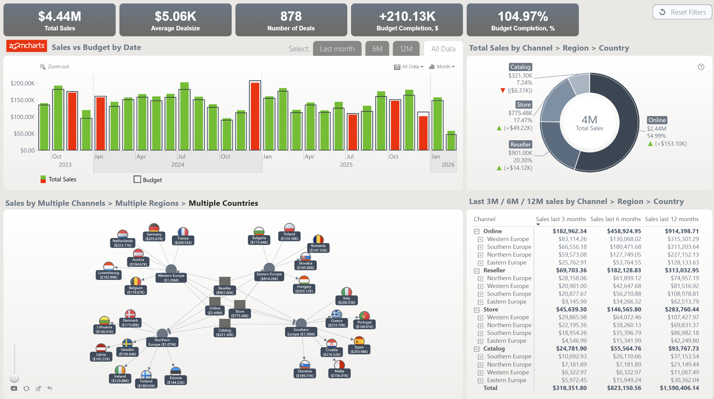
Budget-versus-actual reporting is one of the most reusable finance patterns in Power BI. This template compares planned sales with achieved results, highlights positive and negative variance, and supports analysis across the dimensions available in the report.
The timeline provides a time-based comparison, the network visual presents sales across channels, regions, and countries, and the donut gives a proportional view of sales channels. KPI cards and a table update as users filter the charts.
Explore this budget vs actual dashboard
ZoomCharts visuals used:
Drill Down Network PRO, Drill Down Timeline PRO, and Drill Down Donut PRO.
8. Law Firm Profitability by Practice Area Power BI Dashboard
Best for: Professional services revenue, profit, margin, and practice area analysis
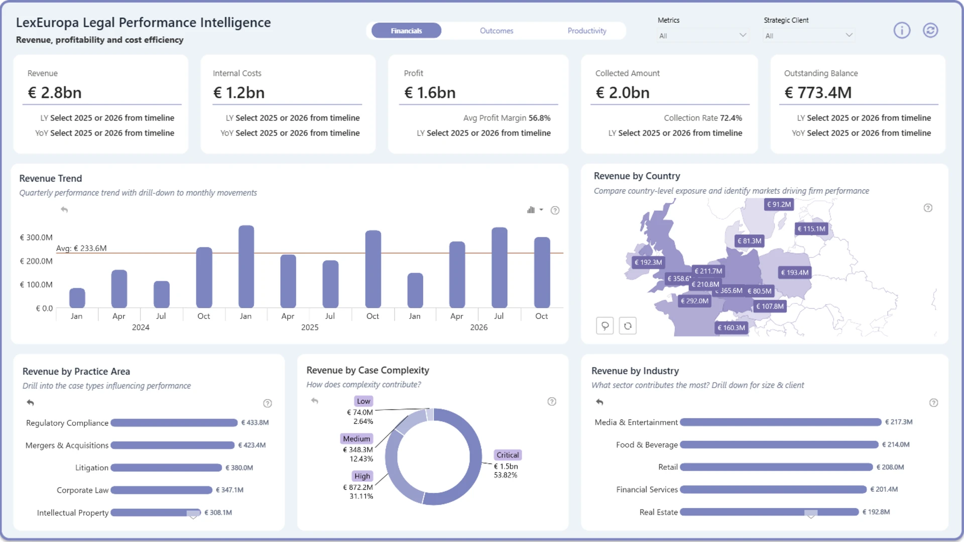
This sector-specific example helps legal operations teams, finance leaders, and managing partners compare revenue, profit, and profit margin across practice areas. It also supports trend analysis and lets users move from firm-level results into more detailed practice area performance.
The report is a useful reminder that profitability analysis works best when its dimensions match the way the business is managed. For a law firm, practice area is more meaningful than a generic product category. Selecting active chart elements filters related data for comparison from different perspectives.
Explore this law firm profitability dashboard
ZoomCharts visuals used:
Drill Down Bubble PRO, Drill Down Shape Map PRO, Drill Down Combo PRO, Drill Down Combo Bar PRO, Drill Down Timeline PRO, and Drill Down Donut PRO.
9. Power BI Customer Profitability Analytics Dashboard
Best for: Finding margin losses across products, channels, and markets
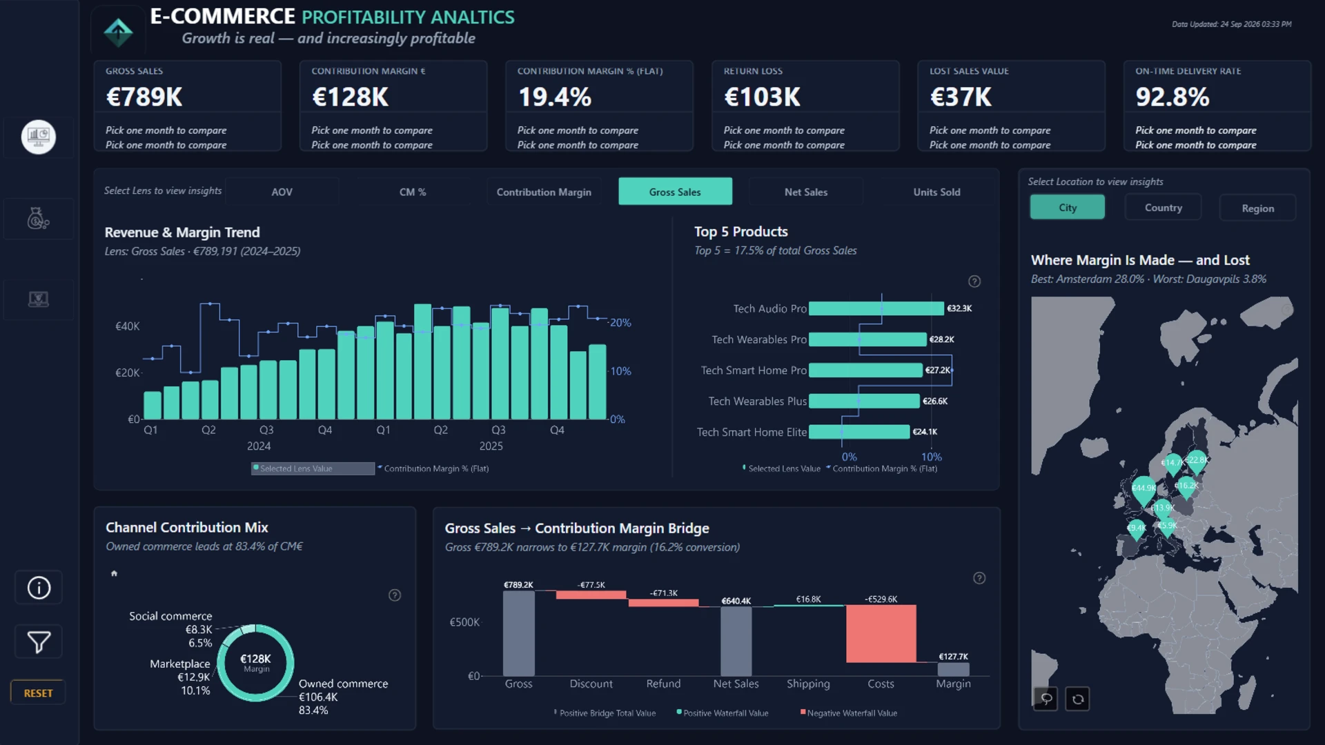
Mohamed Elbushra’s e-commerce finance dashboard follows profitability beyond gross sales. It brings together contribution margin, returns, lost sales, and delivery performance, with views of products, channels, and locations.
The dark overview combines sales and margin trends, a bridge from gross sales to contribution margin, and a geographic view. It is a useful design reference when revenue alone does not tell the full financial story.
Explore this dashboard template
ZoomCharts visuals used:
Drill Down Scatter PRO, Drill Down Waterfall PRO, Drill Down Map PRO, Drill Down Timeline PRO, Drill Down Donut PRO.
10. Power BI Finance Dashboard for Revenue and Transactions
Best for: Comparing revenue sources, clients, and budget
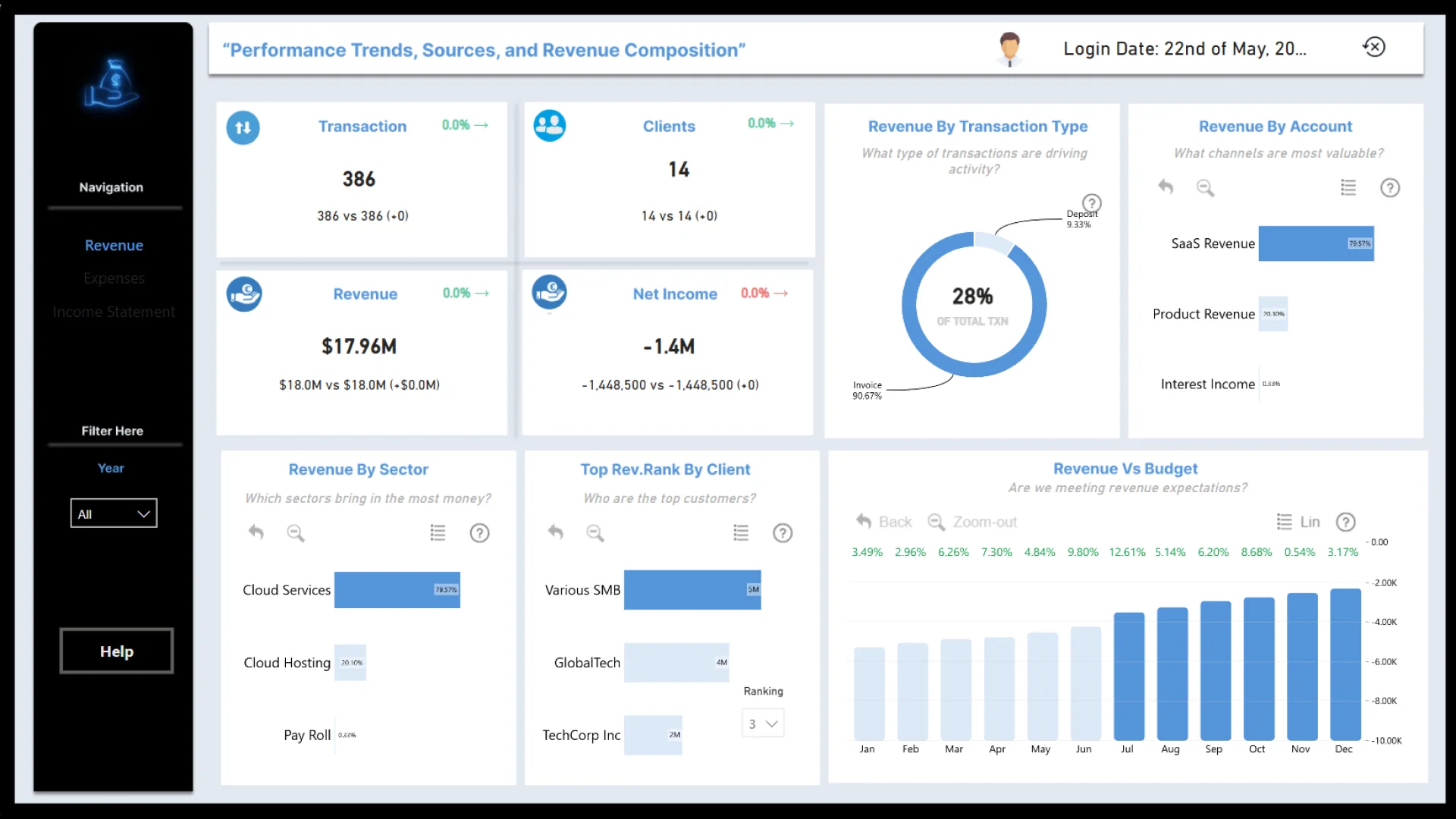
Eniola Adekoya’s Finance report uses the Financial Statements dataset from the May 2025 FP20 Analytics challenge. Its overview shows transactions, clients, revenue, and net income alongside breakdowns by transaction type, account, sector, and client.
The layout gives readers several ways to inspect where revenue comes from. A revenue-versus-budget chart provides a comparison over time, while the other visuals focus on composition and ranking.
Explore this dashboard template
ZoomCharts visuals used:
Drill Down Combo PRO, Drill Down Waterfall PRO, Drill Down Combo Bar PRO, Drill Down Donut PRO.
11. Power BI Revenue vs. Budget Dashboard
Best for: Comparing revenue against targets and forecasts
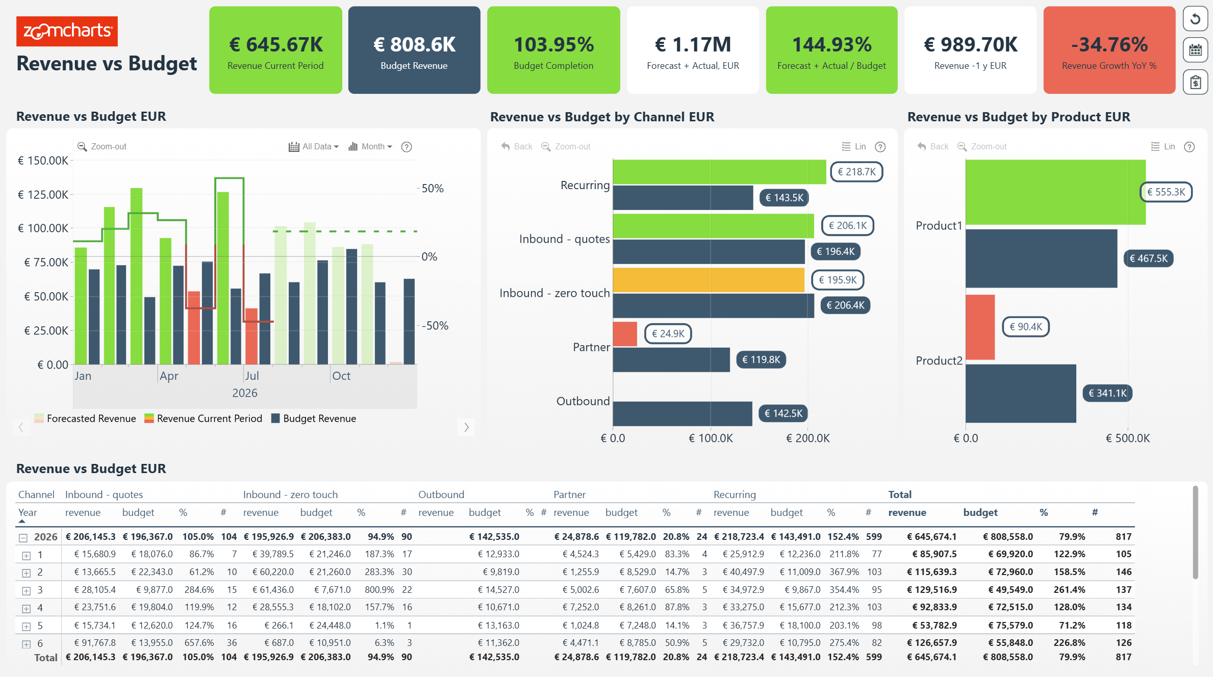
This ZoomCharts report places actual revenue, budgeted revenue, budget completion, and the revenue forecast in one view. A monthly chart compares progress against the plan, while separate breakdowns show which channels and products are ahead or behind.
It is a useful layout for monthly finance reviews because the high-level variance stays visible while the detailed table allows figures to be checked.
Explore this dashboard template
ZoomCharts visuals used:
Drill Down Combo Bar PRO, Drill Down Timeline PRO.
12. Power BI Procurement Spend Analysis Dashboard
Best for: Controlling purchasing costs and supplier performance
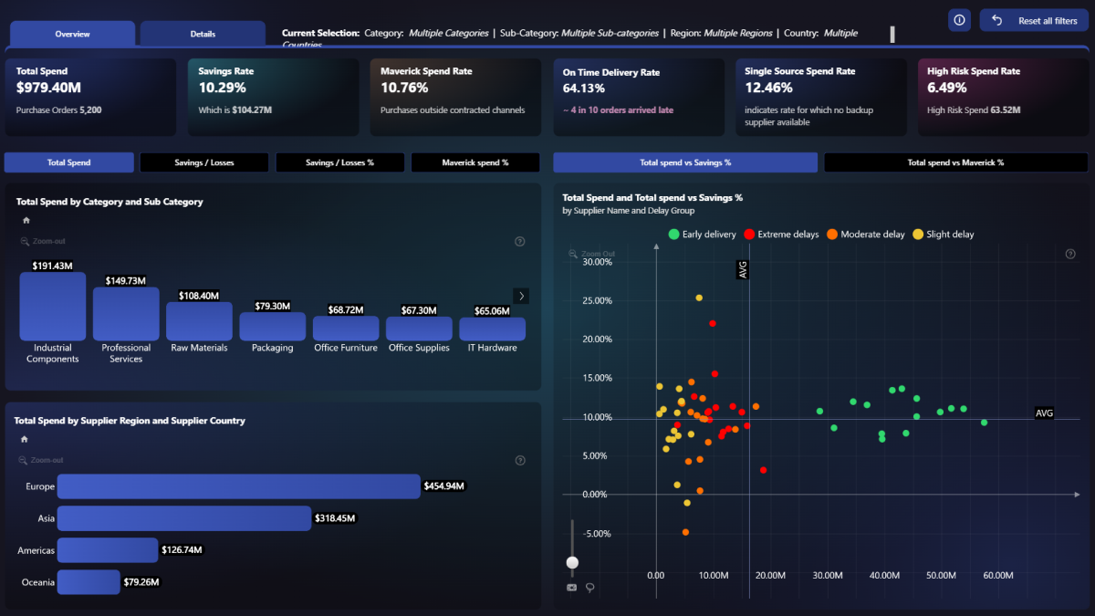
This procurement report tracks total spend, savings, delivery reliability, supplier risk, and off-contract purchasing. Category and supplier comparisons help finance teams see where purchasing costs are concentrated.
The dashboard pairs headline procurement KPIs with supplier-level detail, making it useful for reviewing savings opportunities and compliance alongside spending.
Explore this dashboard template
ZoomCharts visuals used:
Drill Down Scatter PRO, Drill Down Combo PRO, Drill Down Combo Bar PRO, Drill Down Timeline PRO.
13. Power BI Supply Chain Financial Performance Dashboard
Best for: Connecting supply chain efficiency with revenue and margin
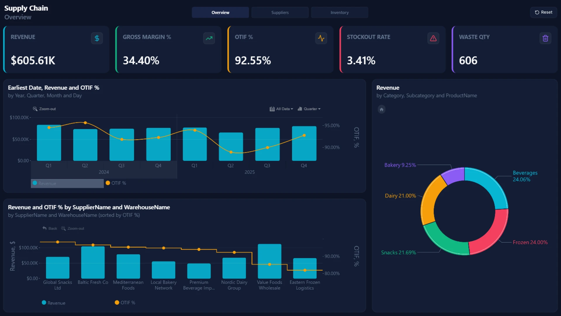
The supply chain overview combines revenue and gross margin with on-time-in-full delivery, stockout rate, and waste quantity. Additional views cover suppliers, inventory, expired products, and warehouse performance.
This example is relevant to finance teams because it puts commercial results beside operational indicators that can affect costs and profitability.
Explore this dashboard template
ZoomCharts visuals used:
Drill Down Bubble PRO, Drill Down Combo PRO, Drill Down Combo Bar PRO, Drill Down Timeline PRO, Drill Down Donut PRO.
14. Power BI E-Commerce Profitability Dashboard
Best for: Understanding what remains after sales costs, returns, and fulfillment
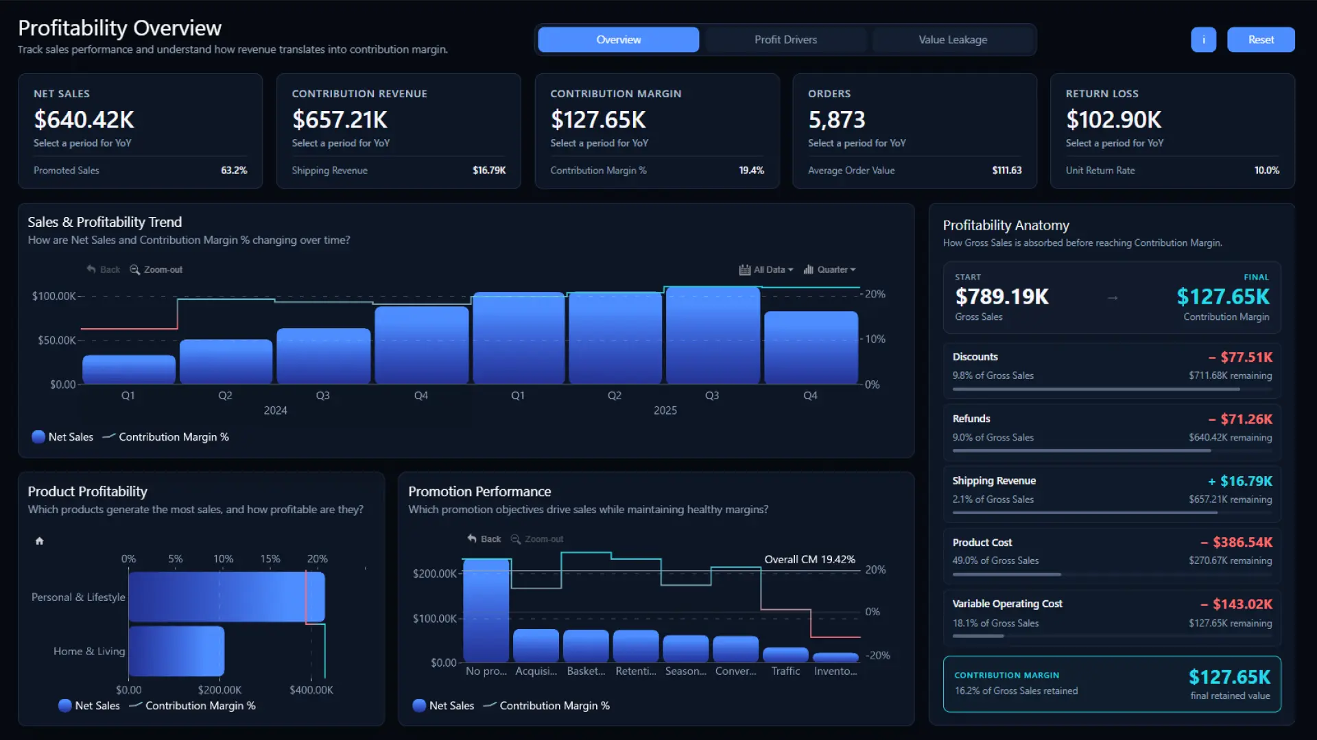
This three-page report follows sales from gross revenue to contribution margin after discounts, refunds, shipping revenue, product costs, and variable operating costs. Its Profit Drivers and Value Leakage pages explore which products, channels, and markets create value and where costs reduce it.
The clear margin breakdown is a useful design reference when revenue alone does not explain whether a business is growing profitably.
Explore this dashboard template
ZoomCharts visuals used:
Drill Down Bubble PRO, Drill Down Combo PRO, Drill Down Combo Bar PRO, Drill Down Timeline PRO.
15. Power BI B2B Sales Performance and Profitability Dashboard
Best for: Comparing B2B sales results with profit and targets
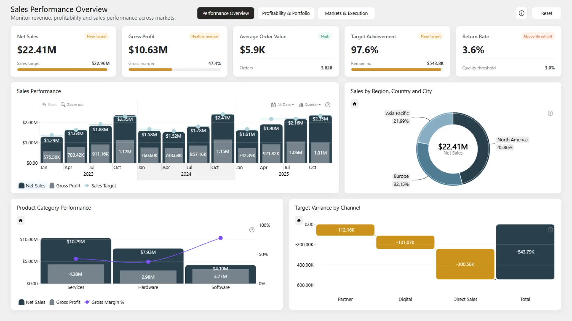
This report tracks net sales, gross profit, sales targets, average order value, and returns. Three pages cover performance, product profitability, and markets, with comparisons across products, channels, customers, and sales teams.
It shows how to place sales volume and financial quality side by side, rather than treating a rise in sales as a complete measure of performance.
Explore this dashboard template
ZoomCharts visuals used:
Drill Down Timeline PRO, Drill Down Donut PRO.
What the Best Finance Dashboards Have in Common
The examples differ in scope, but the strongest design choices are consistent. They begin with a small set of decision-critical KPIs, preserve a visible comparison such as budget, forecast, prior year, or margin, and give users a clear path from summary to detail.
- Start with the decision: Choose metrics because they support a review, action, or investigation, not simply because the data is available.
- Keep comparisons near the headline figure: Actual results are more informative when budget, forecast, prior period, or target is visible nearby.
- Use pages deliberately: Separate the financial overview, drivers, customer context, and operational context when combining them would make the first view harder to scan.
- Make filters and drill paths predictable: Users should understand how to narrow the report and return to the starting view.
- Design for the business structure: Regions, business units, product lines, customer segments, and practice areas should reflect how performance is managed.
- Test with realistic data volumes: Measures, relationships, and visuals must remain responsive in the deployed report.
How to Use a Power BI Finance Dashboard Template
A template is most valuable as a working reference, not as a finished reporting solution. Preview the report in the gallery, download the PBIX, and inspect how the pages, measures, filters, and visual interactions are organized. Then map the structure to your own chart of accounts, fiscal calendar, organizational hierarchy, security model, and reporting definitions.
Before publishing, validate every measure with the finance owner, check that favorable and unfavorable variance rules are consistent, and test the drill paths with the people who will use the report. Keep only the pages and visuals that support a real decision.
Browse more Power BI dashboard examples and templates in the ZoomCharts Power BI Template Gallery.
Try ZoomCharts Drill Down Visuals Free for 30 Days
Try ZoomCharts Drill Down Visuals in your own Power BI reports. The free trial lasts 30 days and includes access to the paid features of the ZoomCharts visuals.
You can also explore more Power BI report templates before choosing the best starting point for your next dashboard.