Oct 16, 2026
October Product Update: Series Labels, Guided Setup, Multiple Node Hiding and Regression Lines by Legend
This product update makes complex Power BI visuals easier to build and easier to read. Add Series Labels directly next to line and area series, start Combo visuals with guided setup, hide multiple Graph nodes at once, explain change indicators with a dedicated legend, and compare regression trends for individual legend groups in Scatter and Bubble charts.
This product update makes complex Power BI visuals easier to build and easier to read. Add Series Labels directly next to line and area series, start Combo visuals with guided setup, hide multiple Graph nodes at once, explain change indicators with a dedicated legend, and compare regression trends for individual legend groups in Scatter and Bubble charts.
What is new in this ZoomCharts product update
This release focuses on two practical problems Power BI developers face: getting advanced visuals configured faster and making complex charts easier for report users to understand.
- Series Labels show series names next to line or area series and connect each label to the correct series.
- Guided Combo setup helps you start from a common chart configuration and shows which fields are required.
- Hide Selected Nodes lets users select and hide several Graph nodes in one action.
- Indicator Legend explains positive, unchanged and negative change indicators directly inside Donut and Pie charts.
- Regression lines by Legend let you compare the overall trend with separate trends for individual legend groups.
Series Labels make line and area charts easier to read
Drill Down Timeline PRO, Drill Down TimeSeries PRO, Drill Down Combo PRO and Drill Down Line PRO now support Series Labels, making it easier to identify line and area series directly on the chart.
Series Labels display the series name next to the chart and connect the label to the matching line or area series.
This is especially useful when several lines are close together. Instead of repeatedly checking the legend and matching colors, report users can see the series name next to the data itself.
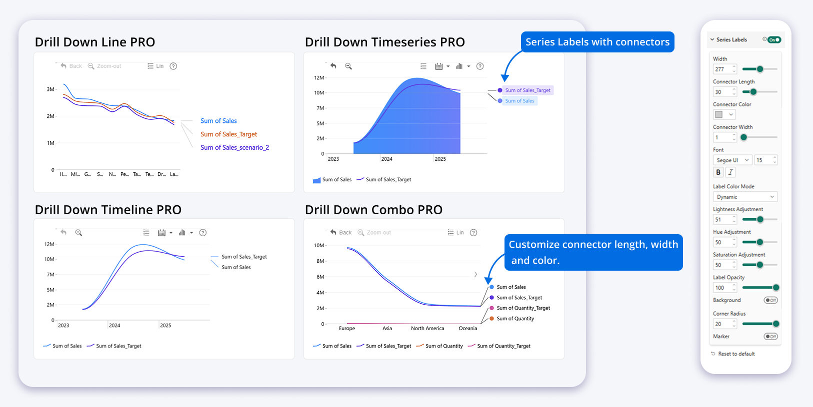
Series Labels can be displayed next to line and area series, with controls for connectors, text color, background and markers.
When are Series Labels available?
Series Labels are available when these conditions are met:
- The series uses the primary axis and the secondary axis is not enabled.
- At least one series is displayed as a line or area.
Customize Series Labels
When Series Labels are enabled, additional settings become available for label space, connectors, text, backgrounds and markers.
| Setting | What it controls |
|---|---|
| Width | Controls how much horizontal space is reserved for Series Labels. Smaller values leave more room for the chart. Larger values provide more space for longer series names. |
| Connector Length | Controls the length of the connector between the series and its label. |
| Connector Color | Defines the connector line color. |
| Connector Width | Controls the thickness of the connector line. |
| Font Family, Font Size and Font Style | Control the appearance of the label text. |
| Label Color Mode | Choose Fixed to select a specific label color or Dynamic to derive the label color from the corresponding series. |
| Hue, Saturation and Lightness Adjustment | Adjust the dynamically generated label color. |
| Label Opacity | Controls label visibility from 0 to 100. A value of 0 is fully transparent and 100 is fully visible. |
| Background | Turns the Series Label background on or off. |
| Background Color Mode | Choose Fixed for a manually selected color or Dynamic to derive the background color from the corresponding series. |
| Hue, Saturation and Lightness Adjustment | Adjust the dynamically generated background color. |
| Background Opacity | Controls background visibility from 0 to 100. |
| Background Padding | Controls the spacing between the label text and the background border. |
| Corner Radius | Controls how rounded the label background corners are. |
| Marker | Turns the marker next to the Series Label on or off. |
| Marker Shape | Choose Circle, Square, Rhombus, Triangle or Upside Down Triangle. |
| Marker Size | Controls the size of the marker. |
Why Series Labels are useful
Legends work well when a chart has only a few clearly different series. They become harder to use when several lines are close together or use similar colors.
Series Labels reduce the distance between the data and its explanation. That can make a busy Power BI chart easier to scan without adding another visual or text box.
Guided setup for Combo and Combo Bar visuals
Drill Down Combo PRO and Drill Down Combo Bar PRO now include a guided initial setup experience.
Instead of starting from an empty visual and working out every required field yourself, you can choose a common chart configuration first.
After you select a configuration, the visual shows which fields are required to build it.
How the guided setup works
- Add the visual to your Power BI report.
- Choose one of the available chart configurations.
- Review the required fields shown by the visual.
- Add your data fields.
- The visual shows which required fields have already been provided and whether the supplied data is valid.
- Once all required data is available, the chart is generated.
- Continue customizing the chart in the Format pane.
Developers who prefer to create the visual from scratch can still choose Manual Setup at the bottom of the initial setup window.
Why this helps report developers
Combo visuals can support many series and several display types. That flexibility also means there are more fields and settings to understand.
The guided setup makes the required data structure visible earlier. This can shorten the first setup and make the visual easier to understand for developers who have not used it before.
Hide multiple selected Graph nodes at once
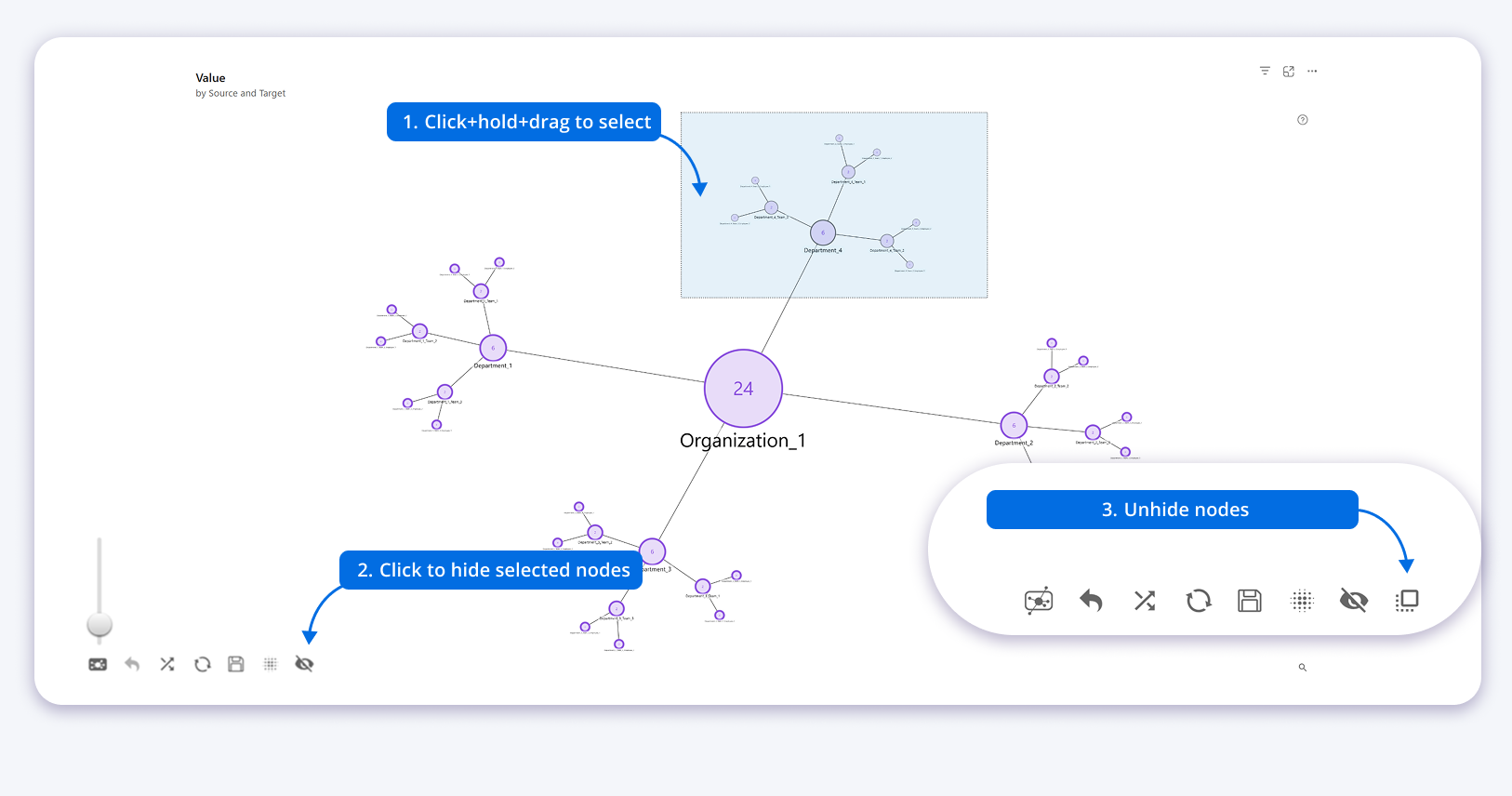
Drill Down Graph PRO can now hide several selected nodes in one action.
Previously, users could hide individual nodes from the node context menu. Now you can select several nodes and hide them together.
How Hide Selected Nodes works
- Use rectangular selection to select multiple nodes.
- Select Hide Selected Nodes from the chart toolbar.
- Use the existing Unhide Nodes action when you want to restore hidden nodes.
The new Hide Selected Nodes toolbar action can be enabled or disabled in the Toolbar settings.
Show users that nodes are hidden
When at least one node is hidden, the chart can display a message in the upper left corner showing how many nodes are currently hidden.
Show Hidden Node Message turns the hidden node information message on or off.
Hidden Nodes Message lets you change the wording to match the terminology used in your report while keeping the current hidden node count visible.
Why this is useful
Large relationship maps can quickly become crowded. Hiding several nodes at once makes it faster to focus on the part of the network that matters for the current analysis.
The hidden node message also makes the current chart state clearer because users can immediately see that part of the graph has been hidden.
Indicator Legend explains change indicators
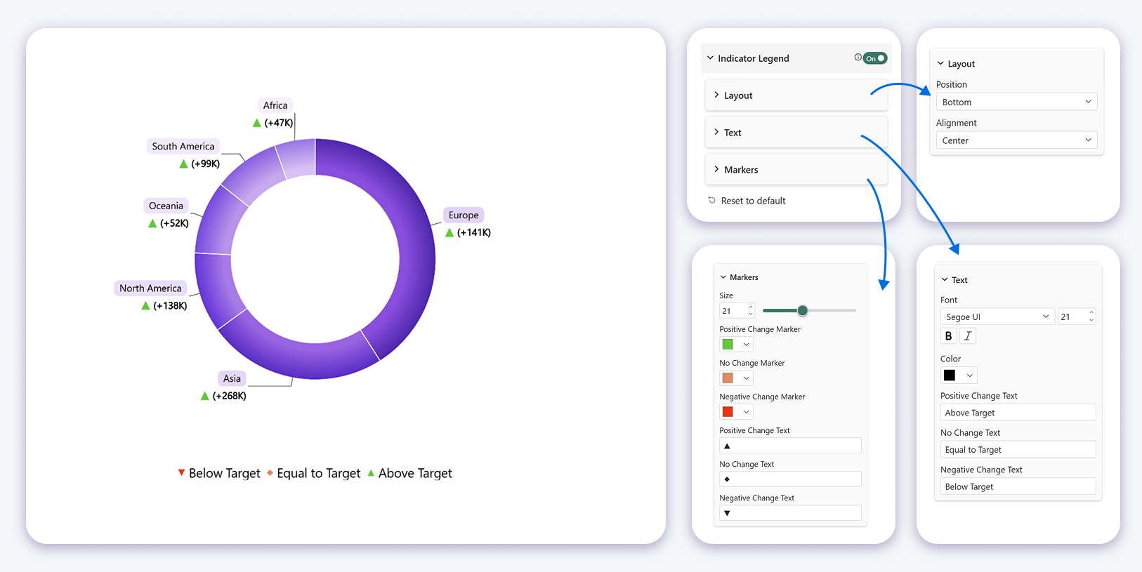
Drill Down Donut PRO and Drill Down Pie PRO now support a dedicated legend for change indicators.
Change indicators provide context by showing how a category value compares with its reference value. The Indicator Legend explains what the positive, unchanged and negative indicator states mean directly inside the visual.
Customize the Indicator Legend
When Indicator Legend is enabled, Layout, Text and Markers settings become available.
Layout
- Position places the Indicator Legend at the Bottom, Left, Right or Top of the chart.
- Alignment aligns the legend to the Left, Center or Right relative to the chart.
Text
Text settings control the explanatory text displayed next to each change indicator marker.
- Font Family selects the font used for the legend text.
- Font Size controls text size.
- Font Style applies the available text styles.
- Font Color defines the legend text color.
- Positive Change Text defines the explanation for a positive change.
- No Change Text defines the explanation when there is no change.
- Negative Change Text defines the explanation for a negative change.
Markers
Marker settings control the appearance of the positive, unchanged and negative indicators shown in the legend.
- Size controls indicator marker size.
- Positive Change Marker defines the positive change marker color.
- No Change Marker defines the no change marker color.
- Negative Change Marker defines the negative change marker color.
- Positive Change Text defines the symbol used for positive change.
- No Change Text defines the symbol used when there is no change.
- Negative Change Text defines the symbol used for negative change.
Marker settings stay synchronized
Change indicator marker settings are shared with the corresponding label settings.
If you update a marker in the Indicator Legend, the matching marker used with labels is also updated. Changes made in the label settings are also reflected in the legend.
This keeps the indicator appearance consistent and avoids configuring the same marker in two different places.
Why this helps report users
A change indicator only helps when the reader understands what it means.
The Indicator Legend keeps that explanation inside the chart. This is especially useful when a Power BI report is shared with people who did not build the report themselves.
Compare regression lines by Legend
Drill Down Scatter PRO and Drill Down Bubble PRO can now calculate and display separate regression lines for legend groups in addition to an overall regression line.
The Legend field groups related data points independently from the Categories hierarchy.
When data points are split by Legend, a regression line can now be calculated for each legend group. This makes it possible to compare group level trends with the overall trend and customize regression settings for individual lines.
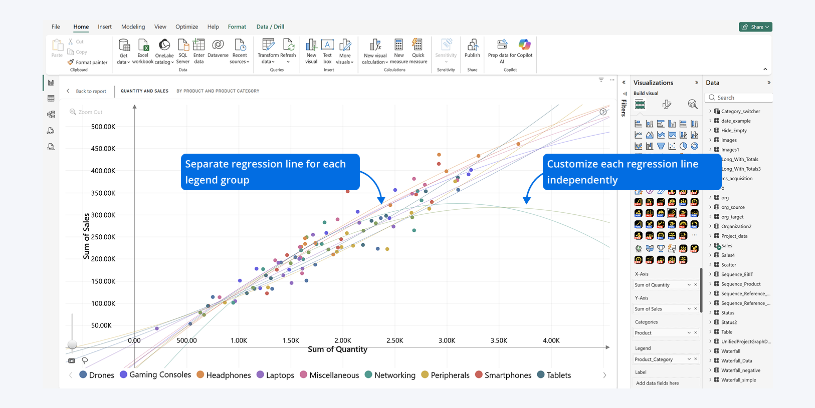
Separate regression lines can be displayed for each legend group, and each regression line can be customized independently.
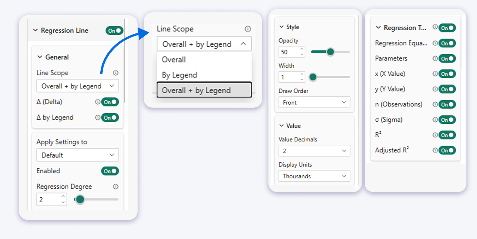
Use Line Scope to choose which regression lines are displayed and configure regression behavior.
The Line Scope setting defines which regression lines are displayed when the visual contains legend groups.
- Overall displays one regression line calculated from all visible data points.
- By Legend displays a separate regression line for each legend category.
- Overall + By Legend displays the overall regression line together with separate regression lines for each legend category.
Regression lines are recalculated when the visible data changes, for example after filtering, legend interactions or drill down navigation.
Use Delta to compare a data point with its regression line
Delta represents the vertical distance between a data point and its regression line.
When enabled, the data point tooltip can show how far the point is above or below the fitted trend.
- Delta Overall enables or disables Delta values relative to the overall regression line.
- Delta By Legend enables or disables Delta values relative to the regression line for the data point's legend group.
The available Delta controls depend on the selected Line Scope. When Overall + By Legend is selected, both Delta settings can be controlled independently.
Delta values are displayed in data point tooltips when Tooltips are enabled. They are not displayed in the separate Regression Tooltip.
Customize regression lines individually
Apply Settings to selects which regression line configuration is being customized.
You can apply default settings, adjust the overall regression line, or customize regression lines for individual legend categories separately.
Enabled turns the selected regression line on or off. This lets you show or hide individual legend regression lines without disabling the complete regression line feature.
Regression Degree sets the degree of the regression function.
- 1 displays a linear regression line.
- 2 to 10 displays a polynomial regression line of the selected degree. For example, 2 creates a quadratic regression and 3 creates a cubic regression.
Style each regression line
The selected regression line can also have its own appearance settings.
- Color selects the regression line color using the Power BI color picker. You can use a palette color or enter a custom HEX value through More colors.
- Opacity controls visibility from 0 to 100, where 0 is fully transparent and 100 is fully opaque.
- Width controls the regression line thickness.
- Draw Order determines whether the regression line appears in front of or behind other chart elements.
Why regression lines by Legend matter
One overall regression line can hide meaningful differences between groups.
For example, several product categories can follow different patterns even when the full dataset appears to have one clear overall trend.
Separate legend regression lines let Power BI developers compare those patterns in the same visual instead of creating a separate Scatter chart for every group.
Key takeaways for Power BI developers
- Series Labels make line and area series easier to identify directly on the chart in Drill Down Timeline PRO, Drill Down TimeSeries PRO, Drill Down Combo PRO and Drill Down Line PRO.
- Guided setup makes it faster to start building with Drill Down Combo PRO and Drill Down Combo Bar PRO.
- Drill Down Graph PRO can hide several selected nodes in one action and tell users when nodes are hidden.
- The Indicator Legend explains change indicator logic directly inside Drill Down Donut PRO and Drill Down Pie PRO.
- Drill Down Scatter PRO and Drill Down Bubble PRO can compare overall and legend specific regression trends in the same visual.
Try the updated ZoomCharts Power BI visuals
The new features are available in the latest versions of the affected ZoomCharts visuals.
Start a free trial to test the updated visuals in your own Power BI reports.
You can also explore all ZoomCharts Power BI custom visuals and find the visual that fits your report.

Want more info like this?
Subscribe to our newsletter and be the first to read our latest articles and expert data visualization tips!