Sep 02, 2026
August 2026 Product Update: Fixed Width, Others Column, Node Outlines and Custom Tooltip Dates
The August 2026 ZoomCharts update adds new controls to Drill Down Combo PRO, Drill Down Combo Bar PRO, Drill Down Graph PRO, Drill Down Timeline PRO, and Drill Down TimeSeries PRO.
The August 2026 ZoomCharts update adds new controls to Drill Down Combo PRO, Drill Down Combo Bar PRO, Drill Down Graph PRO, Drill Down Timeline PRO, and Drill Down TimeSeries PRO.
The main changes include fixed column and bar widths, an Others column or bar for charts with many categories, support for up to 20 link category classes in Graph, data driven node outline colors, custom date and time formats in tooltips, and hover highlighting that remains visible when tooltips are turned off.
What is new in the August 2026 update
- Drill Down Combo PRO and Drill Down Combo Bar PRO: fixed column and bar width
- Drill Down Combo PRO and Drill Down Combo Bar PRO: new Others column or bar
- Drill Down Graph PRO: support for up to 20 link category classes
- Drill Down Graph PRO: node outline colors from data
- Drill Down Timeline PRO and Drill Down TimeSeries PRO: custom tooltip date and time formats
- Applicable Facet visuals: hover highlighting is independent from tooltip visibility
Drill Down Combo PRO and Drill Down Combo Bar PRO: Set a Fixed Column or Bar Width
By default, Drill Down Combo PRO and Drill Down Combo Bar PRO adjust the width of columns and bars to fit the available chart area.
This works well in many reports, but charts with different numbers of categories can end up using different column or bar widths.
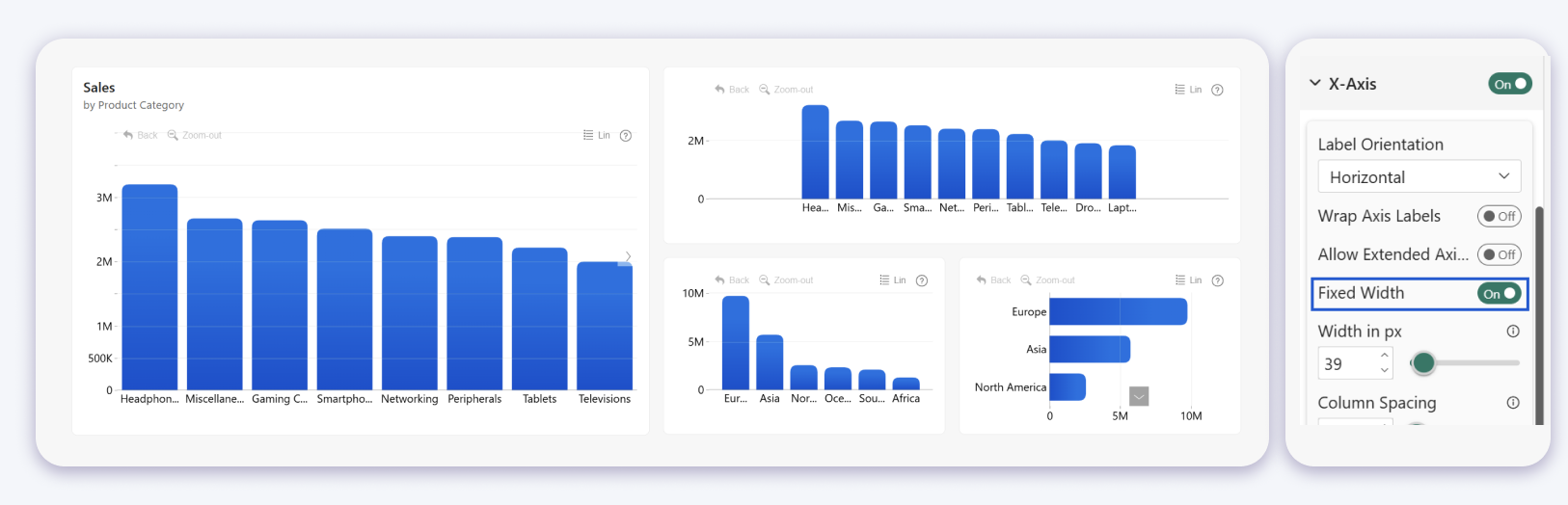
The new Fixed Width setting lets report creators specify a consistent width instead.
For Drill Down Combo PRO, the setting is available under X Axis. For Drill Down Combo Bar PRO, it is available under Y Axis.
Width in px defines the width of each column or bar in pixels.
Column Spacing controls the space between categories.
If the configured columns or bars require more space than the visual can display, users can scroll through the remaining categories. If they require less space than is available, they are centered within the chart.
This is useful when several column or bar charts are placed on the same Power BI report page and you want their widths and spacing to remain consistent.
Drill Down Combo PRO and Drill Down Combo Bar PRO: Group Remaining Categories into an Others Column or Bar
Charts with many categories can quickly become difficult to read. The new Others feature provides a Top N style view for Drill Down Combo PRO and Drill Down Combo Bar PRO.
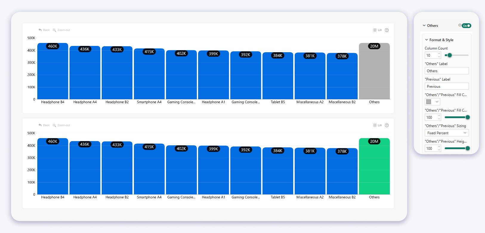
Report creators can choose how many categories are displayed individually. The remaining categories are grouped into a single Others column in Drill Down Combo PRO or an Others bar in Drill Down Combo Bar PRO.
Users can select the Others column or bar to explore the categories it contains. The visual then displays the next group of categories together with a Previous column or bar that returns users to the previous view.
When is the Others feature available?
The feature is available when one series is used and that series is displayed as columns or bars.
If multiple series are used, or the series uses another chart type, the Others settings are not available.
Others settings
Column Count defines how many categories are displayed individually before the remaining categories are grouped into Others. For example, a value of 10 displays ten categories individually.
Others Label lets you change the text displayed for the grouped column or bar.
Previous Label lets you change the text displayed for the navigation column or bar.
Others / Previous Fill Color and Fill Color Opacity control the appearance of the Others and Previous columns or bars.
Others / Previous Sizing controls how the size of the Others column or bar is calculated.
- Actual Size: the visual adds the values of all categories grouped into Others and displays the resulting total.
- Fixed Percent: the Others column or bar uses a defined percentage relative to the largest visible column or bar.
Fixed Percent is useful when the combined value of the remaining categories is much larger than the individually displayed Top N categories. It prevents the Others column or bar from dominating the chart scale.
When Fixed Percent is selected, Others / Previous Height in % controls the displayed size. At 100%, Others is displayed at the same size as the tallest visible column or longest visible bar.
Drill Down Graph PRO: Use Up to 20 Link Category Classes
Drill Down Graph PRO now supports up to 20 link category classes. Previously, up to 9 were supported.
Link categories are used to separate and style different types of relationships in a graph.
The higher limit allows a single Drill Down Graph PRO visual to represent more relationship groups without combining them into the same category.
This is particularly useful for graph reports where links represent several different relationship types and each type needs its own formatting.
Drill Down Graph PRO: Set Node Outline Colors from Data
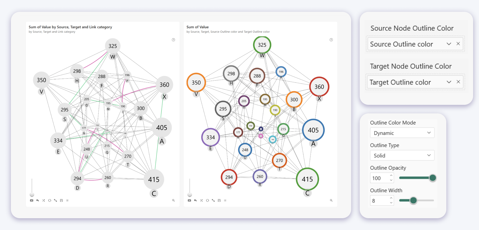
Drill Down Graph PRO now lets report creators define node outline colors directly from Power BI data fields.
Previously, node outline colors could be customized manually through the visual settings. You can now also supply outline colors directly through fields in the Power BI data model.
Two data fields are available for defining outline colors:
- Source Node Outline Color
- Target Node Outline Color
This makes it possible to control the outline colors of source and target nodes directly from the data model.
The fields support common text color formats including HEX, RGB, RGBA, and CSS color values.
Choose how node outline colors are assigned
The new Outline Color Mode setting determines how node outline colors are assigned.
- Fixed: uses an outline color selected manually in the visual settings.
- Dynamic: uses outline colors supplied through the corresponding data fields. If no outline color field is provided, colors are assigned automatically by node category.
Outline type, opacity, and width can also be customized in the visual settings.
Outline Type supports Solid, Dashed, and Dotted outlines.
Outline Opacity controls transparency.
Outline Width controls the thickness of the outline.
This gives report creators the option to control node outline colors from the data model while keeping the existing manual formatting controls.
Drill Down Timeline PRO and Drill Down TimeSeries PRO: Customize Tooltip Date and Time Formats
Drill Down Timeline PRO and Drill Down TimeSeries PRO now let report creators control how dates and times are displayed in tooltips.
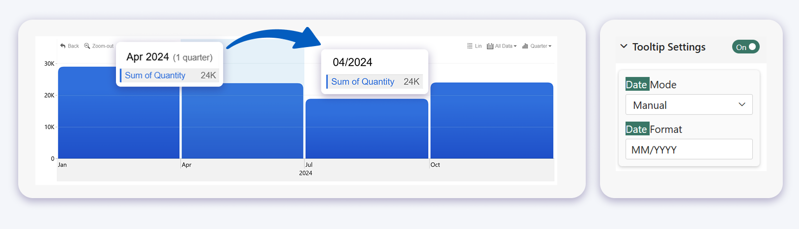
Previously, tooltip dates relied on automatic formatting. The new settings make it possible to use the date convention required by the report.
Date Mode
The new Date Mode setting is available under Tooltip Settings.
Auto uses the default date and time format selected by the visual.
Manual displays an additional Date Format field where you can enter your own format.
Date Format
The Date Format field uses Moment.js compatible formatting conventions.
For example:
- YYYY-MM-DD displays 2026-08-18
- DD.MM.YYYY displays 18.08.2026
- MMM D, YYYY displays Aug 18, 2026
- YYYY-MM-DD HH:mm displays 2026-08-18 16:35
- h:mm A displays 4:35 PM
Formatting tokens are case sensitive. For example, MM represents the month while mm represents minutes. HH uses a 24 hour clock while hh uses a 12 hour clock.
Current limitation
The custom date format currently applies across all Drill Down Timeline PRO time units.
For example, if a format is configured while viewing minutes, the same format is also used when navigating to hours, days, months, or years.
For this reason, custom formatting is currently best suited to reports that use a consistent time granularity.
Hover Highlighting Now Works Without Tooltips
Hover highlighting is now independent from tooltip visibility in applicable Facet visuals.
Previously, turning off tooltips could also remove the visual highlight that appeared when a user hovered over a chart element.
Now, disabling tooltips hides only the tooltip. The chart element can still be highlighted when the pointer moves over it.
No additional setup is required for this change.
This means tooltip visibility and hover feedback can now be controlled separately. A report can keep tooltips hidden while still showing users which chart element they are pointing at.
Key Takeaways
- Drill Down Combo PRO and Drill Down Combo Bar PRO can use fixed column or bar widths and fixed spacing.
- The new Others feature in Drill Down Combo PRO and Drill Down Combo Bar PRO groups categories outside the selected Top N into an Others column or bar and lets users explore them directly in the chart.
- Drill Down Graph PRO now supports up to 20 link category classes instead of 9.
- Drill Down Graph PRO can now use node outline colors supplied directly from the Power BI data model.
- Drill Down Timeline PRO and Drill Down TimeSeries PRO tooltips can use manually configured date and time formats.
- Hover highlighting can remain visible even when tooltips are disabled.
Try the Updated ZoomCharts Power BI Visuals
The new features are available in the latest versions of the affected ZoomCharts visuals.
Start a free trial to test the updated visuals in your own Power BI reports.
You can also explore all ZoomCharts Power BI custom visuals and find the visual that fits your report.

Want more info like this?
Subscribe to our newsletter and be the first to read our latest articles and expert data visualization tips!