Feb 26, 2025
February 2025: What’s New in ZoomCharts Visuals for Power BI
You can now enable extended axis labels in Combo, Combo Bar and Waterfall, assign lasso shapes to specific shape layers in Map, and enter custom display names for link categories in Graph. Read more about the latest update in this article!
You can now enable extended axis labels in Combo, Combo Bar and Waterfall, assign lasso shapes to specific shape layers in Map, and enter custom display names for link categories in Graph. Read more about the latest update in this article!
Your visuals should update automatically from AppSource. If your visuals have not received the updates automatically, read this documentation article that explains the manual update process.
Combo, Combo Bar, Waterfall: Allow Extended Axis Labels
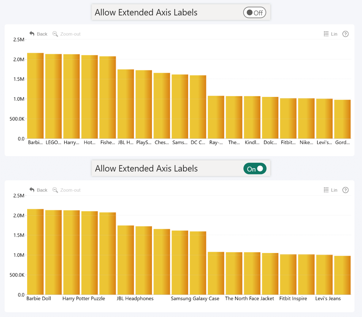
The January 2025 update for Combo, Combo Bar, and Waterfall visuals introduces a new toggle: Allow Extended Axis Labels. The new setting may be useful in certain scenarios where your data has lengthy category names (e.g. full names) or you are creating a tightly packed chart with narrow axis unit widths.
By default, the X-Axis for Combo and Waterfall or Y-Axis for Combo Bar will display a label for each category; and if there is not enough space, the label will be truncated with an ellipsis. But, if the new Allow Extended Axis Labels toggle is enabled, labels will be allowed to go outside their allotted space to be fully displayed. When enabled, a new setting will be revealed – Max Label Length, which can be used to set the upper length limit in pixels.
However, keep in mind that any extended label may “take away” space from its neighboring category. In cases where one label overlaps with two or more axis units, only one label will be displayed. Therefore, we encourage report creators to consider the tradeoffs of either mode and use settings that provide the best user experience and readability for your use case.
- Documentation: Allow Extended Axis Labels

 Drill Down Combo PRO
 Drill Down Combo Bar PRO
 Drill Down Waterfall PRO
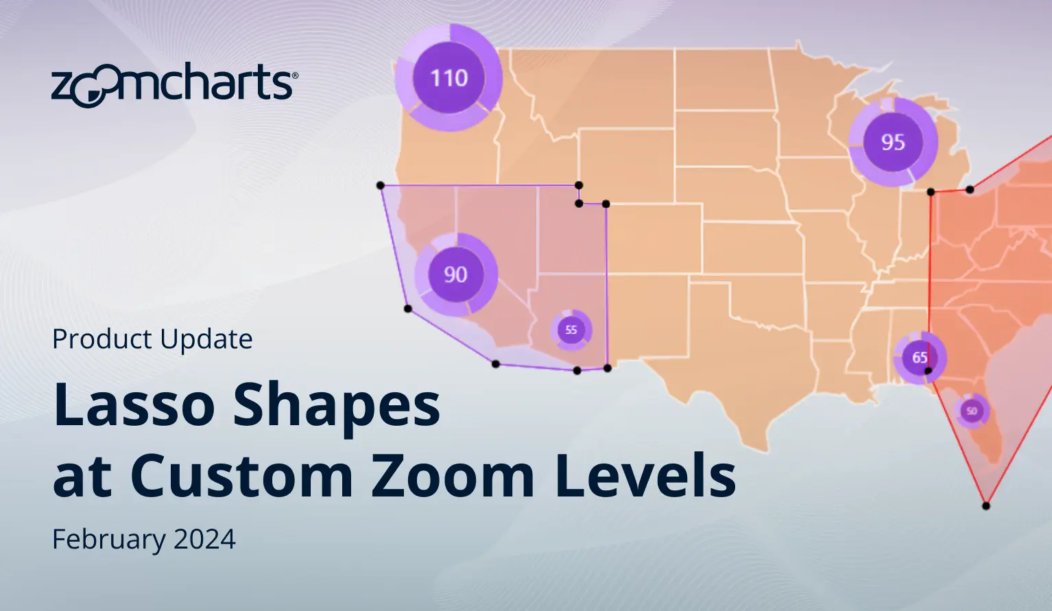
Map, Shape Map: Assign Lasso Shapes to Shape Layers
One of the most exciting features of Map and Shape Map is Lasso Shapes, which can be used to create and store custom shapes with the lasso tool from the toolbar. It’s useful for marking specific areas of interest or creating an easy way to select multiple nodes at once. What’s more, when the Lasso mode is active, you can right-click each shape to change settings like shape name, fill and outline color and opacity.
The January 2025 update for Map and Shape Map introduces a new setting to the lasso shape right-click submenu: Shape Layer, which allows you to assign each shape to a specific shape layer. The default setting (all) will keep the shape independent like before, but if you assign it to a shape layer, it will be governed by the settings in the Shape Layer X Settings section.
Why is this important? If you set the shape layer’s Type to Lasso, you can configure the min/max zoom level, which will be applied to all lasso shapes assigned to that layer. This means that you can now choose the zoom levels at which the shapes are displayed, similar to other shape layer types. Furthermore, by using multiple shape layers (up to 10), you can create a fully customized user experience where different zoom levels display different lasso shapes.
- Documentation: Type (Shape Layer Settings)


 Drill Down Map PRO & Shape Map PRO
Graph: Display Names for Link Categories
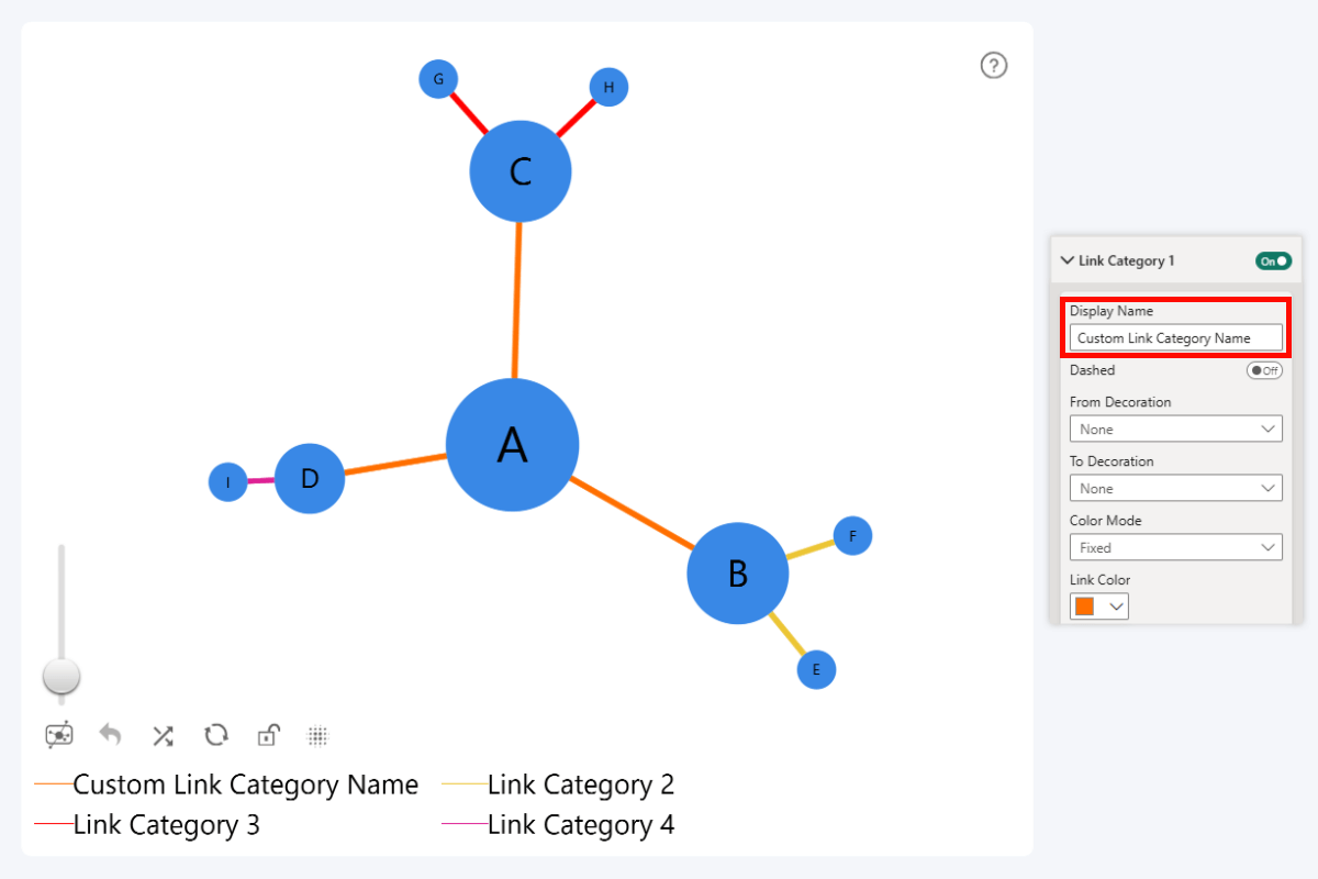
In Graph PRO, you can use the Link Category Class field to assign links to categories, which will allow you to apply custom appearance settings for each category. Previously, each link category was displayed in the legend as “Link Category 1”, “Link Category 2”, etc.
With the January 2025 update for Graph PRO, you can now choose custom display names for link categories. Enter your desired name in the Display Name setting, and the legend will display that instead of the default name.
This will allow you to provide context about relationships – for example, identify different stakeholder types (“investor”, “supplier”, “customer”, “partner”, etc.).
- Documentation: Display Name (Link Category)

 Drill Down Graph PRO
Get Started with ZoomCharts
Be sure to download the latest version of ZoomCharts Visuals to enjoy these new additions, along with hundreds of other features! With a free trial available, you can see for yourself how these powerful visuals can take your Power BI reports to the next level.

Want more info like this?
Subscribe to our newsletter and be the first to read our latest articles and expert data visualization tips!