Sales Revenue Dashboard Example
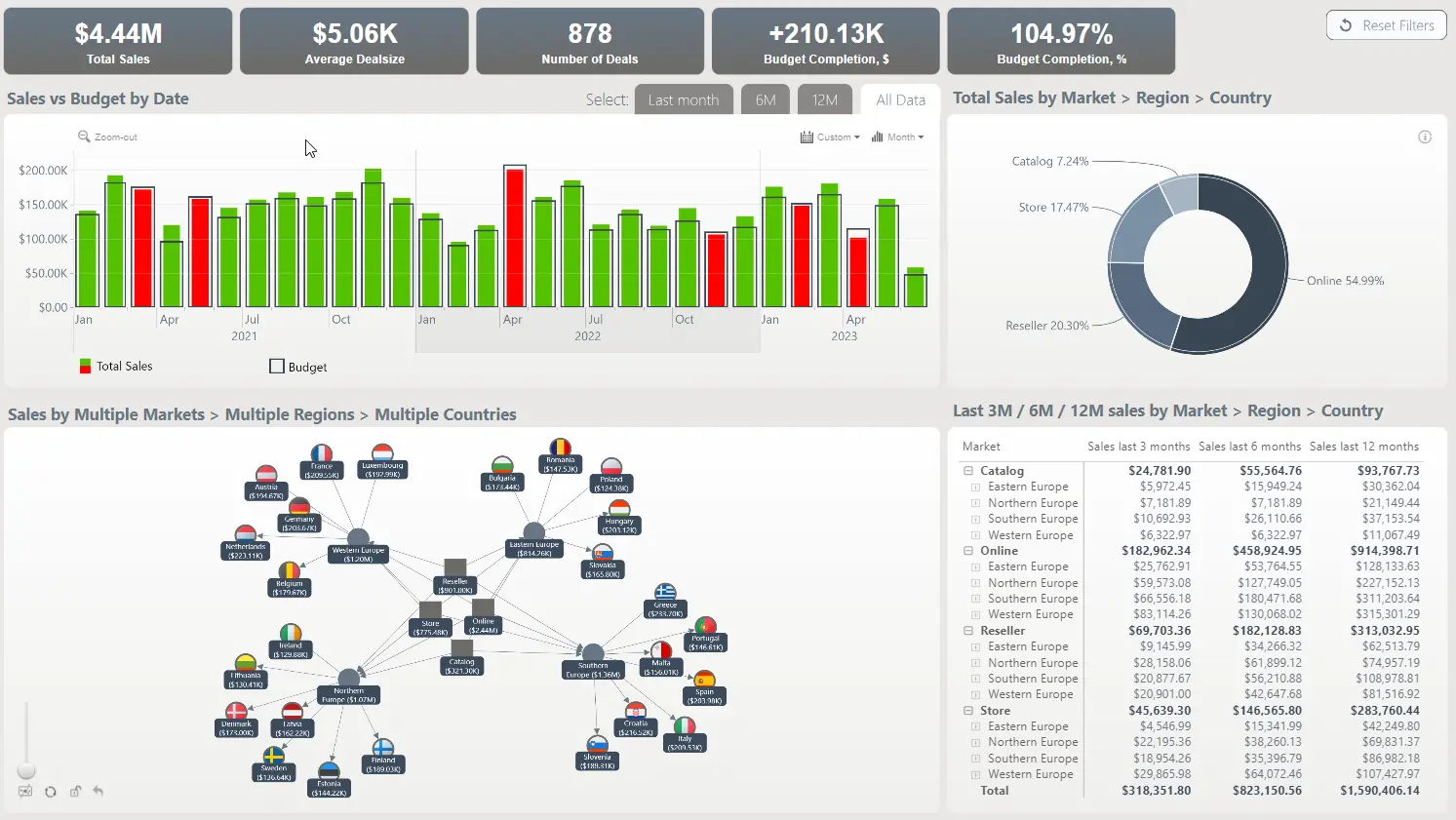
This dashboard, which consists of a net chart, time chart, pie chart and table, is designed to analyze sales performance against the budget. The time chart displays sales and budgets as two series - actual sales as a column, and budget as an outline; and the conditional formatting applies red color if the budget is not met, and green if it is exceeded. In addition, you can click on the pie chart to drill down and see sales per channel, region, and country.
While this dashboard is built on the Microsoft Power BI platform, it utilizes ZoomCharts JS technology for some or all its visual components.