HR Workload Analytics Dashboard Example
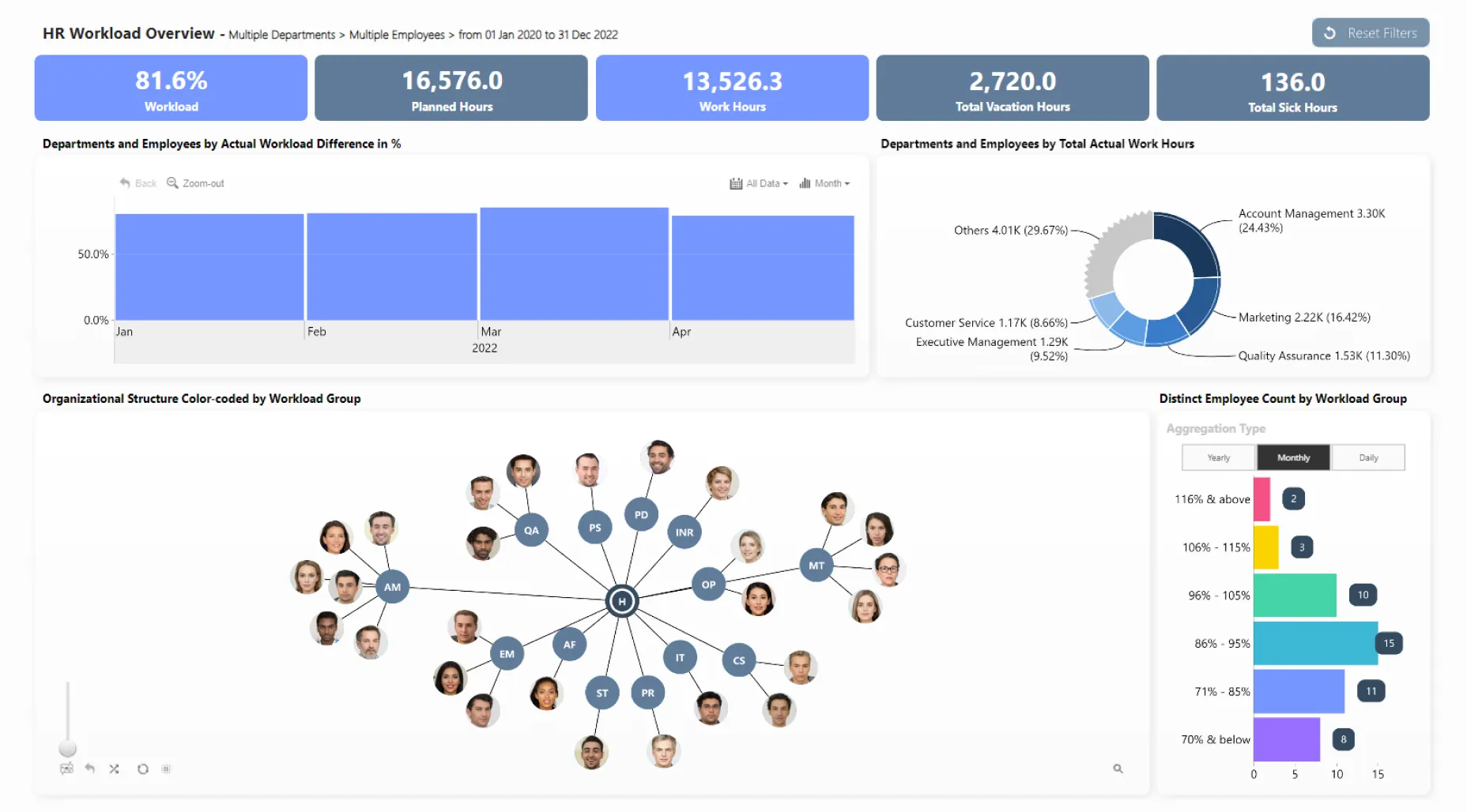
Analyze organization workload with multiple visuals - time chart, pie chart, net chart, and horizontal facet chart - all of which cross-filter each other. For example, you can select a department in the pie chart, specific employees in the org chart, or a time period, and all other visuals will show data related to your current filter state.
While this dashboard is built on the Microsoft Power BI platform, it utilizes ZoomCharts JS technology for some or all its visual components.