ARR Dashboard Example
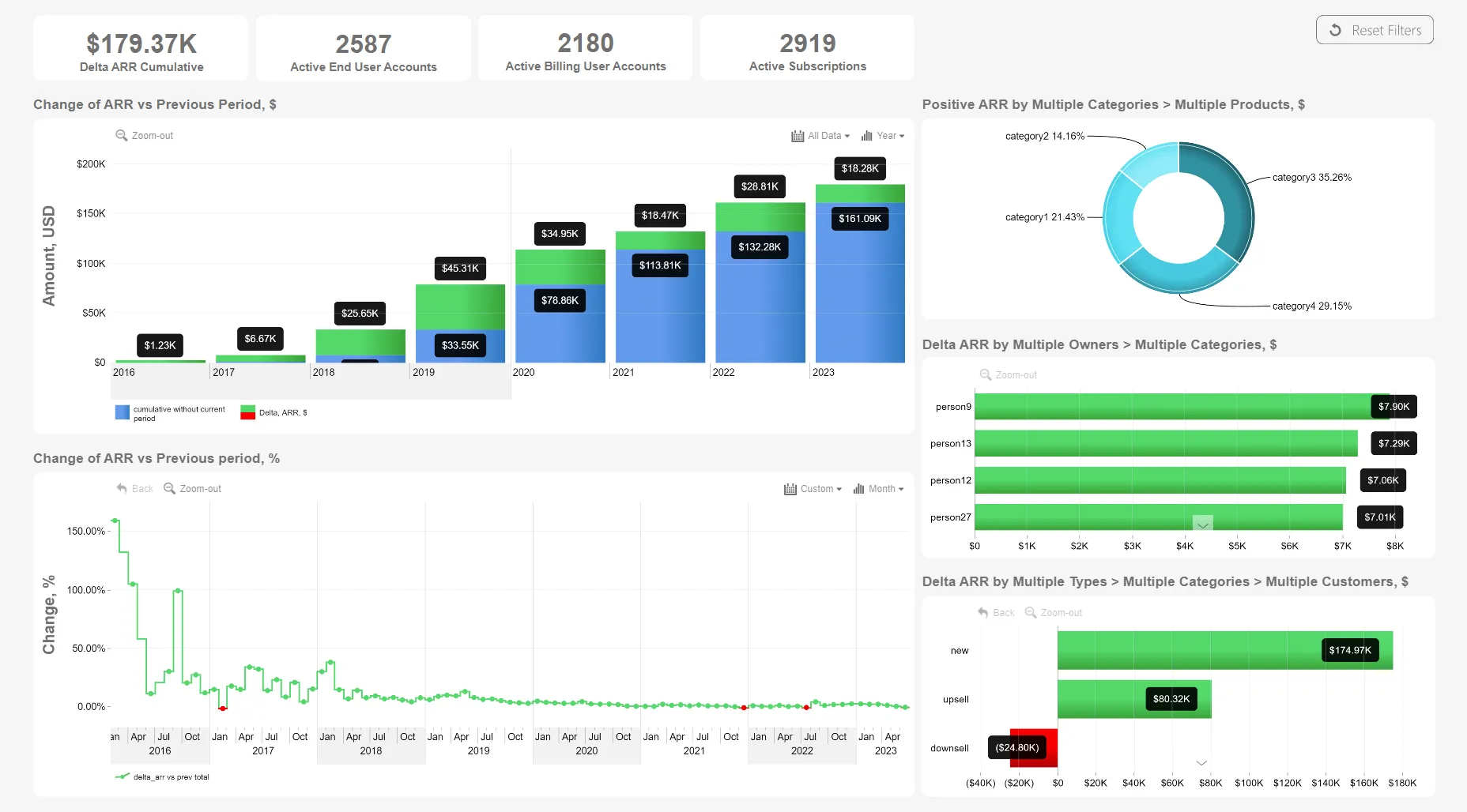
When analyzing annual recurring revenue, the most important thing is growth - that's why the top column chart shows the increase over previous year as a green segment (achieved by stacking two series - previous period and delta). In addition, the stepped line chart below shows the change percentage - positive growth is marked green, but negative growth is marked red. You can also use the pie and bar charts on the right as filters to see ARR per category, product, owner, and see the ARR gain due to new customers or upsells and loss due to churn or downsells.
While this dashboard is built on the Microsoft Power BI platform, it utilizes ZoomCharts JS technology for some or all its visual components.