Invoice Analysis Dashboard Example
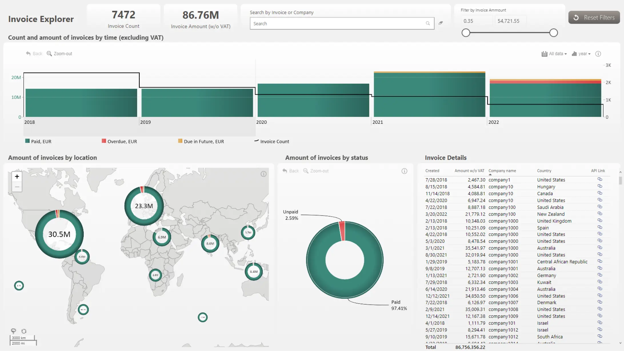
The Invoice Explorer dashboard is designed so that you can find clients with unpaid invoices in just a few clicks - for example, the map chart can be used to filter data per country or region, and the time chart shows data over time (you can switch between yearly or monthly view). The pie chart will show the ratio between paid and unpaid invoices at your current filter state. Click on the red 'Unpaid' slice, and the table will show all clients with unpaid invoices, plus a clickable link to their entry in the CRM.
While this dashboard is built on the Microsoft Power BI platform, it utilizes ZoomCharts JS technology for some or all its visual components.