Global Sales Dashboard Example
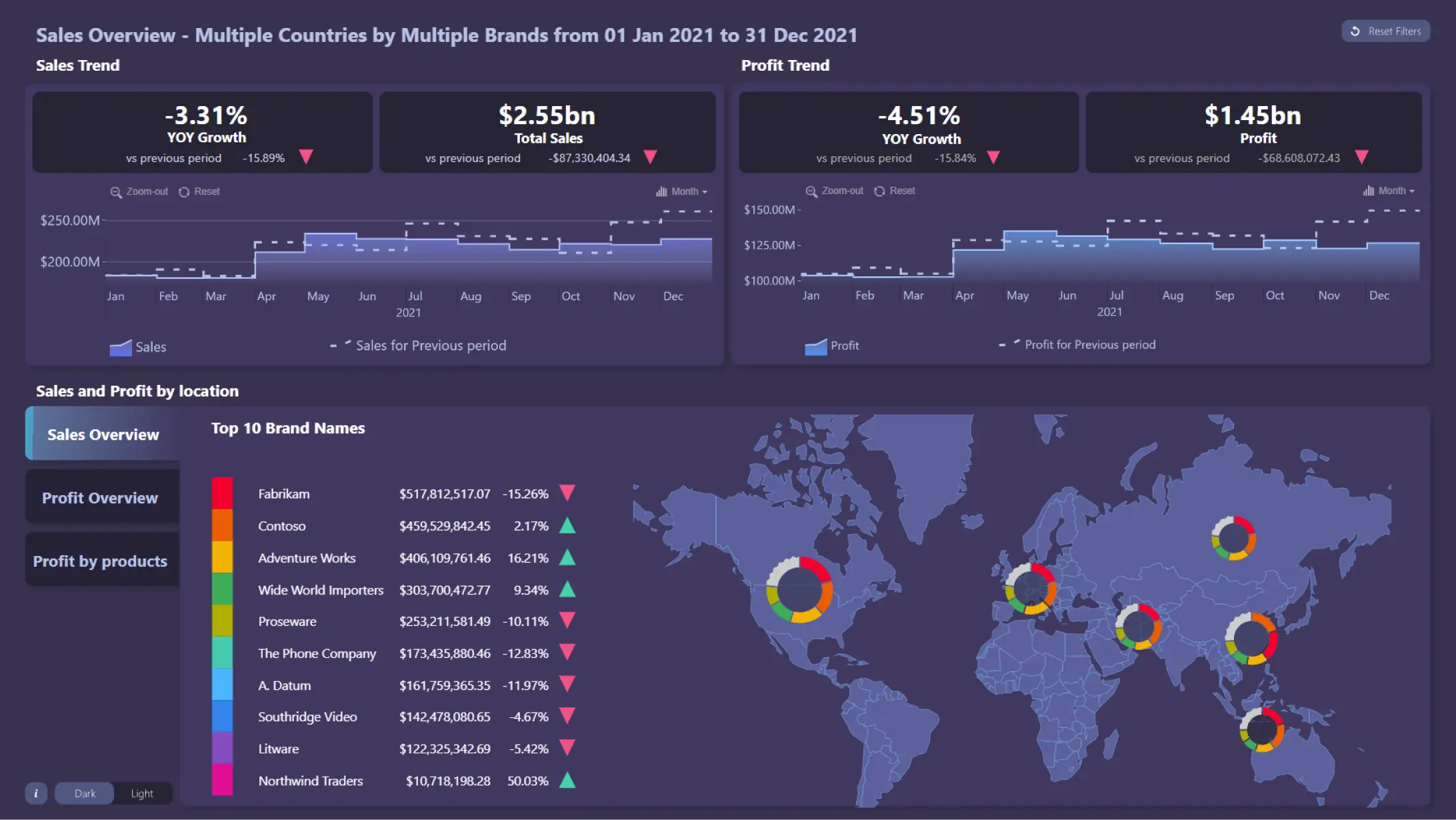
Dashboard example for sales analysis. Sales and profits trends are visualized on time charts. For easy comparison between current and previous period, the latter is displayed as an outline - you can toggle its display by clicking on the legend. The global sales data is visualized on an interactive map chart. Nearby nodes are clustered together and visualized as pie charts that show which brands have the highest sales or profits in the region. Selecting data in one visual will filter the entire dashboard - for example, highlighting a specific time range or clicking on a country.
While this dashboard is built on the Microsoft Power BI platform, it utilizes ZoomCharts JS technology for some or all its visual components.