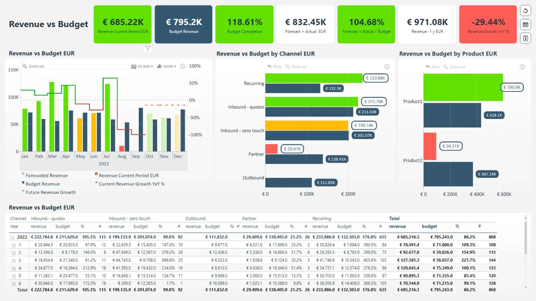
Budget vs. Actual Dashboard Example
Financial dashboard for analyzing Budget vs. Actual revenue. Conditional formatting is widely used to provide instant visual cues about performance to the user. The time chart displays multiple series that can be toggled on/off by clicking its legend item, and the secondary Y-axis has been enabled to display revenue growth percentage as a line. The two bar charts next to it are displayed horizontally - in Power BI, it can be achieved by using Combo Bar PRO custom visual, but in ZoomCharts JS, you can rotate FacetChart using the 'horizontal' property.
While this dashboard is built on the Microsoft Power BI platform, it utilizes ZoomCharts JS technology for some or all its visual components.