HR Turnover Dashboard Example
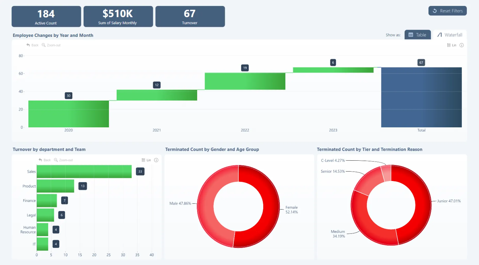
Get quick and easy-to-read insights about your employee turnover. The waterfall chart shows changes in your employee count over time - click to drill down to monthly view. The three visuals below can be used to analyze turnover per department, termination distribution per demographic group (gender and age groups), and position and termination reason. Selecting data in one visual will filter the entire report. You can also switch to table view for even more detailed insights.
While this dashboard is built on the Microsoft Power BI platform, it utilizes ZoomCharts JS technology for some or all its visual components.