Drill Down Timeline PRO is our second custom Power BI visual
for date/time-based data. Timeline PRO carries over all ZoomCharts signature
features of TimeSeries PRO – intuitive on-chart user interactions for
navigation and drill downs, extensive customization, and cross-chart filtering
– but expands the functionality and provides even more flexibility to report
creators.
Timeline PRO employs matrix data structure, which can be leveraged by report creators to have full control over the date hierarchy. In addition, Timeline PRO has full support for DAX measures and calculated columns, conditional formatting, and up to 25 series (of three different chart types) on the same chart. You can read a more detailed comparison between our two visuals for date/time-based data – TimeSeries PRO and Timeline PRO – in this blog article.
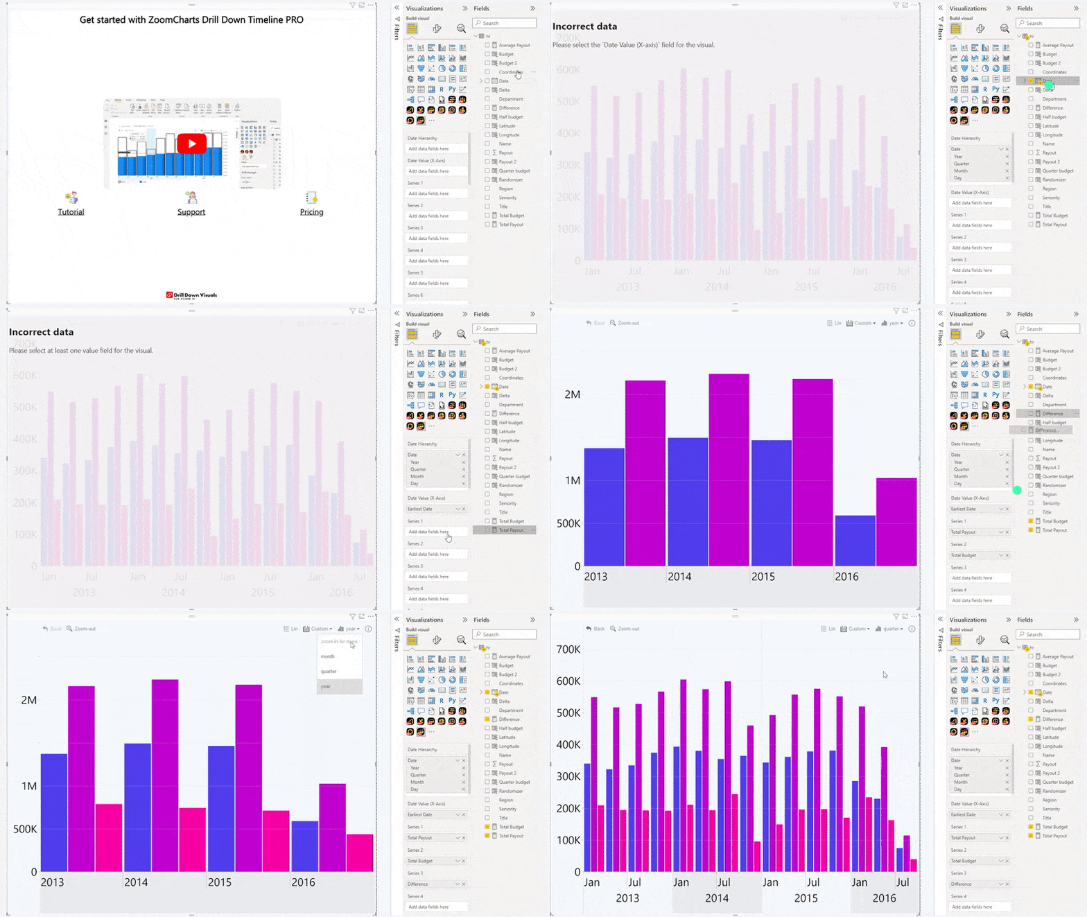
Drill Down Timeline PRO uses datetime values to create a time dimension scale on the X-axis, which will then be used to display numerical values from the Series fields as columns, areas, or lines on the Y-axis. This visual has three mandatory fields - Date Hierarchy, Date Value (X-Axis) and at least one Series. You can read more about Timeline PRO data requirements in the Setting Up Fields page of this documentation.
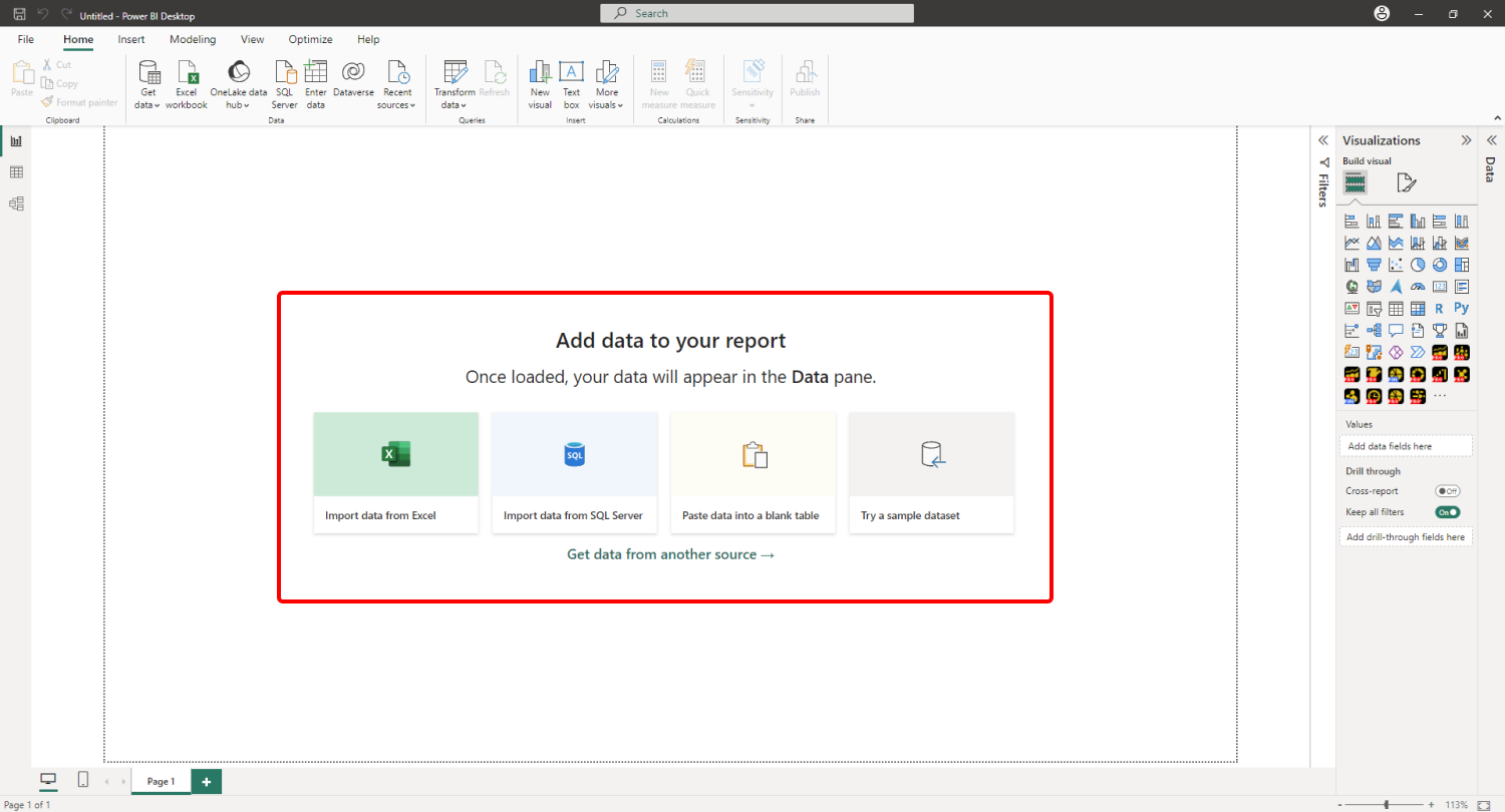
When you create a blank Power BI report, you will be
presented with multiple options: you can import your own data, paste it into a
blank table, or try a sample data set that’s provided by Power BI. The latter
option is recommended if you want to experiment with the features of Drill Down
Timeline PRO without using your own data.

Adding Drill Down Timeline PRO to Power BI
If you have downloaded this visual from Microsoft AppSource
within Power BI Desktop, its icon should automatically appear in the Visualizations
pane on the right side of your Power BI window.

If you have acquired Drill Down
Timeline PRO externally, you may need to add it to Power BI manually. You can
do that by clicking the ellipsis button at the end of the visualizations list,
and pressing Import a visual from a file. Locate the .pbiviz file and the
visual will be added to the Visualizations pane.

Add Drill Down Timeline PRO to your Power BI report by clicking the visual’s icon in the Visualizations pane. Doing so will create a blank visual that contains no data. Once you add at least one valid column in each of the required fields – Date Hierarchy, Date Value (X-Axis) and Series – Timeline PRO will visualize your data using the default formatting settings.

You can then head to the Format Visual tab of the Visualizations pane to customize your chart (either each individual series or all series), including selecting the chart type for each series (column, line, or area), applying custom color fill and outline settings, adjusting stacking and clustering behavior, and more.
Format Visual tab also contains various options to
adjust formatting settings, customize legends, tooltips, thresholds and
more, or enable a Secondary Y-Axis. If you want to enable cross-chart filtering
to use this visual as an interactive filter for the entire report (or vice
versa – filter your timeline chart with other visuals), you can do that with
the Use as Filter toggle.
Was this helpful? Thank you for your feedback!
Sorry about that.
How can we improve it?