Jul 08, 2025
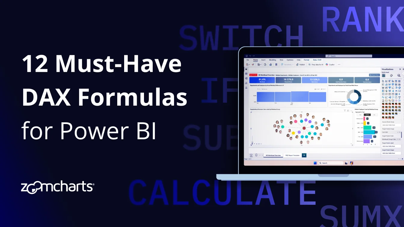
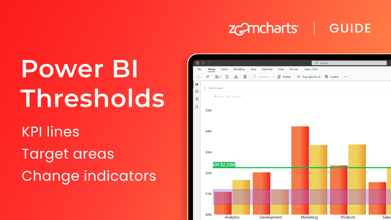
Power BI Reference Lines, Areas, Change Indicators: ZoomCharts Thresholds Explained
Constant or dynamic reference lines, shaded areas, change indicators – these visual aids are important tools to provide context and clarity to your reports.

Constant or dynamic reference lines, shaded areas, change indicators – these visual aids are important tools to provide context and clarity to your reports.
In this article, we will explore various ways you can use the Thresholds feature in ZoomCharts visuals, walk through the configuration, and explain different settings and what they do. Some of the Power BI use cases include:
- Constant reference line to show KPIs or targets
- Dynamic line for percentile or average
- Shaded area to visually distinguish target range
- Green or red arrow that shows the change between two values
The Thresholds feature is available in the following ZoomCharts Visuals: Combo, Combo Bar, Line, Timeline, TimeSeries, Waterfall, and Scatter. Even though the examples in this article will use Combo, this guide can be applied to our other visuals since Thresholds function similarly in all of them.
Reference Line in Built-in Power BI Visuals
Some of the built-in Power BI visuals already include a way to show visual aids like reference lines or areas. They can be accessed in the Analytics tab of the Visualizations pane.
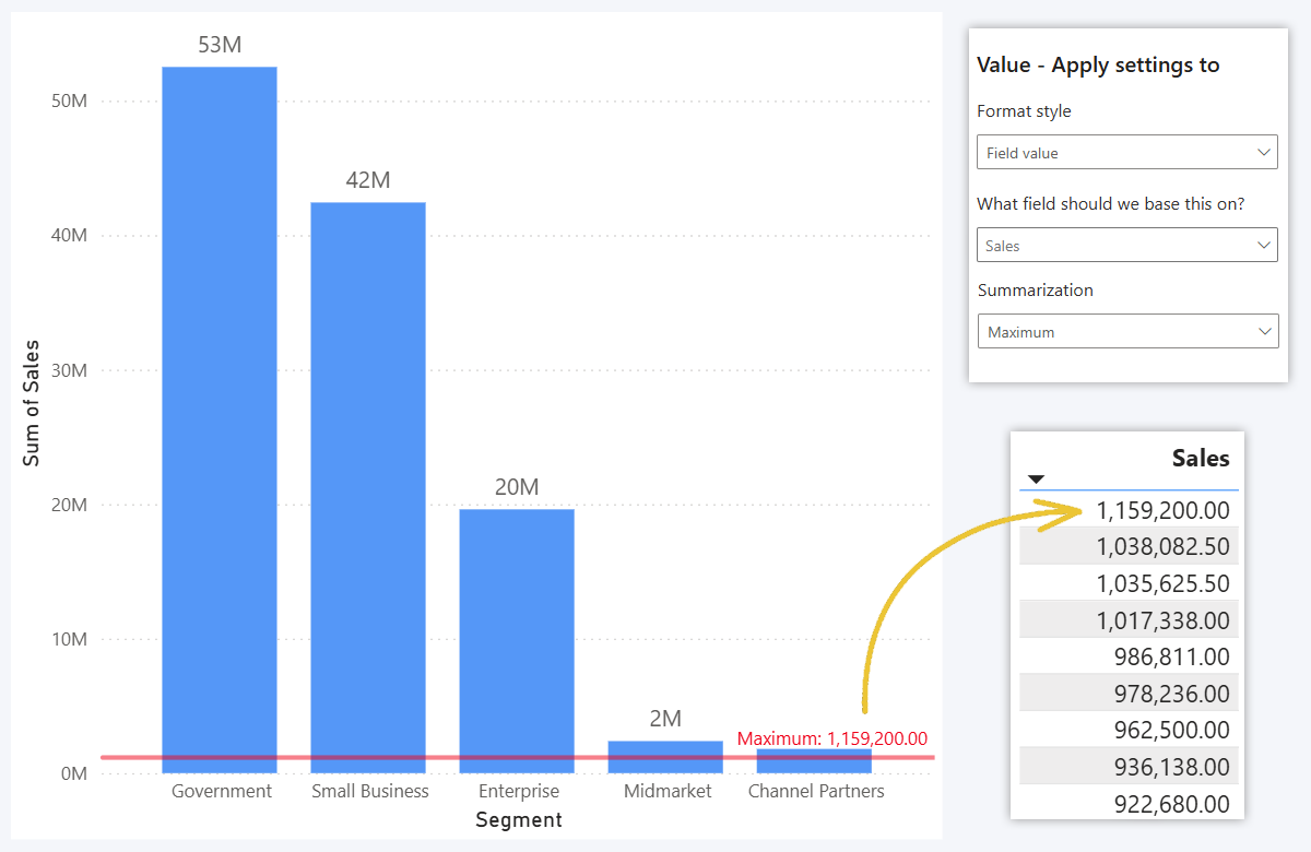
For this example, we used the built-in Stacked Column Chart visual, and you can see an option to add one or multiple Y-Axis lines to the chart. In addition to the value, you can adjust line color, style, thickness and other settings.
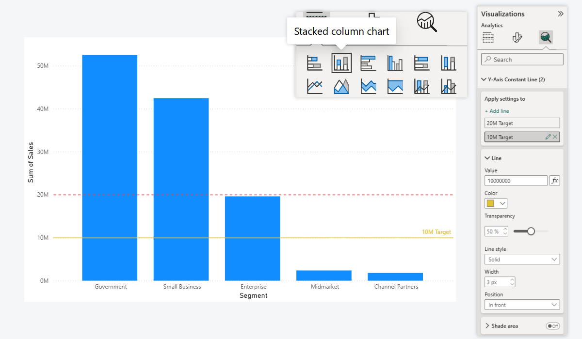
You can place the line at a manually entered value, or apply a calculation (Sum, Average, Median, Min, Max, Count, etc.) to a field of your choice. But note: the summarization will be applied to the entire field, not per category in the chart.
For example, if you select Sales (the same field that is visualized as columns in our example) and use Average summarization, it will take the entire Sales column and calculate the average value across all rows, not the average per segment.
So, if we wanted to show the average per-segment sales as a reference line, we’d have to create a workaround with a custom DAX measure to achieve that. Or use ZoomCharts, which will summarize based on visible data and take categories into account.
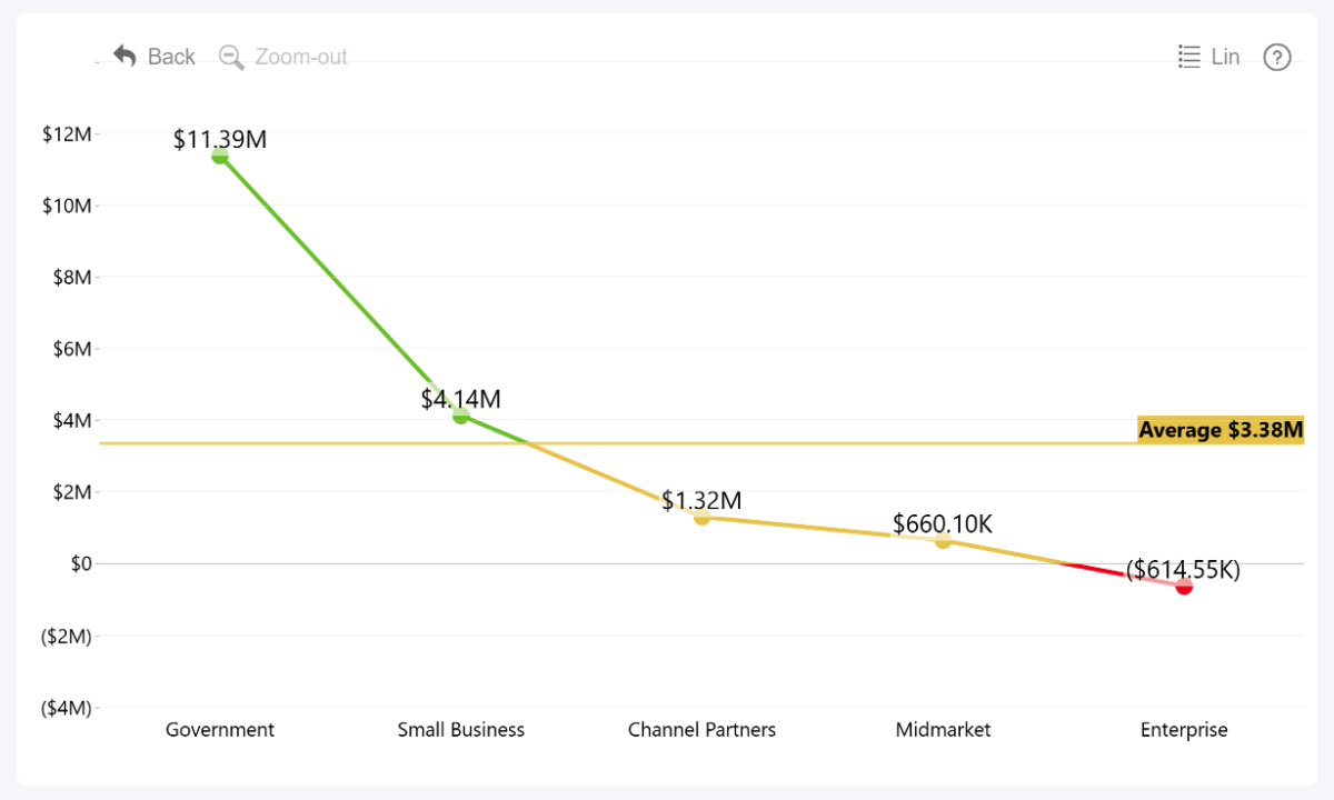
To better demonstrate this, here's what happens when you apply Maximum to Sales. The series is visualized as five columns, of which the largest category value is 'Goverment' (53 million). But since the summarization is applied to the entire field, without taking the categories into account, it returns the largest individual row value of the Sales field instead.
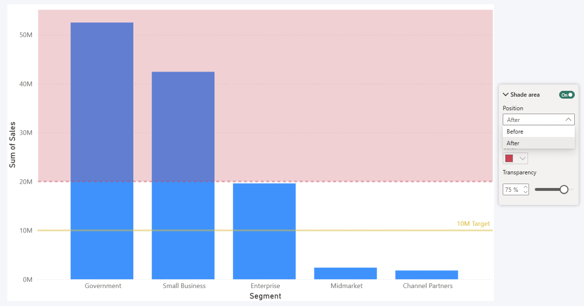
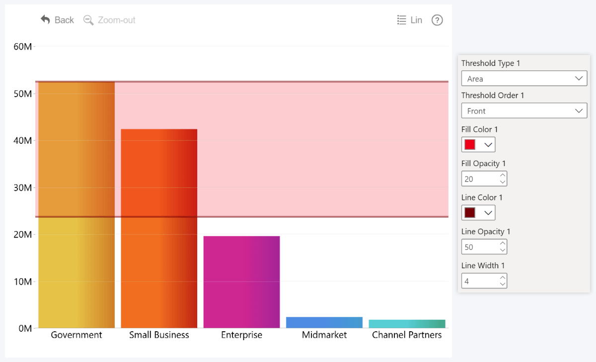
Another limitation we wanted to address in ZoomCharts visuals is areas. In the built-in visuals, you can enable Shade area toggle, but it will only allow you to apply color shading to the entire chart area below or above the defined value. In ZoomCharts, you can define both the start and end points of the area.
Power BI Thresholds in ZoomCharts Visuals
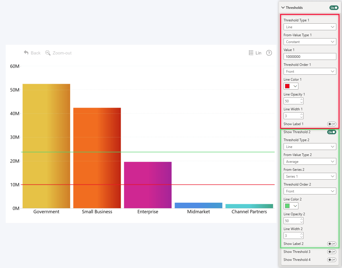
Just like in the built-in visuals, you can create constant reference lines in Drill Down Visuals by ZoomCharts as well. But, in addition to what’s already possible, we decided to introduce even more configuration options and functionality so you can craft more effective visualizations for your reports. In our visuals, this feature is called Thresholds and you can find it in the Thresholds section under Format Visual tab.
The term Thresholds in ZoomCharts visuals covers not just constant reference lines, but also shaded areas, and even a change indicator between two values. Basically, when you are looking to add visual aids or reference markers for your data, head to the Thresholds section.
Thresholds Tutorial for ZoomCharts Visuals
In Combo, Combo Bar, Line, Timeline, TimeSeries, and Waterfall, you can enable and display up to four thresholds in a chart, perpendicular to the value axis. In Scatter, you can enable up to eight thresholds – since both the X and Y axes are value axes in a scatter plot, you can show up to four thresholds per each axis.
Step 1: Enabling Thresholds
In the Format Visual tab of the Visualizations pane, find the Thresholds section. By default, it will be disabled and all the options within will be grayed out. However, once you enable the section toggle, the visual will place one threshold (constant line by default) and the configuration options will become available.
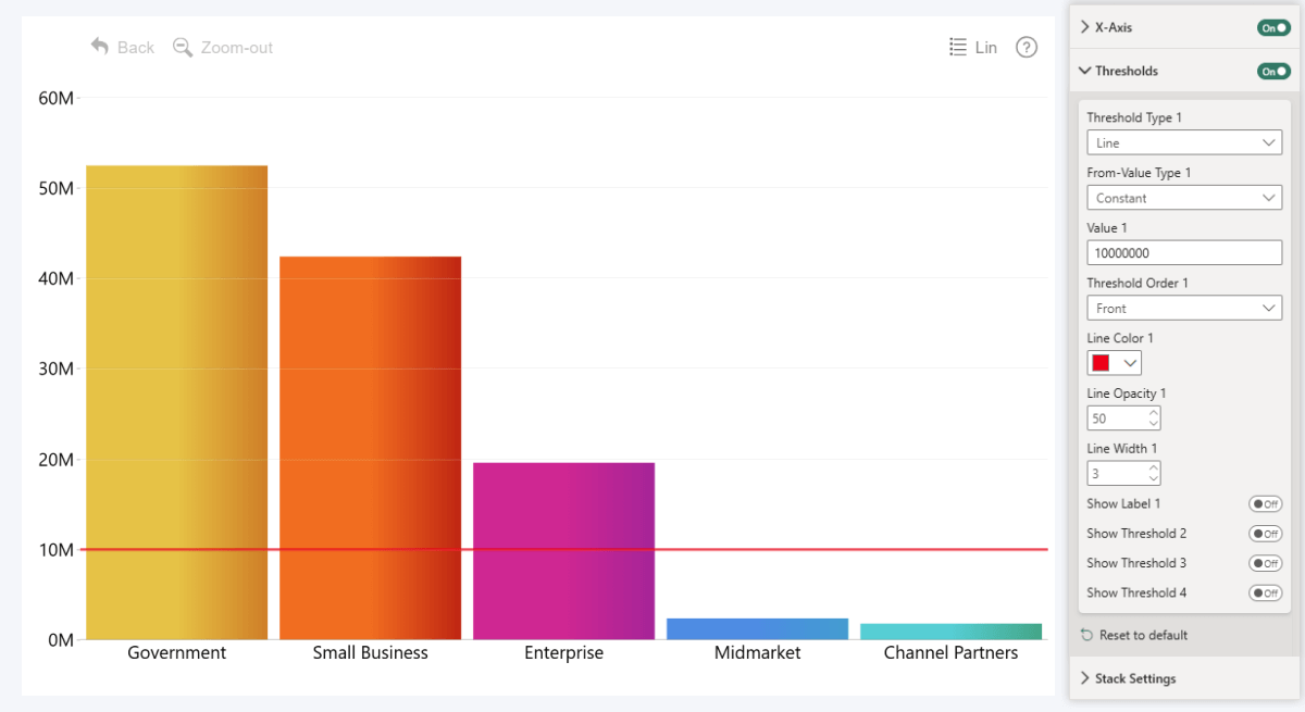
If you want to display more than one threshold, enable “Show Threshold (2, 3, 4)” toggle for each additional threshold you want to add to the chart. Doing so will reveal an additional set of configuration options that you can use to customize each threshold separately. They will be identified with a number – for example, “Line Color 1” will affect Threshold 1, but “Line Color 2” is for Threshold 2.
For Scatter: Unlike other Drill Down Visuals, in Scatter there will be two sections – Thresholds X and Thresholds Y. One governs vertical thresholds on the X axis, and the other is for horizontal thresholds on the Y axis. You can configure four thresholds for each axis as described above.
Step 2: Threshold Type
In ZoomCharts visuals, the Thresholds name refers to three different types of on-chart visual aids. Whenever you add a new threshold to your chart, the Threshold Type setting is the first thing you should configure, since they are intended for different use cases:
- Line: use this if you want to show a single line that spans across the chart from the value axis. Use case: KPIs, targets, average lines, reference lines.
- Area: use this if you want to apply color shading to a range between two values. Use case: highlighting target ranges, risk areas, segments, QC tolerance bands.
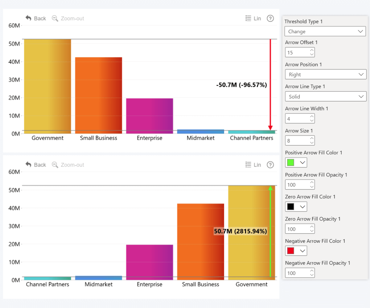
- Change: use this if you want to define two values and compare them – the visual will calculate the difference and show it as a positive or negative arrow. Use case: monitoring growth over time, comparing max vs. min, visualizing completion rate, etc.
Note: ‘Change’ Threshold type is available in Combo, Combo Bar, Line, Waterfall, and Timeline visuals. Since it wouldn’t really make sense in scatter plots, we didn’t include it in Scatter PRO – but you can use many other visual aids exclusive to Scatter, such as Area Shading or regression lines.
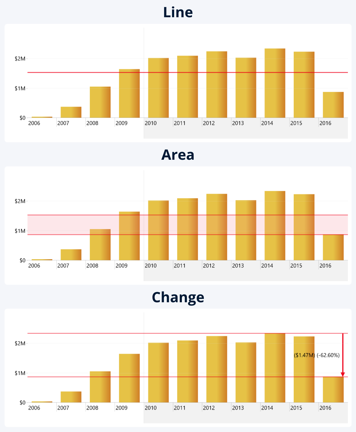
The reason why we recommend selecting the type first is because each option will reveal a different set of threshold settings. For example, since Line requires only one value, it will have just From-Value settings, whereas the latter two will also show To-Value settings for adjusting the second value. Similar story with things like area color and opacity, or arrow settings that are exclusive to Change type.
Step 3: Threshold Value
All three threshold types require one or two numerical values to determine its position on the value axis (Y-Axis in Combo, Timeline, TimeSeries, Waterfall, X-Axis in Combo Bar, either axis in Scatter). If you want a constant line or area, you can manually enter a constant value, but if you want a dynamic Power BI reference line, you can select one of the calculation options and apply to series values.
Line threshold type requires just one value, since it is just that – a line extending from the value axis. However, Area and Change thresholds require two values – From-Value and To-Value. For Area, these two values will be boundaries for the shaded area, but for Change, the From-Value will be compared against To-Value.
| From-Value | To-Value | |
|---|---|---|
| Line | Determines threshold line position | - |
| Area | Starting boundary for the area | Ending boundary for the area |
| Change | First value for comparison | Second value for comparison |
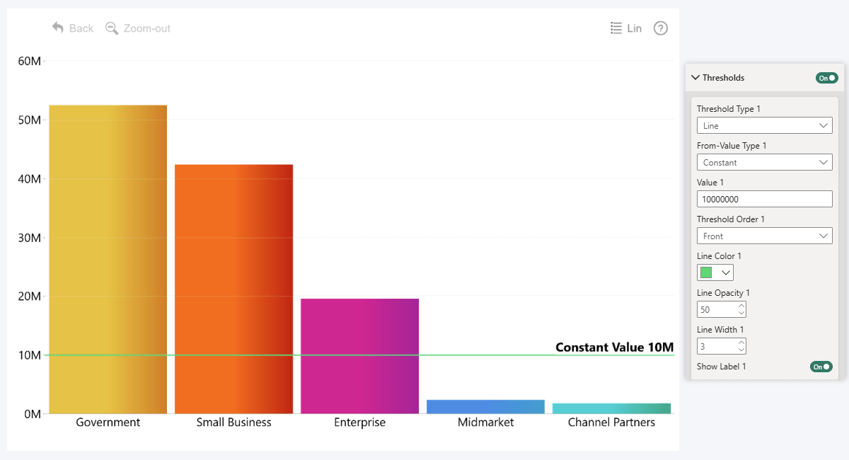
Constant Threshold Value
You can choose between different types for either value. The simplest one, Constant, will allow you to manually enter a numeric value. In this example, we entered 10 million, so that’s where the line is placed (for clarity, we also enabled labels).
Dynamic Threshold Value
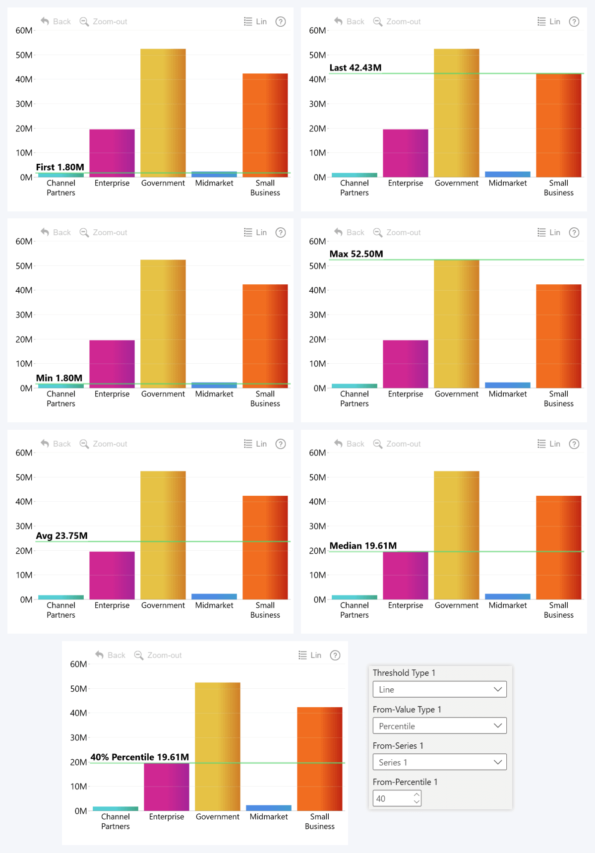
You can also preselect one of the available calculation options and apply it to series values to dynamically determine the position for your reference line or area:
- First: the first value in order of appearance in the chart (affected by data sorting order).
- Last: the last value in order of appearance in the chart (also affected by data sorting order).
- Minimum: the smallest value in the series between the visible categories.
- Maximum: the largest value in the series between the visible categories.
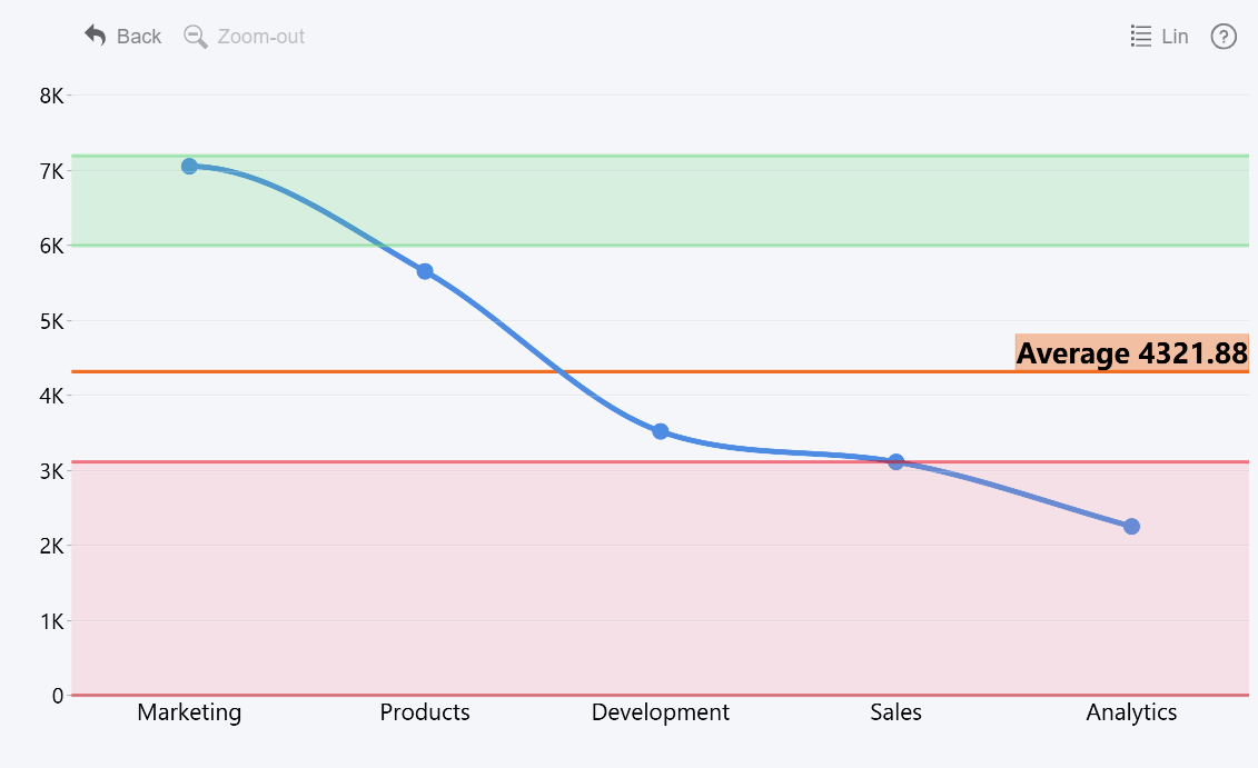
- Average: mean series value across the visible categories (total / number of categories = average).
- Median: middle value between the visible categories (e.g. if you have 5 values, median will be the 3rd highest).
- Percentile: value that is above xx% of all data points (e.g. if you enter 40%, then 40% of series values will be below and 60% above – in our example, 2 below and 3 at or above).
Dynamic Threshold Values - ZoomCharts vs. PBI Built-in
Whereas the built-in visuals will apply the calculation to the entire field (for example, Average of “Sales” column will return the average individual sale size), ZoomCharts will use series values as they appear in the chart.
This means that it will use aggregated category values (not individual rows in the column), and take the active filter state into account. For example, if the series “Sales” is split into categories using “Segment” column, then the threshold value will be determined based on total sales per segment, not individual sales.
Here’s what will happen in our example when we apply Average to "Sales":
- In PBI built-in visuals: sum of all field values ($118,726,350.26) / number of rows in field (700) = $169,609.07
- In ZoomCharts: sum of all visible series values ($118,726,350.26) / number of visible categories (5) = $23,745,270.05
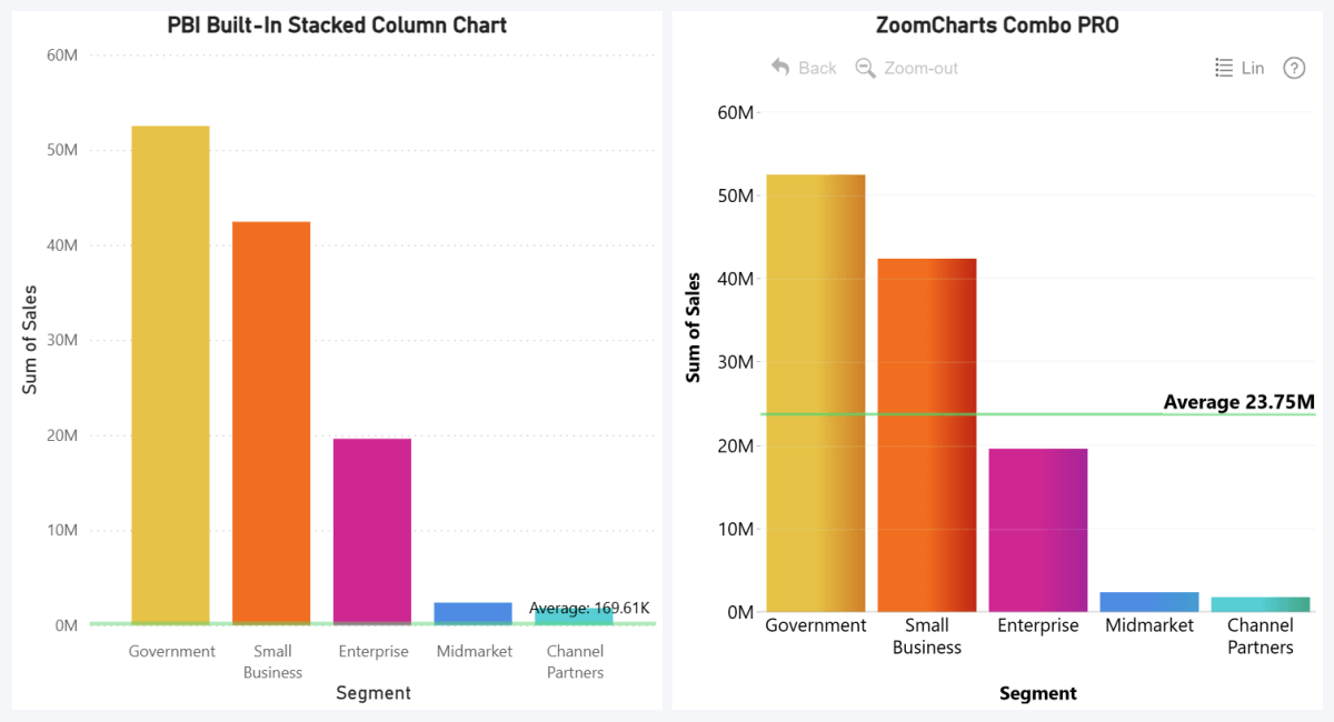
In this context, it’s more relevant to see the average of total per-segment sales, rather than the average individual deal size. Of course, let us be fair – you can achieve this in the built-in visuals by creating measures for this purpose, but our approach offers a quick and easy-to-use solution that doesn’t require you to transform data.
Dynamic Thresholds & Drill Down
Why did we emphasize the word ‘visible’ when talking about categories and series values? Because it directly leads into one of the main benefits of our approach – the threshold will react to drill downs or filtering, and instantly recalculate values whenever there are changes in the visible data.
Referencing Other Series for Thresholds
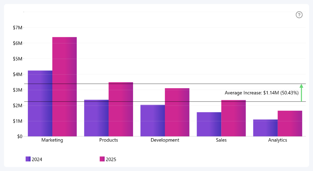
Whenever you choose a non-constant value type, you can select which series is used to determine the value. This will come in handy if you have multiple series present in the chart. Another use for this is with a “hidden” series (add it to a Series field and disable its Series Configuration toggle) to determine the threshold placement – useful for measures, such as SUMX for totals between multiple stacked series.
Here's an example with a clustered column chart where the dynamic reference line compares the average of 2024 (Series 1) against the average of 2025 (Series 2). This was achieved by setting From-Value to “Average” and “Series 1”, and To-Value to “Average” and “Series 2”.
Step 4: Customizing Your Thresholds
You can configure each threshold separately, and, depending on your selected threshold type, you will see a different set of configuration options. For example, Line thresholds will have settings for line color, thickness, and opacity.

Area thresholds, in addition to outline color, thickness, and opacity, will also have settings for area fill color and opacity.
The Change threshold has even more customization settings. Just like the other two types, you can customize the line appearance and area fill (it’s set to 0% opacity by default, but it’s possible to have a shaded area if you need it). There are a lot of settings related to the arrow that indicates change – arrowhead size, arrow line thickness and style (solid, dotted, dashed), and different colors for increase, decrease, or no change.
Enable the Show Label toggle if you want to display a label for the threshold. It will reveal a wide variety of settings.
- Content: Display threshold value, custom text, or both. Change thresholds can also show the difference between the two values – as absolute value, percentage, or both.
- Font: Customize label text size, font family, style (regular, bold, italic, both).
- Background: Adjust opacity and color for the label background – you can also enable and customize a drop shadow effect. Increase Border Radius if you want rounded corners.
- Position: Choose the right or left side of the chart and display the label on top or below the value (or between both values for Area and Change thresholds).
Thresholds as Part of Effective Reports
Visual aids like reference lines, target areas or change indicators are incredibly helpful for the report user, since they will add context to your data. Imagine a user who opens a financial chart and sees values like $2 million. Without context, that sounds like a lot of money – but if there’s a reference line that shows a KPI of $3 million, that value will suddenly turn from an imaginary pile of money into a missed target that needs attention.
It’s one of the many tools in ZoomCharts visuals that creators can use to craft clear and effective visualizations that convey the necessary insights. You can combine thresholds with other features like conditional formatting for even more impact.
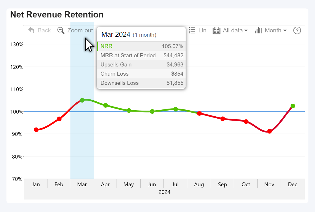
For example, in this chart (from our article about SaaS metrics visualization), the line is green if the NRR is above the 100% target, and red if it is below it – we achieved it by setting the same value (100%) as both From-Value and Upper Color value under Conditional Formatting.
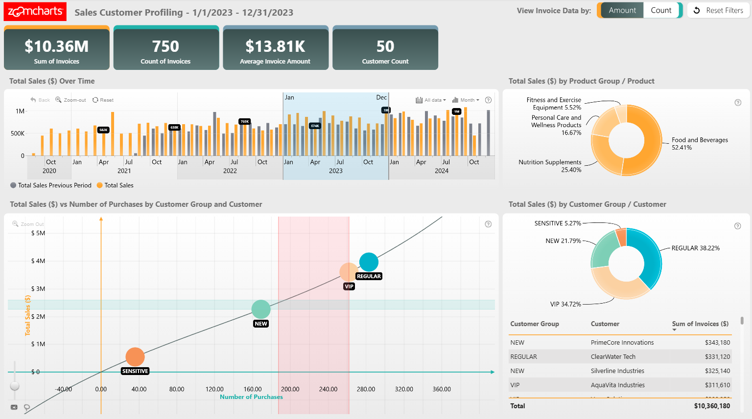
Here's an example from our Report Gallery – Sales Customer Profile Report - which uses both vertical and horizontal area thresholds in a scatter chart to highlight areas of interest. This can be a way to show averages or medians between all data points, mark specific customer segments, or show risk areas. Click on data points to drill down – note how the thresholds will dynamically adjust based on the visible data.
Try Live Demo & Download .pbix Template

Want more info like this?
Subscribe to our newsletter and be the first to read our latest articles and expert data visualization tips!