Written by the ZoomCharts team. ZoomCharts Power BI custom visuals are certified by Microsoft and used in reports across more than 25,000 organizations worldwide. Published: June 2026.
Power BI reports are most valuable when users can understand the story behind the data quickly. The June 2026 ZoomCharts update focuses on three practical improvements: faster setup, clearer interactions, and more flexible visual design.
This release introduces a new guided setup experience for Drill Down Donut PRO, expanded styling controls for node and link interactions in Graph Visual, a new Card node type for hierarchy reports, a setting to control node dragging, and a UTC Offset option for Timeline Visual.
- Drill Down Donut PRO: guided initial setup experience with field validation
- Graph Visual: custom hover and selection outline styling for nodes
- Graph Visual: custom hover and selection fill colors for nodes
- Graph Visual: link highlight intensity, color, and opacity controls
- Graph Visual: node dragging on/off setting
- Graph Visual: new Card node type with image support and child node counts
- Timeline Visual: UTC Offset option for time zone aware analysis
Drill Down Donut PRO: A Simpler Way to Start Building Charts
Setting up a new visual can be challenging, especially for users who are new to Power BI custom visuals. The updated Drill Down Donut PRO setup experience helps users begin with common chart configurations instead of exploring every setting manually.
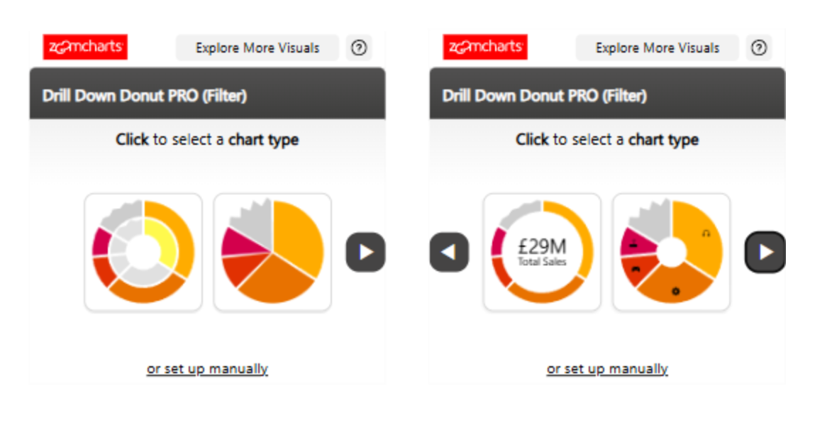
When the visual is added to a Power BI report, users are presented with multiple chart configuration options. After selecting one, the visual shows exactly which data fields are required. Users can see at a glance what is missing, what has already been added, and whether the provided data is valid for the selected configuration.
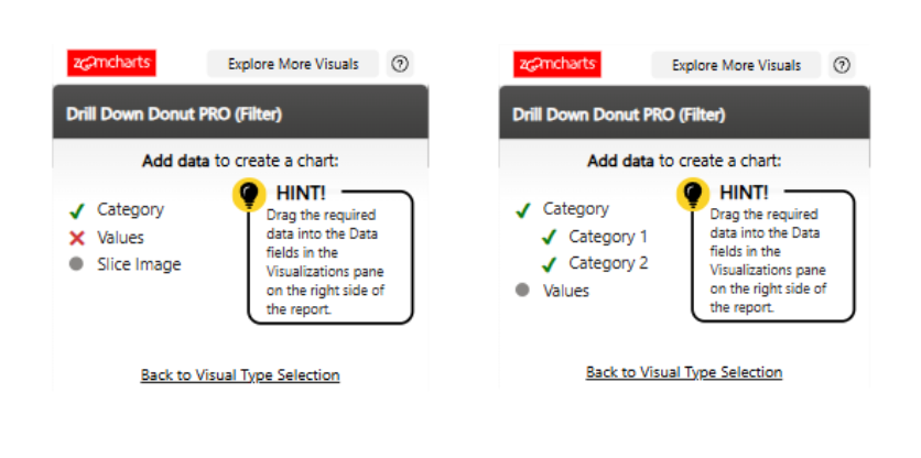
Once all required fields are added, the chart is generated and can be customized further in the settings pane. For users who prefer full control from the beginning, Manual Setup remains available at the bottom of the initial setup window.
This update reduces setup friction for new users while keeping full flexibility for experienced report builders. It is especially useful when teams need to build reports faster or onboard new report creators without a dedicated walkthrough.
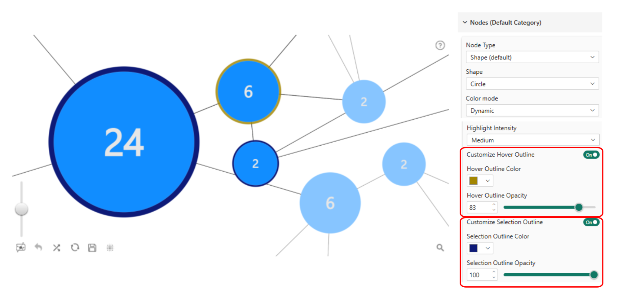
Graph Visual: More Control Over Node Hover and Selection Styling
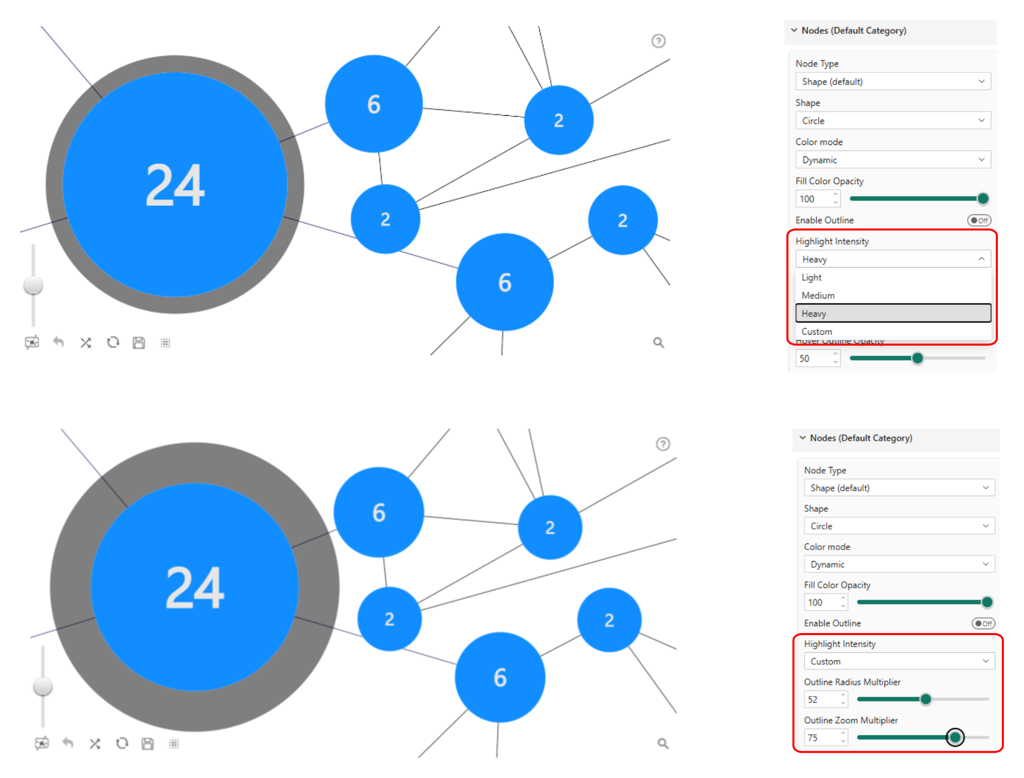
Graph reports often contain many connected nodes. When users explore these reports, visual feedback is important: hover and selection effects help users track which node they are focusing on and how it relates to the rest of the network. The june 2026 update adds fine-grained control over these interaction states.
Custom hover outline and selection outline
The hover outline and selection outline can each be turned on or off independently. When enabled, report creators can set outline color and opacity for each state. The hover outline also supports a Highlight Intensity setting with four options:
- Light: a thin, subtle outline
- Medium: a more visible outline with moderate emphasis
- Heavy: a thicker outline for stronger emphasis
- Custom: reveals Outline Radius Multiplier and Outline Zoom Multiplier for precise manual control of the outline shadow size and visibility
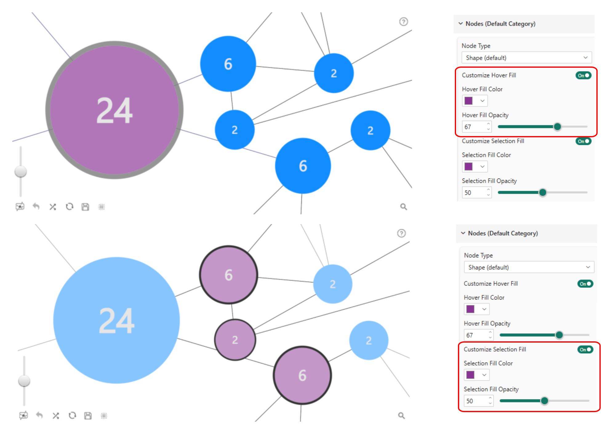
Custom hover fill and selection fill
In addition to outlines, this release adds Customize Hover Fill and Customize Selection Fill controls. These settings allow report creators to apply custom fill colors and opacity values when a node is hovered or selected. This is especially useful when the graph needs to match a specific brand color palette or when selected nodes need to stand out clearly in dense network visuals.
Graph Visual: Link Hover Styling for Clearer Relationship Exploration
Links are just as important as nodes in a graph report: they show how data points are connected. The june 2026 update adds link highlight styling settings under Links Default Category. Report creators can now adjust link highlight intensity, highlight color, and highlight opacity when links are highlighted on hover. Highlight Intensity follows the same Light, Medium, Heavy, and Custom structure as nodes. Selecting Custom reveals Width Radius Multiplier and Width Zoom Multiplier for precise manual control of the highlight shadow size and visibility around the link.
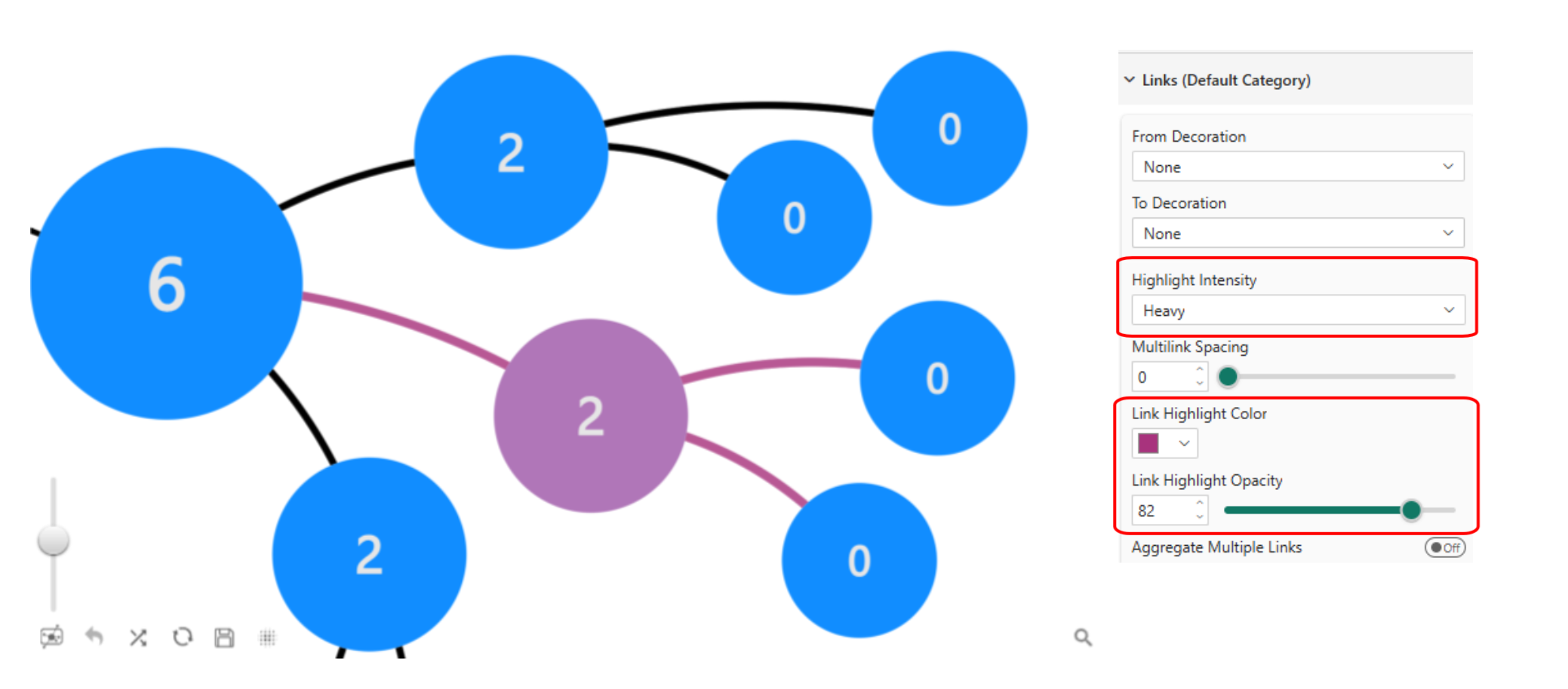
This makes it easier for users to follow relationships across the visual, particularly in reports with many connections where individual links can be hard to distinguish at a glance.
Graph Visual: Control Whether Users Can Drag Nodes
Node dragging is enabled by default in Graph Visual. This allows users to select and reposition nodes around the canvas freely. The new node dragging setting lets report creators turn this behavior off when the layout needs to remain stable.
This is especially useful for hierarchy layouts where the original structure should stay intact for every viewer. If a report is designed to show a clear organizational chart, disabling node dragging ensures the layout appears consistently regardless of how individual users have previously interacted with it.
Graph Visual: New Card Node Type for Hierarchy Reports
The new Card node type is the most significant Graph Visual addition in this release. Card nodes are designed for organizational charts and hierarchy reports where each node should display more than a label or a shape.
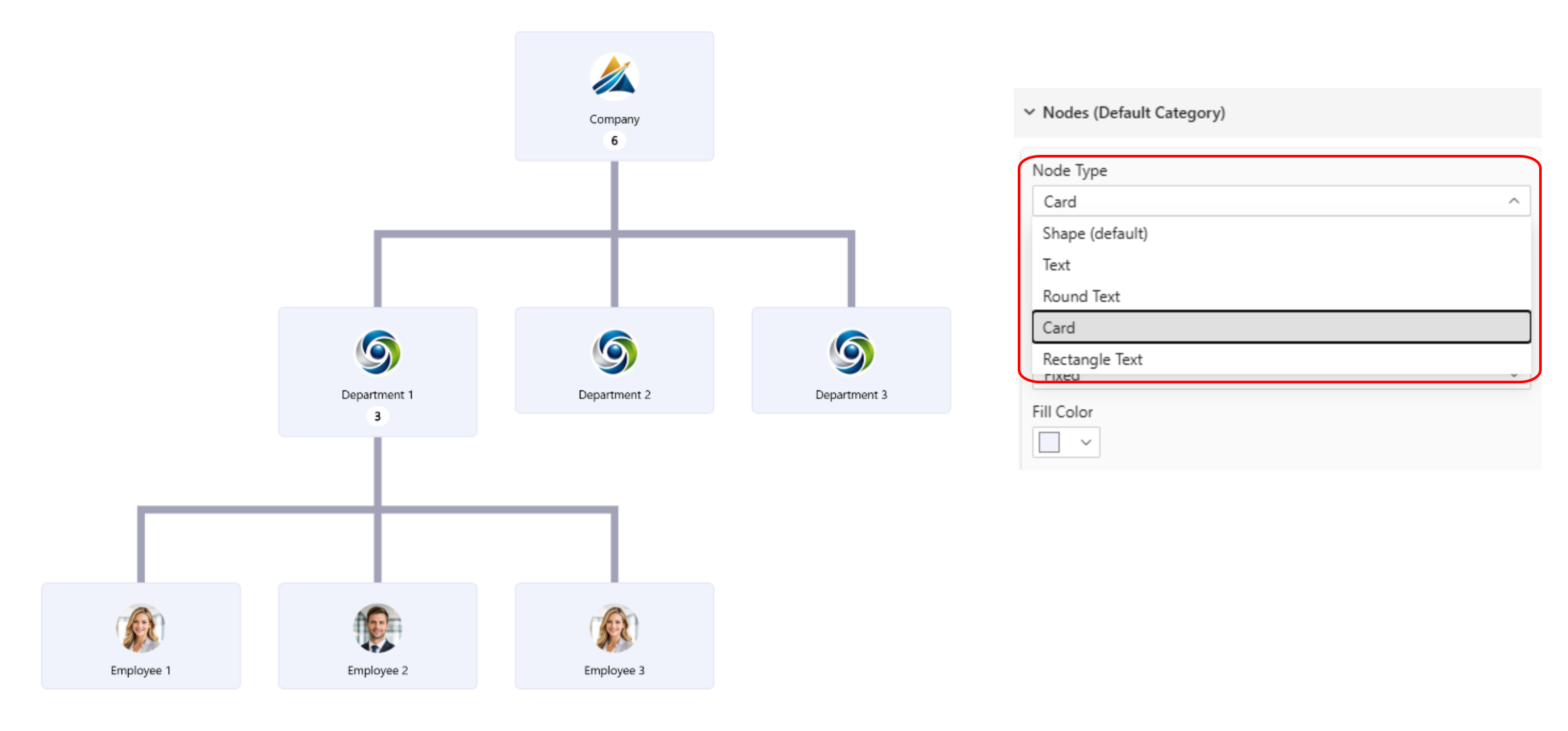
When Node Type is set to Card, nodes are displayed as employee-style cards and the layout automatically switches to a hierarchy layout. If images are provided in the corresponding data fields, they are displayed inside the cards, making this node type well suited for organizational charts, team structures, responsibility maps, and people-focused hierarchy reports.
Graph Visual now supports five node types:
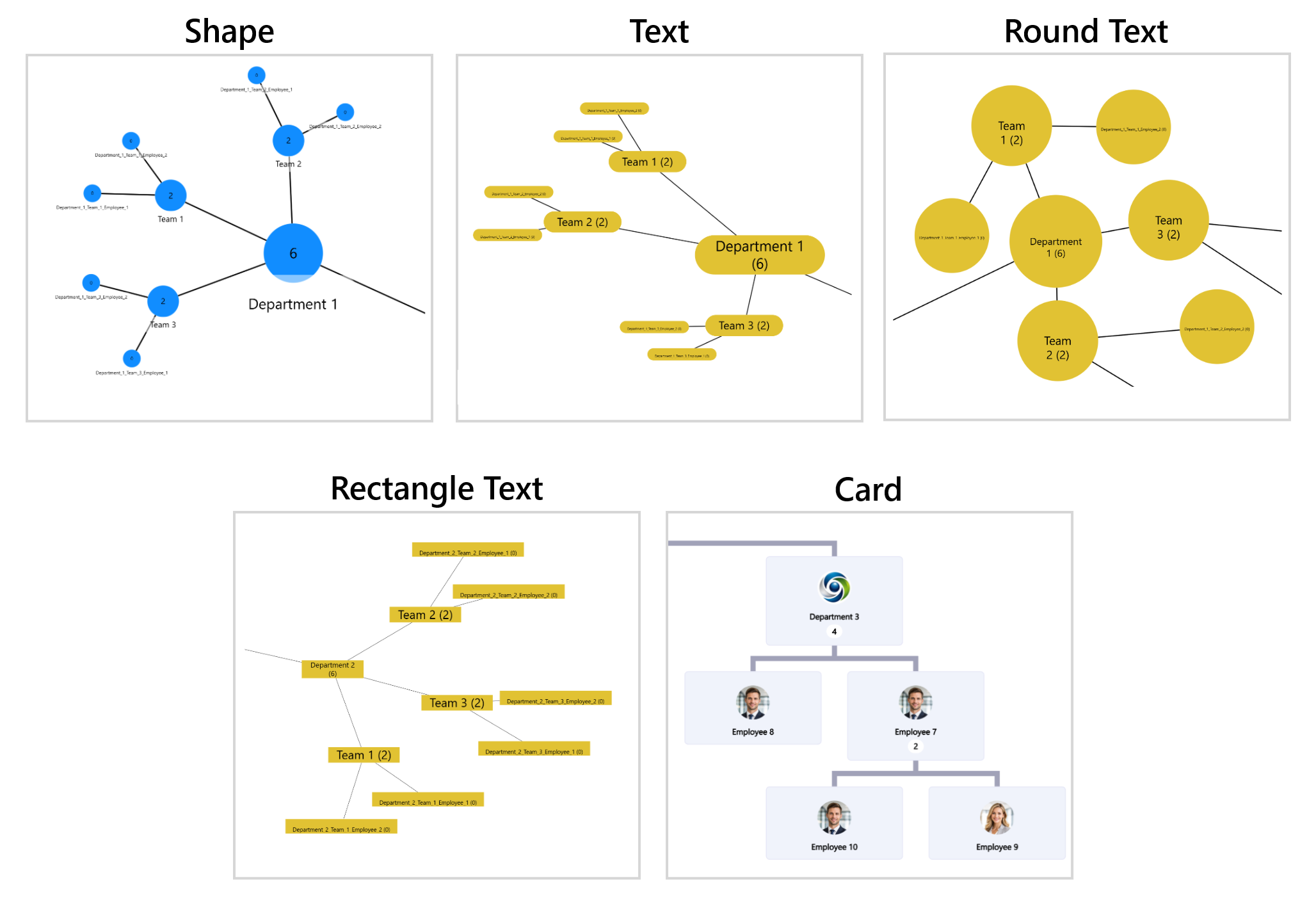
| Node type | Best for |
|---|---|
| Shape | Network graphs, relationship maps, free-form layouts |
| Text | Hierarchy labels, category trees, process flows |
| Round Text | Compact networks, topic maps, circular label nodes |
| Rectangle Text | Decision trees, labeled hierarchies, flow diagrams |
| Card | Organizational charts, people hierarchies, responsibility maps with images |
Card Customization: Spacing, Images, and Corners
When Card is selected as the node type, additional settings become available for fine-tuning the card appearance.
Padding settings
Vertical padding and horizontal padding control the spacing between card content and the card edges. Adjusting vertical padding is especially visible when cards are taller, creating a more airy or compact feel depending on the report design.
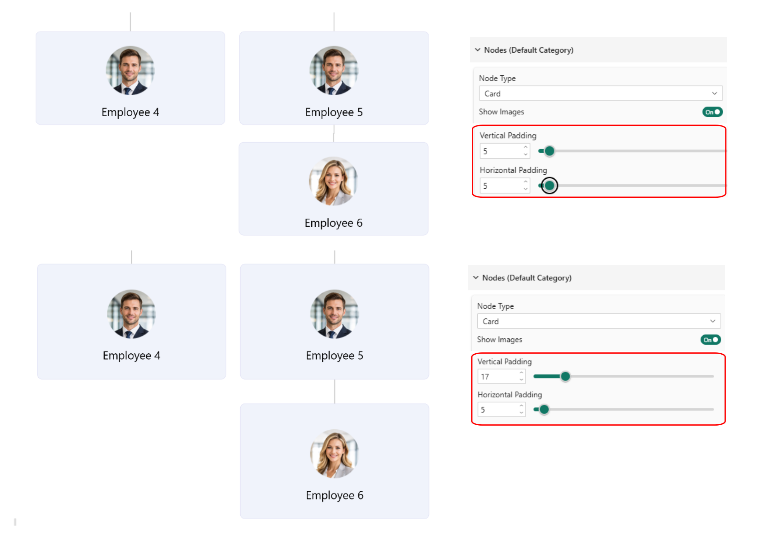
Image settings
Image padding controls the spacing around the image within the card. Image Scale determines what percentage of the card area the image occupies, and Image Align controls where the image is positioned inside the card. These settings make it easier to create card layouts that match the visual style of the report while keeping the hierarchy readable.
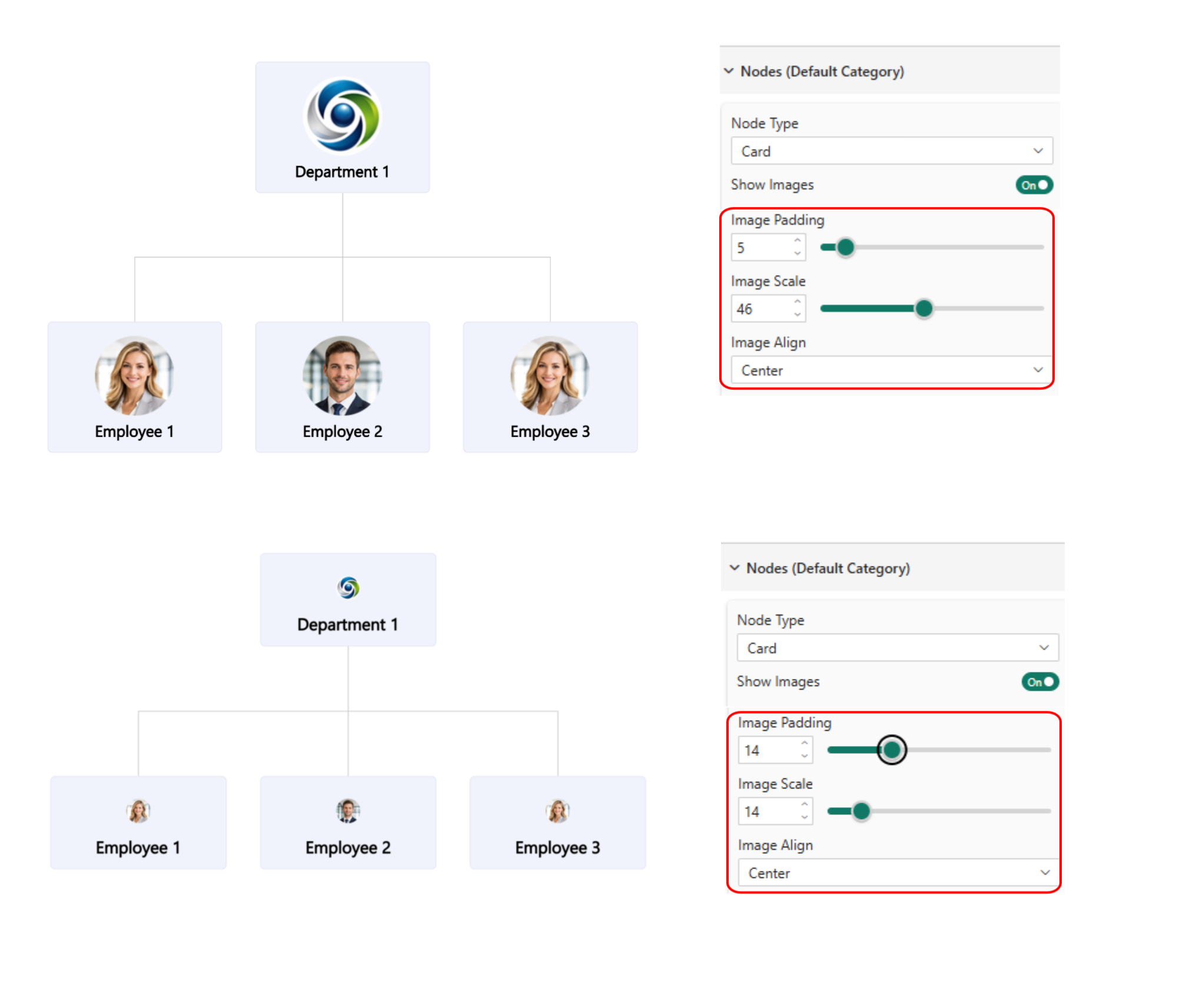
Rounded corners
The Rounded Corners setting controls the degree of corner rounding on each card. A lower value creates a more squared card shape, while a higher value creates a softer, more rounded appearance.
Child Node Count: Show Hierarchy Size Directly on Cards
Card nodes include an option to enable Child Node Count. When enabled, parent node cards display the number of child nodes beneath them, giving users immediate context about the size of each branch in the hierarchy.
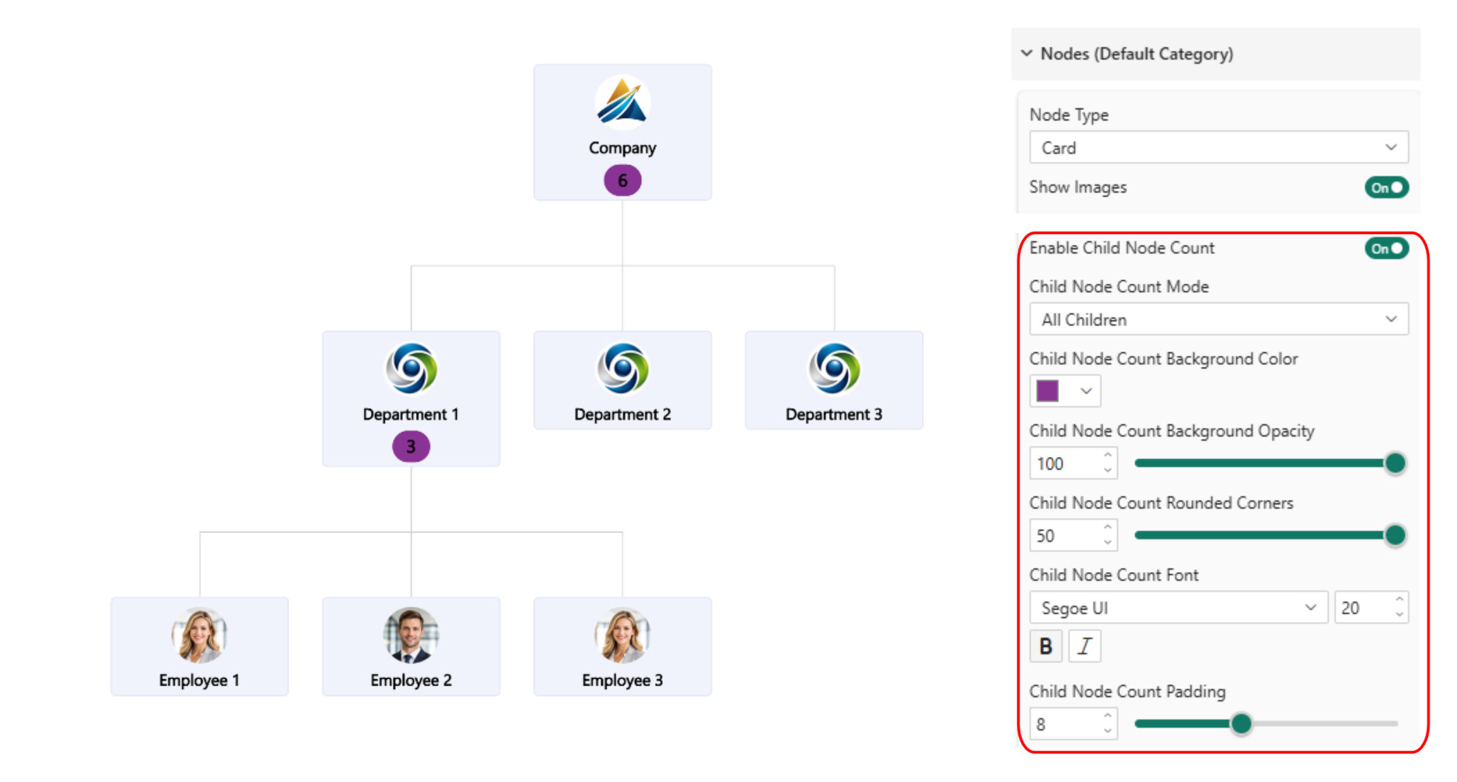
Child Node Count Mode lets report creators choose between All Children and Direct Children. All Children shows every subnode in the branch, while Direct Children shows only the nodes immediately connected to the parent. The count badge supports full customization: background color and opacity, rounded corners, font family and size, bold and italic, and padding.
Child Node Count is especially useful in organizational charts and team structure reports where users need to understand headcount or the number of items under each parent without expanding the full hierarchy. It reduces the need to click through each branch just to assess its size.
Category-Specific Styling for Advanced Report Design
All of the Graph Visual styling updates in this release are available not just for the default category, but also for specific node groups and link groups under their corresponding category settings.
This means one node group can use Card nodes for employees while another uses Shape nodes for departments. Different link categories can use different highlight styles to make relationship types easier to distinguish. Node Highlight and Selection Styling, Node Type, Card Customization, and Child Node Count are all available per node category. Link Highlight settings are available per link category.
This gives report designers the flexibility to build visually layered graph reports where different types of nodes and connections look and behave differently, without needing separate visuals for each group.
Timeline Visual: UTC Offset for Time Zone Aware Analysis
The june 2026 update adds a UTC Offset option to Timeline Visual. This setting controls how the visual handles time zone data from the source.
This is useful when reports include events, operations, or measurements collected across multiple time zones. Using normalized UTC time creates more accurate comparisons when the same report includes data from different regions. For example, a global operations report with activity from Europe, North America, and Asia can use UTC comparison so all events are analyzed on a consistent time basis rather than comparing misaligned local times.
Key Takeaways
- Drill Down Donut PRO now offers a guided setup experience with chart type selection and field validation, reducing friction for new users while keeping Manual Setup available.
- Graph Visual node styling now includes customizable hover outline, selection outline, hover fill, and selection fill with independent color, opacity, and intensity controls per node.
- Graph Visual link styling adds highlight intensity, color, and opacity controls for link hover behavior.
- Node dragging can now be disabled to keep hierarchy layouts stable for all viewers.
- Card node type is a new Graph Visual option designed for organizational charts and people-focused hierarchy reports, with full image and padding customization.
- Child Node Count displays hierarchy size directly on parent card nodes, with All Children or Direct Children modes and full badge customization.
- All Graph Visual styling updates are available at the category level for node groups and link groups, enabling layered designs in a single visual.
- Timeline Visual adds UTC Offset for accurate time-based comparisons across multiple time zones.
Try the updated visuals
ZoomCharts Power BI custom visuals are certified by Microsoft and available on AppSource. The developer license is free. Install it to explore the new Card node type, guided Donut setup, and interaction styling updates locally before any production deployment.
Get the free developer license Explore all ZoomCharts visuals