logo
For Power BI Report Templates
  • Products

    Drill Down Visuals for Power BI

    Discover the most customizable custom visuals for Power BI.

    Pricing & licensing
    • Drill Down Donut Pro
      Drill Down Donut Category Composition
    • Drill Down Pie Pro
      Drill Down Pie Proportional Breakdown
    • Drill Down Combo Pro
      Drill Down Combo Multi-Metric Trends
    • Drill Down Combo Bar Pro
      Drill Down Combo Bar Cross-Metric Trends
    • Drill Down Line Pro
      Drill Down Line Trend Analysis
    • Drill Down Bubble Pro
      Drill Down Bubble Value Relationships
    • Drill Down Scatter Pro
      Drill Down Scatter Correlation Analysis
    • Drill Down Network Pro
      Drill Down Network Entity Connections
    • Drill Down Graph Pro
      Drill Down Graph Relationship Mapping
    • Drill Down Map Pro
      Drill Down Map Geographic Insights
    • Drill Down Waterfall Pro
      Drill Down Waterfall Change Breakdown
    • Drill Down Timeline Pro
      Drill Down Timeline Time-Based Metrics
    • Drill Down TimeSeries Pro
      Drill Down TimeSeries Temporal Patterns
    • Drill Down Line Pro
      Drill Down Line Trend Analysis

    Visuals in Planning

    Discover visuals we’re exploring, share your feedback, and help us decide what to build next.

    Browse concepts
  • Template Reports
    • Browse Report Templates
      Browse Report Templates Explore 2000+
      Power BI reports
    • Pricing Report Templates
      unlimited access

    Explore Report Templates

    Industry

    • Logistics
    • Education
    • Healthcare
    • Transportation
    • Banking
    • Ecommerce
    • Crime analytics
    • Retail
    • Manufacturing

    Business Domain

    • Sales
    • Marketing
    • Accounting & Finance
    • Human Resources
    • Research
    • Project Management
    • CRM
    • Support
    • Customer experience
  • Resources

      Learn

    • Video Tutorials Step-by-step Power BI guides
    • Webinars Live and recorded expert sessions
    • Visuals Gallery Explore all custom Power BI visuals
    • Blog Power BI tips, updates, and guides
    • Documentation Setup, features, and API reference

    Support

    • ZoomCharts Assistance Help from our product experts
    • Contact Sales Questions about pricing or licensing
    • Contact Support Technical help and troubleshooting
    • FAQ Quick answers to common questions
  • Services
    • Power BI Report Development
      Power BI Report Development End-to-end custom
      Power BI reports.
    • Custom Visual Development
      Custom Visual Development Custom visuals for
      your business needs.
  • Challenges
  • Pricing
Request a quote Get Developer License Sign in
Request a quote Book a Demo Get Developer License Sign in
Get it now
Go back

Contents

Blog Use Cases How We Turned Many Excel Files Into an Interactive Power BI Report about Latvia’s Export landscape

Dec 16, 2021

How We Turned Many Excel Files Into an Interactive Power BI Report about Latvia’s Export landscape

How We Turned an Excel Sheet Into an Interactive Report: Latvia Export Barometer. ZoomCharts took part in a widescale project that created a full report of...
Title image
Title image
How We Turned an Excel Sheet Into an Interactive Report: Latvia Export Barometer. ZoomCharts took part in a widescale project that created a full report of...

Contents

Share this article

How We Turned an Excel Sheet Into an Interactive Report: Latvia Export Barometer.


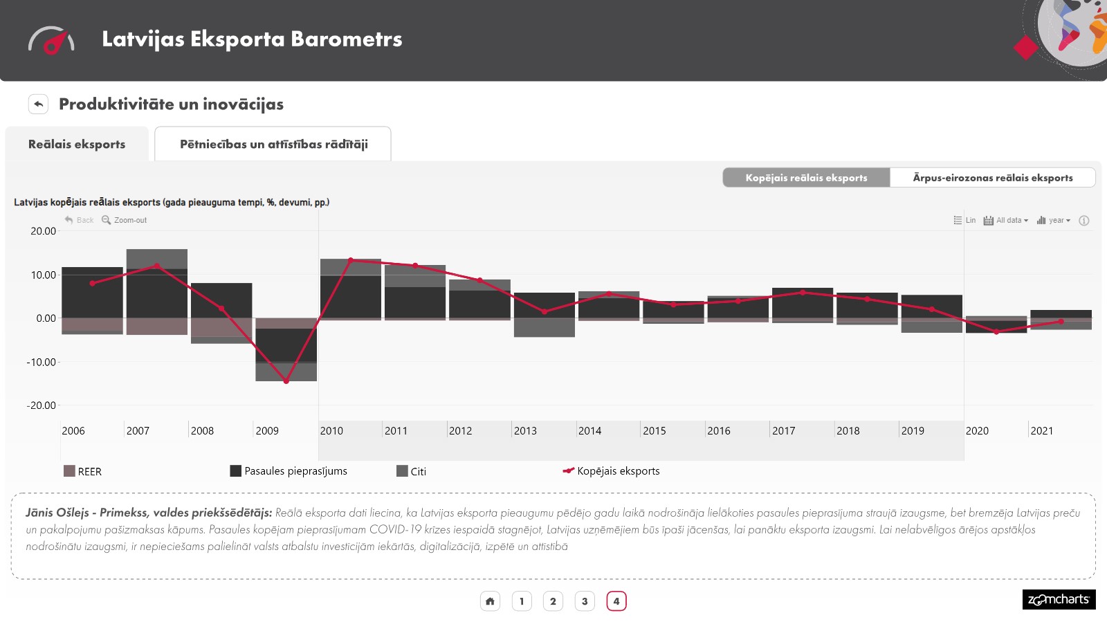
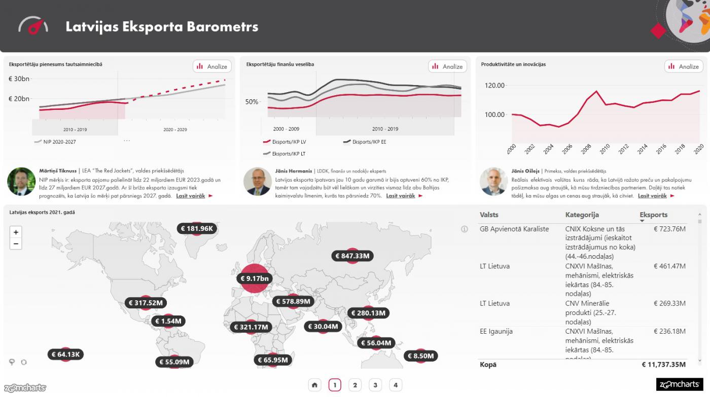
ZoomCharts took part in a widescale project that created a full report of Latvia’s Export Barometer. This report focused on Latvia’s export shifts within the past 3 years to more accurately assess Latvia’s overall export growth.

The Latvia Export Barometer is intended to showcase Latvia’s export landscape to a wider audience, including the government sector, companies, and the general public. The interactive nature of the report, made possible by ZoomCharts, allows everyone to gain full comprehension of Latvia’s exportation process. The Latvia Export Barometer was publicly demonstrated during the Export and Innovation Awards’ closing ceremony and is available for public viewing online.

The Journey From Raw data to beautiful report

ZoomCharts received datasets from a variety of data and statistics suppliers and set out to clean up the data in preparation for importing it into Power BI. After discussing what story should the report tell and ensuring that it was not oversaturated with information while still being capable of engaging users, we input that data into Power BI. 

A report cannot be made more interactive than the data permits. If the data is one-dimensional and straightforward, there is no use in performing a drill-down to analyze the data deeper or look at it from different aspects. 

ZoomCharts custom visuals are known for their interactive approach to data visualization and analysis. We strive to provide stellar interactive charts through our custom visuals and report design services. 

If you would like to have your business data turned into highly engaging and productive reports, ZoomCharts offers a report overhaul service, where we can help take the next step into the world of BI.
Get better reports

See full report here! 


envelope icon

Want more info like this?

Subscribe to our newsletter and be the first to read our latest articles and expert data visualization tips!


Find out more

Apr 22, 2026

Blog Thumbnail
Tutorials
Data visualization

How to Build a 4U Procurement Report in Power BI

Procurement data is some of the most decision-critical data an organization holds. It touches budgets, supplier relationships, delivery risk, and compliance, all at once. Yet most procurement reports get built the same way: tables of spend, a few bar charts, and a handful of slicers. Users open them, feel overwhelmed, and go back to spreadsheets.

Apr 13, 2026

Blog Thumbnail
Tutorials
Data visualization

How to Build 4U Executive KPI Reports

Any developer can publish a report. But building a report that executives actually open, navigate confidently, and use to make decisions requires a different approach. This guide walks through how to apply the 4i principles in Power BI and achieve 4U Reports, using a real executive KPI dataset as a working example.

Apr 08, 2026

Blog Thumbnail
Data visualization

4U Reports: Unique, User Friendly, Uncovering, Understandable

Most organizations have invested heavily in business intelligence tools, data platforms, and analytics teams. Yet the reports go unused, and decisions are still made based on intuition and speculation. 4U Reports are built to close that gap by putting user experience at the center of every reporting decision.

Mar 24, 2026

Blog Thumbnail
Product updates

March Update: Dynamic Thresholds and Filtering From Legend Categories

This product update focuses on two key improvements: 1. dynamic thresholds that adapt automatically to data context 2. More precise interaction through subcategory selection

Mar 02, 2026

Blog Thumbnail
Product updates

February Update: Breadcrumbs, Multiple Change Thresholds and Full Tooltip Styling Control

This release focuses on something our users care about deeply: reducing manual work and improving report clarity. We improved the way analysts build reports and how users understand them. Here’s what’s new.

Feb 12, 2026

Blog Thumbnail
Power BI tutorials

How to Explore Power BI Data Without Adding More Report Pages

Most Power BI developers improve their reports by adding more: more pages, more slicers, more drill-through pages, more bookmarks. It rarely works.
  • «
  • 1
  • 2
  • 3
  • 4
  • 5
  • 6
  • ...
  • 16
  • »

Contents

Share this article

Want more info like this?

Subscribe to our newsletter and be the first to read our latest articles and expert data visualization tips!

Thank you!

Check your inbox to verify your email address.

logo
[email protected]
+44 204 577 3993
logo

Products

Drill Down Bubble PRO Drill Down Line PRO Drill Down Network PRO Drill Down Waterfall PRO Drill Down Graph PRO Drill Down Combo PRO Drill Down Combo Bar PRO Drill Down Donut PRO Drill Down Pie PRO Drill Down TimeSeries PRO Drill Down Timeline PRO Drill Down Map PRO Drill Down Scatter PRO All Visuals

Resources

Report Examples Webinars Blog ZoomCharts Academy Visuals Gallery Documentation Custom Visual Development Subscribe to News

Solutions

Custom Visual Development

Company

Pricing About Us Partners Leave feedback Join PowerGroup EU Funding

Help

ZoomCharts Assistance Contact Sales Contact Support FAQ AI Information

Drill Down Line PRO Drill Down Bubble PRO Drill Down Network PRO Drill Down Waterfall PRO Drill Down Graph PRO Drill Down Combo PRO Drill Down Combo Bar PRO Drill Down Donut PRO Drill Down Pie PRO Drill Down TimeSeries PRO Drill Down Timeline PRO Drill Down Map PRO Drill Down Scatter PRO All Visuals

Report Examples Webinars Blog ZoomCharts Academy Visuals Gallery Documentation Custom Visual Development Subscribe to News

Custom Visual Development

Pricing About Us Partners Leave feedback Join PowerGroup EU Funding

ZoomCharts Assistance Contact Sales Contact Support FAQ AI Information
+44 204 577 3993
[email protected]

Ready to get in touch?

Contact our experts with any question about Power BI and ZoomCharts for Free!

Contact us

© 2026, Data Visualization Software Lab

U.S. Patents No. 11,645,343; 11,921,804; 12,346,389

Cookies
Privacy Policy
Global
Legal
Patent
warning

Error message

success

Success info: Done!

ZoomCharts AI Assistant

We noticed you're using an old OS version.

For the best experience, we recommend upgrading to ensure that all website features display correctly.

Cookie settings

We use necessary cookies for site functionality, as well as statistic, marketing, and preference cookies to enhance your experience. For more information and to manage your preferences, please visit our Cookie policy