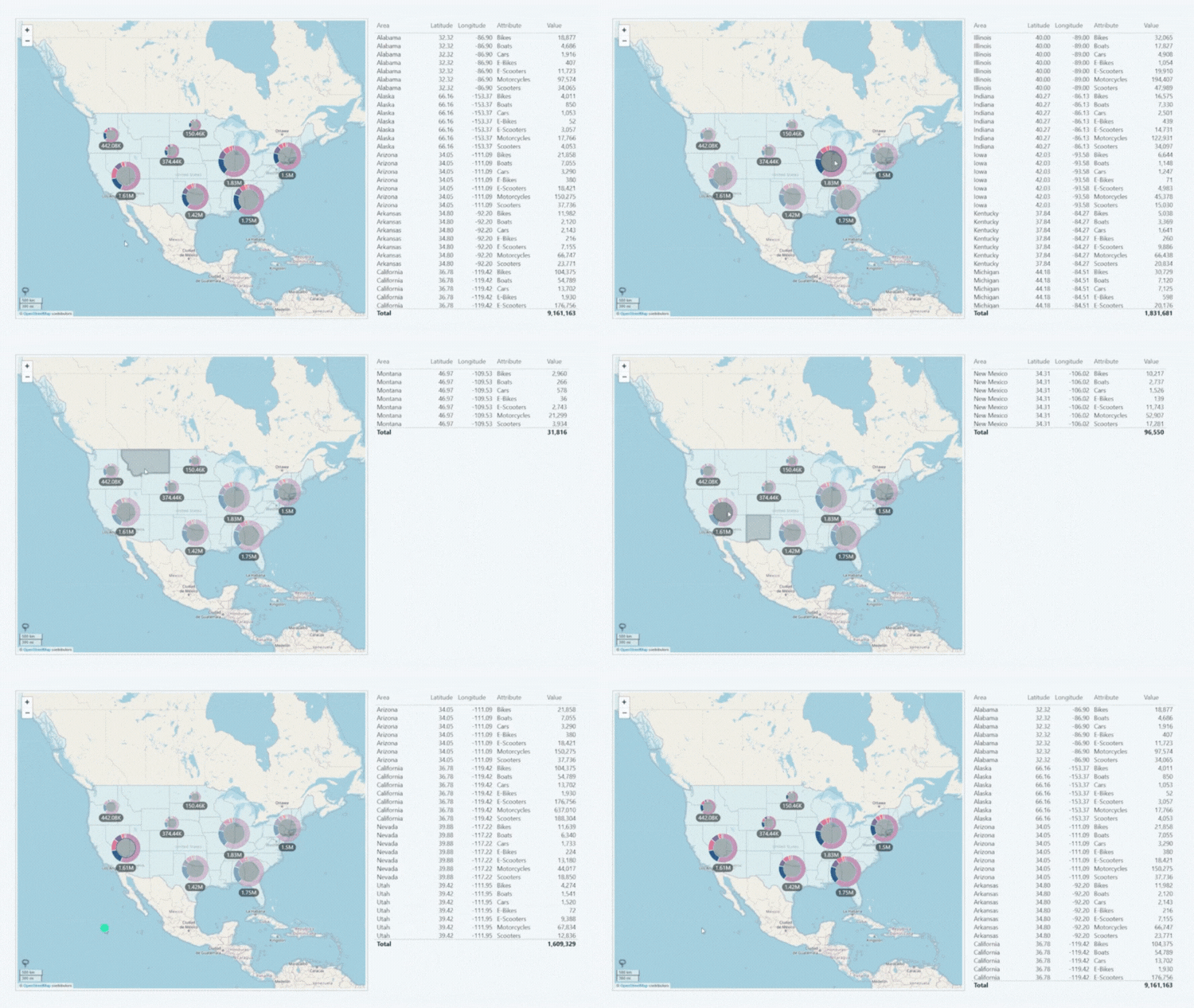
With Drill Down Map PRO, you can create interactive and easy-to-use map charts in Power BI. With intuitive on-chart interactions exploring location-based data will be a joy for any user. Furthermore, you can use the wide range of customization features, including custom base layers and shape layers, node pie charts, auras, and other options to make the perfect chart for your report.

Before you begin
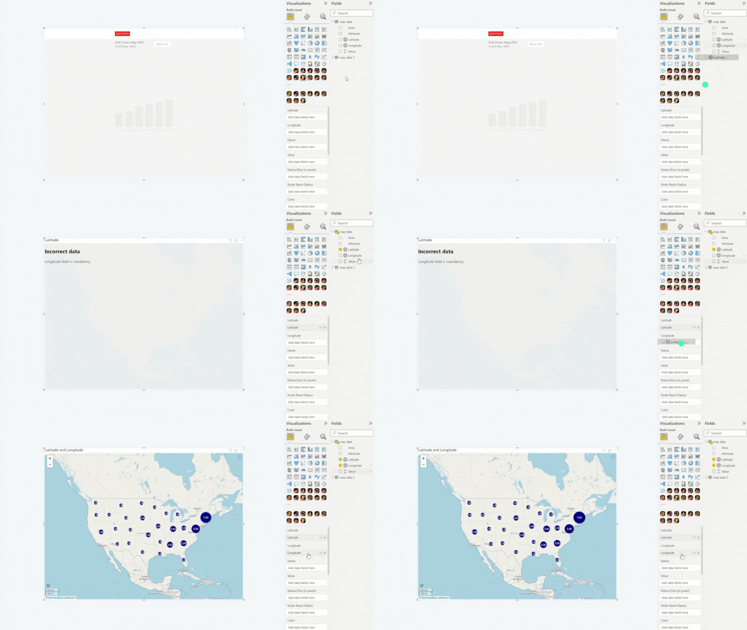
This visual uses location data to place data points on the map. To successfully create a map chart with this visual, you’ll need two mandatory fields – Latitude and Longitude. These fields must contain valid geographic coordinates (for example, 48.8584 in Latitude column and 2.2945 Longitude column, using Eiffel Tower in Paris, France as a sample). Multiple data points may contain the same coordinates.
Each data point will then be visualized as a node on your map chart. Depending on your settings, multiple nearby nodes can be merged into Cluster Nodes when displaying a larger map view. As the user zooms in, the clusters will be expanded to show a more detailed view of the nodes.

In addition to the mandatory location fields, you can use various custom fields to provide more data or customize nodes, including numeric values for each data point, custom names, node colors, sizes or images, tooltip content and node categories – read more in the Setting Up Fields page.
Adding Drill Down Map PRO to Power BI
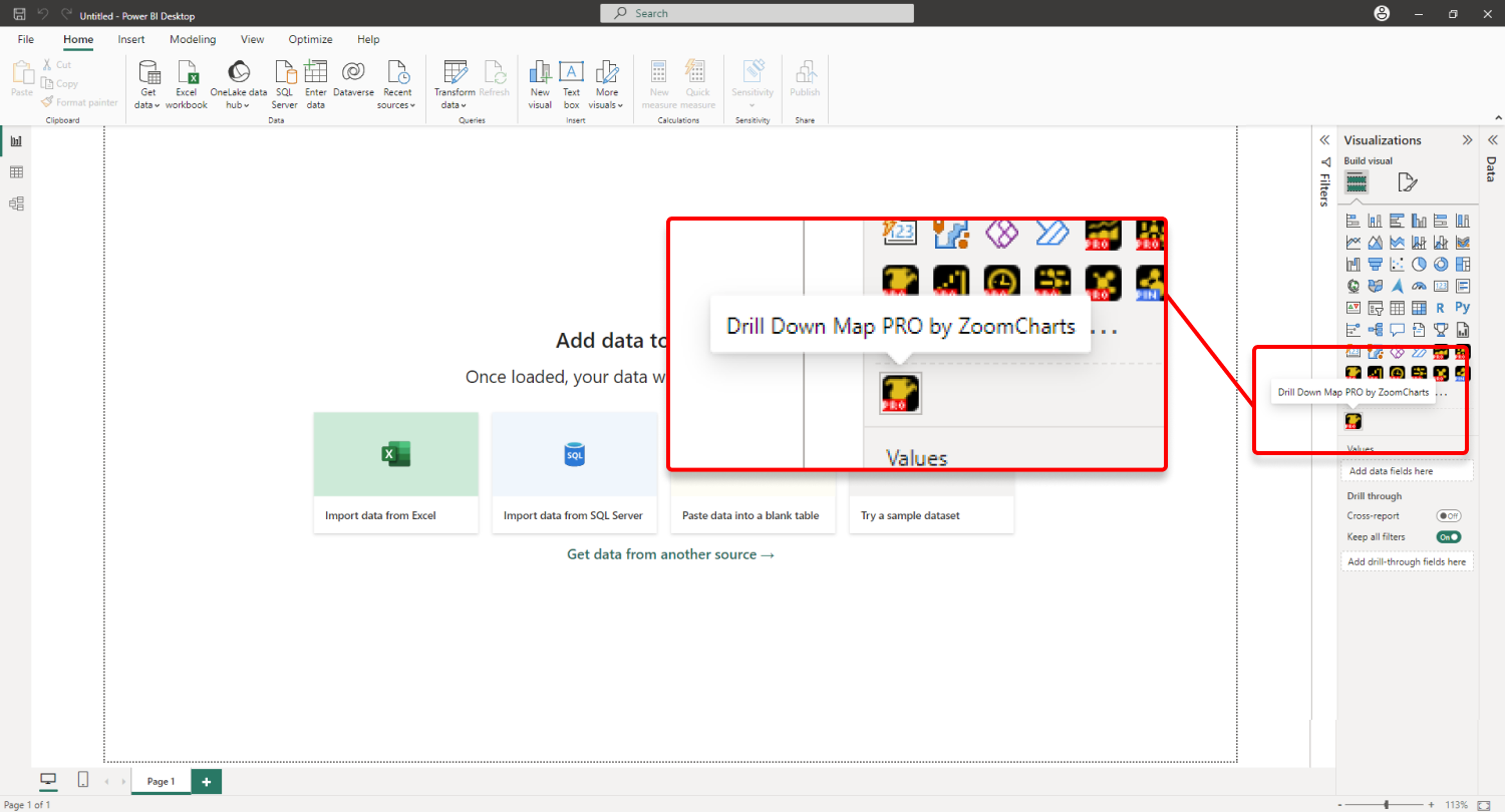
If you have downloaded this visual from Microsoft AppSource within Power BI Desktop, its icon should automatically appear in the Visualizations pane on the right side of your Power BI window.

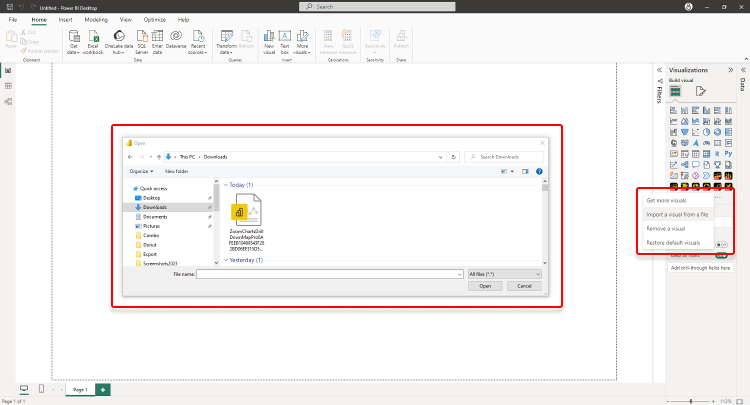
If you have acquired Drill Down Map PRO externally, you may need to add it to Power BI manually. You can do that by clicking the ellipsis button at the end of the visualizations list, and pressing Import a visual from a file. Locate the .pbiviz file and the visual will be added to the Visualizations pane.


Was this helpful? Thank you for your feedback!
Sorry about that.
How can we improve it?