657
Supply Chain Analays
Supply Chain Analays
Report Author: David Amri
657
Share template with others
Report submitted for Onyx Data DataDNA ZoomCharts Mini Challenge, November 2024. The report is based on the Supply Chain Analysis dataset and includes ZoomCharts custom Drill Down PRO visuals for Power BI.
Author's description:
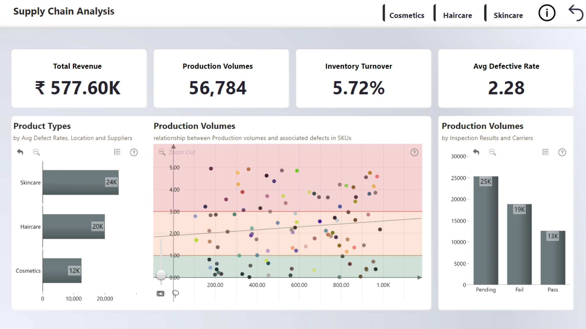
Summary Insights: The Dashboard focuses on overall Production Analysis with the aim of providing insights on the relationship between Production volumes and defect rates.
• Haircare leads the product types in average defective rates i.e. 2.48
• Skincare leads in failed inspection results
• Chenai region leads as the location with the highest defective rates i.e. 2.58 The utilization of thresholds for the scatterplot provides clear concerns in regard to the SKUs
• Red – denotes high defective rates
• Yellow – denotes moderate defective rates
• Green – denotes acceptable defective rates An in depth analysis of location and product type is recommended in order to ascertain the cause of the defective rates and failed inspections.
4U Report Challenges
Participate in data challenges, build and submit reports to get free template downloads.
Join CommunityMobile view allows you to interact with the report. To Download the template please switch to desktop view.
Was this helpful? Thank you for your feedback!
Sorry about that.
How can we improve it?