1443
Flight Delay Analysis Power BI Report
Flight Delay Analysis Power BI Report
More Report pages
Report Author: Haoyu Huang
1443
Share template with others
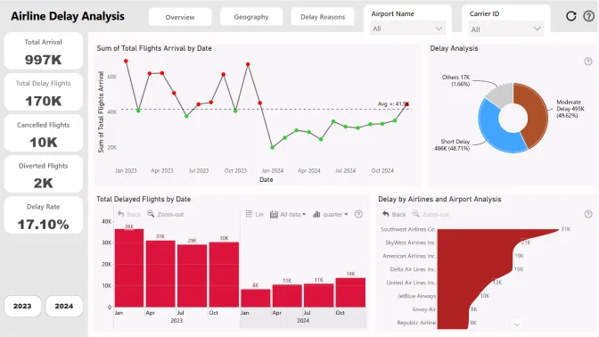
This Flight Delay Dashboard Template for Power BI helps users build an aviation delay report that tracks flight disruptions, delay trends, and route performance.
Report submitted for the FP20 Analytics ZoomCharts Challenge, January 2025. The report was built using the Airline Delays Dataset and includes ZoomCharts custom Drill Down PRO visuals for Power BI.
Project Overview
The goal of this project is to analyze and visualize airline delay data, highlighting on-time performance and the reasons behind delays for different airlines and airports. The project consists of three interactive dashboards, each designed to explore delays from different perspectives.
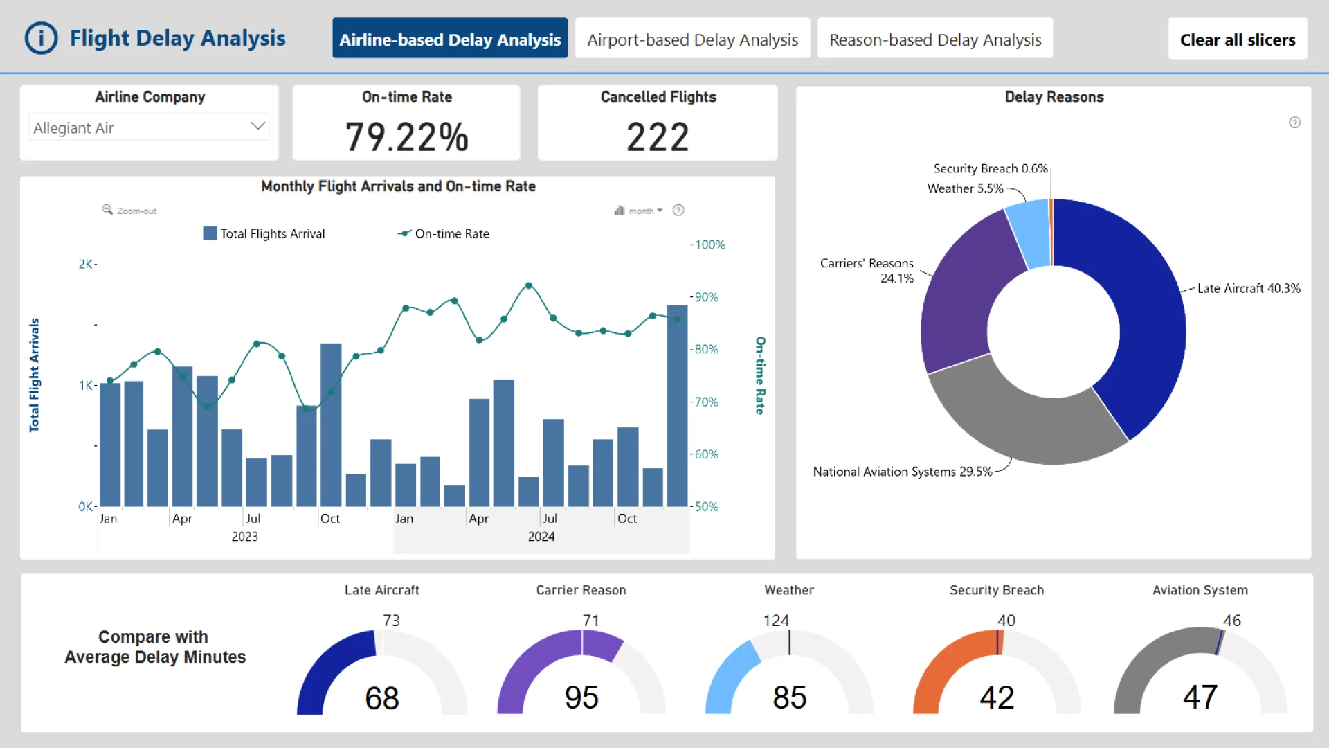
1. Airline-Based Delay Analysis
Purpose
This dashboard focuses on individual airline companies (carriers) to help users:
-
Identify major delay reasons for a selected airline.
-
Compare the airline’s average delay time with the industry standard within the same timeframe.
-
Track on-time performance and total flight arrivals through a line chart.
-
Analyze delays for a specific month and discover key delay patterns.
Expected User Flow
1️⃣ Select or type an airline company.
2️⃣ (Optional) Set a timeframe.
3️⃣ (Optional) Select a month in the line chart.
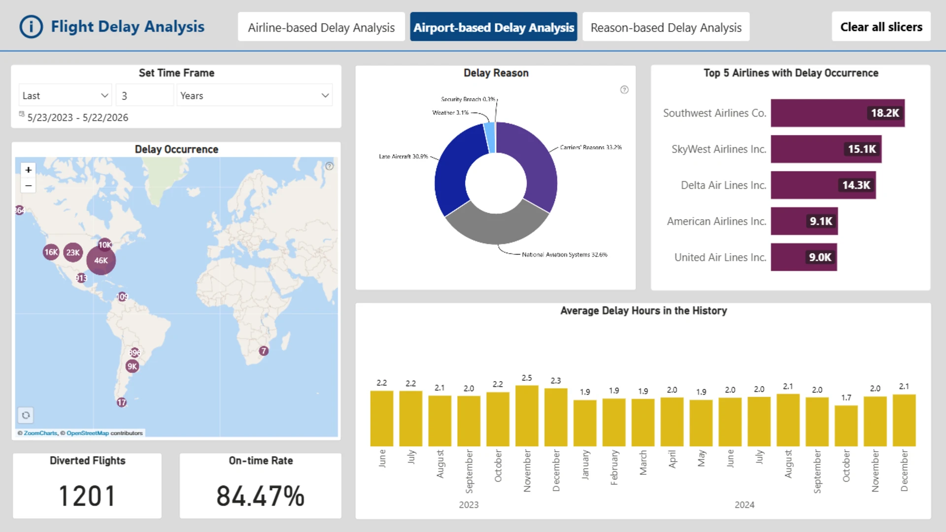
2. Airport-Based Delay Analysis
Purpose
This dashboard provides insights into airport-specific delays, allowing users to:
-
Select an airport on an interactive map to view key metrics.
-
Analyze the on-time rate, major delay reasons, and the top three airlines with delays at the selected airport.
-
Examine historical average delay hours for a more comprehensive understanding.
Expected User Flow
1️⃣ Choose an airport on the map.
2️⃣ (Optional) Select a specific delay reason.
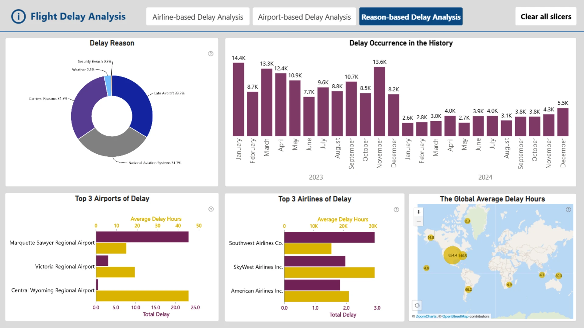
3. Reason-Based Delay Analysis
Purpose
This dashboard helps users explore delay reasons in-depth by:
-
Analyzing total delay occurrences across different time periods.
-
Identifying geographical delay patterns and the most affected airports.
-
Examining associated airlines and airports contributing to the delay reason.
-
Viewing average delay hours and historical trends.
Expected User Flow
1️⃣ Select a delay reason.
2️⃣ Select a month in the line chart.
3️⃣ (Optional) Select an airport and/or airline for further details.
ZoomCharts visuals used




4U Report Challenges
Participate in data challenges, build and submit reports to get free template downloads.
Join CommunityMobile view allows you to interact with the report. To Download the template please switch to desktop view.
How to use a PBIX template
Preview the interactive report, download the PBIX file, open it in Power BI Desktop, and replace the same data connection with your own dataset.
Preview and download
Explore the report online and download the PBIX template file.
Open in Power BI Desktop
Open the downloaded PBIX file in Power BI Desktop.
Connect your data
Replace the sample data source with your own dataset.
Refresh and adjust
Refresh the model and update fields or visual were needed.
Save and share
Save your report and publish it for your audience.