Welcome to the FP20 Analytics March 2024 Challenge!

Feb 25 - Apr 03, 2024 | EDT

Challenge 14 Focus: National Fuel Market Analysis with real-life data. Enhance your Power BI skills, expand your portfolio, and get noticed.

Timeline

Registration Open

Registration Open

25 February | 19:00

-

Submissions Open

Submissions Open

25 February | 19:00

-

Workshop | How To Build A Fuel Market Analysis Report with ZoomCharts

Workshop | How To Build A Fuel Market Analysis Report with ZoomCharts

07 March | 11:00

-

1:1 Mentoring Sessions

1:1 Mentoring Sessions

07 March | 11:00

25 February - 26 March

Entry Submission Deadline

Entry Submission Deadline

26 March | 20:00

25 February - 26 March

Webinar | Analyzing the Best Fuel Market Reports: TOP 5 Report Insights

Webinar | Analyzing the Best Fuel Market Reports: TOP 5 Report Insights

04 April | 11:00

25 February - 26 March

Winner Announced

Winner Announced

04 April | 11:00

25 February - 26 March

Dataset

Get the dataset

See past FP20 Analytics challenges

See past challenges
Submitted Reports
About challenge
How to participate
The Brief
Judging criteria
Timeline
Dataset
Past challenges

Winner of the challenge

All Submissions

About FP20 Analytics ZoomCharts Challenge

Want to learn to build Pro reports? With personalized feedback and informative workshops, this is your opportunity to take your report-building skills to the next level, build your professional portfolio, and network with like-minded people.

The ZoomCharts challenge is hosted in partnership with FP20 Analytics – a group that unites passionate and inspiring data enthusiasts, and helps new data analysts improve their skills and build a competitive portfolio. Join in and sharpen your skills together with this open and friendly data community. Read more about the challenges on the FP20 Analytics website. Join the community on LinkedIn.

Participate in FP20 Analytics ZoomCharts Challenge to enrich your skill in creating Pro reports that help business users explore data quickly and intuitively. 

  1. Free License: All participants receive a free ZoomCharts Developer License that gives access to the full Drill Down PRO visuals library. License will remain active for 1 year after the challenge.
  2. Learn from Experienced Professionals: As part of the challenge, we host live workshops on report building and visualizing the challenge’s dataset in Power BI. Challenge participants can also book an individual consultation with an experienced Power BI mentor to ask questions and get personalized tips.
  3. Tailored Feedback: Every challenge submission will receive personalized feedback, giving participants the chance to hone their skills and improve their reports.

Prizes

The best report’s creator will receive a $300 Amazon gift card from ZoomCharts. The winner will be announced in a special live webinar session on April 4, where we will review the top entries from the challenge. 

Webinar recordings

How to participate?

  1. Register and receive a Drill Down Visuals Developer License for Power BI.
  2. Download the challenge dataset.
  3. Use the dataset to build a Power BI report with ZoomCharts Drill Down Visuals.
  4. Submit your entry to be verified.
    (If your submission doesn’t match the challenge criteria, you will be notified by email, so make sure you will have time for revision and resubmission if needed. Feel free to resubmit the entry as many times as necessary before the deadline)
  5. Upload your publish to web link on NovyPro. 

    Note: If you opt to post your report on NovyPro, for instructions on how to do this, refer to the provided video link. 
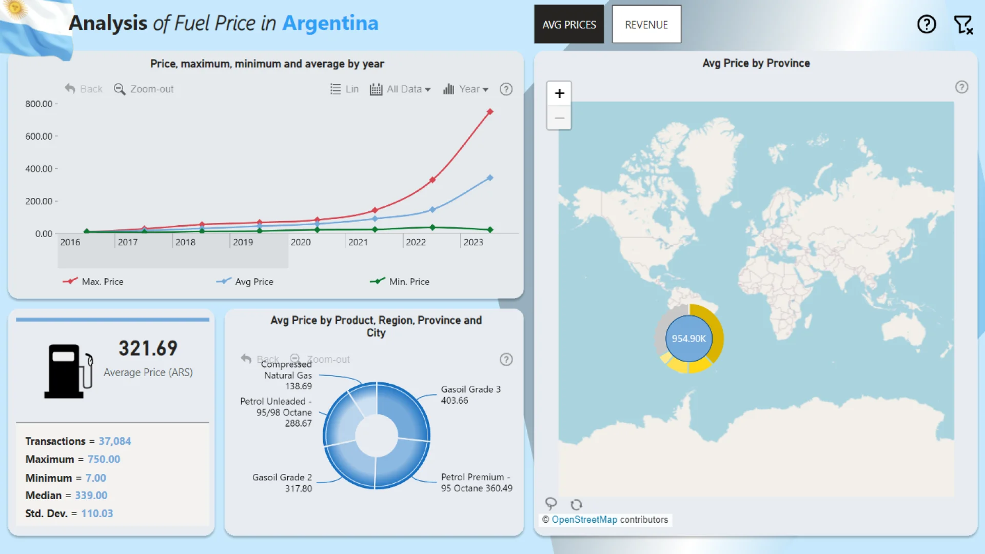
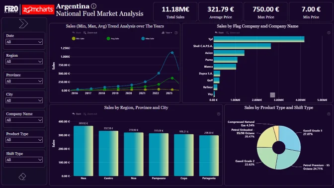
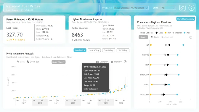
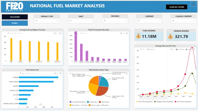
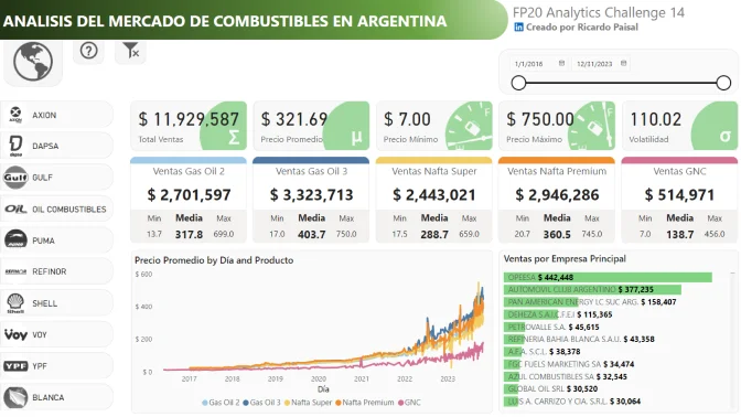
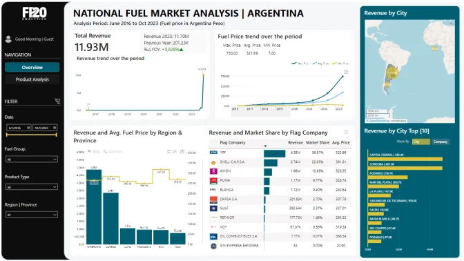
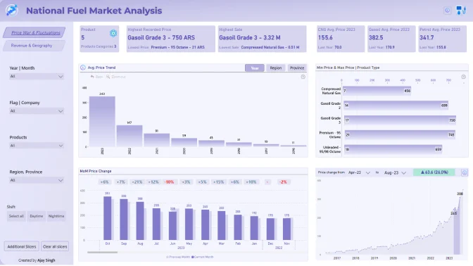
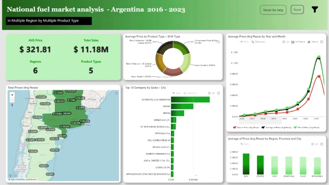
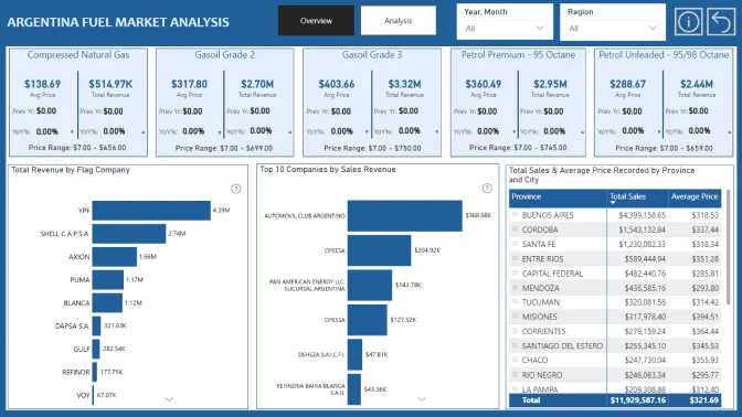
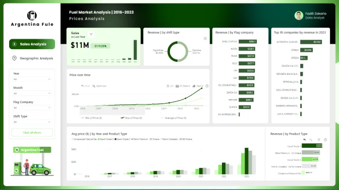
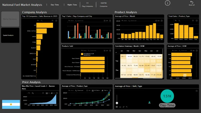
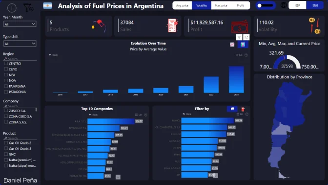
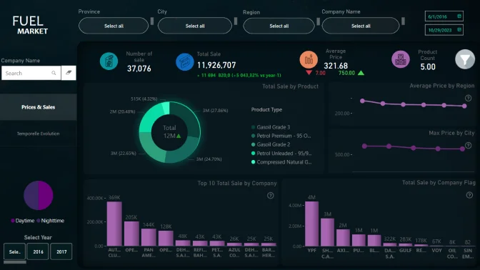
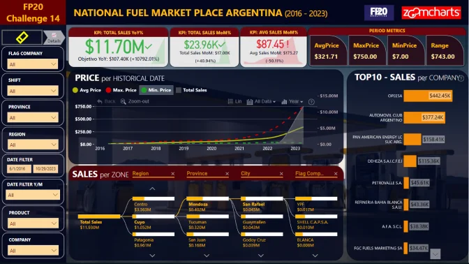
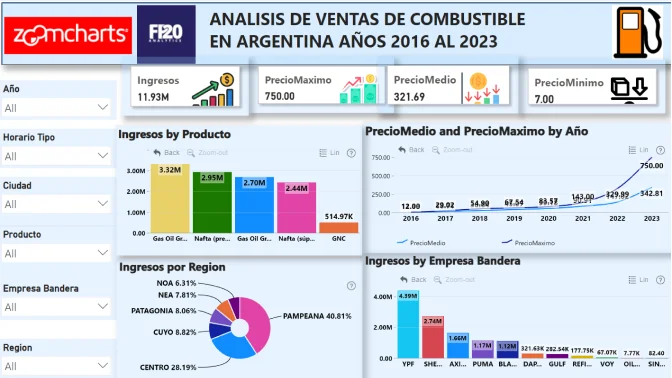
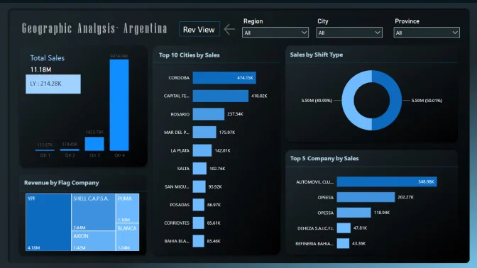
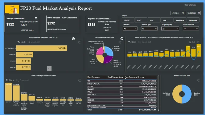
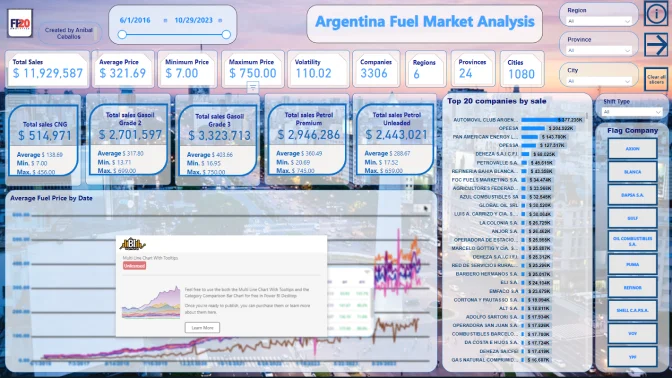
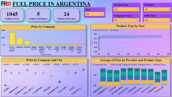
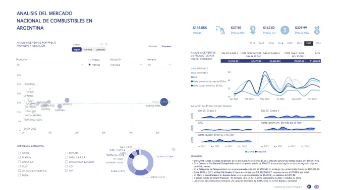
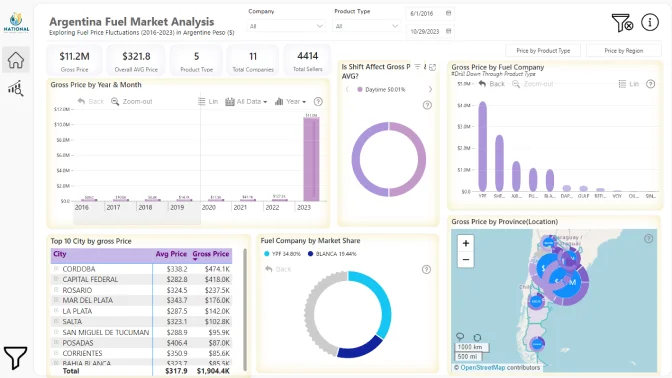
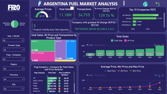
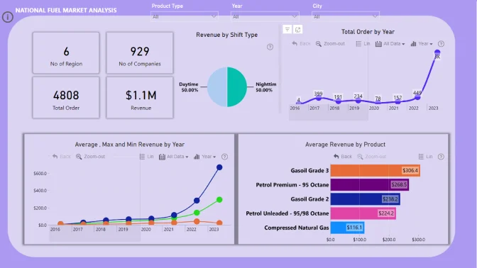
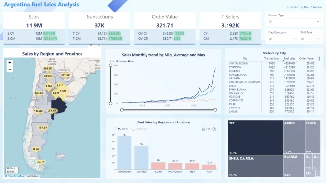
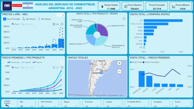
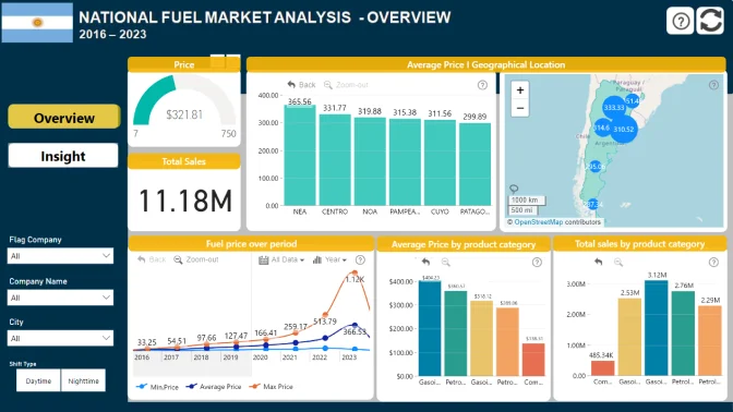
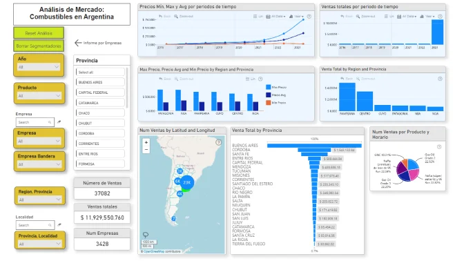
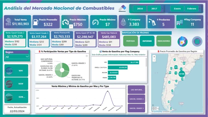
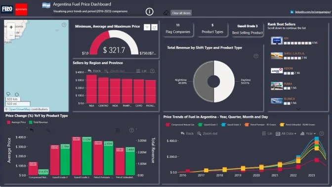
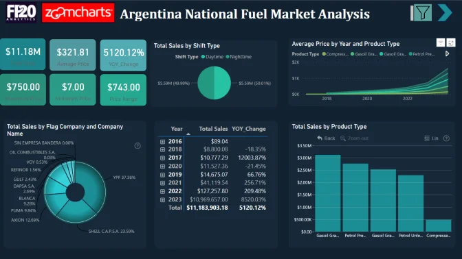
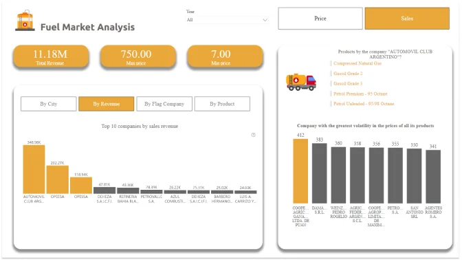
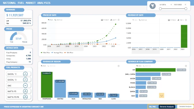
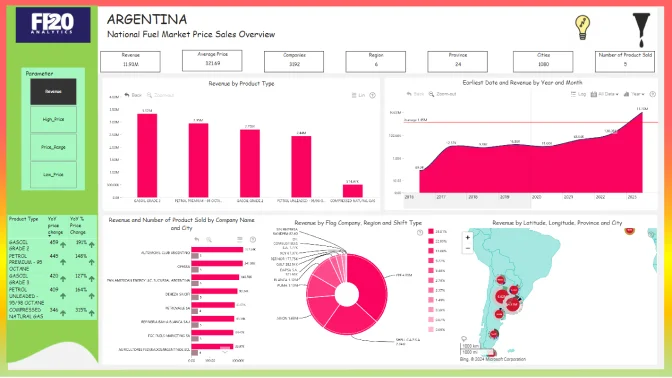
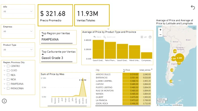
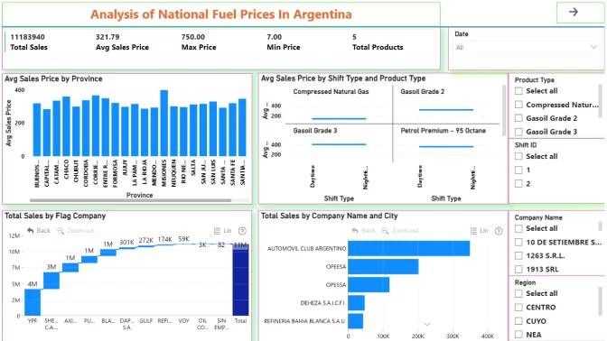
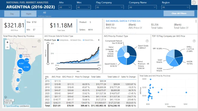
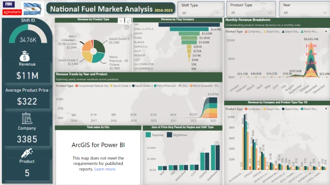
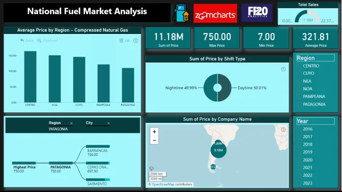
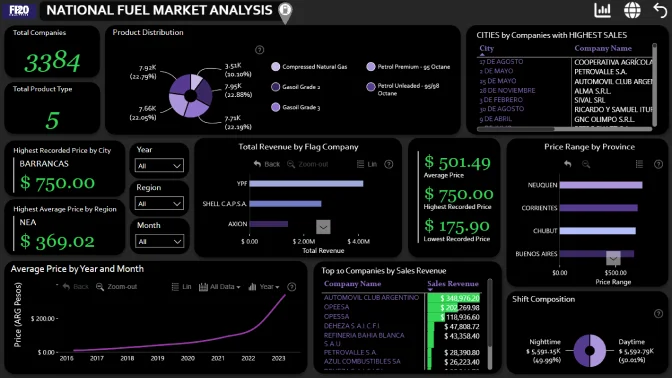
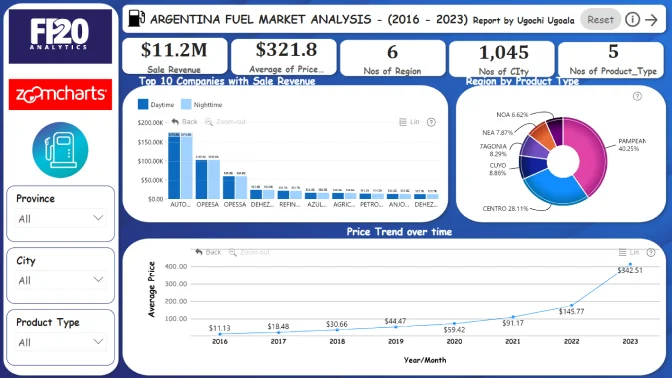
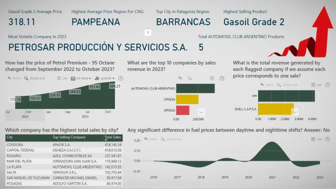
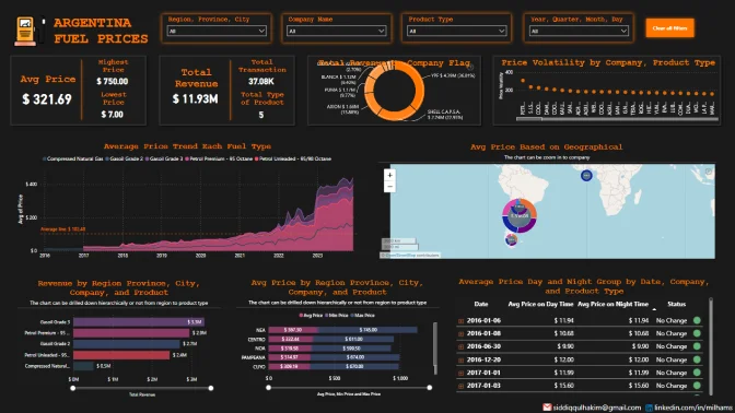
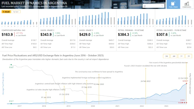
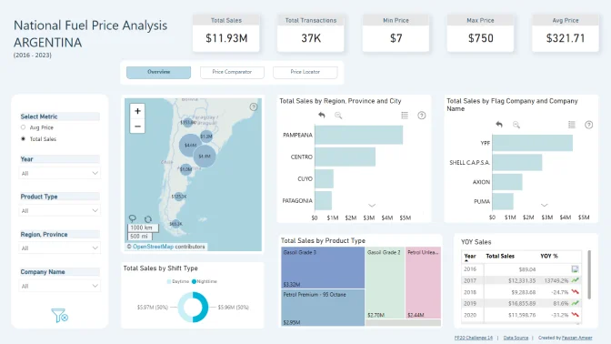
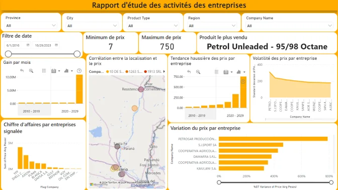
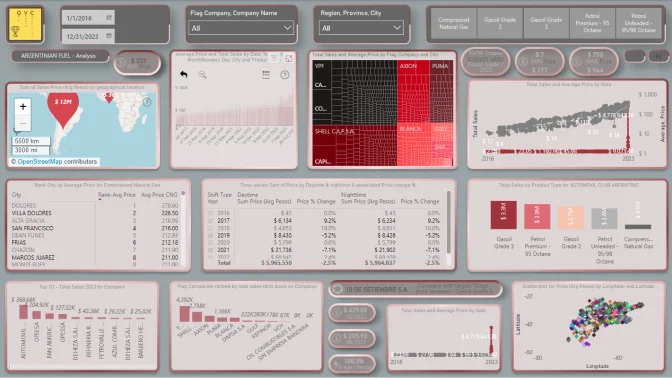
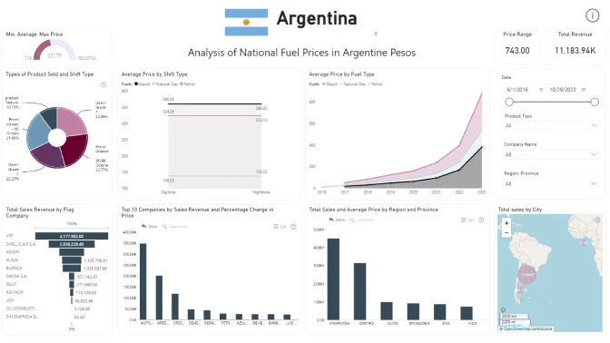
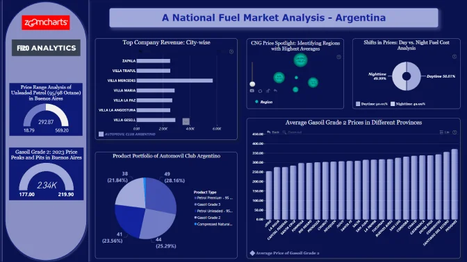
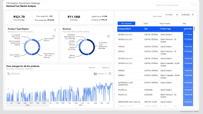
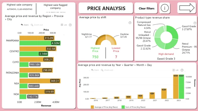
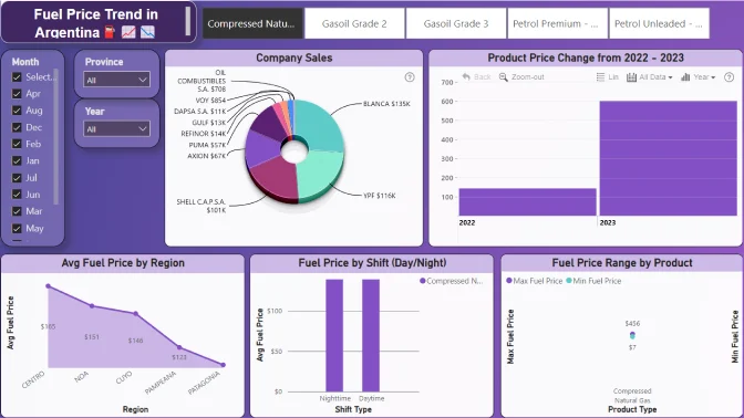
    NovyPro: https://www.novypro.com/
    Instruction Video: https://www.youtube.com/watch?v=jkcAYgFGWUY
  6. Post your submission on LinkedIn:
    • Upload the report as a PDF document on your LinkedIn feed.
    • Use the caption, “I am participating in FP20 Analytics Challenge 13”, along with screenshots from your report.
    • Include a brief summary about your report's key insights and publish to web or NovyPro link.
    • Use the hashtags #FP20Analytics, #FP20AnalyticsFuelAnalysis, #builtwithzoomcharts, tag @Federico Pastor and @Zoomcharts.
    • Additionally, post your report in the FP20 Analytics LinkedIn Community Group.
  7. Follow ZoomCharts on LinkedIn

This data analysis project is designed to investigate the trends and fluctuations of fuel prices across Argentina during the last few years, focusing on various fuel types and sellers. By collecting and examining data from a range of sources, including government databases and fuel companies, the study aims to uncover patterns of price adjustments, seasonal trends, and differences across regions.

Through careful data analysis, the project aims to trace the trajectory of fuel prices, providing insights into the factors influencing these changes without delving into complex statistical methodologies. By analyzing the pricing data of gasoline, diesel, and alternative fuels, the project intends to offer a detailed overview of how fuel prices vary across Argentina.


What should your report include?

In Challenge 14, we analyze the trends in a National Fuel Market.
Create a report that allows end users to easily find answers to the following questions: 

  1. What is the average price of Gasoil Grade 2 across all provinces?
  2. Which company has the highest total sales by city?
  3. How has the price of Petrol Premium - 95 Octane changed from September 2022 to October 2023?
  4. Which region has the highest average price for Compressed Natural Gas?
  5. Can we observe any significant difference in fuel prices between daytime and nighttime shifts?
  6. What is the price range for Petrol unleaded - 95/98 Octane in the Buenos Aires province?
  7. How many different types of products are sold by the company "AUTOMOVIL CLUB ARGENTINO"?
  8. Which city in the Patagonia region has the highest recorded price for any fuel type?
  9. What are the top 10 companies by sales revenue in 2023?
  10. What is the total revenue generated by each flagged company if we assume each price corresponds to one sale?
  11. Which company experienced the greatest percentage change in the price of Gasoil Grade 3 between September 2022 and October 2023?
  12. What was the highest and lowest prices of Gasoil Grade 2 in the province of Buenos Aires during the year 2023?
  13. Which month had the greatest profit win in the prices of Petrol unleaded - 95/98 Octane during the year 2022?
  14. Are there significant correlations between geographical location (latitude and longitude) and product prices for a specific company?
  15. What was the product that showed the highest sales?
  16. Was there any month in the year 2023 where a trend of increasing prices for all products sold by a specific company was observed?
  17. Which company showed the greatest volatility in the prices of all its products during the year 2023?

Technical requirements

  • Build your report using only Power BI 
  • Reports are restricted to a maximum of 2 pages 
  • Canvas size is 16:9 (Default Power BI size) or Full HD size = w:1920 - h:1080 
  • The report should contain at least 2 ZoomCharts Drill Down visuals within a single page. See a practical guide for using Drill Down visuals here

Judging criteria

Business users use reports to make data-driven decisions. That’s why reports are called effective if they enable users to drill down and filter data quickly and intuitively to find answers to any question they might have and analyse data in all possible directions and dimensions. We will evaluate:

  1. How easy is it to understand the data? (max 10 points)
    • Is too much text used for explanation?
    • Are the indicative colors in charts instinctually understandable?
    • Does it tell a story?
  2. How easy-to-use is the report? (max 14 points)
    • Cross-chart filtering implementation across the report. Can other visuals provide relevant data as the user explores the report?
    • Response time
    • Drill Down: multi-layer data exploration. Can the user drill down and gain additional insights within the report?
    • Use of tutorial overlays and other elements to assist new users. Can a new user start using this report straight away with just the guidance provided within the report itself?
  3. How good is the report design and is it suitable for its purpose? (max 10 points)
    • Visual design: is the overall look consistent, no empty spaces, no overcrowding?
    • Interface design: are there unnecessary visualisations/buttons/complexity in use?
    • UX design: is the produced report usable?
    • Report design: is the main challenge answered?
    • Technical: are all the fonts used the same, are the sizes readable?

You are encouraged to use various techniques at your disposal, such as tooltips, drill-throughs, drill-downs, cross-chart filtering and page navigation features, to enhance your analysis.

Timeline

Registration Open

Registration Open

25 February | 19:00

-

Submissions Open

Submissions Open

25 February | 19:00

-

Workshop | How To Build A Fuel Market Analysis Report with ZoomCharts

Workshop | How To Build A Fuel Market Analysis Report with ZoomCharts

07 March | 11:00

-

1:1 Mentoring Sessions

1:1 Mentoring Sessions

07 March | 11:00

25 February - 26 March

Entry Submission Deadline

Entry Submission Deadline

26 March | 20:00

25 February - 26 March

Webinar | Analyzing the Best Fuel Market Reports: TOP 5 Report Insights

Webinar | Analyzing the Best Fuel Market Reports: TOP 5 Report Insights

04 April | 11:00

25 February - 26 March

Winner Announced

Winner Announced

04 April | 11:00

25 February - 26 March

Dataset

Get the dataset

See past FP20 Analytics March 2024 challenges

See past challenges